Your iPhone deserves a little autumn magic, too. 🍂
Ready to make every unlock feel warmer, cozier, and more seasonal?
These fall iPhone wallpaper ideas bring the beauty of autumn right to your screen.
From soft neutral tones and cozy coffee moments to pumpkins, falling leaves, warm plaid, and dreamy fall landscapes, this collection is filled with wallpapers that instantly capture the season. If your current background feels plain or you simply want a fresh look for September and October, these ideas make an easy update without changing anything else on your phone.
I’ve noticed that small seasonal details can make everyday routines feel more enjoyable, and a beautiful wallpaper is one of the easiest ways to create that feeling. Whether you love minimalist designs or rich autumn colors, you’ll find inspiration here to match your style. Keep scrolling to discover your favorite, save the ideas you love, and give your iPhone a cozy fall refresh.
1. Rustic Plaid Pattern
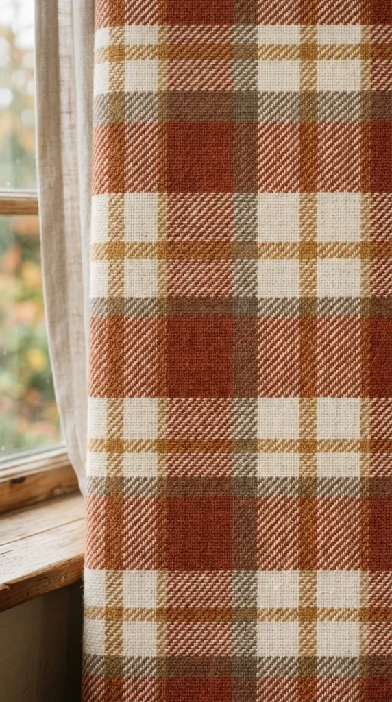
- Warm plaid instantly gives the screen a cozy autumn character.
- Rust, cream, and brown create a soft seasonal palette.
- Medium-sized checks keep icons and widgets easy to see.
- A simple pattern works well with neutral phone cases.
A cozy lock screen can make your phone feel like part of the season before you even open an app. A warm plaid design brings autumn indoors through soft rust, cream, caramel, and muted brown tones, creating a relaxed visual without feeling busy. Choose a simple pattern with generous space around the clock so the time remains easy to read. In my experience, understated patterns age better than overly detailed graphics because they stay attractive throughout October and November. This look works especially well with neutral phone cases, textured accessories, and minimalist home screens that keep the seasonal mood consistent.
Plaid instantly suggests crisp mornings, soft blankets, and comfortable fall layers, making it an easy choice for a seasonal phone background. A rust-and-cream pattern adds warmth while keeping icons visible against a balanced backdrop. For a cleaner result, select medium-sized checks instead of tiny lines, which can look cluttered on a smaller screen. You can also coordinate the wallpaper with a brown, beige, or terracotta case for a polished finish. These fall iphone wallpaper ideas are especially useful when you want something festive enough for autumn but versatile enough to keep using after the first chilly days.
Also Read : 24 Front Porch Fall Decor Ideas for a Cozy Autumn Look
2. Pressed Maple Leaves
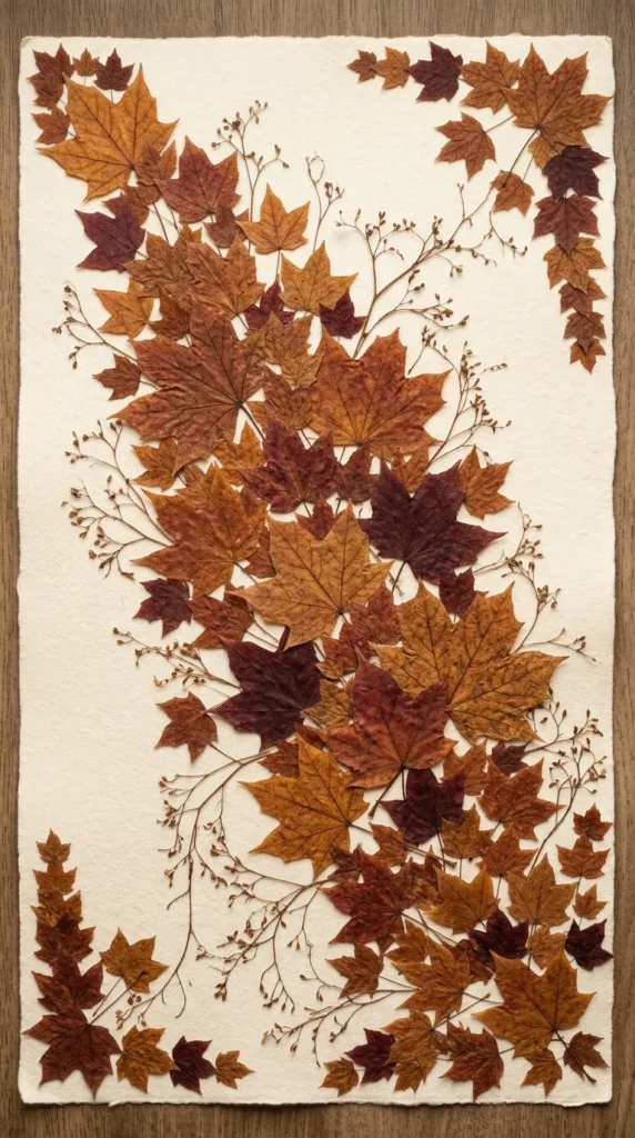
- Layered maple leaves create an organic, collected appearance.
- Amber, copper, and burgundy feel naturally autumnal.
- A light background keeps the design bright and readable.
- Leave open space near the clock for better visibility.
Bring a little woodland charm to your screen with a close-up arrangement of pressed maple leaves in amber, copper, and deep burgundy. The natural textures create a collected, handmade feel while keeping the composition simple enough for phone icons. Place the leaves diagonally with soft shadows and a warm cream background for contrast. This style suits rustic, cottage, and cozy minimalist aesthetics, especially when paired with a matte tan or brown phone case. I’ve noticed that natural elements feel more timeless when the palette stays limited to three or four related colors rather than mixing every autumn shade together.
Pressed leaves give a phone screen an instant seasonal update without relying on pumpkins, lettering, or busy illustrations. Their irregular edges and delicate veins add visual texture, while the muted palette keeps the display calm and sophisticated. For a practical lock screen, leave a quieter area near the top where the clock and notifications appear. A warm ivory background also helps dark text remain readable throughout the day. This botanical approach works beautifully for anyone who wants an autumn-inspired phone without making the screen look overly themed, and it transitions naturally from early fall into the deeper colors of November.
3. Amber Gradient Glow
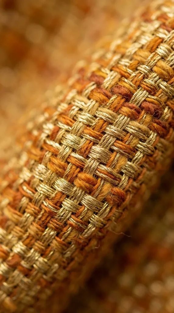
- A golden gradient adds warmth without visual clutter.
- Honey and caramel tones create a polished autumn mood.
- A lighter center improves icon visibility.
- Minimal styling makes the background easy to use daily.
Soft amber tones can turn a simple phone background into a warm autumn focal point. Picture a minimalist gradient moving from honey gold at the center to muted caramel around the edges, with a subtle glow that adds depth without distracting from app icons. The design feels polished, modern, and easy to pair with different cases. Use warm beige, golden brown, and a touch of burnt orange for a refined palette. This type of background helps when you want seasonal color rather than obvious fall graphics, giving your phone a cozy update while keeping the overall screen clean and sophisticated.
A golden gradient works because it captures the warmth of autumn without filling the screen with visual details. The soft transition between honey and caramel shades creates depth, making the display feel richer than a flat color background. Keep the center slightly lighter so icons and widgets remain easy to distinguish. A matte case in cream, tan, or warm brown complements the effect without competing for attention. That’s why many designers recommend subtle tonal changes when styling small digital surfaces: they create atmosphere while preserving everyday usability, especially when your phone screen needs to stay readable in changing light.
4. Cozy Pumpkin Collage
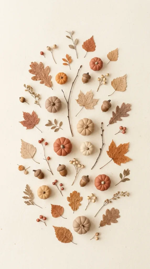
- Tiny pumpkins create an instantly recognizable autumn accent.
- Cream, terracotta, and muted orange keep the collage sophisticated.
- Scattered placement leaves enough room for icons.
- Hand-drawn details add warmth without making the screen feel crowded.
Nothing says autumn quite like a collection of tiny pumpkins, but the trick is keeping the arrangement light and refined. Choose miniature pumpkin illustrations in muted orange, terracotta, cream, and warm beige, then scatter a few leaves and acorns between them. The open background gives the screen breathing room, so your apps remain easy to find. I’ve noticed that smaller repeated motifs often look more polished on phones than one oversized graphic. Pair this wallpaper with a cream or caramel case for a coordinated seasonal look that feels cozy without becoming overly decorative.
A pumpkin collage can make an ordinary phone screen feel playful and festive while still looking tasteful enough for everyday use. Keep the illustrations simple, with soft outlines and subtle shading rather than highly saturated colors. Position busier elements toward the lower half of the screen if you want the lock-screen clock to remain prominent. This approach is especially helpful for Pinterest-inspired styling because the finished look feels cheerful, photogenic, and easy to recreate. Among fall iphone wallpaper ideas, this one works particularly well for anyone who enjoys traditional autumn symbols but prefers a softer, more modern color scheme.
5. Moody Forest Mist
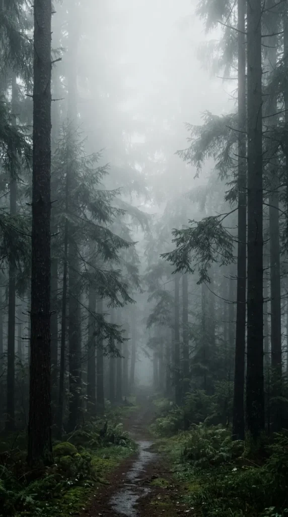
- Deep greens and browns create a peaceful woodland atmosphere.
- Light mist adds depth without overwhelming the screen.
- Darker tones work beautifully with warm-colored widgets.
- A simple forest silhouette keeps the composition visually calm.
A misty autumn forest brings a quiet, atmospheric feeling to your phone without needing bright seasonal graphics. Imagine tall evergreen and deciduous trees fading into soft morning fog, with touches of amber foliage visible through the haze. Deep forest green, muted brown, and warm gold create a sophisticated palette that feels especially beautiful on darker phone displays. Keep the central area relatively simple so the clock and widgets remain readable. This style is ideal when you want your wallpaper to feel peaceful rather than festive, almost like carrying a quiet woodland morning with you throughout the day.
The beauty of a forest mist background comes from its layers. Darker trees create a natural frame, while lighter fog adds softness and prevents the image from feeling heavy. I’ve seen this work well in many homes where people prefer earthy colors and understated seasonal décor, and the same principle translates beautifully to a phone screen. Choose an image with gentle contrast rather than intense shadows, especially if you frequently use your phone outdoors. Add warm beige or muted gold widgets to create a subtle connection between the woodland scene and the cozy colors associated with fall.
Also Read : 34 Easter Wreath Ideas Front Door for a Spring Welcome
6. Cinnamon Latte Art
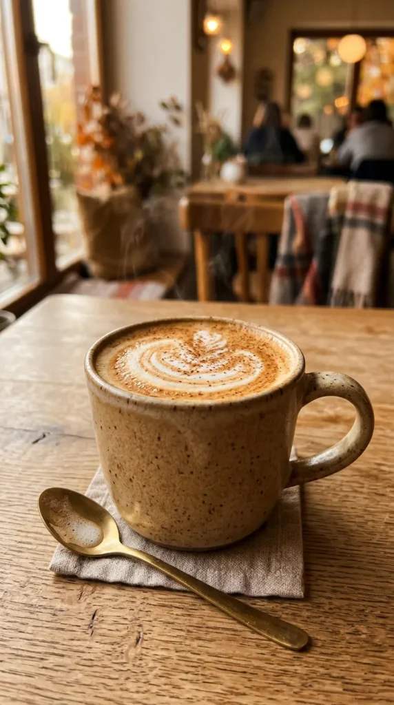
- Warm coffee tones create an instantly cozy visual.
- Cinnamon details add a subtle seasonal touch.
- Creamy foam provides a lighter area for icons.
- Minimal styling keeps the wallpaper elegant and versatile.
A warm cinnamon latte makes an effortless autumn-inspired background because it combines comfort, color, and everyday familiarity. Picture creamy foam swirled with cinnamon inside a simple ceramic mug, resting on a warm beige surface beside a few subtle coffee details. Caramel, cream, tan, and medium brown create a soft palette that feels cozy without becoming dark. Leave some uncluttered space around the upper portion of the image so the lock-screen clock remains visible. This design works particularly well with neutral cases and gives your phone the relaxed feeling of a favorite café on a cool morning.
Coffee-inspired backgrounds are also practical because their neutral colors pair easily with almost any phone setup. A cream mug, wooden surface, and cinnamon dusting provide enough texture to make the image interesting without competing with your apps. For a cleaner result, avoid adding too many props such as books, flowers, or utensils. One or two supporting details are enough. These autumn phone backgrounds are a great choice when you want something seasonal but not overly literal, especially if your personal style leans toward warm neutrals, café aesthetics, minimalist décor, or simple everyday comforts.
7. Cozy Sweater Texture
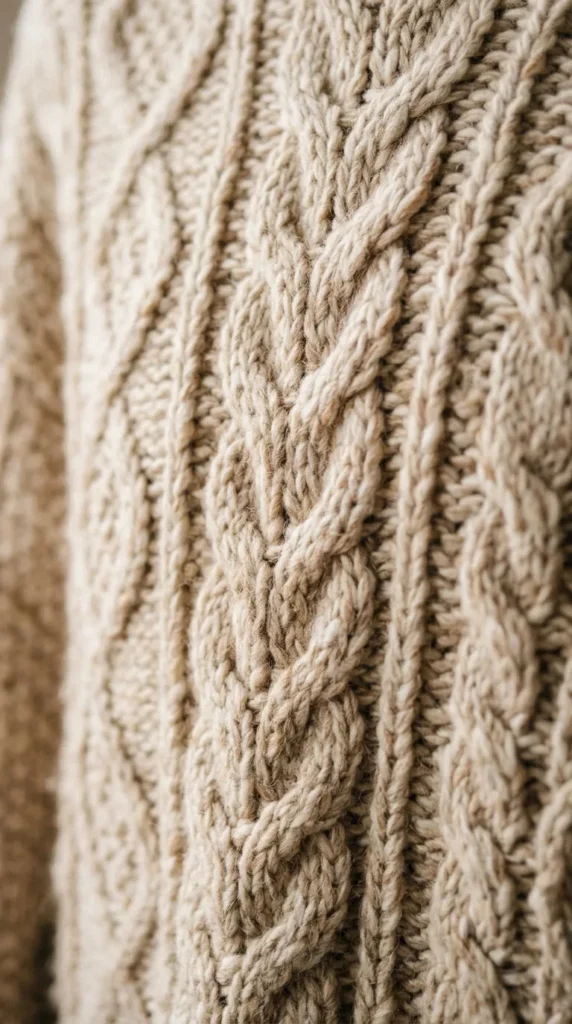
- Knit texture adds warmth without using seasonal illustrations.
- Cream, oatmeal, and caramel shades feel soft and inviting.
- A subtle pattern keeps icons easy to read.
- Textured backgrounds pair naturally with neutral phone cases.
A chunky knit texture can make your phone screen feel as comforting as your favorite fall sweater. Choose a close-up pattern in oatmeal, cream, beige, or soft caramel, with visible woven fibers that add depth without introducing busy imagery. The tactile look works especially well when you prefer minimalist wallpapers but still want a seasonal feeling. Keep the texture slightly blurred or softly lit so icons remain clear. I’ve noticed that neutral textile backgrounds are surprisingly versatile because they coordinate with almost any case color, from warm brown and tan to muted sage or dusty rose.
The appeal of a sweater-inspired background is its quiet simplicity. Instead of showing an obvious autumn scene, it uses texture and color to suggest the season in a more subtle way. A tightly woven knit creates gentle shadows that give the screen dimension, while lighter fibers keep the overall image bright. For better readability, avoid extremely high-contrast patterns or oversized stitches directly behind app icons. This cozy wallpaper style is particularly useful for people who change their phone backgrounds often because the neutral palette feels seasonal without becoming tied to one specific holiday or decorative trend.
8. Golden Leaf Silhouette
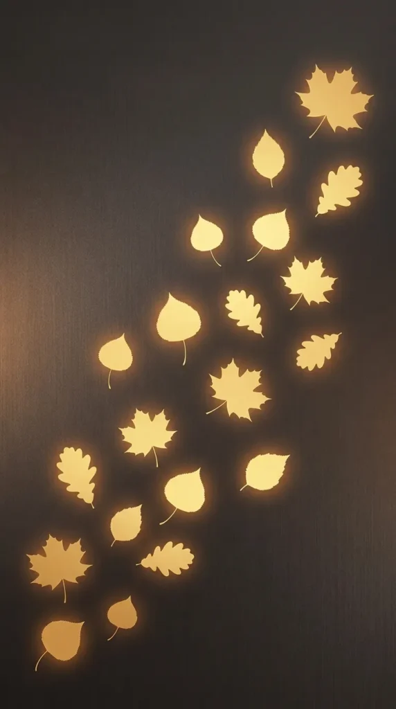
- Simple leaf silhouettes create a clean seasonal statement.
- Golden tones add warmth against darker backgrounds.
- Minimal shapes leave plenty of room for widgets.
- The design works well with both light and dark phone themes.
Golden leaves against a deep background create a sophisticated autumn look with very little visual clutter. Use delicate maple or oak silhouettes in muted gold, bronze, or warm amber, then place them against charcoal, espresso, or deep brown. The contrast makes the leaves stand out while leaving enough negative space for icons and widgets. A faint glow around a few leaves can add depth without turning the design flashy. This approach works beautifully when you want your phone to feel seasonal and polished, especially if your accessories already feature dark neutrals or warm metallic accents.
The strongest version of this design keeps the leaf shapes simple and the background slightly textured rather than completely flat. A subtle gradient from dark brown to charcoal can make the screen feel richer while maintaining excellent readability. If your phone uses a dark-mode setup, this wallpaper can also help the entire display feel cohesive. I’ve noticed that metallic-looking gold works best when it is slightly muted; bright yellow gold can quickly feel less natural. Pair the background with cream, bronze, or beige widgets for a balanced autumn palette that feels elegant rather than overly festive.
9. Harvest Sunflower Field
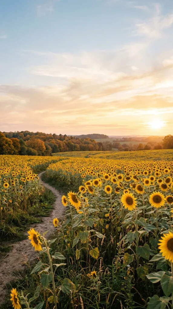
- Sunflowers bring cheerful golden color to the screen.
- A distant field creates natural depth.
- Soft blue and amber balance the warm palette.
- Keep the horizon low for better lock-screen visibility.
A sunflower field can brighten your phone with the golden colors of late summer and early fall. Picture tall sunflowers stretching toward a pale sky, with rich yellow petals, muted green leaves, and a distant tree line softened by warm afternoon light. Keeping the horizon low leaves more open sky near the top, which helps the lock-screen clock stand out. This look brings natural energy to the screen without relying on decorative graphics. It is especially appealing when you want an autumn background that feels cheerful, outdoorsy, and connected to the changing landscape.
The key to making a sunflower image work as a phone background is choosing one with depth and breathing room. A field that extends toward the horizon naturally guides the eye, while warm sunlight adds dimension to the flowers. Avoid extremely saturated yellows because they can make the screen feel harsh, particularly at higher brightness. Instead, look for golden, honey, and muted mustard tones. Among fall iphone wallpaper ideas, a sunflower field is a lovely choice for anyone who prefers bright seasonal imagery and wants a screen that feels sunny even on cool, cloudy autumn mornings.
10. Autumn Window Scene
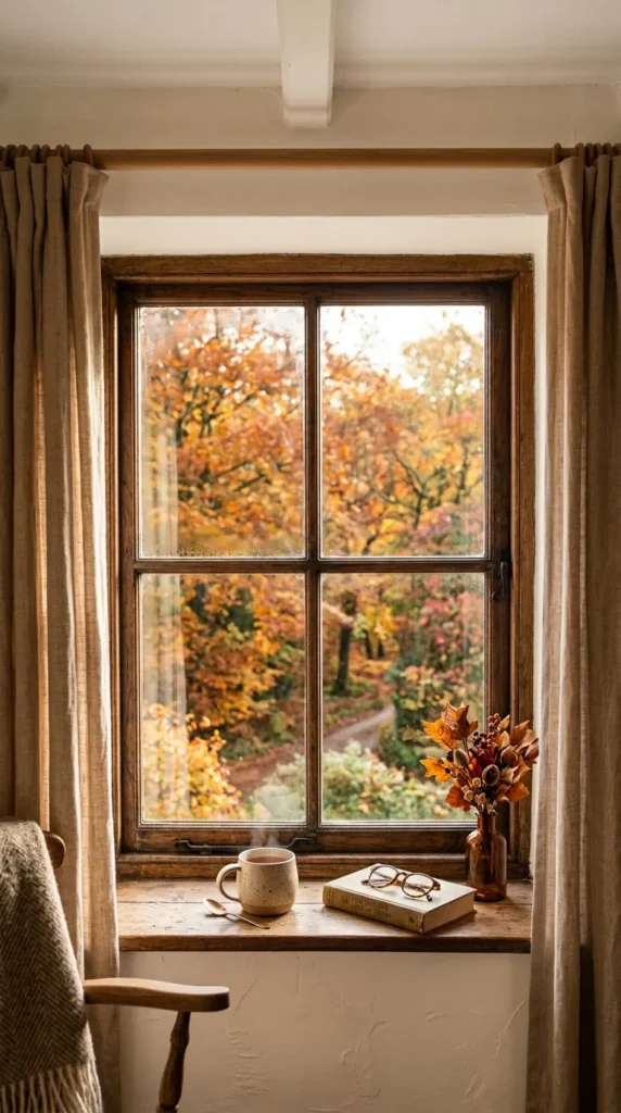
- A window view creates a peaceful indoor-outdoor connection.
- Warm curtains soften the composition.
- Muted foliage keeps the seasonal colors natural.
- Open glass space helps preserve lock-screen readability.
A quiet window scene can make your phone feel like a cozy corner on a cool autumn morning. Imagine warm beige curtains framing a view of amber and copper trees outside, with soft sunlight filtering through the glass. A simple wooden sill adds natural texture without crowding the composition. Keep the upper section relatively open so the clock remains easy to read. This design works especially well for anyone who enjoys cozy interiors, cottage style, or peaceful seasonal photography. The combination of indoor warmth and outdoor foliage creates depth while keeping the overall screen calm and inviting.
For the most polished result, choose a window scene with gentle natural light rather than dramatic contrast. Linen curtains, warm wood, and muted foliage create enough visual interest while maintaining a soft color balance. A few fallen leaves outside can reinforce the season without making the image feel staged. I’ve noticed that realistic everyday scenes often feel more personal on a phone than highly decorative graphics because they suggest a familiar moment without demanding attention. Pair this background with cream, tan, or brown widgets for a cohesive setup that feels warm, natural, and comfortable throughout the fall season.
11. Rustic Acorn Pattern
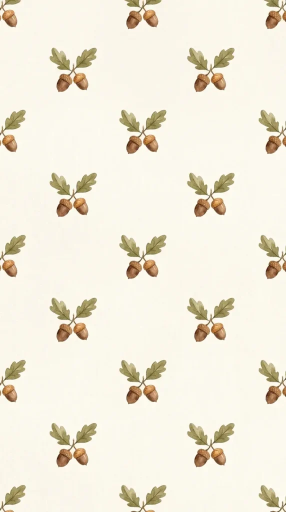
- Acorns add a small woodland detail without overwhelming the screen.
- Warm neutrals make the pattern easy to coordinate.
- Repeated motifs create visual rhythm.
- A light background keeps notifications and icons readable.
Small acorns can create a surprisingly charming seasonal pattern when the colors and spacing are kept simple. Use warm brown acorns with tiny muted olive leaves on an ivory or soft beige background. The repeated shapes create a gentle rhythm across the screen while leaving enough contrast for app icons. Choose hand-drawn or lightly textured illustrations for a more natural appearance. This design suits rustic, cottage, farmhouse, and neutral aesthetics because it introduces autumn character without relying on brighter orange or red shades. It also feels subtle enough to use well beyond the first weeks of fall.
A repeating acorn pattern works best when the motifs are small but clearly separated. Too many overlapping elements can make a phone screen look busy, especially once widgets and notifications are added. Keep generous spacing between each acorn and use a warm neutral background to maintain visual balance. In my experience, muted botanical patterns are easier to live with every day because they provide seasonal personality without competing with the phone’s practical functions. Add a tan, olive, or dark brown case to reinforce the woodland palette, or keep the case cream for a lighter, softer finish.
12. Dark Academia Autumn
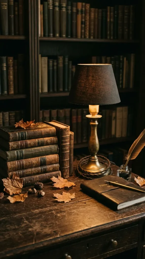
- Deep brown tones create a rich, sophisticated atmosphere.
- Antique books and warm wood add subtle character.
- Amber lighting keeps the darker palette inviting.
- Minimal objects prevent the lock screen from feeling crowded.
Dark academia style gives an autumn phone background a richer, more sophisticated personality. Picture an antique wooden desk with a few vintage books, dried leaves, dark leather details, and a small brass lamp casting warm amber light. Deep espresso, olive, bronze, and cream create a layered palette that feels cozy without becoming gloomy. Keep the composition focused on two or three main objects so the screen remains functional. This setup is especially appealing for readers, students, and anyone who enjoys vintage interiors, classic textures, and moody seasonal styling with an understated autumn character.
The secret to a successful dark academia background is balance. Dark colors should create depth, but there should still be enough warm light or lighter surfaces to keep the image readable. A wooden desk can provide texture, while aged book pages and brass accents introduce small highlights. Avoid placing detailed objects directly behind important widgets because their edges can interfere with text. These fall iphone wallpaper ideas can easily coordinate with brown leather cases, antique-inspired accessories, or neutral lock-screen widgets, creating a complete visual theme rather than simply adding an isolated autumn image.
13. Burnt Orange Minimalism

- Burnt orange creates an instantly recognizable autumn palette.
- A smooth background keeps the screen clean.
- Subtle tonal variation adds depth without clutter.
- Cream widgets stand out beautifully against deeper orange shades.
A single rich color can sometimes make a stronger statement than a detailed seasonal scene. Burnt orange brings instant autumn warmth while keeping the phone screen exceptionally clean and easy to use. Choose a soft terracotta center that gradually deepens toward rust around the edges for subtle dimension. The smooth background gives icons plenty of breathing room and works especially well with cream, beige, or white widgets. This approach is perfect when you want your phone to feel unmistakably seasonal but prefer modern minimalism over illustrations, photographs, or decorative patterns.
The beauty of a monochromatic background is how effortlessly it adapts to different phone layouts. A gentle gradient prevents the screen from looking completely flat, while the limited palette keeps every element visually connected. For a softer appearance, choose muted clay or cinnamon orange instead of a highly saturated shade. I’ve noticed that warm colors look particularly inviting when paired with simple typography and fewer widgets. If you use a clear phone case, the orange background can also complement neutral accessories without creating a competing color story, making this an easy everyday autumn update.
14. Cozy Cabin Fireplace
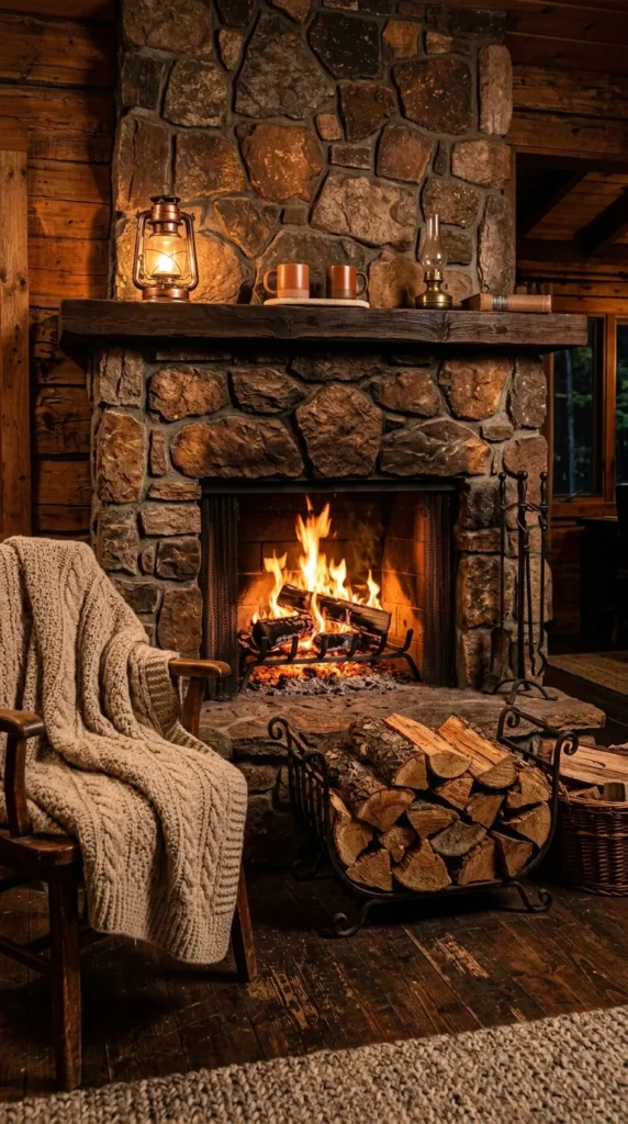
- A fireplace scene creates instant warmth and comfort.
- Wood textures add authentic rustic character.
- Amber firelight creates a beautiful focal point.
- Keep surrounding details softly blurred for better icon visibility.
Few images capture cozy autumn energy as naturally as a glowing cabin fireplace. Imagine a rustic stone hearth surrounded by warm wooden walls, stacked firewood, and a soft beige blanket, with amber flames providing the main source of light. Rich brown, copper, cream, and golden tones create a welcoming palette that feels especially comforting on chilly evenings. Keep the fireplace slightly lower in the composition so the upper portion remains darker and less detailed for the clock. The result is a warm, realistic background that feels like a quiet mountain retreat.
A fireplace image works particularly well when the lighting looks natural rather than overly orange. Let the fire provide a gentle glow while keeping the surrounding wood and stone slightly darker for contrast. A little depth-of-field blur can also make the wallpaper more practical by reducing visual competition behind icons. In my experience, cozy interior scenes feel strongest when they contain only a few recognizable textures, such as stone, wood, wool, and firelight. This combination creates richness without requiring a crowded arrangement, making the background beautiful while still functional for everyday phone use.
15. Falling Leaf Trail
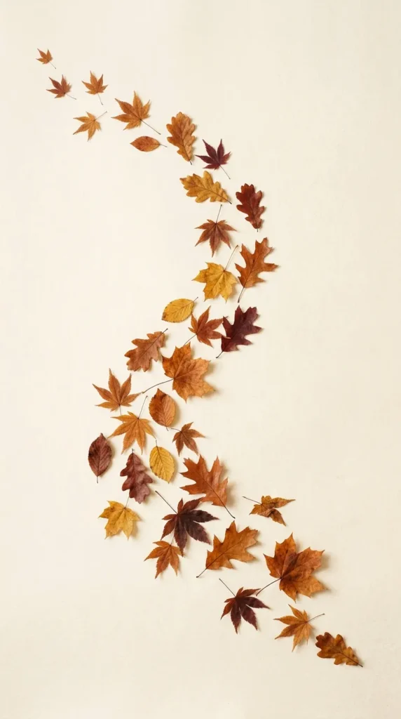
- Scattered leaves create natural movement across the screen.
- Rust, gold, and burgundy provide classic autumn color.
- A soft neutral background keeps the composition balanced.
- Curved placement naturally guides the eye downward.
A flowing trail of autumn leaves can give your phone screen a sense of movement while keeping the overall design beautifully simple. Arrange maple and oak leaves along a gentle diagonal curve, using rust, amber, mustard, and muted burgundy tones. A warm cream background provides enough contrast without feeling stark. The curved arrangement naturally guides the eye across the screen and leaves open areas for app icons. This style works especially well when you want something decorative but not overly detailed, giving the phone a polished seasonal appearance that still feels light and modern.
For a cleaner result, vary the size and angle of each leaf instead of repeating identical shapes. A few smaller leaves can appear farther away, creating depth without needing a complicated scene. Keep the colors slightly muted so the display remains comfortable to look at throughout the day. This is one of those fall iphone wallpaper ideas that can suit many aesthetics because it sits between botanical, minimalist, and traditional autumn styles. Pair it with a cream, tan, or burgundy case, or use a transparent case to let the warm leaf palette remain the main visual feature.
16. Neutral Pumpkin Sketches
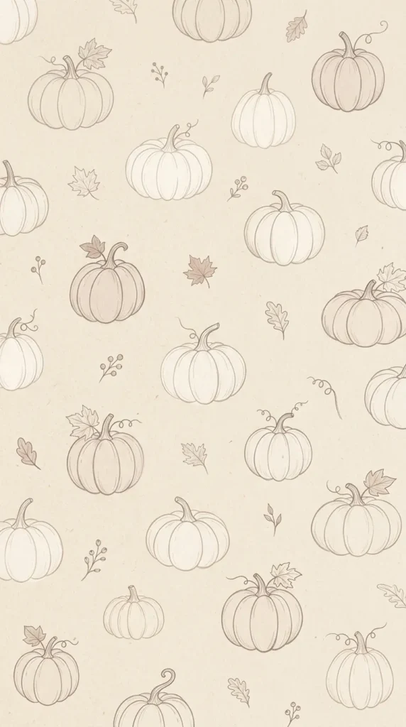
- Line-drawn pumpkins add seasonal charm without visual heaviness.
- Beige and brown tones create a soft neutral palette.
- Simple outlines keep app icons easy to spot.
- Small leaves can fill empty areas naturally.
Simple pumpkin sketches offer a softer alternative to colorful autumn graphics. Use delicate line drawings in taupe, warm brown, or muted terracotta against a creamy beige background. Add a few tiny leaves and stems between the pumpkins to create visual rhythm without making the screen feel crowded. The neutral palette works beautifully with minimalist phone layouts and keeps icons readable. This design is especially useful when you want a seasonal touch that feels subtle enough for everyday use. It also pairs naturally with cream, tan, brown, or clear phone cases for an effortless coordinated look.
The charm comes from restraint. Instead of filling the screen with realistic pumpkins, use thin outlines with varied sizes and gentle spacing. A slightly textured background can make the sketches feel handmade, while a warm ivory base keeps the overall image bright. I’ve noticed that neutral autumn graphics are especially easy to style because they do not compete with colorful app icons or widgets. If you prefer a calm home screen, place the smallest illustrations around the edges and leave the center more open. The result feels festive, but still clean, modern, and visually comfortable.
17. Warm Plaid Background
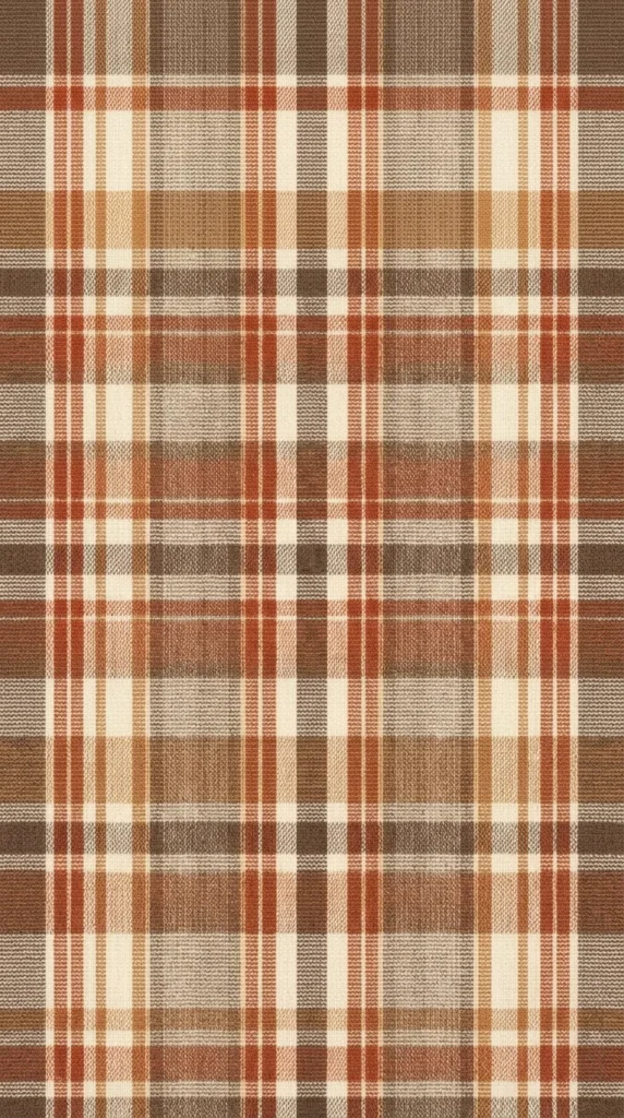
- A softer plaid pattern gives the screen a cozy textile feel.
- Rust and beige create a classic autumn combination.
- Fine lines add texture without overwhelming icons.
- The design pairs easily with warm neutral accessories.
A warm plaid background brings the familiar comfort of autumn textiles directly to your phone. Choose a refined pattern with rust, caramel, cream, and muted brown lines rather than extremely bold checks. Fine woven details create texture while keeping the screen visually calm. A low-contrast design is particularly helpful because it allows app icons and widgets to remain prominent. This background works well with rustic, farmhouse, cottage, and cozy minimalist styles. It also gives you an easy way to coordinate your phone with seasonal blankets, scarves, cushions, or other textiles around your home.
The most useful plaid backgrounds are simple enough to disappear behind your everyday phone layout while still adding a noticeable seasonal color shift. Keep the lines thin and evenly spaced, and avoid placing very dark intersections directly beneath important text. A subtle fabric texture can make the pattern feel warmer and more realistic. In my experience, muted plaid is one of the easiest seasonal styles to keep for several weeks because it feels autumnal without being tied to a specific holiday. Pair it with cream widgets and a tan case for a soft, coordinated finish.
18. Foggy Pumpkin Patch
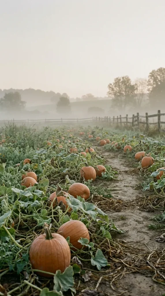
- Misty lighting gives the pumpkin scene a peaceful mood.
- Muted orange pumpkins feel softer than bright seasonal colors.
- A distant field creates natural depth.
- Open sky provides useful space for the lock-screen clock.
A foggy pumpkin patch gives autumn a quieter, more atmospheric look. Picture muted orange pumpkins resting among green vines, with soft morning mist drifting across a distant field and rustic fence. The pale gray-beige sky creates an open area near the top of the screen, making the lock-screen clock easier to read. Instead of bright orange, choose pumpkins in dusty terracotta and muted copper tones for a more sophisticated result. This scene feels especially beautiful when you want a traditional fall subject presented in a calm, natural, almost photographic style.
The mist is what makes this composition work. It softens distant objects, creates depth, and prevents the pumpkin patch from becoming visually overwhelming. Keep the foreground pumpkins clear enough to show their texture, while allowing the background to fade gently into fog. A restrained palette of orange, sage, brown, and cream keeps the image connected to nature. Among fall iphone wallpaper ideas, this option is ideal for people who enjoy seasonal photography but prefer peaceful landscapes over highly decorated scenes. A warm brown or olive phone case can complete the earthy look without distracting from the image.
19. Caramel Coffee Background
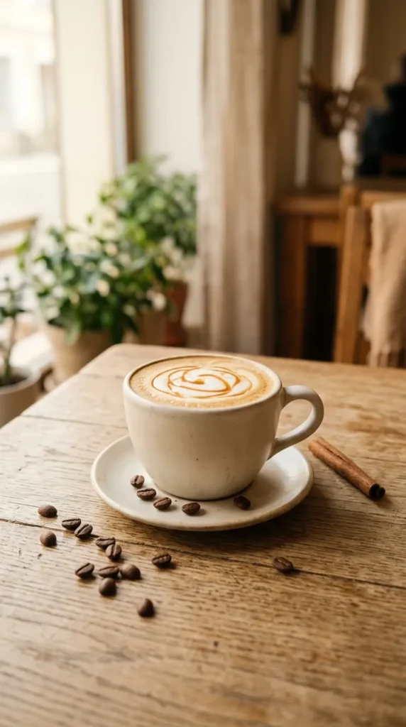
- Caramel tones create an instantly warm and inviting screen.
- Coffee details add subtle seasonal personality.
- Cream accents keep the darker palette balanced.
- Minimal styling leaves plenty of room for icons.
Warm caramel coffee tones can make your phone feel cozy without relying on obvious autumn symbols. Picture a creamy coffee in a simple ceramic cup, resting on a beige tabletop with a few coffee beans and one cinnamon stick nearby. Honey brown, caramel, cream, and soft tan create a comforting palette that feels naturally seasonal. Keep the props minimal so the screen does not become visually crowded. A soft window glow adds warmth and realistic depth. This design works especially well for anyone who loves café-inspired aesthetics, neutral interiors, and subtle seasonal styling.
The strongest coffee backgrounds focus on texture and color rather than too many decorative objects. A ceramic cup, creamy foam, and lightly textured tabletop provide enough detail to make the image interesting while preserving open areas for phone icons. Choose warm natural lighting instead of a heavy orange filter so the colors remain realistic. I’ve noticed that café-inspired wallpapers are easy to keep for longer because they suggest comfort without looking specifically tied to one month. Pair the image with cream widgets and a tan or chocolate-brown case for a cohesive, relaxed autumn setup.
20. Woodland Mushroom Scene

- Tiny mushrooms add whimsical woodland character.
- Mossy greens balance traditional fall oranges and browns.
- Soft forest light creates natural depth.
- A simple foreground keeps the display visually manageable.
A tiny woodland scene can bring a charming storybook quality to your phone without feeling overly decorative. Imagine small mushrooms growing through moss, surrounded by fallen amber leaves, delicate twigs, and textured forest ground. Muted sage, rust, cream, and earthy brown create a balanced palette that feels naturally connected to autumn. Soft filtered sunlight can highlight the mushrooms while leaving the background gently blurred. This design suits cottagecore, woodland, and nature-inspired aesthetics particularly well. It is also a lovely alternative when you want seasonal character without relying on pumpkins, leaves, or traditional autumn patterns.
For a phone wallpaper, close-up woodland imagery works best when the main subject is positioned slightly below center. This leaves quieter space above for the clock and notifications while still giving the image a clear focal point. Keep the background softly out of focus so tiny details do not compete with app labels. That balance makes the scene feel immersive without sacrificing usability. These fall iphone wallpaper ideas can be especially appealing if you enjoy natural textures, miniature details, and earthy colors. A sage green, brown, or cream case will reinforce the woodland palette beautifully.
21. Copper Leaf Close-Up
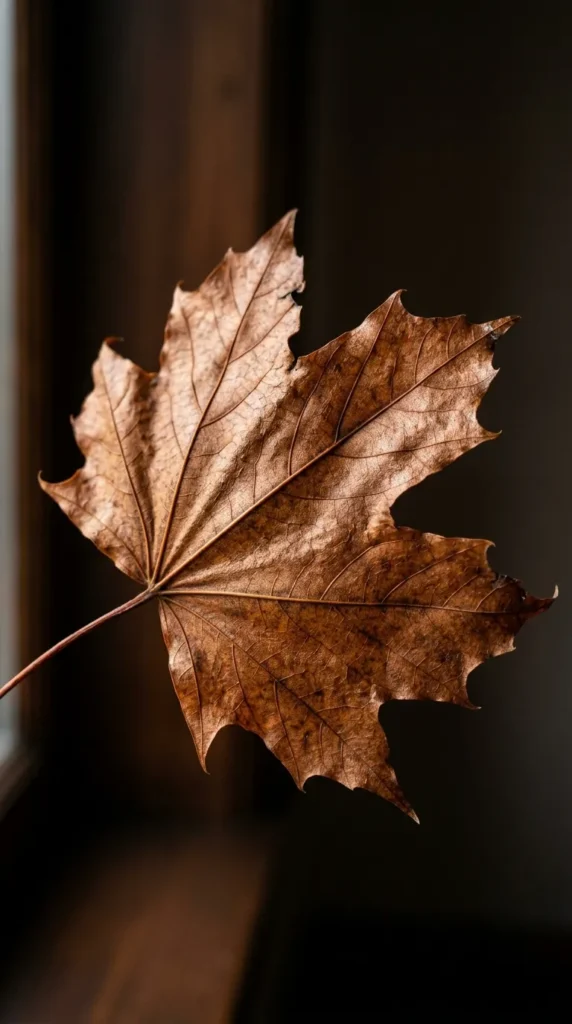
- Copper leaves create a rich, sophisticated autumn accent.
- Close-up details make veins and textures more visible.
- Darker backgrounds emphasize the warm metallic tones.
- Minimal composition keeps the screen elegant and uncluttered.
A single copper leaf can create a striking autumn wallpaper without filling the screen with multiple elements. Choose a close-up maple leaf with visible veins, warm bronze highlights, and rich rust tones against a deep brown background. Soft directional light brings out the natural texture and gives the leaf an almost metallic glow. Keep the composition simple so the detailed foliage becomes the focal point. This style feels sophisticated enough for minimalist setups while still offering strong seasonal color. It is particularly effective when you want your phone background to look polished, artistic, and distinctly autumn-inspired.
Close-up botanical photography works because natural details become visually powerful when enlarged. The delicate veins of a maple leaf can provide texture without requiring additional objects, while the darker background creates strong contrast. For everyday use, make sure the most detailed areas do not sit directly beneath frequently used icons. A slightly darker corner can also provide better space for widgets. I’ve seen this work well with neutral and darker phone cases because the copper tones become the main accent. Keep the rest of your screen simple, and the single-leaf composition can feel surprisingly luxurious.
22. Cozy Autumn Cottage
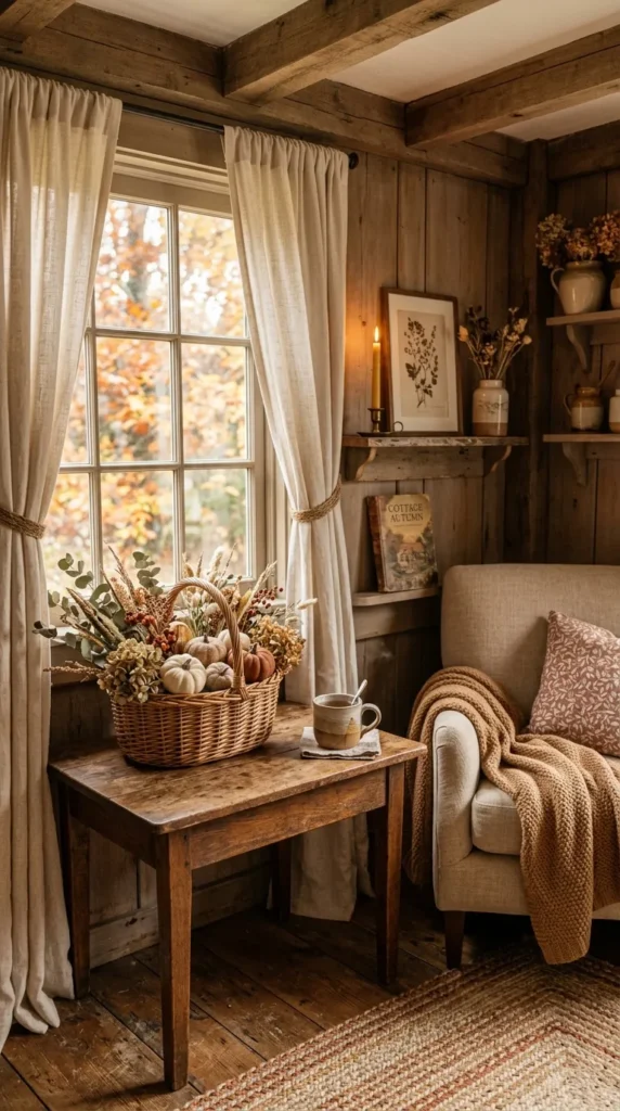
- Warm cottage details create an inviting seasonal atmosphere.
- Wood, linen, and dried foliage add natural texture.
- Soft lighting keeps the scene peaceful and comfortable.
- A simple layout prevents small details from overwhelming the screen.
A cozy cottage interior can turn your phone screen into a tiny autumn retreat. Picture warm wooden walls, cream linen curtains, a rustic table, dried foliage, and a few understated pumpkin accents illuminated by soft golden window light. Woven baskets and natural textiles add texture without making the composition feel cluttered. Keep the upper portion of the image lighter and quieter so the lock-screen clock remains readable. This style is ideal when you love farmhouse or cottage interiors and want your phone background to echo the warm, layered feeling of seasonal decorating at home.
The best cottage wallpapers focus on a few recognizable materials rather than filling every corner with décor. Wood, linen, dried leaves, and woven textures already provide plenty of visual interest. Use muted rust, caramel, cream, and warm brown instead of highly saturated colors for a more realistic finish. I’ve noticed that natural lighting makes these scenes feel much more inviting because it creates gentle shadows and believable warmth. Pair the wallpaper with a neutral case and simple widgets to keep the overall screen organized, allowing the cozy cottage scene to remain the main visual feature.
23. Golden Hour Leaves
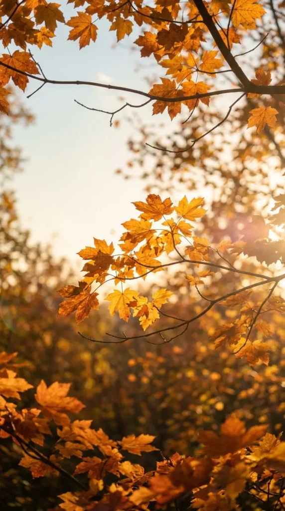
- Golden-hour lighting gives autumn foliage a naturally glowing finish.
- Amber leaves create warmth without heavy decoration.
- Soft sky tones provide useful negative space.
- A blurred background keeps the screen easy to navigate.
Golden-hour foliage creates a beautiful final choice for an autumn phone screen because the lighting does much of the decorating for you. Imagine amber and copper leaves glowing in low afternoon sunlight against a softly blurred sky. The warm light creates natural highlights while the pale background provides enough open space for the clock and widgets. This style feels seasonal without looking staged or overly themed. It works particularly well for anyone who prefers realistic photography, warm colors, and peaceful outdoor scenes, giving the phone a gentle glow that feels especially inviting during fall.
When choosing a golden-hour image, look for soft sunlight rather than intense glare. Low-angle light should highlight the edges of the leaves while leaving enough shadow to create depth. A slightly blurred background is helpful because it keeps the display visually calm once icons are added. The combination of honey, amber, copper, and muted green also pairs easily with neutral accessories. This final option among fall iphone wallpaper ideas is especially versatile because it captures the beauty of changing seasons without depending on pumpkins, patterns, or holiday-specific decorations, making it easy to enjoy throughout autumn.
Conclusion
A seasonal wallpaper is a simple way to bring autumn’s cozy feeling into your everyday routine. From warm leaves and pumpkins to soft neutrals, moody skies, and charming coffee-inspired designs, these fall iPhone wallpaper ideas offer plenty of inspiration for every style. Choose one that makes you smile each time you check your phone, or switch between a few throughout the season for a fresh look. I’ve seen how small visual changes can make