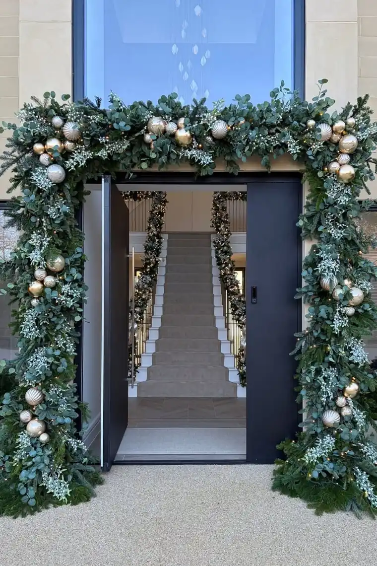
How to Coordinate Christmas Decor Colors Like a Pro
Walk into any beautifully decorated Christmas home and the colors feel calm, even when there are hundreds of decorations. That calm is not taste or luck — it is a small palette, repeated on purpose. Designers are not using more colors than you; they are using fewer, and letting repetition do the magic.
This guide shows you how to coordinate christmas decor colors with the exact system pros use: choose two or three colors, run them through the 60-30-10 rule, anchor everything with neutrals and greenery, and repeat each color until the whole house feels like one story.
Bring a notebook. By step two you will know your palette, and every decorating decision after that becomes quick and easy.
1. Choose a Palette of Two or Three Colors

Photo: Courtney Allison (@frenchcountrycottage) on Instagram
Photo credit: @thechristmasdecorators on Instagram
Everything starts with restraint: two main colors plus one small accent is a full, rich palette. The classic families never fail — deep red and green with gold; burgundy and cream with olive; navy and silver with white; or a soft modern mix of cream, beige, and sage. Pick colors that already live in your home's furniture, rug, and curtains, because your decor must move into a furnished room, not an empty stage.
If you are starting from a decoration collection rather than a blank room, lay everything out and find the two colors that appear most. That is your palette revealing itself. Colors outside it — the random purple ornament, the lone turquoise ribbon — are not ugly; they are simply benched this year. Pros edit ruthlessly, and editing is free.
Palette note: Take one phone photo of your tree decorations spread on the floor. The dominant two colors in the photo are your palette, whether you meant them to be or not.
2. Run It With the 60-30-10 Rule
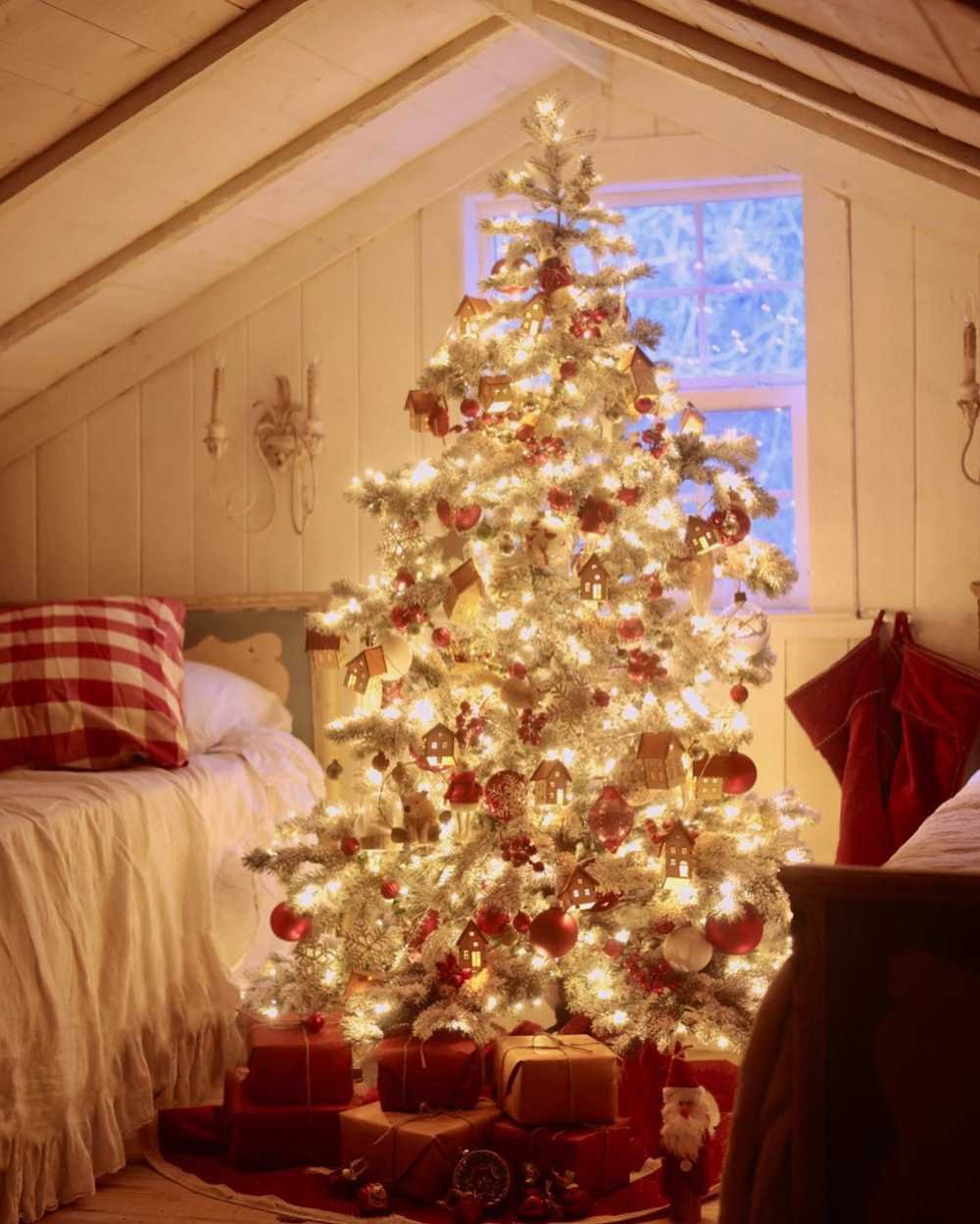
Photo: Courtney Allison (@frenchcountrycottage) on Instagram
Photo credit: @christmastreeideas on Instagram
The 60-30-10 rule is the designer's measuring cup. Roughly sixty percent of what the eye sees is your base — usually greenery and neutrals like cream, warm white, and wood. Thirty percent is your main color, carried by ornaments, ribbon, pillows, and throws. Ten percent is your accent or sparkle — the metal, the brightest red, the crystal pieces — used in small, bright doses.
This is why red-and-green trees still feel calm: green is doing sixty-percent duty as both greenery and a color, red takes the thirty, and gold winks in the ten. When a room feels chaotic, the diagnosis is almost always a broken ratio — too much accent shouting at full volume, or three colors all competing at thirty percent each. Rebalance the percentages before buying or blaming a single thing.
Scale note: The smaller the display, the more the base matters. A single wreath might be eighty percent greenery with just a ribbon and three ornaments carrying the whole color story — and look perfect.
You May Also Like: Classic Christmas Decor Ideas That Never Go Out of Style
3. Give Every Palette a Neutral Anchor

Photo: Liz Marie (@lizmariegalvan) on Instagram
Photo credit: @christmastreeideas on Instagram
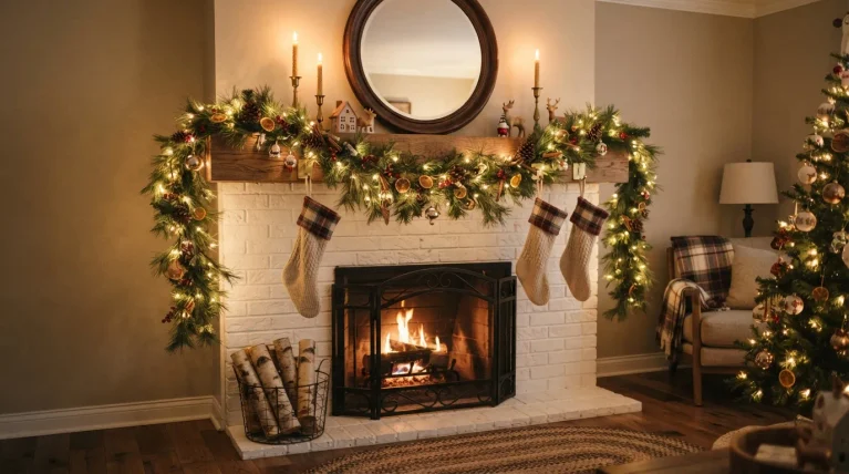
Neutrals are the peacekeepers between colors. Cream, warm white, beige, natural wood, and clear glass create breathing room so your palette reads as elegant instead of loud. Every display needs a neutral layer: cream ribbon through the garland, a wooden tray under the centerpiece, plain cushions between the plaid ones on the sofa.
Greenery counts as a neutral too — the most useful one you own. Deep green works next to literally every palette, which is why pros build green-first and add color second. If a display ever looks like a color fight, the fix is rarely removing color; it is adding a neutral. More cream, more wood, more green — and suddenly the same red and gold look like a magazine.
Texture note: Matte neutrals calm a palette better than shiny ones. Choose linen, wood, and frosted glass as your anchors, and save the sparkle strictly for the ten-percent accent layer.
4. Repeat Each Color at Least Three Times

Photo: Kayla Currier (@liveoaknest) on Instagram
Photo credit: @randigarrettdesign on Instagram
One red ornament is a dot. Red in the ribbon, the ornaments, and the tree skirt is a scheme. Colors earn their place through repetition — at least three appearances in every view is the professional minimum. This is the same trick that makes a single pillow color suddenly "tie the room together" once it echoes a throw and a candle across the space.
Repeat at different heights and scales so the rhythm feels natural: a color can appear high in a garland bow, mid-height in ornaments, and low in a basket of pinecones. Uneven spacing is fine — you want a gentle echo, not a marching band. When adding anything new, ask the three-times question: can this color show up in at least two other spots nearby? If not, it does not go in.
Style note: Ribbon is repetition on a spool. One roll of your main color, woven through the tree, mantel, and wreath, manufactures instant coordination for just a few dollars.
You May Also Like: 25 Neutral Christmas Decor Ideas for a Calm Elegant Home
5. Carry the Same Colors Room to Room

Photo: Lovely Harbor (@lovely.harbor) on Instagram
Photo credit: @mattcrump on Instagram
A coordinated house tells one color story with the volume turned up or down per room. The living room, where the tree lives, gets the full palette at full strength. The kitchen takes a smaller dose — a ribboned wreath, two towels, a small arrangement. The bedroom runs the softest version: the same colors, paler and quieter, through cushions and a throw.
Walking from room to room should feel like chapters of one book, not channel-hopping. This does not mean identical decorations everywhere; it means the same two or three colors, plus your neutrals and greenery, shaking hands in every room. Even a hallway gets one line of dialogue — a garland with the palette's ribbon is enough to connect the spaces.
Budget note: Room-to-room coordination stretches a decoration budget beautifully. One palette means every ribbon, ornament set, and cushion cover you buy works in multiple rooms instead of one.
6. Check the Palette in Daylight and Lamplight

Photo: Lovely Harbor (@lovely.harbor) on Instagram
Photo credit: @thechristmasdecorators on Instagram
Colors are shape-shifters. Burgundy that looked rich at noon can go muddy-brown at night, silver can turn blue-ish under cool bulbs, and cream can read yellow in warm lamplight. Check your palette twice: once in natural daylight, standing where guests will stand, and once in the evening with only your Christmas lights on — the setting your decor actually performs in.
Warm-white fairy lights are the palette's best friend because they deepen reds, flatter golds, and make greens look like a forest at dusk. If a color misbehaves in the evening test, do not replace it — relocate it. Daylight rooms like the kitchen can carry the cooler version; evening rooms like the living room carry the warm one. Matching colors to the light they live in is a genuine pro move, and it costs nothing.
Lighting note: Before buying ribbon or ornaments, look at them under your tree's lights, not the shop's fluorescents. Half of all "wrong color" regrets are actually wrong-lighting surprises.
You May Also Like: 23 Minimalist Christmas Decor Ideas for a Simple Home
7. Edit Out the Odd Color
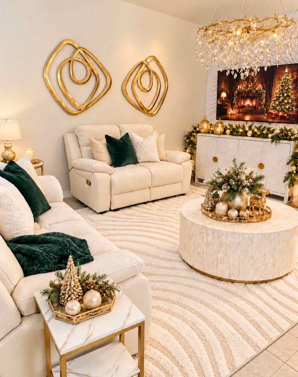
Photo: Lumy (@lumys_home) on Instagram
Photo credit: @wilshire_collections on Instagram
The final professional step is subtraction. Stand in the doorway of each decorated room and find the one color that appears only once — the leftover from another year's scheme, the gift you felt obliged to display, the ornament set that matches nothing. Remove it. Nine times out of ten, the room instantly looks calmer and more expensive, because coordination is mostly the absence of that one noisy guest.
Store the edited pieces without guilt; palettes can rotate next year, and last year's accent may lead next Christmas. The exception is anything sentimental — a child's handmade ornament, a family heirloom. Those do not follow palette law. Give them a chosen home where they are the point, like a small memory branch or a special spot on the tree, and let sentiment be its own accent.
Fixing note: If a room still feels off after editing, photograph it. The camera flattens everything honestly, and the offending color usually jumps straight out of the picture at you.
The 60-30-10 Palette Cheat Sheet

Photo: Courtney Allison (@frenchcountrycottage) on Instagram
Photo credit: @christmas_interior on Instagram
| Palette idea | 60% base | 30% main color | 10% sparkle |
|---|---|---|---|
| Classic Christmas | Greenery and cream | Deep red ornaments, ribbon, cushions | Gold ornaments and candlelight |
| Calm winter neutral | Greenery, cream, warm wood | Beige and soft white layers | Champagne gold or frosted silver |
| Rich traditional | Greenery and warm white | Burgundy and forest green | Antique gold ribbon and bells |
| Frosty modern | Greenery and bright white | Silver ornaments and ribbon | Icy blue touches |
| Cozy rustic | Greenery, wood, burlap cream | Cranberry red checks and plaid | Natural pinecone browns and warm light |
Frequently Asked Questions
What is the simplest way to understand how to coordinate christmas decor colors?
Choose two main colors plus one small accent, then follow the 60-30-10 rule: about sixty percent greenery and neutrals, thirty percent your main color, and ten percent your sparkle. Repeat each color at least three times in every room and carry the same palette through the house at different strengths. That is the entire professional system.
How many colors should a Christmas palette have?
Two main colors and one accent is plenty, with greenery and neutrals doing quiet background work. Most chaotic-looking rooms are not using ugly colors — they are using five or six colors at equal strength. Editing down to a tight palette fixes the room faster than any new purchase.
Can I coordinate decor if my ornaments are all different colors?
Yes — sort the collection and find the two colors that appear most, and make those your palette this year. Use the rest of the colors only inside the tree's deepest branches, keep them for a multi-color year later, or group the leftovers into one small nostalgic display where variety is the point.
Should every room use the exact same colors?
Related, not identical. Let the tree room run the palette at full strength, then use smaller, softer doses in the kitchen, entryway, and bedroom. The same colors and neutrals repeating at different volumes make the home feel designed rather than decorated room by room.
You Would Also Love
💬 Join Our Decor Community
Decor Fern | Home Decor Ideas & Inspiration — share your rooms, get ideas, and chat with fellow decor lovers.
Join the Facebook GroupFollow on Facebook


3 Comments