Ever walked past a plain chalkboard and wished it looked more… alive? You’re not alone. A blank board sitting in the kitchen or hallway is easy to forget about, but it’s also one of the fastest ways to bring new life into a room. These spring chalkboard ideas are here to change that, turning a forgotten surface into something genuinely worth looking at. Whether you’re decorating a porch, styling a shelf, or freshening up a kitchen corner, chalk and a little creativity can do more than most people expect. In my experience, small seasonal updates like these make a home feel cared for without requiring a big budget or a weekend of work. This list covers ideas for every skill level, from beginners who’ve never picked up a chalk pen to anyone who simply wants their space to feel a little more like spring. Each idea is simple, practical, and easy to recreate, so you can pick what fits your home and get started right away.
1. Pastel Welcome Sign
- Sets a warm, welcoming tone right at your entryway
- Pastel chalk colors feel fresh without overwhelming the space
- Easy to update weekly with new flowers or quotes
- A small detail that makes guests pause and smile
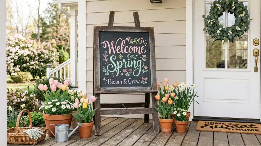
Nothing says “come on in” quite like a hand-lettered sign by the door. A pastel welcome sign is one of the simplest spring chalkboard ideas you can try, and it instantly softens the look of any entryway. Instead of harsh, bold colors, pastel chalk in blush pink or soft mint feels gentle and seasonal. In my experience, this small change makes a home feel more lived-in and cared for. You don’t need artistic skill either — simple block letters or a light floral doodle in the corner is enough to make the space feel intentional and fresh.
This idea works because it creates a focal point without adding clutter. A chalkboard sign draws the eye naturally, guiding guests toward your front door with warmth and personality. I’ve noticed that homes with a small seasonal touch like this feel more curated, even when the rest of the decor stays simple. You can pair it with a wreath, a few potted flowers, or a woven mat for extra texture. The result is a porch or entry that feels refreshed for spring, welcoming, and effortlessly styled — all from one easy chalkboard update.
2. Floral Border Frame
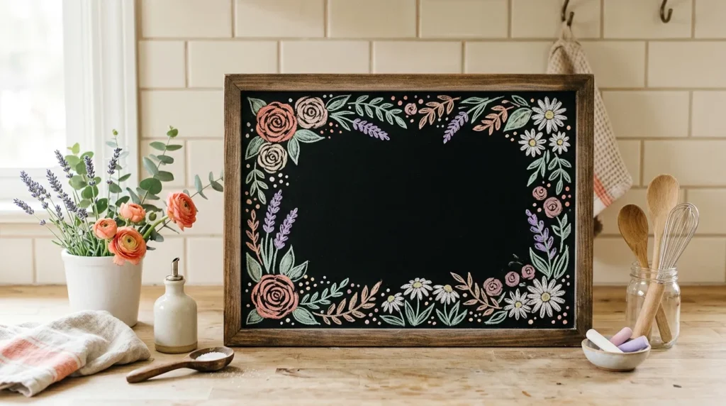
- Turns a plain chalkboard into a piece of seasonal art
- Keeps the center open for menus, quotes, or reminders
- Adds color and texture without needing a big redesign
- A budget-friendly way to dress up a kitchen or nook
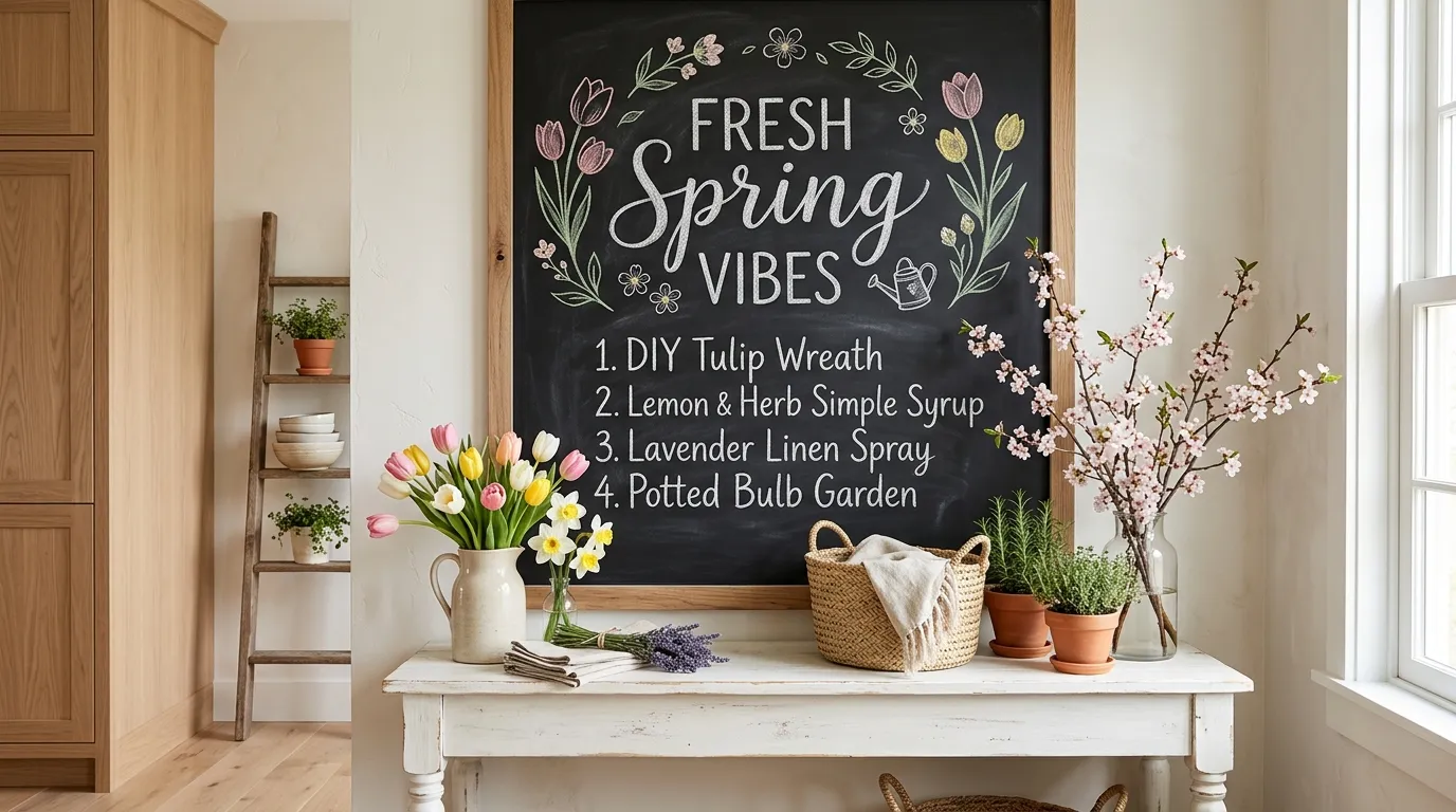
A floral border transforms a plain chalkboard into something you’d want to photograph. Instead of filling the whole board with writing, this idea keeps the center clean and lets a ring of hand-drawn flowers do the decorating. It’s one of those small updates that makes a kitchen or dining nook feel considerably more finished. I’ve tried this style myself, and it takes less time than people expect — even a few simple loops and dots can read as blooms from a short distance. The border becomes the decoration, so your message stays easy to read and uncluttered.
This idea works so well because it balances decoration with function. The flowers frame your words instead of competing with them, so grocery lists, quotes, or menus stay legible while still feeling styled for the season. Many designers recommend leaving negative space around handwritten text, and a floral border does exactly that in a playful way. It also gives you room to change the center message weekly while keeping the same decorative frame, saving time on future updates. The overall effect feels polished, personal, and perfectly suited to a bright spring kitchen or entryway display.
3. Butterfly Accent Doodles
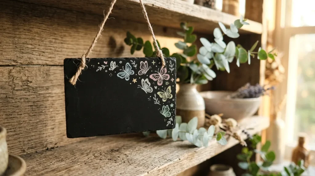
- Adds movement and playfulness to an otherwise static display
- Works beautifully on small tags, labels, or mini boards
- A gentle way to introduce spring themes without full redesigns
- Pairs nicely with greenery for a natural, garden-inspired feel
Butterflies bring a light, playful energy that instantly feels like spring. Adding a few chalk-drawn butterflies in the corner of a small board or tag is a quick way to shift the mood of a shelf or display without redoing the whole setup. This idea works especially well on mini chalkboards used for plant labels or gift tags, where a single doodle adds charm without crowding the space. I’ve noticed that even one small butterfly can make a plain label feel thoughtfully designed rather than rushed, giving the whole corner a soft, seasonal personality that guests naturally notice.
This detail works because small accents often make the biggest visual difference. A cluster of butterflies near a plant label or shelf tag draws the eye upward and adds a sense of movement to an otherwise flat surface. It’s a favorite trick among home stylists because it costs nothing beyond a chalk pen and a few extra minutes. Pair the doodles with a sprig of eucalyptus or a small potted herb, and the whole corner starts to feel like an intentional spring vignette. The result is subtle, charming, and easy to recreate in almost any room.
4. Rain Cloud & Umbrella Sketch
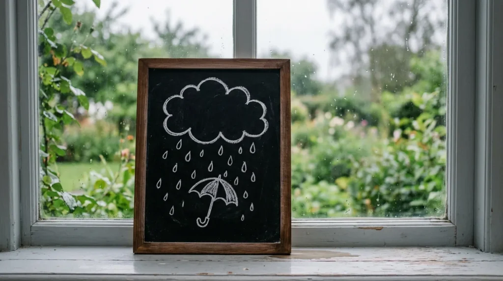
- A playful nod to April showers without feeling childish
- Works well in windows, entryways, or near umbrella stands
- Adds a storybook charm that photographs beautifully
- Easy to sketch even with basic chalk-drawing skills
A little rain cloud sketch might sound simple, but it adds instant character to a windowsill or entry table. This is one of those spring chalkboard ideas that feels playful without trying too hard, especially when paired with a small umbrella or a few chalk raindrops underneath. It works particularly well near a coat rack or umbrella stand, tying the decor to its function. I’ve seen this work well in smaller apartments where wall space is limited, since a windowsill board takes up almost no room while still adding real seasonal charm to the space.
What makes this idea stand out is its storybook quality. Unlike bold floral designs, a rain cloud sketch feels soft and whimsical, which suits nurseries, reading nooks, or cozy corners just as well as entryways. The muted tones keep it from feeling overly busy, so it works in both minimal and maximalist homes. Adding a short quote about spring showers underneath the cloud gives it purpose beyond decoration. It’s a small, low-effort detail that consistently draws smiles from visitors and adds genuine seasonal warmth to an easily overlooked corner of the home.
5. Garden Herb Labels
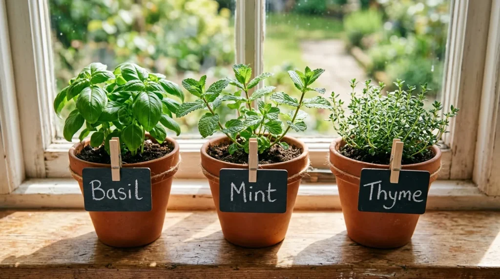
- Makes a kitchen herb garden look styled and intentional
- Helps with organization while adding a decorative touch
- Small, functional, and easy to update as herbs grow
- A charming detail that fits both indoor and outdoor gardens
Herb labels prove that function and style can exist in the same small chalkboard tag. Clipping a labeled tag to each terracotta pot turns a simple windowsill herb garden into something that looks curated straight out of a home magazine. This idea works particularly well because it solves a real problem — knowing which pot is basil and which is mint — while still contributing to the overall spring aesthetic. In my experience, guests notice these small details far more than larger decor pieces, often asking where the tags came from or how they were made.
The reason this idea performs so well visually is contrast. Dark chalkboard tags against terracotta and green leaves create a natural color palette that feels earthy and fresh at the same time. It requires almost no maintenance beyond rewriting a label if a herb is swapped out, making it one of the lowest-effort ideas on this list. Whether displayed on a kitchen windowsill or an outdoor patio table, herb labels bring practicality and charm together. They’re especially popular with beginner gardeners who want their setup to feel organized and intentional from day one.
ALSO READ : 21 Contemporary Coastal Living Room Ideas to Try
6. Quote of the Season
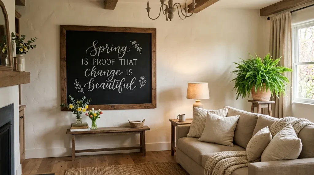
- Turns a blank wall into a meaningful focal point
- Easy to swap out as moods or seasons shift
- Adds personality and warmth to shared living spaces
- A low-cost way to refresh a room’s entire feel
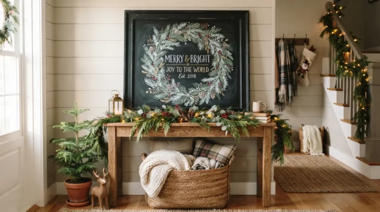
A well-placed quote can change the entire energy of a room without a single piece of furniture moving. Mounting a larger board with an elegant, hand-lettered spring quote gives a living room or hallway an instant refresh. This idea leans more toward Pinterest inspiration than the smaller accent pieces on this list, making it a strong centerpiece rather than a supporting detail. That’s why many designers recommend using at least one larger statement board per room — it anchors the space and gives smaller decorative touches somewhere visual to lead toward.
This works because words carry emotional weight that plain decor sometimes lacks. A short, well-chosen quote gives visitors something to pause on, read, and connect with, which is exactly the kind of detail that makes a space memorable. Cursive lettering in white chalk against a black board also photographs exceptionally well, which matters if the room doubles as a spot for casual photos. Since the message is easy to erase and rewrite, this board can transition from spring quotes to summer ones in minutes, keeping the display relevant all year with zero extra cost.
7. Watercolor-Effect Chalk Blending
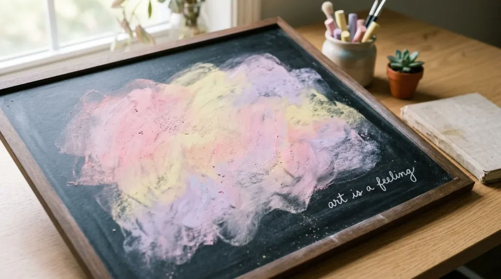
- Creates a soft, artistic background without needing real paint
- Great base for layering text, florals, or seasonal quotes
- Adds color depth that flat chalk lettering can’t achieve
- A simple blending trick that looks far more advanced than it is
Blending chalk into a soft watercolor effect is one of those tricks that looks impressive but takes very little skill to pull off. Using the side of a chalk stick and gently smudging with a finger or soft cloth creates a gradient background in pastel tones, which instantly elevates a plain board. This is one of the more advanced spring chalkboard ideas on this list, yet it remains beginner-friendly once you see the technique in action. I’ve tried this on a few boards myself, and the softness it adds makes even simple text look intentional and artistic rather than plain.
The appeal of this idea lies in the texture it creates. A blended background gives depth to a board that flat lettering alone can’t achieve, making it feel more like wall art than a simple message board. It pairs beautifully with minimal white text layered on top, letting the color do most of the visual work. This technique also photographs particularly well for social sharing, since the soft gradients catch natural light in a flattering way. It’s a small upgrade that makes a noticeable difference in how professional the final display feels.
8. Mini Easel Table Displays
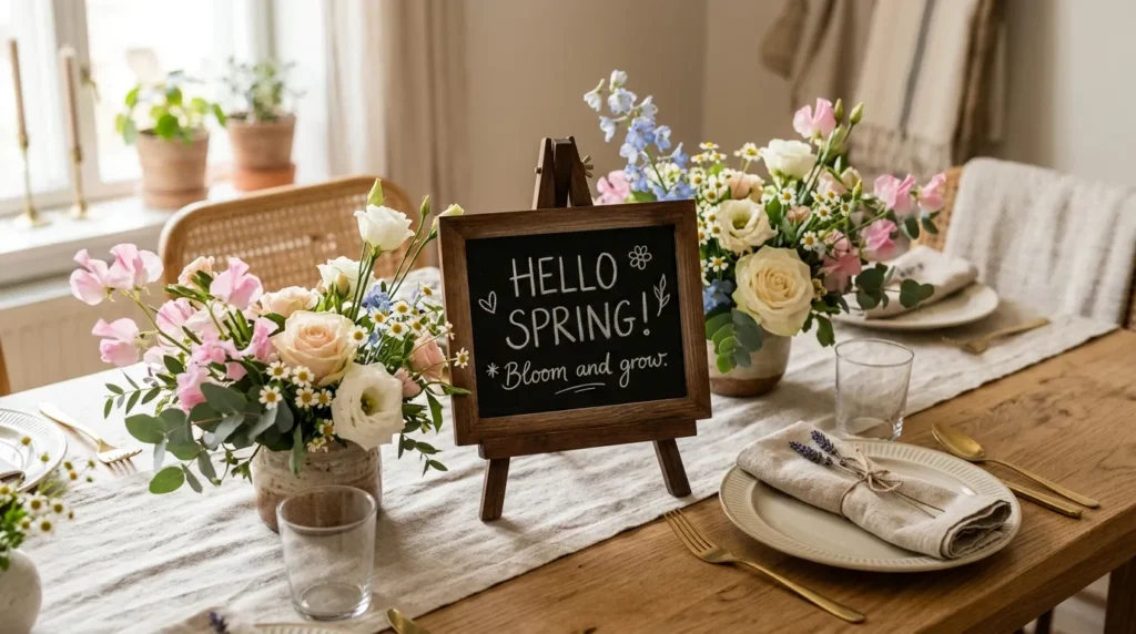
- Elevates a table setting without needing a full centerpiece redo
- Perfect for brunches, dinners, or everyday table styling
- Small size means it never overwhelms the table layout
- Adds a personal touch guests remember and comment on
A mini easel display brings the chalkboard trend to your dining table without taking up much space at all. Propping a small board beside a floral centerpiece adds a personal, styled touch that feels appropriate for everything from a quiet weeknight dinner to a spring brunch with guests. This idea works especially well because it doesn’t compete with the rest of the table setting — it simply adds one more layer of intention. I’ve noticed that even a short, simple message like “Welcome Spring” on a mini board gets more comments than expensive centerpieces often do.
What makes this idea so effective is scale. Because the board is small, it never overwhelms the table the way a large floral arrangement might, yet it still adds color, texture, and personality. It’s also incredibly easy to update for different occasions, whether that means a birthday message, a seasonal quote, or a simple menu for the meal ahead. Pairing it with linen table runners and neutral tableware keeps the overall look elegant rather than cluttered. It’s a small styling choice that consistently makes table settings feel more thoughtful and complete.
9. Spring Countdown Tracker
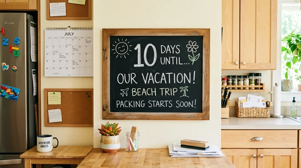
- Combines organization with seasonal decor in one board
- Builds anticipation for spring events, holidays, or trips
- Keeps kids and families engaged with a visual countdown
- Functional enough for daily use, decorative enough to display
A countdown tracker gives a chalkboard real daily purpose beyond just looking nice on the wall. Whether it’s counting down to the first day of spring, a holiday, or a family trip, this idea combines function with seasonal charm in a way that keeps people returning to the board each morning. It works particularly well in kitchens near a calendar or planning area, where the household already checks in regularly. This is a favorite among families because it turns something as simple as chalk and a board into a small daily ritual everyone can take part in.
This idea succeeds because it merges decoration with genuine usefulness, which is something many purely decorative boards lack. Kids especially enjoy updating the number each day, making it an easy way to involve the whole household in a small, shared tradition. A simple sun or flower doodle beside the numbers keeps it visually tied to the spring theme without adding unnecessary clutter. Because it changes daily, this board also keeps a kitchen or hallway feeling fresh and active, rather than static like most seasonal decor tends to be.
10. Layered Ribbon & Chalk Combo
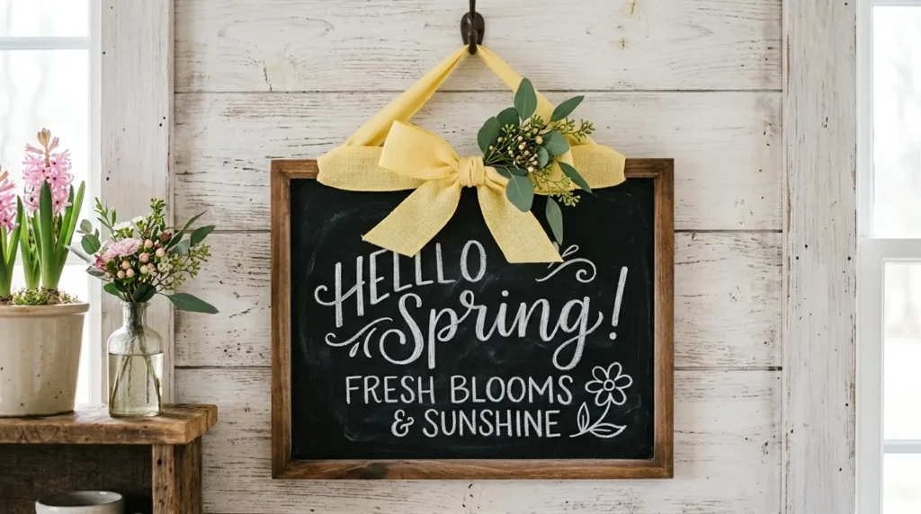
- Adds texture and softness through fabric, not just chalk
- Ribbon color can be swapped to match any spring palette
- Gives a plain board a finished, gift-like presentation
- Simple styling trick that elevates hallway or door displays
Adding a ribbon to the top of a chalkboard is a small styling trick that instantly makes the whole piece feel finished, almost like it was wrapped as a gift. This idea works well because fabric introduces a texture that chalk alone can’t provide, softening what might otherwise feel like a flat, one-note display. It’s especially effective on boards hung near doorways or hallways, where the ribbon catches the eye before the text even does. I’ve noticed that this small addition often gets more attention than the message written on the board itself.
The reason this combination works so well is contrast between materials. Smooth chalk lettering paired with a soft fabric bow creates visual interest without requiring any extra artistic skill. Because ribbon comes in countless colors and widths, this idea is also incredibly easy to adjust for different seasons or moods, making one board reusable well beyond spring. Tucking a small sprig of greenery into the bow adds a final natural touch that ties the whole look together. It’s a low-cost detail that consistently makes handmade displays look intentional and polished.
11. Nursery-Inspired Soft Pastels
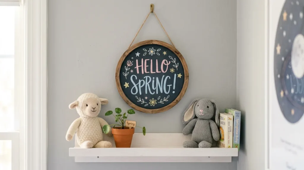
- Softens a chalkboard’s typically bold, dark look
- Works beautifully in nurseries, kids’ rooms, or reading corners
- Creates a gentle, calming display without losing visual interest
- Easy to coordinate with existing nursery color schemes
Chalkboards are often associated with bold black backgrounds, but a softer, pastel-forward approach makes this idea perfect for nurseries and children’s spaces. Using gentle pink, blue, or lavender chalk instead of stark white creates a calmer, more soothing look that fits naturally into a nursery’s existing color palette. This is one of the gentler spring chalkboard ideas on this list, better suited to rooms where a loud, high-contrast design might feel out of place. In my experience, softer palettes like this tend to age well too, staying appropriate as a child grows past the newborn stage.
This idea works because it adapts the chalkboard trend to a specific type of room rather than applying a one-size-fits-all style everywhere. Pairing the board with plush toys, a small potted plant, or soft textiles on a nearby shelf reinforces the gentle mood throughout the space. Because the color palette stays muted, it also photographs beautifully in soft, natural light, which matters for parents who like documenting nursery updates. It’s a thoughtful way to bring a seasonal touch into a room that calls for calm, comforting design choices above all else.
12. Garden Party Welcome Board
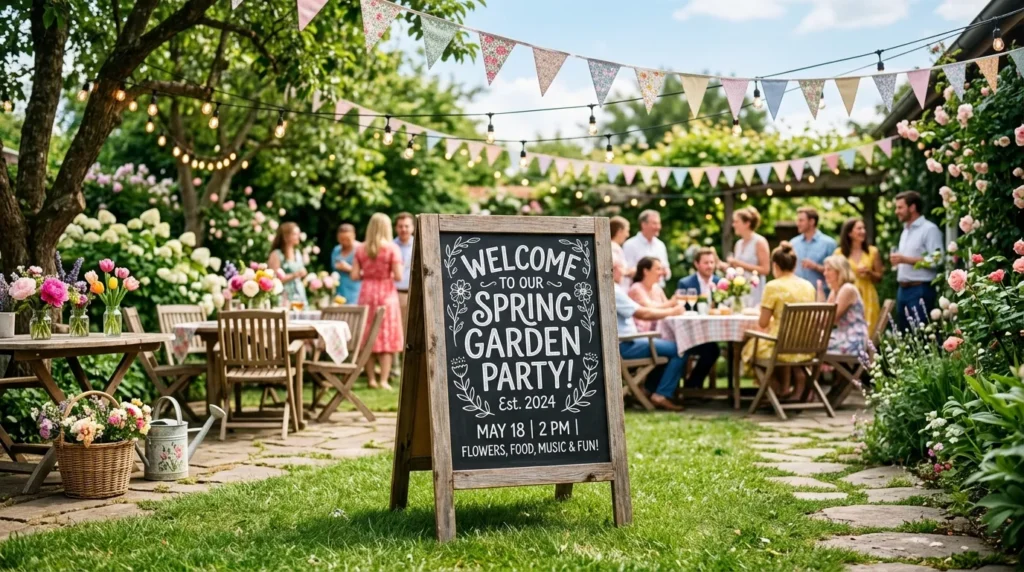
- Sets the tone immediately for outdoor spring gatherings
- Doubles as directional signage for guests at events
- Easy to personalize for birthdays, brunches, or garden parties
- A statement piece that photographs well for social sharing
An A-frame welcome board does more than decorate — it directs and informs guests the moment they arrive at an outdoor gathering. This idea is particularly useful for spring garden parties, brunches, or birthday celebrations held outside, where a bold sign near the entrance sets expectations and adds a festive touch before guests even reach the main seating area. Unlike smaller indoor boards, this one is designed to be seen from a distance, so bold lettering and simple wording work better than intricate details that might get lost outdoors.
This idea performs well because it combines hospitality with visual impact in one piece. Placed near a garden gate or patio entrance, it immediately signals that guests are in the right place, reducing confusion at larger events. Pairing it with bunting flags or string lights extends the festive feel beyond the board itself, creating a cohesive outdoor setup. Because outdoor events are often photographed heavily for social sharing, a well-styled welcome sign frequently becomes an unplanned backdrop for guest photos, adding lasting value well beyond the event itself.
13. Chalkboard Menu for Spring Brunch
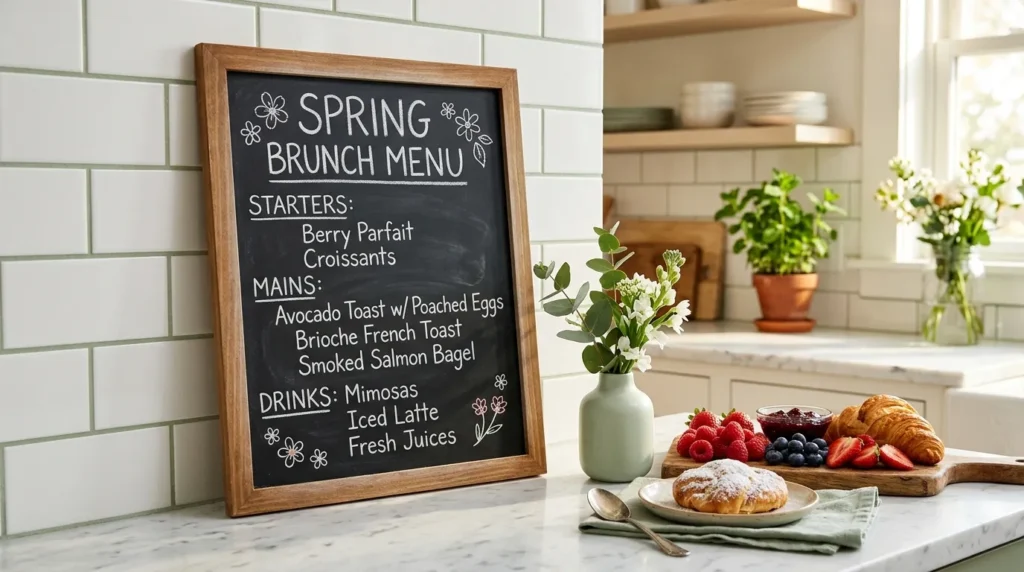
- Turns meal planning into a stylish, functional display
- Perfect for brunches, dinner parties, or weekend gatherings
- Adds a café-style charm to home entertaining
- Easy to update dish by dish as the menu changes
A chalkboard menu brings a small café-style touch to home entertaining, and it works especially well for spring brunches where fresh, seasonal dishes deserve a little extra presentation. Listing the dishes on a board propped near the food table gives guests a clear idea of what’s being served while adding a decorative element that ties the whole spread together. This idea is popular because it solves two problems at once — communication and styling — without requiring printed menus or extra signage that often gets thrown away after the event ends.
What makes this idea work so well is how naturally it fits into a kitchen or dining setup that’s already being styled for guests. A chalkboard menu draws the eye toward the food table and gives the spread a sense of intention, as if it were planned by a professional host. I’ve seen this work well even at casual, low-key gatherings, where it instantly elevates the mood without extra effort. Because chalk is easy to erase, the same board can be reused for the next event with a completely different menu written in minutes.
14. Vintage Typography Style
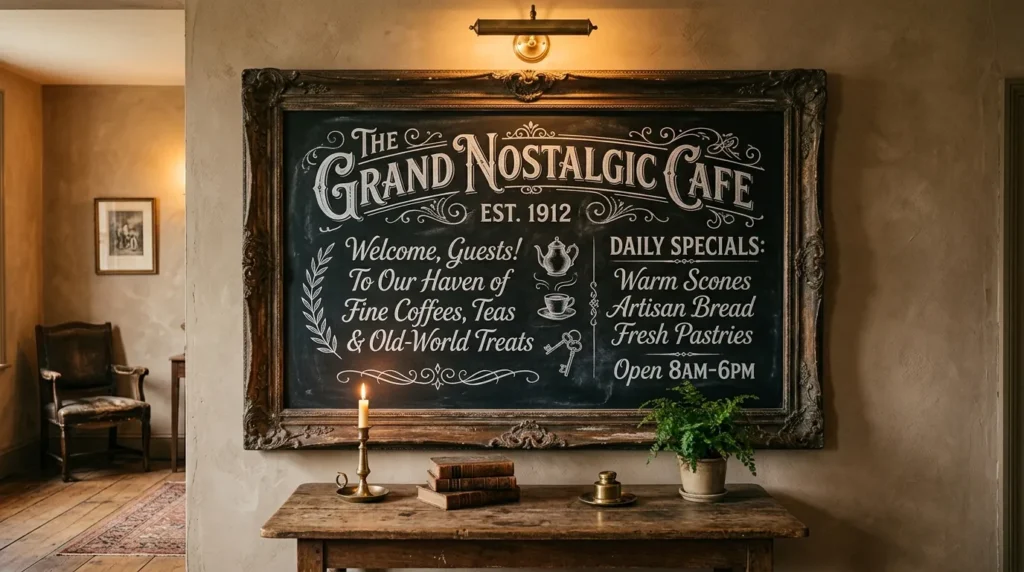
- Adds a timeless, elevated feel compared to modern lettering
- Works well in traditional, farmhouse, or vintage-styled homes
- Creates a focal point that feels handcrafted and artisanal
- Pairs beautifully with antique frames or aged wood accents
Vintage typography takes the chalkboard trend in a more elegant, timeless direction compared to the playful, casual lettering seen in most modern designs. Using serif fonts, decorative flourishes, and careful spacing gives the board a handcrafted, artisanal quality that feels closer to old apothecary signage than a typical kitchen chalkboard. This style suits homes with a traditional or farmhouse aesthetic particularly well, where more ornate lettering complements existing decor instead of clashing with it. That’s why many designers recommend this approach for formal entryways or dining rooms rather than casual, high-traffic spaces.
This idea stands out because it treats the chalkboard as genuine wall art rather than a temporary message board. The added detail in the lettering takes more time to create, but the result feels significantly more polished and intentional than simple block text. Pairing the board with an aged wooden frame or antique furniture nearby reinforces the vintage mood throughout the room. For anyone wanting their spring display to feel less trendy and more enduring, this style offers a classic alternative that remains visually striking well beyond a single season.
15. Chalk Art Landscape Scene
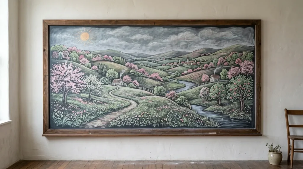
- Turns a chalkboard into genuine hand-drawn wall art
- Best suited for larger statement walls or living areas
- Showcases seasonal beauty through imagery rather than words
- A memorable option for those with some drawing confidence
For those comfortable with a bit more drawing, a full chalk landscape scene turns a chalkboard into genuine artwork rather than a message board. Rolling hills, blooming trees, and a soft sun sketched across the board create a peaceful, scene-based display that relies on imagery instead of text to capture the spirit of spring. This idea works best on larger boards where there’s enough room for the drawing to breathe, making it a strong choice for statement walls in living rooms or open hallways rather than small kitchen corners.
This approach works because it shifts the chalkboard trend from purely functional to genuinely artistic, appealing to readers who want their display to double as decor rather than a rotating message system. Unlike text-based boards, a landscape scene doesn’t need to be updated often, making it a lower-maintenance option once the drawing is complete. In my experience, boards like this become quiet focal points that guests notice slowly rather than all at once, adding a layered, thoughtful quality to a room that busier designs sometimes lack.
16. Recipe Card Chalkboard
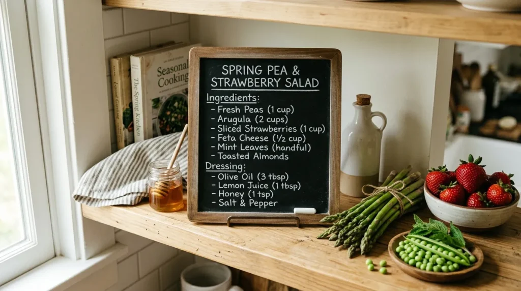
- Displays a favorite seasonal recipe as functional decor
- Encourages cooking with what’s fresh and in season
- Adds a personal, homemade touch to kitchen styling
- Simple to swap as new spring recipes come into rotation
A recipe chalkboard gives a kitchen shelf real purpose while still contributing to the overall spring aesthetic. Writing out a short seasonal recipe, whether it’s a strawberry shortcake or a simple asparagus side dish, turns the board into something guests actually stop to read rather than glance past. This idea works particularly well for home cooks who like celebrating what’s in season, since it naturally highlights spring produce as part of the display itself. I’ve tried this in my own kitchen, and it’s a surprisingly easy way to keep meal planning visible without resorting to printed recipe cards.
This idea succeeds because it merges two things people already enjoy — cooking and styling — into a single functional piece. A short, well-written recipe feels personal in a way that store-bought decor never quite manages, and it gives the kitchen a lived-in, homemade character. Styling a few fresh ingredients near the board, like a bowl of strawberries or a bundle of asparagus, reinforces the seasonal theme visually. Because the recipe can change as often as you like, this board stays relevant and useful well beyond a single week or occasion.
17. Two-Tone Chalk Contrast
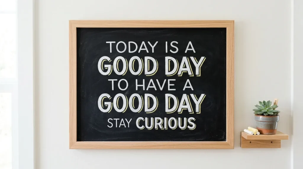
- Draws attention to key words without extra decoration
- Keeps designs modern, clean, and easy to read
- Works well for short phrases or single-word statements
- A simple technique that upgrades basic lettering instantly
Using two chalk colors instead of one is a small technique that makes a big visual difference without adding any extra imagery. Writing most of a phrase in white and highlighting a single word in a soft yellow or pastel tone draws the eye exactly where you want it, which works especially well for short, punchy phrases rather than long sentences. This idea suits modern, minimalist homes particularly well, since it keeps the board clean and uncluttered while still adding a clear point of visual interest that a single-color design might lack.
This technique works because contrast naturally guides attention, even in something as simple as chalk lettering. A word like “Spring” highlighted in yellow against an otherwise white phrase becomes the immediate focal point, making the message easier to read at a glance. It’s a favorite trick among home stylists because it requires no drawing skill, just a second chalk color and a little planning. Paired with a small potted succulent or plant nearby, this style feels fresh and modern, fitting seamlessly into homes that prefer clean lines over heavily decorated displays.
18. Family Chore & Task Board
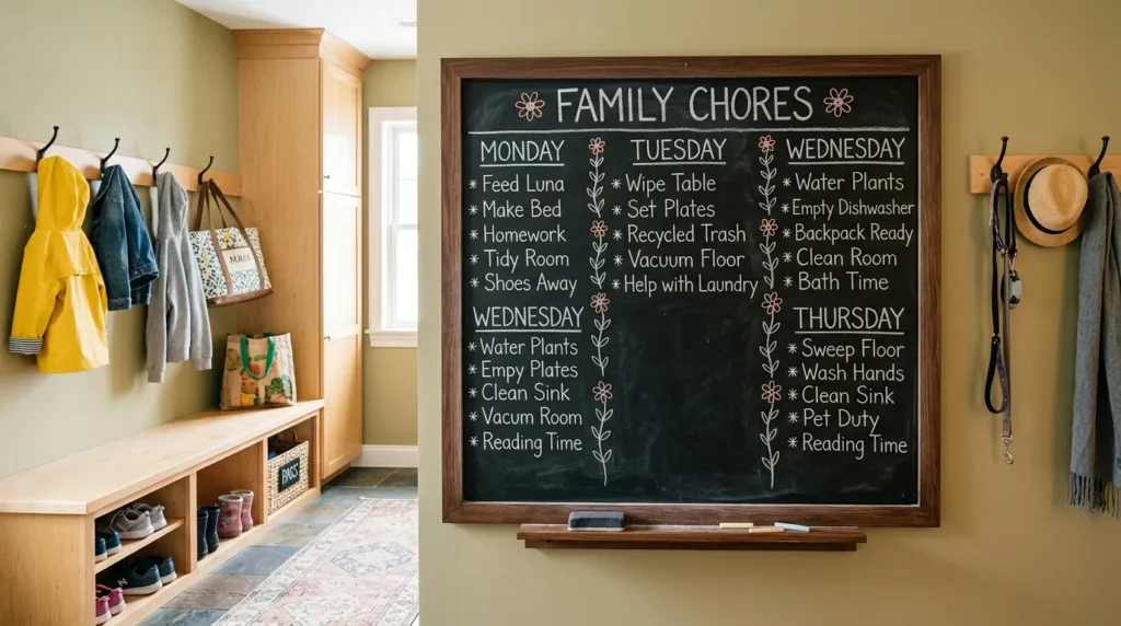
- Combines household organization with seasonal decorative touches
- Helps keep the whole family on track visually
- Small doodles keep a functional board from feeling sterile
- Practical enough for daily use, styled enough to display
A chore board proves that even the most practical chalkboard ideas can still look intentionally styled. Organizing family tasks into columns, then separating them with small flower doodles instead of plain lines, keeps the board functional while tying it into the broader spring theme running through the rest of the home. This idea works especially well in mudrooms or entryways, where families already check schedules and reminders daily. It’s one of the more grounded ideas on this list, focused less on pure decoration and more on making a genuinely useful board feel less sterile.
This idea works because it acknowledges that not every chalkboard needs to be purely decorative to add value. Practical boards like this one get used daily, which means the seasonal touches around the edges are seen far more often than a purely ornamental display might be. I’ve noticed that small doodles, like a flower or sun in the corner, are often enough to soften an otherwise businesslike board without making it harder to read. It’s a simple way to bring spring into a functional space that families already rely on every day.
19. Ombre Chalk Background
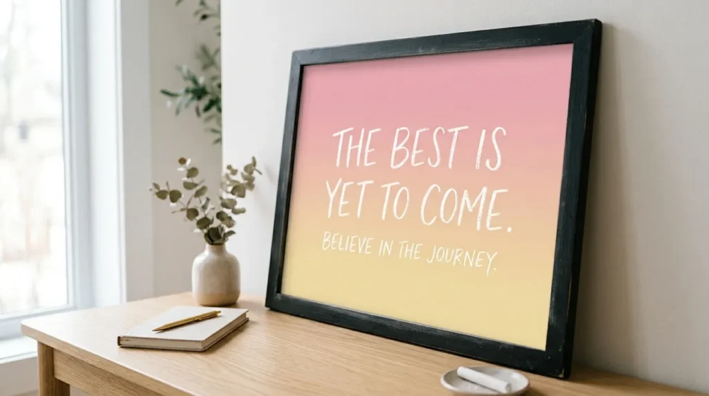
- Creates a soft gradient effect that feels modern and eye-catching
- Gives simple text a colorful, elevated background
- Works well for both small tags and large statement boards
- A visually striking technique that’s easy to recreate at home
An ombre background takes the blending idea a step further by transitioning smoothly between two or more colors instead of staying within one soft tone. Starting with pink at the top and gradually shifting to yellow at the bottom creates a gradient that feels modern and eye-catching, especially when white text is layered cleanly on top. This is one of the more visually striking spring chalkboard ideas on this list, and it works well whether you’re decorating a small gift tag or a large statement board meant to anchor an entire room.
This idea works because gradients naturally catch attention in a way flat colors sometimes don’t. The gentle color shift adds depth and movement to the board, making it feel more dynamic without requiring any drawn imagery at all. I’ve noticed that boards using this technique tend to perform especially well when shared online, since the soft color transition photographs beautifully in natural light. It’s a technique that looks far more advanced than it actually is, making it accessible even for beginners still building their chalk lettering confidence.
20. Chalkboard Photo Backdrop
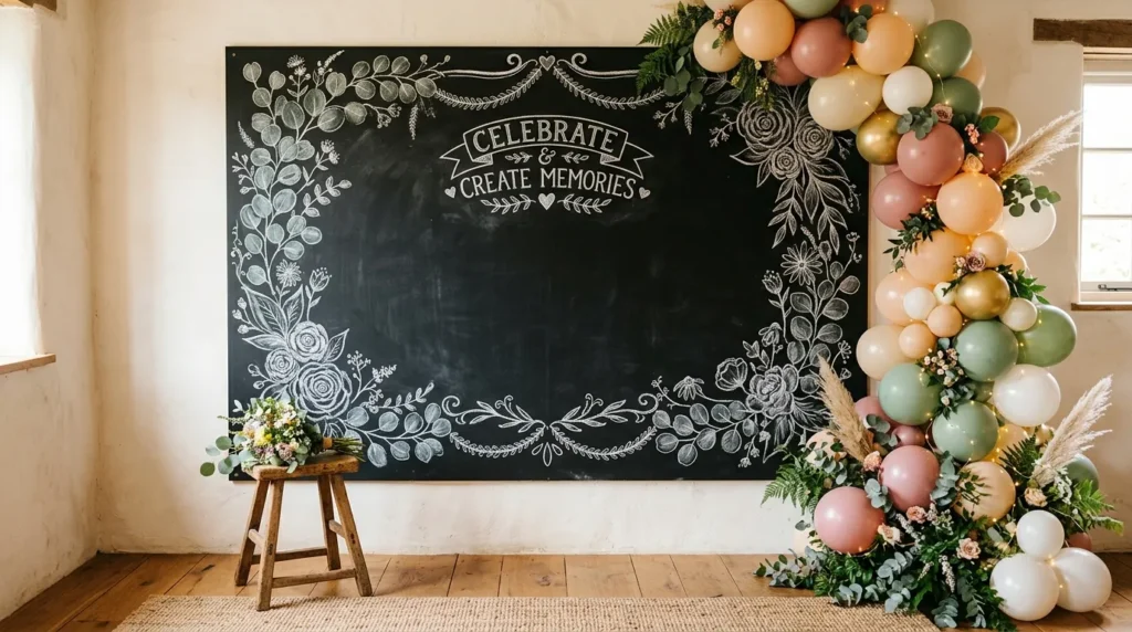
- Doubles as functional decor and a ready-made photo spot
- Perfect for spring birthdays, showers, or family gatherings
- Encourages guests to interact with the display naturally
- Easy to personalize with names, ages, or event details
A chalkboard backdrop gives any spring gathering a built-in photo spot without needing separate decorations for the wall and the camera-ready area. Framing an empty center space with a decorative floral border, then leaving room for a name or event detail, turns a plain wall into something guests naturally gravitate toward during birthdays, baby showers, or family get-togethers. This idea works particularly well for celebrations because it serves two purposes at once, cutting down on both decorating time and cost while still delivering a strong visual impact.
This idea succeeds because it invites participation rather than simply being observed. Guests tend to stop, take photos, and linger near a styled backdrop, which extends its value well beyond the event itself. Pairing the board with pastel balloons, greenery, or a small stool for seated photos rounds out the setup without much added effort. Because the center text can be changed for each occasion, this same board works for multiple events throughout the season, making it one of the more cost-effective ideas for anyone who hosts often.
21. Minimalist Single-Word Statement
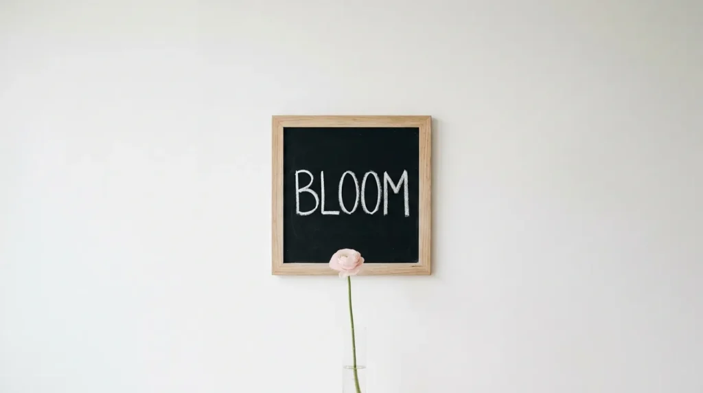
- Proves that less can still feel intentional and stylish
- Fits seamlessly into modern or minimalist home styles
- Requires almost no artistic skill to execute well
- A quiet, calming alternative to busier decorative boards
Sometimes the simplest idea makes the strongest impression. A single word like “Bloom” or “Grow,” written in clean, bold lettering with nothing else on the board, proves that a display doesn’t need heavy decoration to feel intentional. This minimalist approach suits modern homes especially well, where busier designs might feel out of place against clean lines and neutral color palettes. It’s also one of the most beginner-friendly ideas on this list, since there’s no drawing or blending involved, just confident, well-spaced lettering.
This idea works because restraint often reads as more sophisticated than abundance. A single word gives the eye somewhere clear to land, and the surrounding empty space on the board becomes part of the design rather than something to fill in. Pairing it with one simple stem in a slim vase reinforces the quiet, uncluttered mood without competing for attention. In my experience, minimal displays like this tend to age particularly well, since a single calm word rarely feels dated the way trend-driven decorations sometimes can.
22. Layered Shelf Styling with Chalkboard Accent
- Integrates a chalkboard into broader shelf or vignette styling
- Adds a personal, handwritten touch among decorative objects
- Balances height, texture, and color across the shelf
- A finishing detail that pulls a styled shelf together
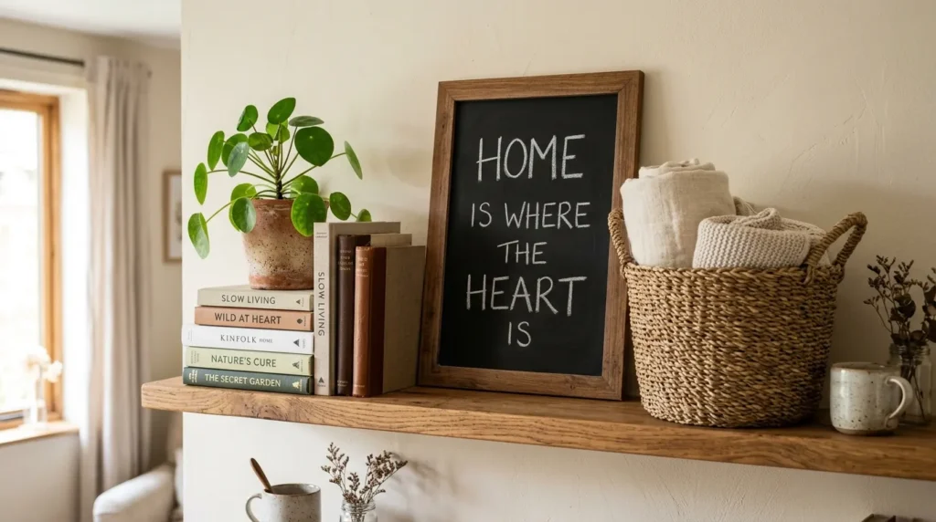
Rather than standing alone, a chalkboard can also play a supporting role within a larger styled shelf or vignette. Leaning a small board against the back of a shelf, then arranging books, a potted plant, and a woven basket around it, adds a personal, handwritten touch to what might otherwise be a purely decorative arrangement. This idea works well for anyone who already enjoys shelf styling and wants to fold seasonal spring chalkboard ideas into their existing setup rather than starting an entirely separate display from scratch.
This idea works because it treats the chalkboard as one element among several rather than the sole focus. Balancing height, texture, and color across the shelf keeps the eye moving naturally, and the handwritten board adds a warm, personal note among more polished decorative objects. I’ve seen this work well in bookshelves, entryway consoles, and even bathroom shelves, proving how flexible the format really is. Because the message can rotate seasonally while the surrounding objects stay the same, this styled shelf remains easy to refresh throughout the year with minimal effort.
Conclusion
A chalkboard is such a small detail, but as these spring chalkboard ideas show, it can genuinely transform how a room feels. From soft pastel welcome signs to playful garden touches, each idea offers an easy way to bring warmth, color, and personality into your home without spending much time or money. I’ve seen how small changes like these can completely shift the mood of a space, and chalk is one of the most forgiving materials to experiment with. Save this post for later, try one idea this week, and share it with a friend who could use a little spring inspiration too. Your next favorite corner might be one chalk stroke away.