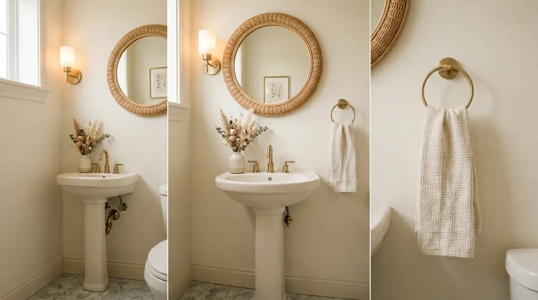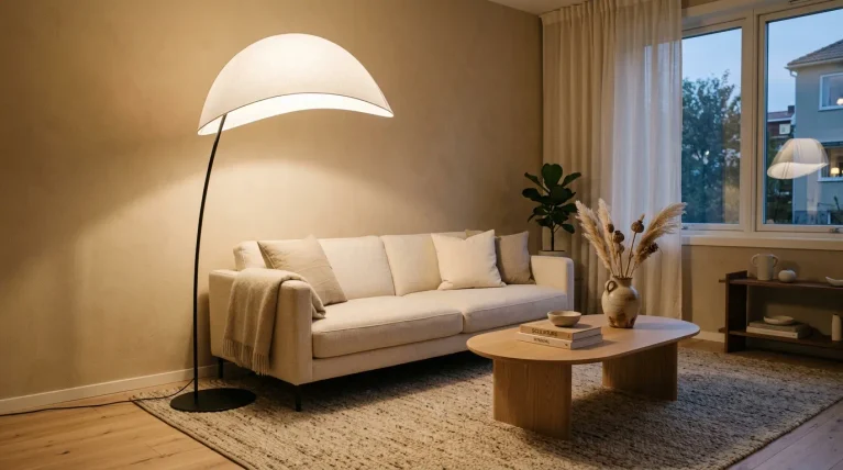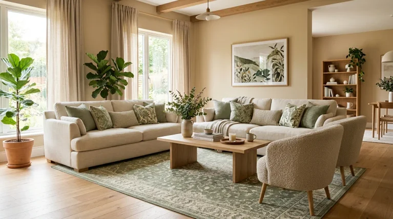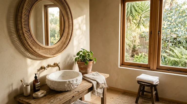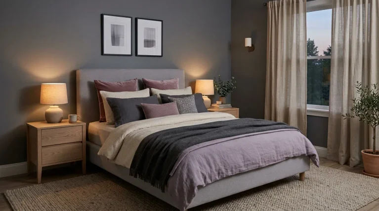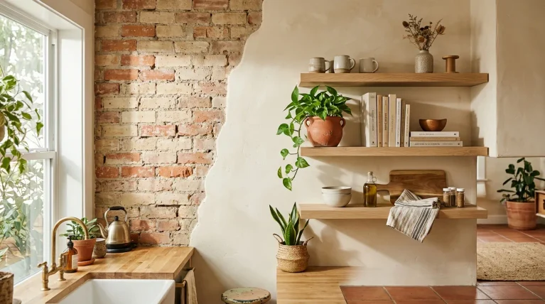
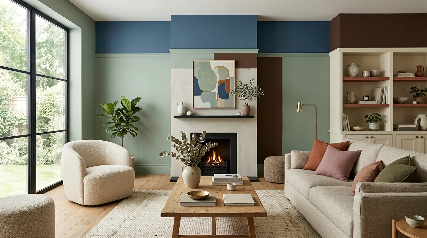
Standing in front of paint swatches, wondering which shade will actually still look good next year? You’re asking the right question at the right time. This guide breaks down the 2026 paint color trends shaping homes right now, from warm earthy neutrals to bold jewel tones that make a real statement. If you’ve ever repainted a room only to feel unsure about it a few months later, you’re not alone, and that’s exactly the problem this list solves. In my experience, the biggest paint mistakes happen when people chase a color without understanding how it actually lives in a room over time. Each shade here comes with practical context, so you’re not just picking a pretty color, you’re choosing one that fits your space, your lighting, and your everyday life. By the end, you’ll have a clear direction for your next update.
1. Warm Terracotta Tones
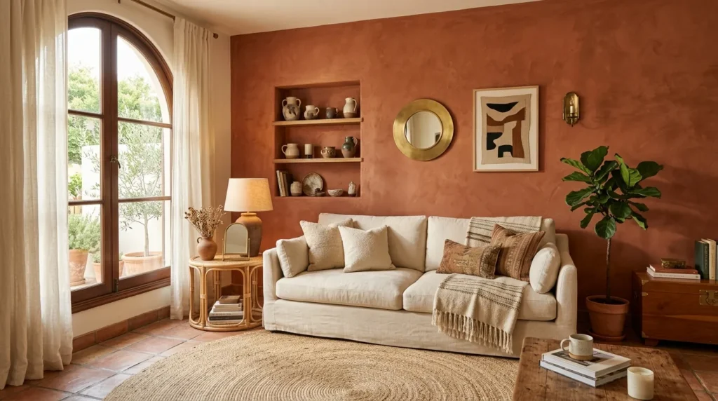
- Brings warmth and richness to living rooms and dining areas
- Pairs beautifully with natural materials like wood, rattan, and linen
- Works well as an accent wall or full-room statement
- Feels grounded rather than trendy, so it won’t date quickly
Warm terracotta is shaping up to be one of the standout 2026 paint color trends, and it’s easy to see why. This earthy, sun-baked hue brings a sense of warmth into a room that cooler neutrals often can’t match. In my experience, terracotta works especially well in spaces that get plenty of natural light, since the color deepens and glows throughout the day. It suits both modern and traditional homes, making it a flexible choice for anyone hesitant to commit to something too bold or fleeting.
What makes this shade so appealing is its ability to feel cozy without making a room feel smaller or darker. Terracotta pairs naturally with wood tones, woven textures, and brass fixtures, creating a layered, collected look rather than a flat, single-note wall. I’ve noticed homeowners gravitating toward this color specifically because it photographs beautifully in natural light, which matters for anyone documenting their home updates. It’s a confident choice that still feels livable, warm, and welcoming in everyday use.
2. Soft Sage Green
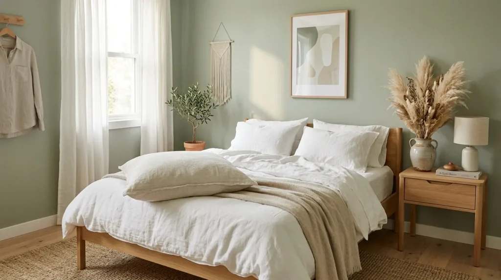
- Creates a calming, restful atmosphere in bedrooms and bathrooms
- Bridges the gap between neutral and statement colors
- Complements both warm and cool-toned furniture
- A gentle way to introduce color without overwhelming a space
Soft sage green continues to hold strong as one of the most requested shades among homeowners looking for a gentle update. Unlike bolder greens, this muted, dusty tone feels closer to a neutral, which makes it far less intimidating for anyone new to using color on their walls. It works particularly well in bedrooms and bathrooms, where a calming atmosphere matters most. I’ve tried this shade in smaller spaces myself, and it has a way of making a room feel softer and more restful without ever feeling flat or boring.
This color’s popularity comes from its versatility. Sage green complements both warm wood tones and cooler metals, so it fits into nearly any existing color scheme without requiring a full redesign. It also pairs beautifully with natural textures like linen, rattan, and dried florals, reinforcing a calm, grounded mood throughout the room. Because it sits comfortably between neutral and statement color, sage green offers a low-risk way to experiment with a fresher palette while still keeping the overall look timeless and easy to live with.
3. Deep Charcoal Accents
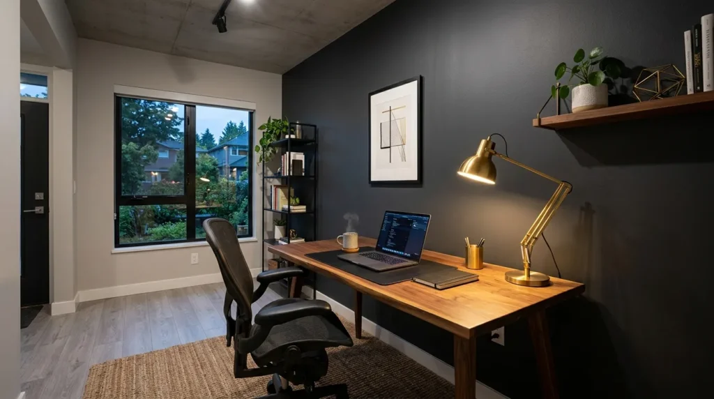
- Adds depth and drama without darkening an entire room
- Works especially well in offices, dens, or reading nooks
- Balances lighter furniture and decor with bold contrast
- Gives a space a more grounded, sophisticated feel
Deep charcoal is proving to be one of the more dramatic entries among this year’s paint color trends, but it’s far more approachable than it might initially seem. Used as a single accent wall rather than across an entire room, charcoal adds depth and sophistication without making a space feel small or closed in. This idea works especially well in home offices or reading nooks, where a slightly moodier atmosphere can actually improve focus. That’s why many designers recommend charcoal for rooms meant for concentration rather than relaxation.
The reason this shade works so well as an accent is contrast. Paired with lighter furniture, natural wood tones, and warm lighting, charcoal grounds a room instead of overwhelming it. It also makes brass or gold fixtures stand out more prominently, adding a subtle sense of luxury without much extra effort. I’ve seen this work well in smaller apartments too, proving that dark colors don’t always shrink a space the way people assume. Used thoughtfully, charcoal brings balance, depth, and quiet confidence to any room.
4. Buttery Yellow Warmth
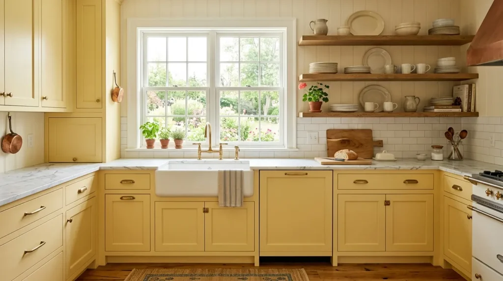
- Brings cheerful energy into kitchens and breakfast nooks
- Softer than traditional yellow, so it feels sophisticated
- Pairs beautifully with white, cream, and natural wood
- Works well on cabinetry, not just walls
Buttery yellow is having a real moment, offering a softer, more grown-up alternative to the bold yellows of past trends. This muted, creamy tone brings warmth and cheerfulness into a kitchen without feeling overly saturated or childish. It works particularly well on cabinetry, where it adds personality to an otherwise neutral space. I’ve noticed this shade appearing more often in kitchen renovations lately, especially among homeowners who want color but still want the space to feel timeless rather than tied to a passing trend.
What sets buttery yellow apart is its versatility across different design styles. It complements white countertops, natural wood shelving, and brass fixtures equally well, making it easy to incorporate into farmhouse, coastal, or modern kitchens alike. Unlike brighter yellows, this softer version doesn’t compete with morning light the way bolder shades sometimes do. Instead, it enhances the natural glow of a sunlit kitchen, creating a genuinely inviting space. It’s a confident yet livable choice for anyone ready to bring a little more warmth into their cooking space.
5. Muted Clay Pink
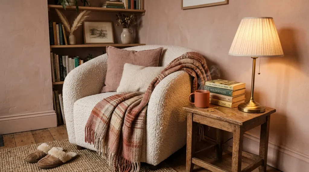
- Offers a grown-up, sophisticated take on pink
- Adds warmth without feeling overly feminine or trendy
- Works beautifully in reading nooks, bedrooms, and hallways
- Pairs well with boucle, wood, and warm metal tones
ALSO READ: 23 Spring Home Decor Ideas for a Fresh Seasonal Look
Clay pink represents one of the more unexpected 2026 paint color trends, softening what many still associate with childhood bedrooms into something far more sophisticated. This dusty, muted tone leans more toward terracotta than bubblegum, giving it a grounded, wearable quality that suits adult spaces just as easily as kids’ rooms. It’s particularly well suited to reading nooks or quiet corners, where a soft, warm color helps create a genuinely relaxing atmosphere. In my experience, this shade surprises people the most, since it rarely reads as pink at first glance.
This color works so well because it behaves more like a neutral than a traditional accent shade. Clay pink pairs effortlessly with warm woods, boucle textiles, and brass or matte black fixtures, giving rooms a layered, collected look rather than a themed one. It also holds up well under different lighting conditions, staying warm and inviting whether lit by natural daylight or a soft evening lamp. For anyone wanting a subtle way to introduce color, clay pink offers warmth and personality without ever feeling loud or overdone.
6. Rich Espresso Brown
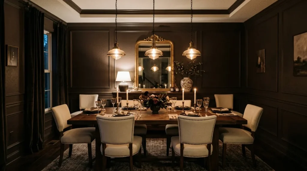
- Creates an intimate, upscale mood in dining spaces
- Deepens a room’s sense of warmth and richness
- Pairs beautifully with gold, cream, and warm wood tones
- Best suited for rooms with strong ambient or accent lighting
Rich espresso brown has quietly become one of the standout shades for anyone wanting a dining room that feels intimate and upscale. Deeper and warmer than charcoal, this rich brown wraps a room in a cozy, enveloping quality that works especially well for evening entertaining. It’s a bolder choice, so it tends to suit spaces with strong ambient lighting rather than rooms relying solely on daylight. I’ve seen this work well in smaller dining rooms particularly, where the color makes the space feel intentionally cozy rather than cramped.
The appeal of espresso brown lies in how effortlessly it elevates a room. Paired with gold accents, cream upholstery, and warm wood furniture, it creates a layered, sophisticated look that feels closer to a boutique restaurant than a typical dining space. Because the color is so rich, even simple furniture pairings tend to look more intentional against it. For anyone wanting their dining room to feel special during dinner parties or holiday gatherings, espresso brown delivers a dramatic, memorable backdrop without requiring elaborate decor to back it up.
7. Coastal Blue-Green
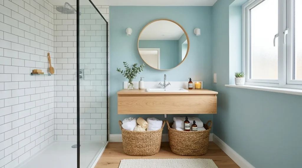
- Brings a fresh, spa-like feel to bathrooms and laundry rooms
- Sits between blue and green for a versatile, calming tone
- Pairs naturally with white tile and light wood accents
- Works well in both small and larger bathroom layouts
Coastal blue-green continues to be a favorite among homeowners chasing a spa-like feel without a full bathroom renovation. This in-between shade, part blue and part green, brings a fresh, breathable quality to smaller spaces where a bold color might otherwise feel overwhelming. It works particularly well in bathrooms and laundry rooms, areas that benefit from a calming, clean atmosphere. I’ve tried this shade in a guest bathroom before, and it consistently gets more compliments than expected for such a subtle, understated color choice.
This shade holds up well because it never feels tied to one specific design style, working equally well in coastal, modern, and traditional bathrooms alike. Paired with white subway tile and light wood vanities, coastal blue-green creates a clean, airy look that feels intentional rather than trendy. It also tends to read differently depending on the light in the room, appearing more blue in the morning and softer green by evening. That subtle shift keeps the space feeling fresh throughout the day without ever needing to change a thing.
8. Warm Greige Neutral
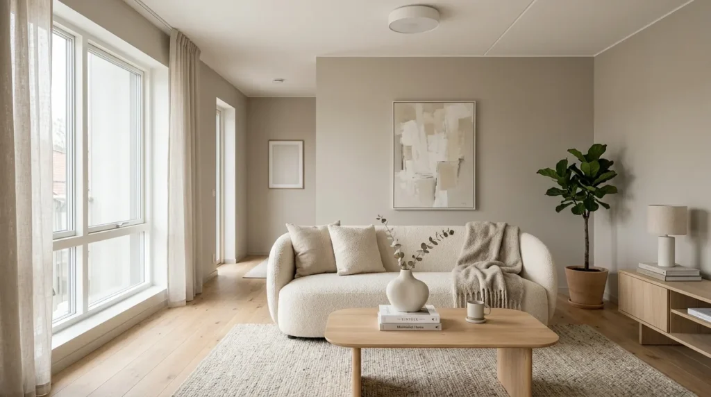
- Offers a warmer alternative to standard cool gray
- Works as a flexible backdrop for changing decor styles
- Suits nearly every room in the home
- A safe yet stylish choice for resale-minded homeowners
Warm greige remains one of the most requested neutrals, and for good reason. Blending gray’s coolness with beige’s warmth, this shade avoids the flat, sterile feeling that plain gray walls sometimes create. It works as a flexible backdrop in nearly any room, making it a popular choice among homeowners who want their space to feel updated without committing to a bold, short-lived trend. That’s why many designers recommend greige specifically for whole-home consistency, since it transitions smoothly from room to room without feeling repetitive or dull.
What makes greige so enduring is its adaptability. It complements both warm wood tones and cooler metal finishes, meaning furniture and decor can shift over time without ever clashing with the walls. This flexibility also makes it a smart choice for anyone thinking about resale value, since neutral, warm tones tend to appeal to a wider range of buyers. I’ve noticed that rooms painted in greige often feel larger and brighter than expected, especially when paired with natural light and simple, uncluttered styling throughout the space.
9. Bold Navy Statement
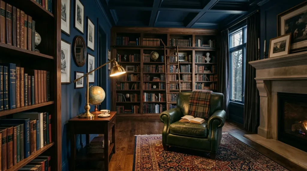
- Adds drama and richness to libraries, offices, or dens
- Pairs beautifully with brass, wood, and leather accents
- Works well as a full room or single accent wall
- A confident choice for anyone wanting a bold focal point
Bold navy remains one of the more dramatic 2026 paint color trends, but its popularity keeps growing among homeowners who want a genuine statement without straying into an unusual or hard-to-match color. Deep and rich, navy brings a library-like sophistication to home offices, dens, or built-in bookshelf walls. It’s a color that photographs exceptionally well under warm lighting, which is part of why it continues showing up so often in styled home photos. I’ve seen this work particularly well in rooms with dark wood furniture, where navy deepens the overall mood instead of competing with it.
This shade succeeds because it strikes a balance between boldness and versatility. Unlike trendier colors that can feel dated within a year or two, navy has a classic quality that keeps it relevant regardless of passing design cycles. Paired with brass fixtures, leather seating, and patterned textiles, it creates a layered, intentional look that feels collected over time rather than newly decorated. For homeowners wanting a confident, statement-making color that won’t require repainting again soon, navy remains one of the safest bold choices available.
10. Chalky Off-White
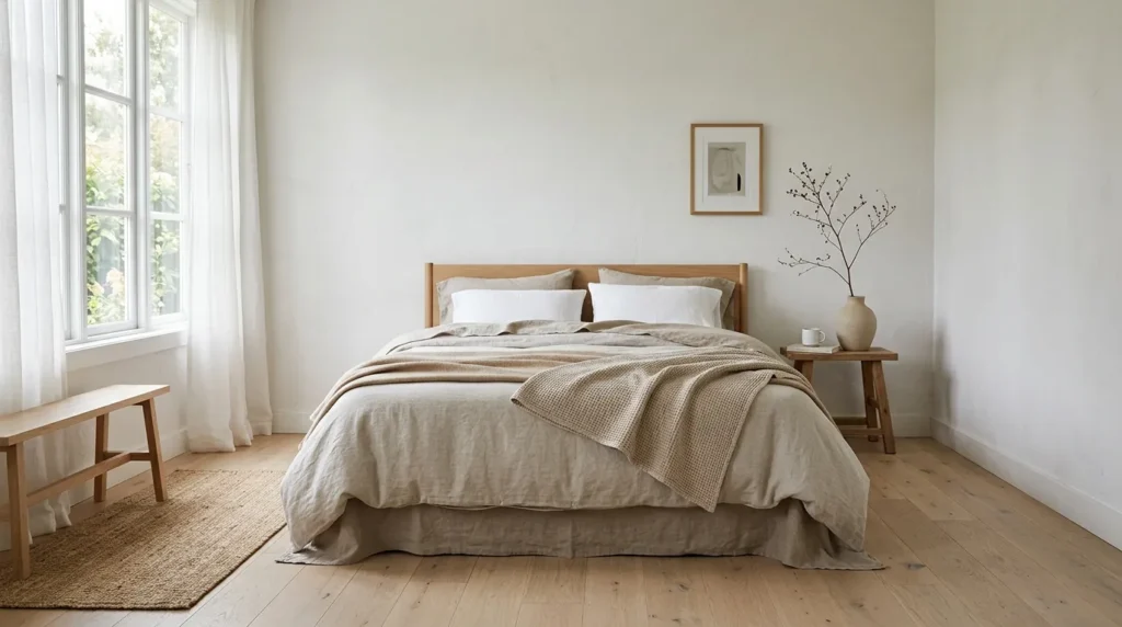
- Creates a soft, warm alternative to stark white walls
- Enhances natural light without feeling cold or clinical
- Works as a flexible base for layered, textured decor
- A timeless choice that suits nearly any design style
Chalky off-white continues to outperform stark white as the neutral of choice for homeowners wanting brightness without a cold, clinical feel. This softer shade carries a subtle warmth that keeps rooms feeling inviting rather than sterile, especially in spaces that rely heavily on natural light. It works particularly well in bedrooms and living rooms where the goal is a calm, restful atmosphere. In my experience, this color also hides small imperfections better than bright white, making it a practical choice for older homes with slightly uneven walls.
The reason this shade continues to hold appeal is its flexibility as a backdrop. Chalky off-white pairs effortlessly with warm wood tones, muted textiles, and natural materials, allowing the furniture and decor to take center stage rather than competing with the walls. It also photographs beautifully, picking up soft shadows and warm light in a way that feels organic rather than staged. For anyone wanting a fresh, brighter home without sacrificing warmth, this shade offers a dependable, timeless option that rarely needs reconsidering.
11. Moody Forest Green
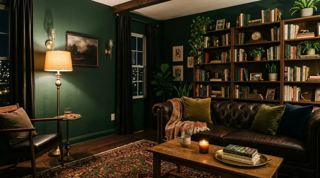
- Adds a rich, nature-inspired depth to dens and living rooms
- Pairs beautifully with greenery, wood, and warm metals
- Creates an intimate mood ideal for evening relaxation
- Best suited for rooms with layered, ambient lighting
Moody forest green has become a favorite for homeowners wanting a deeper, more atmospheric take on the softer sage tones seen elsewhere in this list. Richer and darker, this shade wraps a room in a cozy, nature-inspired depth that feels especially fitting for dens or living rooms used mostly in the evening. It pairs naturally with houseplants, reinforcing the color’s organic feel rather than fighting against it. I’ve noticed that rooms painted this shade tend to feel more intimate almost immediately, even before any furniture changes are made.
This color works so well because it leans into darkness rather than avoiding it, creating a genuinely cozy atmosphere instead of a flat, one-note wall. Paired with leather furniture, brass lighting, and warm wood shelving, forest green develops real depth and texture throughout the room. Because it’s a darker shade, ambient and layered lighting matters more here than in brighter color schemes, so lamps and warm bulbs help the room feel inviting rather than dim. For evening relaxation spaces, this shade delivers mood and richness in equal measure.
12. Soft Lavender Gray
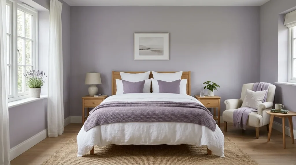
- Offers a subtle, sophisticated take on purple tones
- Creates a peaceful, restful mood in bedrooms
- Reads more neutral than traditional lavender shades
- Pairs well with both warm and cool furniture tones
Soft lavender gray gives homeowners a way to experiment with purple without it ever feeling overly sweet or dated. This muted, grayed-down version leans closer to a sophisticated neutral than a traditional lavender, making it far easier to incorporate into an existing color scheme. It works particularly well in bedrooms, where its gentle, calming quality supports a restful atmosphere without demanding too much visual attention. I’ve tried this shade in a guest room before, and it consistently reads as calm and understated rather than overtly purple or trendy.
What makes this color effective is its subtlety. Because it sits so close to gray, lavender gray pairs comfortably with both warm wood tones and cooler metal accents, avoiding the styling limitations that bolder purples often create. It also shifts gently throughout the day, appearing more gray in bright light and slightly more lavender in dim evening lighting. For anyone wanting a quiet, sophisticated departure from typical neutrals, this shade offers just enough personality to feel intentional without overwhelming the rest of the room’s design.
13. Sunbaked Ochre
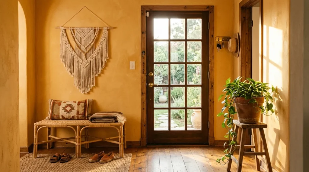
- Adds an unexpected pop of warmth to entryways and hallways
- Feels earthy and grounded rather than loud or trendy
- Pairs beautifully with rattan, wood, and terracotta accents
- Works well in spaces with strong natural light
Sunbaked ochre is emerging as one of the more adventurous shades among current paint trends, bringing a warm, golden quality that feels closer to sunlight itself than a typical wall color. It works especially well in entryways and hallways, spaces that often get overlooked when it comes to color but benefit enormously from a warm first impression. This shade suits homes with strong natural light particularly well, since sunlight deepens and enriches the ochre tone throughout the day. I’ve seen this work beautifully in narrow hallways that once felt dark and forgettable.
This color succeeds because it brings genuine personality without veering into an unusual or hard-to-style territory. Ochre pairs naturally with rattan, terracotta, and warm wood tones, reinforcing an earthy, sun-washed aesthetic throughout the space. It also tends to feel more grounded than typical yellow shades, avoiding anything overly bright or artificial. For homeowners wanting their entryway to feel welcoming and distinct from the moment guests step inside, sunbaked ochre delivers warmth and character that few neutral shades can match.
14. Cool Slate Blue
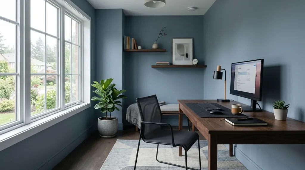
- Creates a calm, focused atmosphere for offices and studies
- Offers a cooler alternative to popular navy tones
- Pairs well with dark wood and matte black accents
- Suits modern, minimal, and contemporary home styles
Cool slate blue offers a quieter, more restrained alternative to bold navy, appealing to homeowners who want depth without quite as much drama. This muted blue-gray tone works particularly well in home offices and studies, where a calm, focused atmosphere matters more than a dramatic statement. It’s a shade that photographs well in both bright and overcast light, holding its cool, composed character throughout the day. That’s why many designers recommend slate blue specifically for workspaces, since it supports concentration without feeling sterile or overly corporate.
This shade works because it strikes a careful balance between color and neutrality. Slate blue reads as sophisticated rather than playful, making it a natural fit for modern and minimalist interiors that favor clean lines and restrained palettes. Paired with dark wood furniture and matte black fixtures, the color develops a cool, composed depth that feels intentional rather than accidental. For anyone wanting a workspace that feels calm and distraction-free, slate blue offers a dependable, quietly confident option that rarely feels overwhelming.
15. Warm Almond Neutral
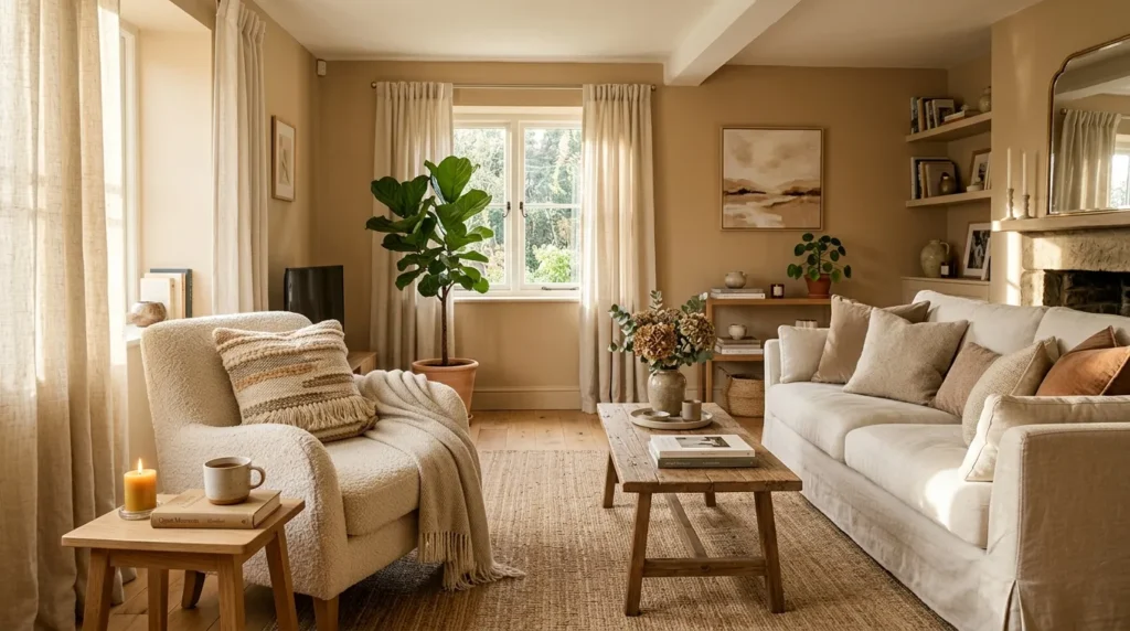
- Provides a warmer, softer alternative to standard beige
- Works as a flexible base across nearly any room
- Pairs beautifully with cream, wood, and woven textures
- A timeless option that adapts well to changing decor
Warm almond has quietly become one of the most reliable neutrals among this year’s shades, offering a softer, more nuanced alternative to standard beige. This gentle tone carries just enough warmth to feel cozy without veering into anything overly yellow or dated. It works well throughout nearly any room in the home, making it a flexible starting point for homeowners still deciding on their broader design direction. In my experience, almond tends to be the color people choose when they want warmth but aren’t ready to commit to something bolder just yet.
This shade holds its appeal because it adapts so easily to changing decor over time. Almond pairs naturally with cream textiles, light wood furniture, and woven accents, creating a soft, layered look that feels comfortable rather than plain. It also tends to look slightly different depending on the room’s lighting, staying warm in natural daylight and slightly deeper under evening lamps. For homeowners wanting a dependable neutral that won’t need reconsidering with every new decor update, warm almond remains one of the safest and most livable choices available.
16. Dusty Blue Calm
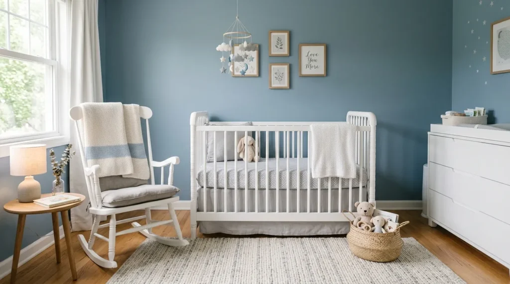
- Brings a gentle, calming quality to nurseries and bedrooms
- Softer and more muted than typical baby blue
- Pairs beautifully with white, gray, and light wood tones
- Works well in rooms meant for rest and unwinding
Dusty blue continues to be a go-to shade for nurseries and bedrooms, offering a gentler alternative to brighter, more saturated blues. This muted tone carries a soft, almost powdery quality that keeps a room feeling calm rather than playful or juvenile. It’s particularly well suited to spaces meant for rest, where a soothing atmosphere matters more than bold visual interest. I’ve noticed this shade holding steady in popularity for good reason, since it works just as well in a nursery as it does in a guest room years later.
This color succeeds because of how easily it blends into a soft, layered color scheme. Dusty blue pairs naturally with white furniture, gray textiles, and light wood accents, creating a cohesive, restful look without much extra effort. It also tends to stay visually interesting without demanding attention, which matters in rooms where the goal is relaxation rather than drama. For anyone wanting a calming, adaptable shade that grows with a room over time, dusty blue remains one of the most dependable choices available this year.
17. Rustic Olive Green
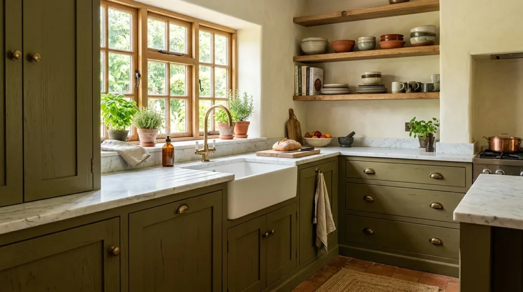
- Adds a rich, earthy tone that feels grounded and natural
- Works beautifully on cabinetry as well as walls
- Pairs well with brass, marble, and natural wood
- A warmer alternative to cooler, more muted greens
Rustic olive green has been steadily gaining ground as a favorite among homeowners looking for a deeper, earthier alternative to sage. This richer, more grounded green feels closer to nature than trend, working especially well on kitchen cabinetry where its warmth stands out against lighter countertops and backsplashes. It’s a shade that tends to age gracefully, avoiding the overly saturated quality that can make some greens feel dated within a few years. I’ve seen this color used particularly well in kitchens with plenty of natural wood, where the two tones complement each other effortlessly.
This shade works because it carries genuine depth without tipping into anything too dark or heavy. Olive green pairs naturally with brass hardware and marble surfaces, creating a warm, textured look that feels collected rather than newly renovated. It also holds up well against both cool and warm lighting, staying grounded and earthy throughout the day. For homeowners wanting a kitchen update that feels rich and intentional without following a fleeting trend, rustic olive green offers lasting warmth and character.
18. Warm White Base
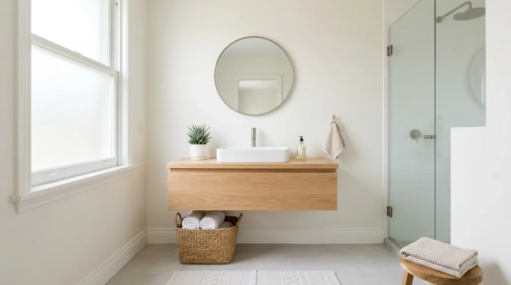
- Provides brightness without the coldness of stark white
- Works as a dependable base in smaller, light-filled rooms
- Pairs well with natural wood and woven textures
- A safe, timeless choice for resale or rental properties
Warm white remains one of the steadiest choices among current paint trends, offering brightness without the flat, clinical feeling that cooler whites sometimes bring. This shade works particularly well in bathrooms and smaller rooms, where light needs to bounce freely without making the space feel sterile. It’s a dependable base for homeowners who prefer letting furniture and decor introduce color rather than the walls themselves. In my experience, warm white also tends to photograph more naturally, avoiding the slightly blue or gray cast that some whites pick up under artificial lighting.
This shade continues to perform well because of its sheer adaptability. Warm white pairs effortlessly with natural wood, woven textures, and greenery, creating a bright, airy backdrop that never competes with the rest of the room. It also remains a popular choice for rental properties and homes being prepared for resale, since it appeals to a wide range of tastes without feeling overly personalized. For anyone wanting a clean, bright space that still feels warm and inviting, this shade continues to be one of the safest, most versatile options available.
19. Deep Burgundy Accent
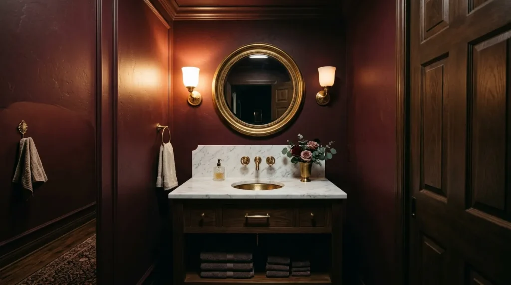
- Adds bold, luxurious depth to small spaces like powder rooms
- Pairs beautifully with brass, marble, and gold accents
- Creates drama without needing a large room to work
- A confident choice for anyone wanting a memorable moment
Deep burgundy is emerging as a favorite for smaller spaces where a bold, dramatic color can shine without overwhelming an entire home. Powder rooms in particular benefit from this rich, wine-toned shade, since the smaller footprint makes a bold color choice feel intentional rather than excessive. It’s a color that thrives under warm, low lighting, deepening into something genuinely luxurious by evening. I’ve seen this shade used to transform a plain powder room into the most memorable spot in the entire house, often becoming a talking point among guests.
This color works so well because small rooms are the ideal place to experiment with bold choices that might feel like too much elsewhere. Burgundy pairs naturally with brass fixtures, marble surfaces, and gold-framed mirrors, creating a rich, layered look reminiscent of a boutique hotel. Because the room is used briefly rather than lived in constantly, the drama feels exciting rather than exhausting. For homeowners wanting one unforgettable space in their home, deep burgundy offers bold, sophisticated impact without requiring a large area to make its presence felt.
20. Soft Stone Gray
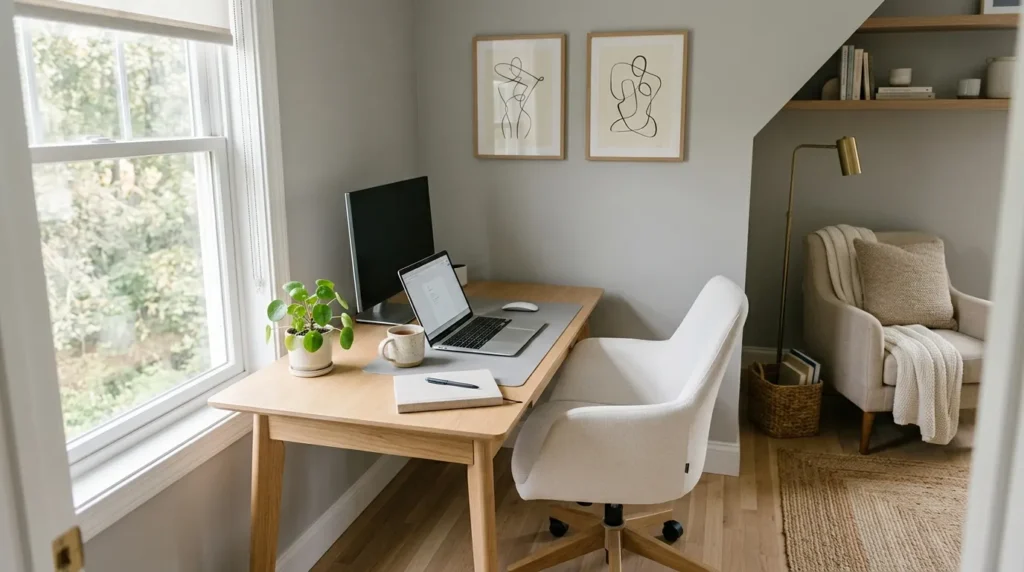
- Offers a balanced, versatile neutral for work and living spaces
- Feels calmer and warmer than typical cool gray
- Pairs well with both light and dark wood tones
- Suits nearly any design style without feeling trendy
Soft stone gray continues to hold its place as one of the most balanced neutrals available, sitting comfortably between warm and cool without leaning too far in either direction. This composed, understated shade works well in home offices and living spaces alike, offering a calm backdrop that doesn’t compete with furniture or decor. It’s a color that suits nearly any design style, from modern to traditional, without ever feeling tied to a specific trend. That’s why many designers recommend stone gray as a dependable starting point for homeowners still refining their overall aesthetic.
This shade succeeds because of its quiet versatility. Stone gray pairs effortlessly with both light and dark wood furniture, adapting easily as decor changes over time. It also tends to feel calmer than typical cool grays, avoiding the sterile quality that sometimes comes with sharper, blue-toned shades. For anyone wanting a neutral that feels intentional rather than default, soft stone gray offers a composed, adaptable option that continues to perform well across nearly every type of room and lighting condition.
21. Warm Terracotta Blush
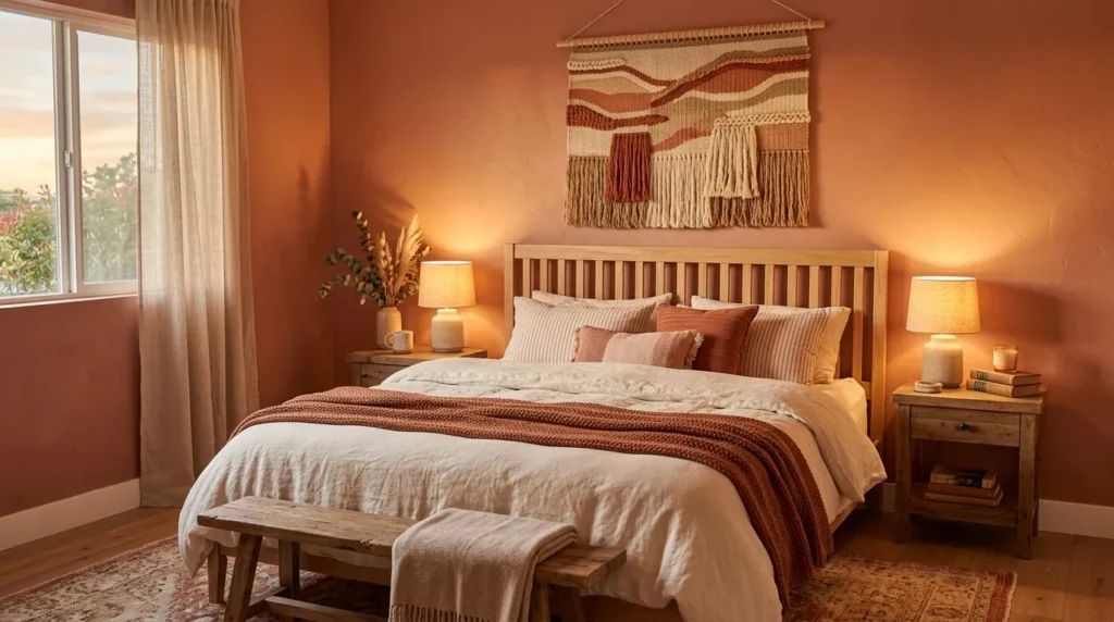
- Combines warmth and softness in one versatile shade
- Works beautifully in bedrooms for a relaxed, intimate feel
- Pairs well with cream, linen, and natural wood textures
- A gentler alternative to bolder terracotta tones
Warm terracotta blush blends the earthiness of terracotta with the softness of blush, creating a shade that feels both grounded and gentle at once. This in-between tone works particularly well in bedrooms, where its warmth supports a relaxed, intimate atmosphere without ever feeling too bold or attention-seeking. It’s a softer alternative for anyone drawn to terracotta but hesitant about committing to something more saturated. I’ve noticed this blended shade appealing especially to those redoing a bedroom for the first time in years, since it feels fresh without being unfamiliar.
This color works well because it carries warmth without weight, staying light enough to suit smaller bedrooms while still adding genuine personality. Paired with cream linens and natural wood furniture, terracotta blush creates a soft, layered look that feels cozy rather than overwhelming. It also shifts gently with the light, appearing warmer in the evening and softer during the day. For anyone wanting a bedroom that feels both updated and calming, this blended shade offers a dependable middle ground between bold and neutral.
22. Cool Mint Freshness
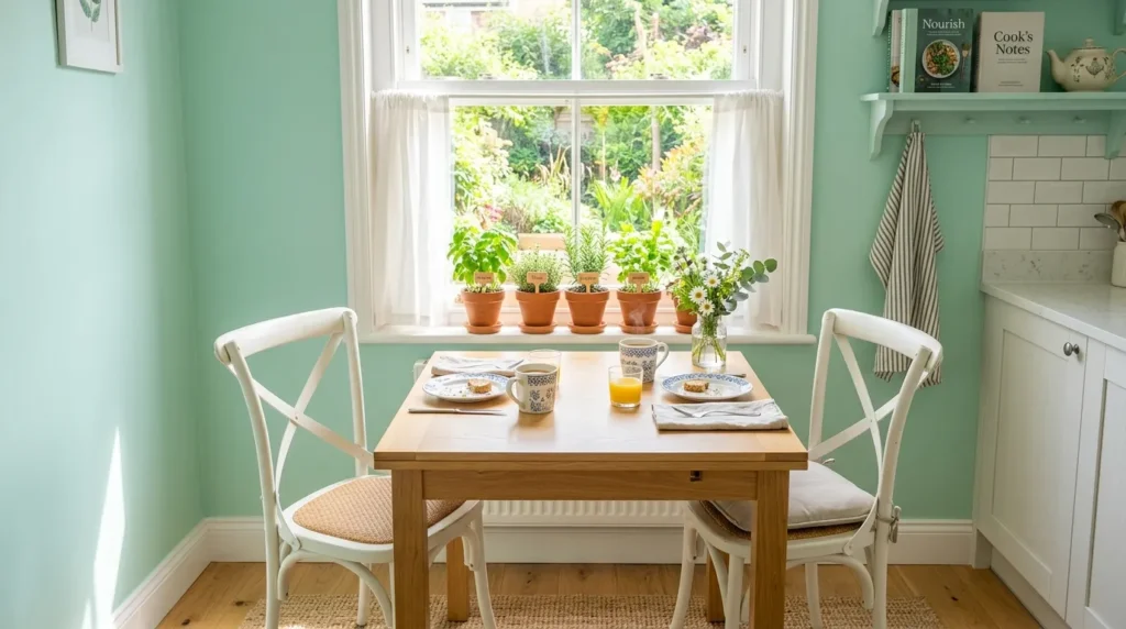
- Adds a fresh, crisp energy to kitchens and breakfast nooks
- Feels light and youthful without being overly saturated
- Pairs beautifully with white and natural wood tones
- Works well in smaller spaces needing a bright lift
Cool mint brings a fresh, crisp energy to smaller spaces that could use a little extra brightness, particularly kitchen nooks and breakfast areas. This lighter, more subdued take on green feels playful without veering into anything overly saturated or difficult to style around. It works especially well in rooms that already receive plenty of natural light, since the color brightens further under daylight rather than competing with it. I’ve tried this shade in a small breakfast nook before, and it consistently made the space feel more awake and inviting each morning.
This color succeeds because it introduces personality without demanding much commitment. Cool mint pairs naturally with white furniture and light wood tones, keeping the overall look clean and uncluttered rather than busy. It also tends to suit smaller spaces particularly well, since lighter shades like this one help a room feel more open rather than closed in. For anyone wanting a cheerful, low-risk way to bring color into a kitchen or breakfast area, cool mint offers a fresh, easygoing option that rarely feels overwhelming.
23. Deep Plum Drama
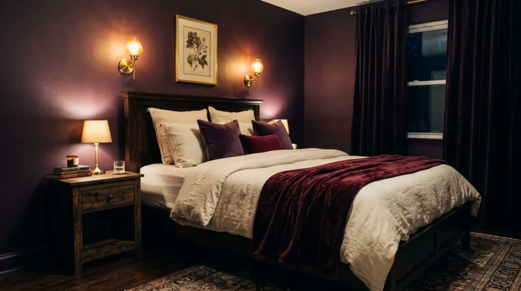
- Adds rich, moody depth to bedrooms and reading corners
- Creates an intimate atmosphere ideal for evening relaxation
- Pairs beautifully with cream, brass, and dark wood
- A bold choice for anyone wanting a dramatic retreat
Deep plum offers a bold, moody alternative for bedrooms designed to feel like a genuine retreat rather than a simple place to sleep. Richer and more saturated than typical purples, this shade creates an intimate, cocoon-like atmosphere that feels especially fitting in the evening. It’s a color that rewards layered, warm lighting, deepening into something genuinely dramatic once the sun goes down. I’ve seen this shade used in primary bedrooms with striking results, particularly when paired with soft textiles that keep the room from feeling too heavy or dark.
This shade works because it commits fully to drama rather than trying to stay neutral or safe. Plum pairs naturally with cream bedding, brass fixtures, and dark wood furniture, creating a rich, layered look that feels indulgent without becoming overwhelming. Because bedrooms are typically used at night, the deeper tone actually suits the room’s natural lighting conditions rather than working against them. For homeowners wanting their bedroom to feel like an escape rather than an afterthought, deep plum delivers bold, memorable atmosphere in every corner.
24. Warm Ivory Softness
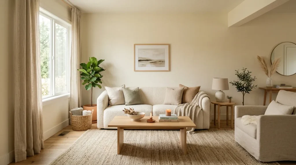
- Provides a softer, warmer alternative to plain white
- Creates a gentle, timeless backdrop for any room
- Pairs beautifully with cream, linen, and light wood
- A dependable choice for those wanting understated warmth
Warm ivory continues to be a quiet favorite among homeowners who want brightness without the slightly harsh edge that plain white can sometimes carry. This soft, gentle shade brings warmth into a room while still keeping the overall feel light and airy. It works well throughout living rooms and shared spaces, offering a timeless backdrop that rarely feels dated regardless of changing decor trends. In my experience, ivory tends to be the shade people return to after experimenting with bolder colors elsewhere in the home, simply because it never stops feeling comfortable.
This color holds its appeal because of how effortlessly it supports other design choices. Ivory pairs naturally with cream textiles, linen curtains, and light wood furniture, creating a soft, cohesive look that feels intentional without much effort. It also tends to read as warmer than white under most lighting conditions, avoiding any cold or clinical quality. For anyone wanting a dependable, understated shade that lets furniture and personal touches take center stage, warm ivory remains one of the most enduring choices available this year.
25. Bold Emerald Statement
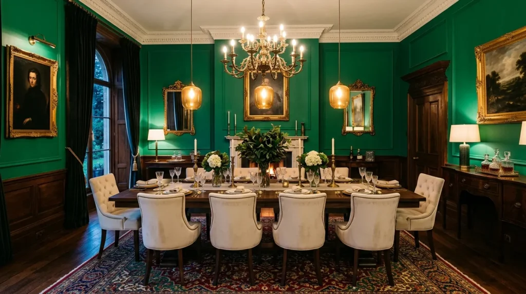
- Delivers a bold, jewel-toned statement in dining or living rooms
- Pairs beautifully with brass, cream, and dark wood accents
- Creates a striking focal point for entertaining spaces
- A confident finish for anyone ready to fully commit to color
Bold emerald closes out this year’s most striking shades, offering a jewel-toned statement for homeowners ready to fully commit to color. Among the boldest of the 2026 paint color trends featured here, emerald works best in dining rooms or formal living spaces used primarily for entertaining, where its richness can be fully appreciated under warm, ambient lighting. It’s a color that demands attention, but in a considered, elegant way rather than something loud or overwhelming. I’ve seen this shade transform a plain dining room into a space that genuinely feels designed rather than simply decorated.
This color succeeds because it embraces boldness with intention rather than restraint. Paired with brass fixtures, cream upholstery, and dark wood furniture, emerald creates a luxurious, jewel-box atmosphere that feels special without requiring elaborate additional decor. Because the color is so rich, even simple furnishings tend to look more polished and considered against it. For homeowners wanting to close out their home update with a truly memorable, statement-making finish, bold emerald delivers the kind of confident impact that lingers long after guests have left the room.
Conclusion
Updating a home doesn’t require a full renovation, sometimes it just takes the right shade on the right wall. These 2026 paint color trends offer something for every room and every comfort level, whether you’re drawn to soft neutrals or ready for a bold, dramatic finish. I’ve seen how small changes like these can completely transform how a space feels, often in far less time than people expect. Save this post to Pinterest so it’s easy to find later, try one shade in a room you’ve been meaning to refresh, and pass it along to a friend planning their own update. Your next favorite room could start with a single can of paint.