21 Best Neutral Paint Colors for the Whole Home
Picking a neutral paint color should be the easy part of decorating, and somehow it is the part that keeps people stuck for months. I have stood in a paint aisle holding six swatches that all looked like the same warm white. The right neutral works with the light you actually have, not the light in the store. These best neutral paint colors are the ones that show up again and again in real homes. Before you buy, try our paint color matcher to see how a shade looks in your light.

Photo: Sergei Korneichenko (@sergei_korneichenko) on Instagram
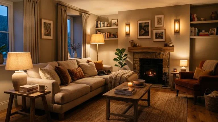
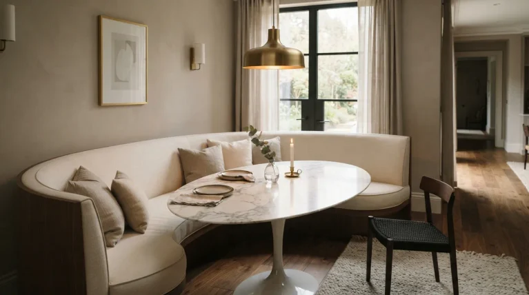
This guide stays with true neutrals only: whites, grays, greiges and beiges that work across a whole home. Every color below is a named paint you can ask for by name at the store. The photos are real rooms in this same neutral family, so you can see what each kind of neutral actually looks like lived in. Pick the family first, then the shade, and test it on your own wall before you commit.

Photo: The Home of Zaida (@thehomeofzaida) on Instagram
Which White Is the Best Neutral Paint Color for Your Whole Home?
White is the hardest neutral to choose, because dozens of them look identical on a swatch card. A white with a warm yellow undertone feels cozy in a north-facing room and creamy in a sunny one. These colorful bedroom ideas show how much a white wall can do once the bedding brings the color.
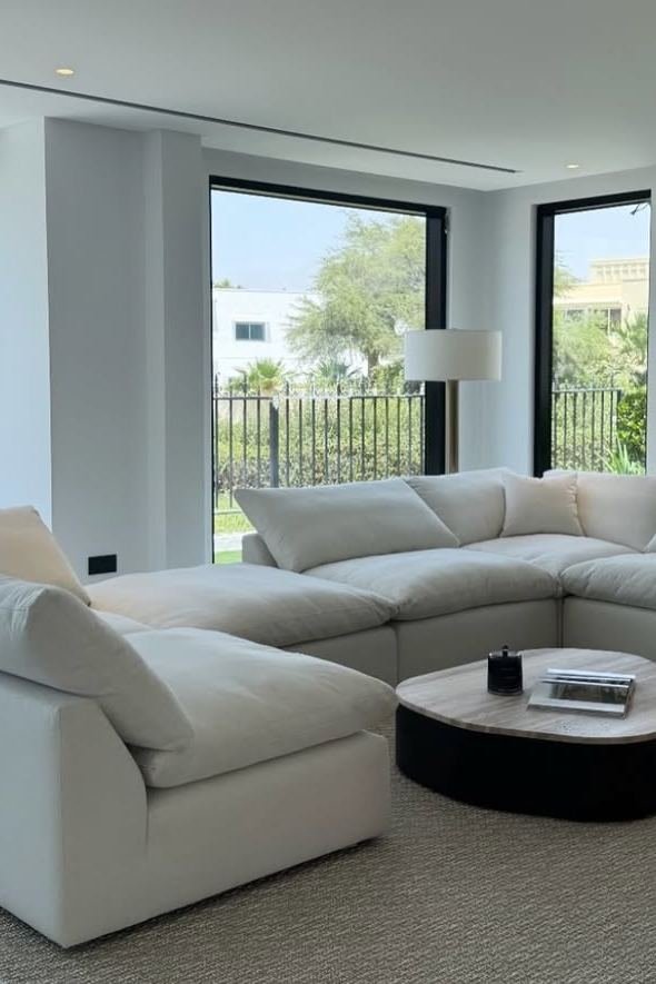
Photo: Mahogni Home (@mahogni.home) on Instagram
1. Start With Simply White for the Brightest Warm White
Simply White by Benjamin Moore is the brightest warm white in this guide, and the one to pick when a room needs light more than anything else. It reflects almost 90 percent of the light that hits it, so a small or dark bedroom feels bigger the moment it goes on the wall. This bedroom shows why it works: white walls, white bedding, and one striped throw as the only pattern, so the room feels fresh instead of bare.
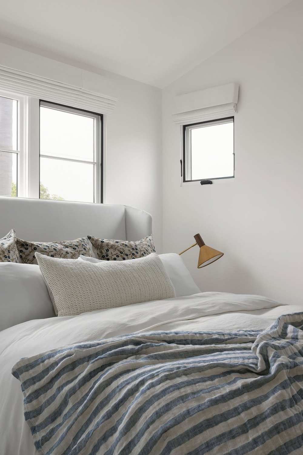
Photo: Bungalow 56 Living (@bungalow56living) on Instagram
2. Choose White Dove When You Want Soft, Not Stark
White Dove by Benjamin Moore is the softer sister of Simply White, and the better pick when a room already gets plenty of light. It has a warm gray-beige undertone that takes the edge off the brightness, so the walls feel calm rather than glaring, and it hides small scuffs far better than a cleaner white. This bedroom shows the feeling: rumpled white bedding against a warm wood headboard wall.
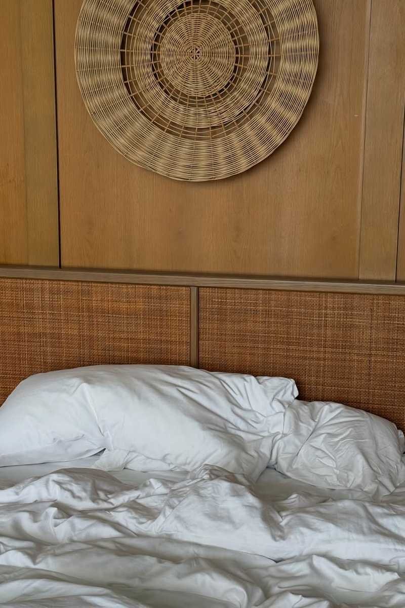
Photo: Sophia Aemelia (@sophiaaemelia) on Instagram
3. Try Swiss Coffee for Creamy Kitchen Cabinets
Swiss Coffee by Benjamin Moore is a creamy warm white, and it is at its best on kitchen cabinets, where a stark white can feel cold against stone and steel. The cream is soft, not yellow, so the cabinets read warm and welcoming, and the color pairs beautifully with wood blinds, a farmhouse sink and brass or black hardware. This kitchen shows the look: cream cabinets, a white worktop and pale walls, with the wood tones doing the warming.
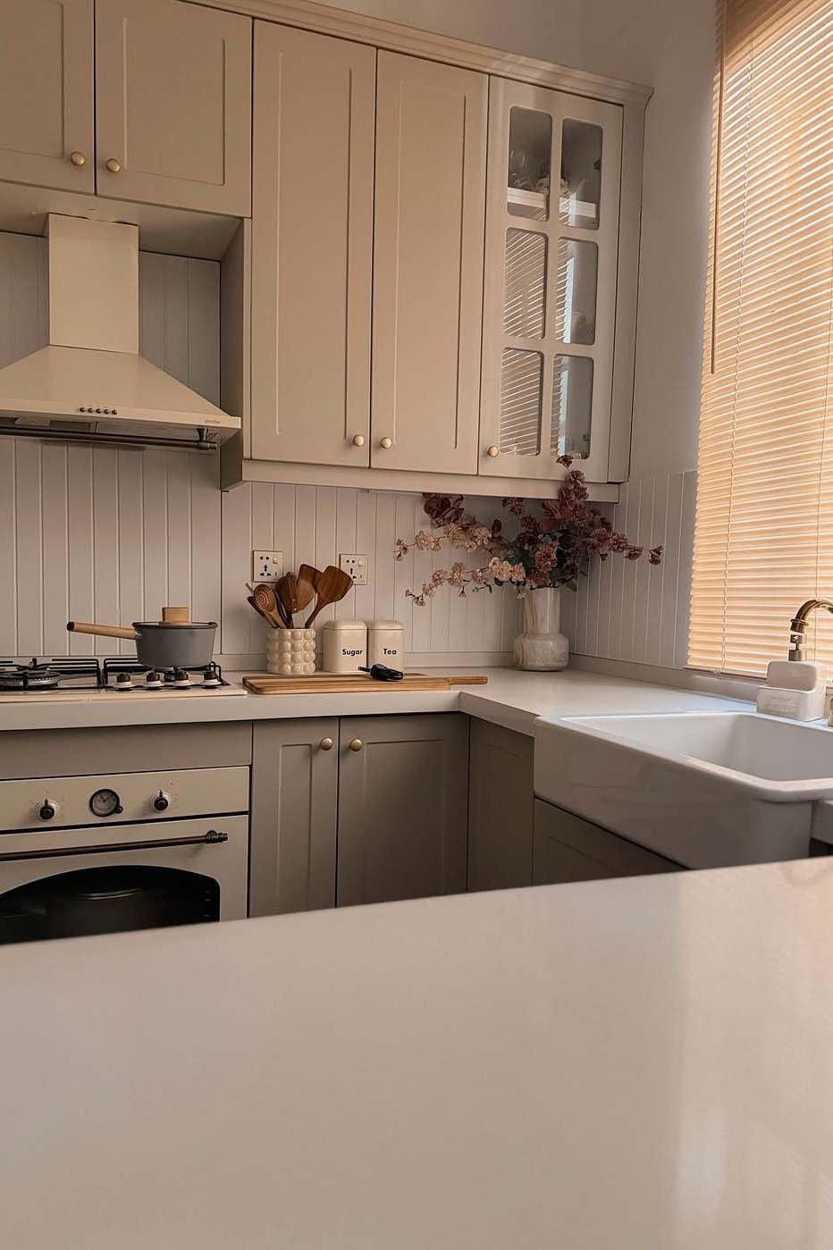
Photo: Fatema Alyassin (@fatema_alyassin) on Instagram
4. Pick Alabaster for Warmth Without Yellowing
Alabaster by Sherwin-Williams is the warm white that never quite turns yellow, and that is why it is one of the most used whites in real homes. It has a soft greige undertone that keeps it grounded, so it feels warm in the evening and clean in the morning, and it works on walls, trim and cabinets alike. This attic bedroom shows why it suits tricky rooms: white linens, a dark wood floor and sloped ceilings, with the warm white holding the whole space together.
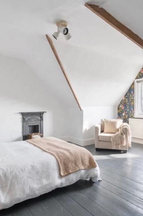
Photo: Harbour Decor (@harbour_decor) on Instagram
5. Use Shoji White in Small Rooms That Need Calm
Shoji White by Sherwin-Williams is a warm white with a quiet gray undertone, and it is the best white in this guide for a small room. The gray keeps it from going creamy in warm light, and the warmth keeps it from feeling cold in a north-facing room, so it sits right in the middle and stays calm all day. This small bedroom shows the effect: white bedding, pale walls and almost no furniture, with the room feeling restful instead of empty. Oyster Pearl by Clark + Kensington is a close cousin if your store carries that brand instead.
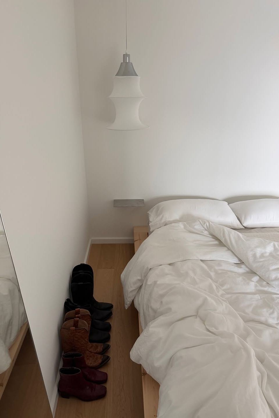
Photo: Dara Maclean (@daramaclean) on Instagram
6. Go Extra White for Crisp Walls and Trim
Extra White by Sherwin-Williams is the cleanest white in this guide, and the one to pick when you want crisp rather than cozy. It has almost no undertone, so it reads as a true bright white, and it is superb on trim, ceilings and doors, where it makes every other color in the room look sharper. This living room shows it at work: white walls, a white sectional and a wall-mounted television, with the light doing all the decorating. Snowbound is the softer alternative if Extra White feels too sharp on your walls. These white brick fireplace ideas show how a crisp white works with texture instead of color.

Photo: Comfort and Co (@comfortandco1) on Instagram
Which Gray Neutral Paint Color Actually Looks Good in Real Light?
Gray is the neutral most people get wrong, because gray paint changes more with light than any other color. The same gray can look soft and warm in the morning, cool and blue at noon, and faintly purple under evening lamps. The six grays below are the ones that stay honest in real rooms, and two close cousins, Repose Gray and Mindful Gray, sit in the same family if you want a slightly deeper version. These sage green living room ideas show how well a warm gray sits beside green.
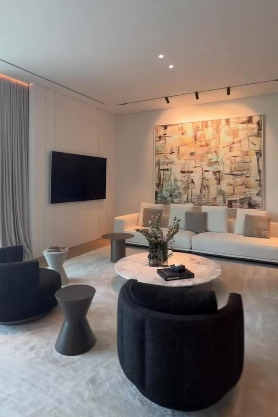
Photo: Hessa Al Falasi (@hessafalasi) on Instagram
7. Try Agreeable Gray, the Whole-Home Favorite
Agreeable Gray by Sherwin-Williams is the best-selling neutral in the country for a reason: it is a warm greige that works in almost any room and any light. This bedroom shows the closest cousin of the color: a warm greige paneled wall with framed photographs and a white nightstand, calm and lived in. Agreeable Gray is the safest whole-home choice in this guide, because it flows from living room to bedroom without a single clash.
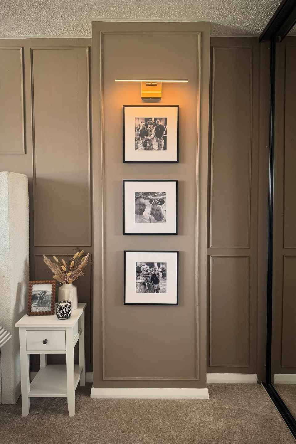
Photo: Laura (@laura_homeat27) on Instagram
8. Choose Revere Pewter for a Richer Greige
Revere Pewter by Benjamin Moore is a deeper greige than Agreeable Gray, with a little more beige and a little more presence on the wall. It is the color to pick when a room feels too pale and needs grounding, because it adds depth without adding darkness, and it pairs beautifully with warm white trim, natural oak and aged brass. This bedroom shows the tone: a warm taupe wall, gray pillows, white bedding and floral art, with the greige holding the whole palette together.
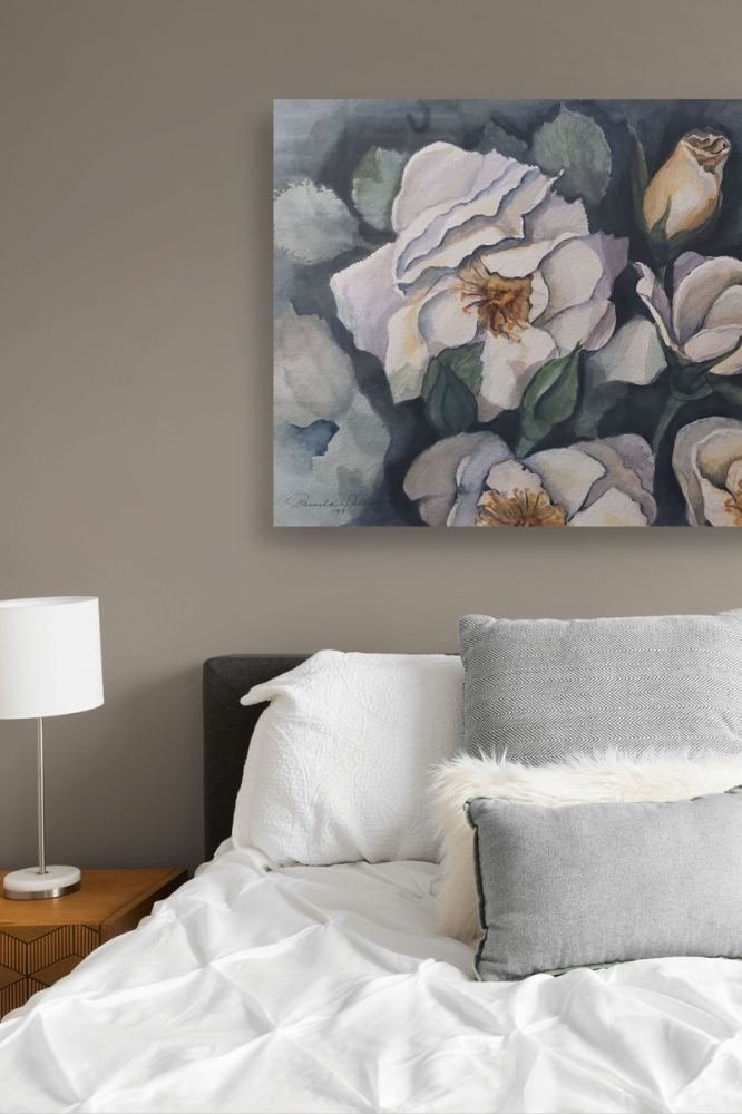
Photo: Pholmquist (@pholmquist.ph) on Instagram
9. Pick Stonington Gray for a Cool, Clean Gray
Stonington Gray by Benjamin Moore is a cool light gray, and the right pick when a room has warm wood or warm light that needs balancing. It reflects about 75 percent of the light, so it keeps a room bright, and its cool undertone stops warm floors and warm bulbs from turning the whole room yellow. This dining room shows the closest version of it: a cool gray table with light gray upholstered chairs, calm and uncluttered.
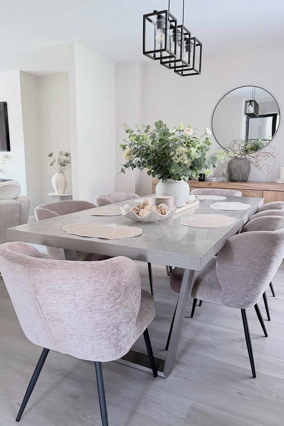
Photo: Home The Maltings (@home_themaltings) on Instagram
10. Use Gray Owl in Rooms With Lots of Daylight
Gray Owl by Benjamin Moore is a pale cool gray with a whisper of green-blue undertone, and it loves daylight. In a bright room it reads as a soft, airy gray, and in a dim room it can lean a little cooler, so it suits south-facing living rooms and dining rooms best. This dining room shows the closest match: a white table with light gray boucle chairs, pale and calm, with the gray living in the textiles rather than the walls.
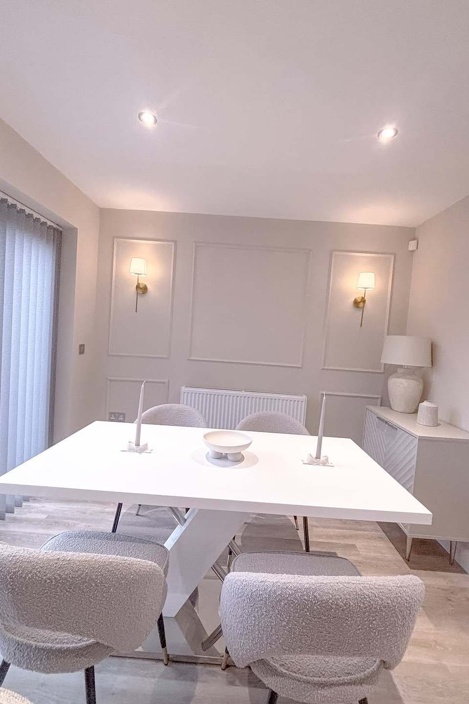
Photo: Diane Sloan (@homeiswhereheartis8) on Instagram
11. Choose Classic Gray for the Palest Possible Gray
Classic Gray by Benjamin Moore is the palest warm gray in this guide, so pale that in some lights it reads as a warm white. That is exactly its charm: it gives a room the softness of gray without any of the coolness, and it is the best choice for a bedroom or living room where you want the walls to disappear. This living room shows the closest version: a beige sectional, pale walls and large windows, with the whole room feeling light and quiet. Classic Gray is the color to pick when you love white walls but find them a little too stark.
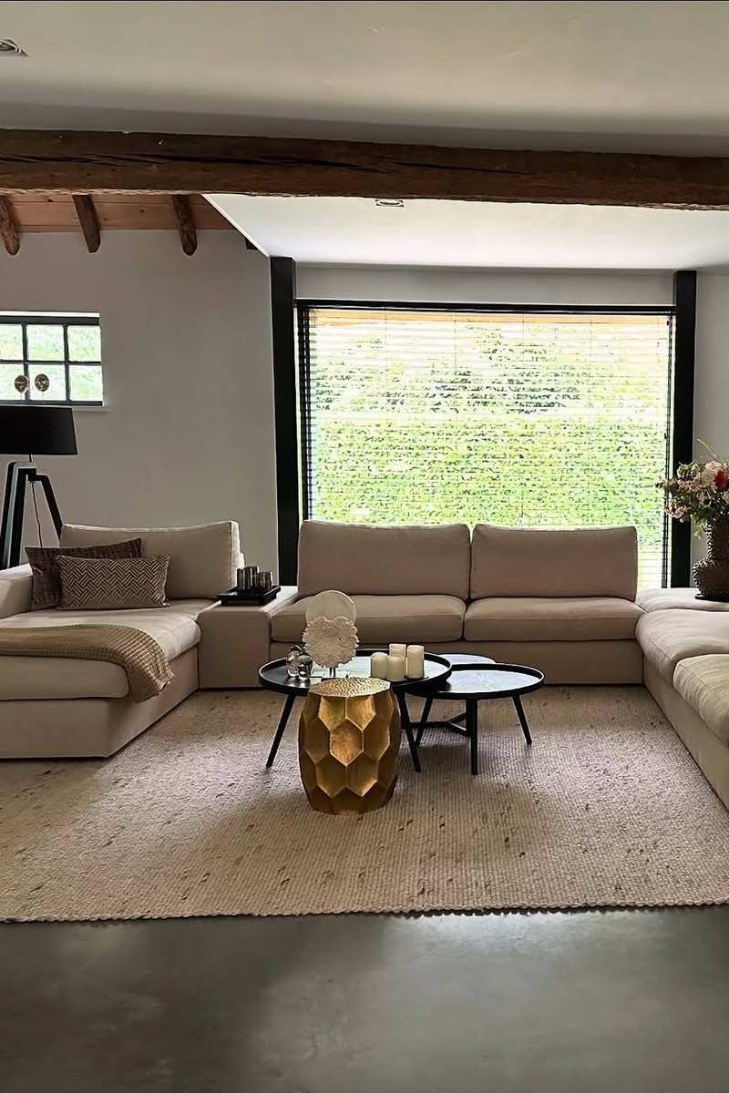
Photo: Kait B Fields (@kaitbfields) on Instagram
12. Try Edgecomb Gray for Warm Light and Wood Floors
Edgecomb Gray by Benjamin Moore is a warm light greige, and it is the gray that gets along best with wood floors and warm evening light. It has a soft beige undertone that deepens a little as the day goes on, so a room painted in it feels brighter at breakfast and cozier at dinner. This living room shows the closest match: a cream sofa, textured pillows and a bookshelf, with the whole room feeling warm without a single strong color. Edgecomb Gray is the best gray for a home with honey oak or warm wood floors, because it meets the wood halfway.
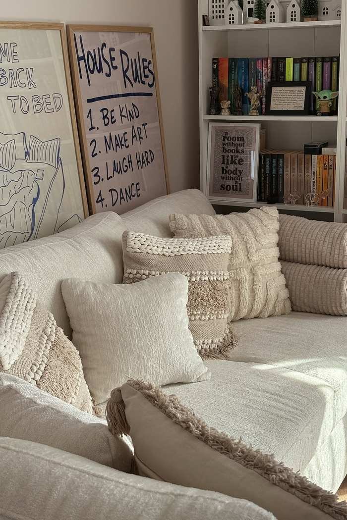
Photo: Cozy Up With K (@cozyupwithk) on Instagram
Which Greige and Beige Neutral Paint Colors Work in Every Room?
Beige got a bad name in the nineties, when it meant flat, yellowish walls with nothing else going on. The beiges in this guide are nothing like that. They are greiges and warm tans with gray in them, which keeps them modern. These sage green bedroom ideas show how a warm beige wall makes green bedding look richer.
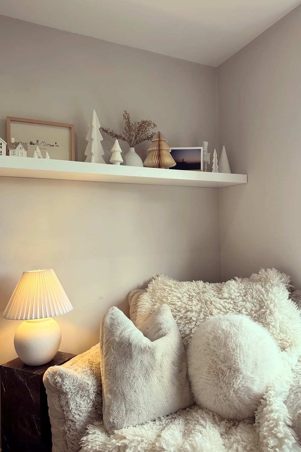
Photo: No. 6 Yarm (@no.6.yarm) on Instagram
13. Start With Accessible Beige for Instant Warmth
Accessible Beige by Sherwin-Williams is the warmest greige in this guide, and the one to pick when a room needs to feel welcoming the moment you walk in. It leans beige rather than gray, with a warm undertone that flatters wood furniture, leather and warm metals, and it reflects just under 60 percent of the light, so it keeps a room bright while adding depth. This farmhouse living room shows the feeling: a light sectional behind a rustic wooden console, with a stone fireplace and soft daylight. Accessible Beige is the best whole-home beige, because its warmth connects rooms the way a cool gray cannot.
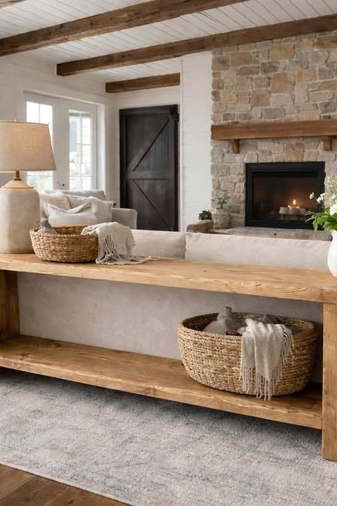
Photo: Gooding Wooding (@goodingwooding) on Instagram
14. Choose Balboa Mist for Pale, Airy Bedrooms
Balboa Mist by Benjamin Moore is a pale warm greige, and the best beige in this guide for a bedroom. It is light enough to keep a small bedroom feeling open, and warm enough that the room never feels cold, with a soft undertone that sits happily beside white bedding and pale wood. This bedroom shows the closest version of it: a beige upholstered bed seen from the doorway, with white bedding and soft daylight. Balboa Mist is the color to pick when you want a bedroom that feels calm at night and bright in the morning.

Photo: Home With The Lavenders (@homewiththelavenders) on Instagram
15. Try Pale Oak for Bedrooms With Dark Wood
Pale Oak by Benjamin Moore is a pale warm greige with a little more depth than Balboa Mist, and it is the best choice when a bedroom has dark wood furniture. The warmth of the color meets the dark wood halfway, so a four-poster bed or a dark dresser feels intentional instead of heavy. This bedroom shows the pairing: a dark wood four-poster bed with white bedding and pink tulips, pale walls and soft light. Pale Oak is also one of the most forgiving neutrals for mixed wood tones, because it does not fight with either light oak or dark walnut.
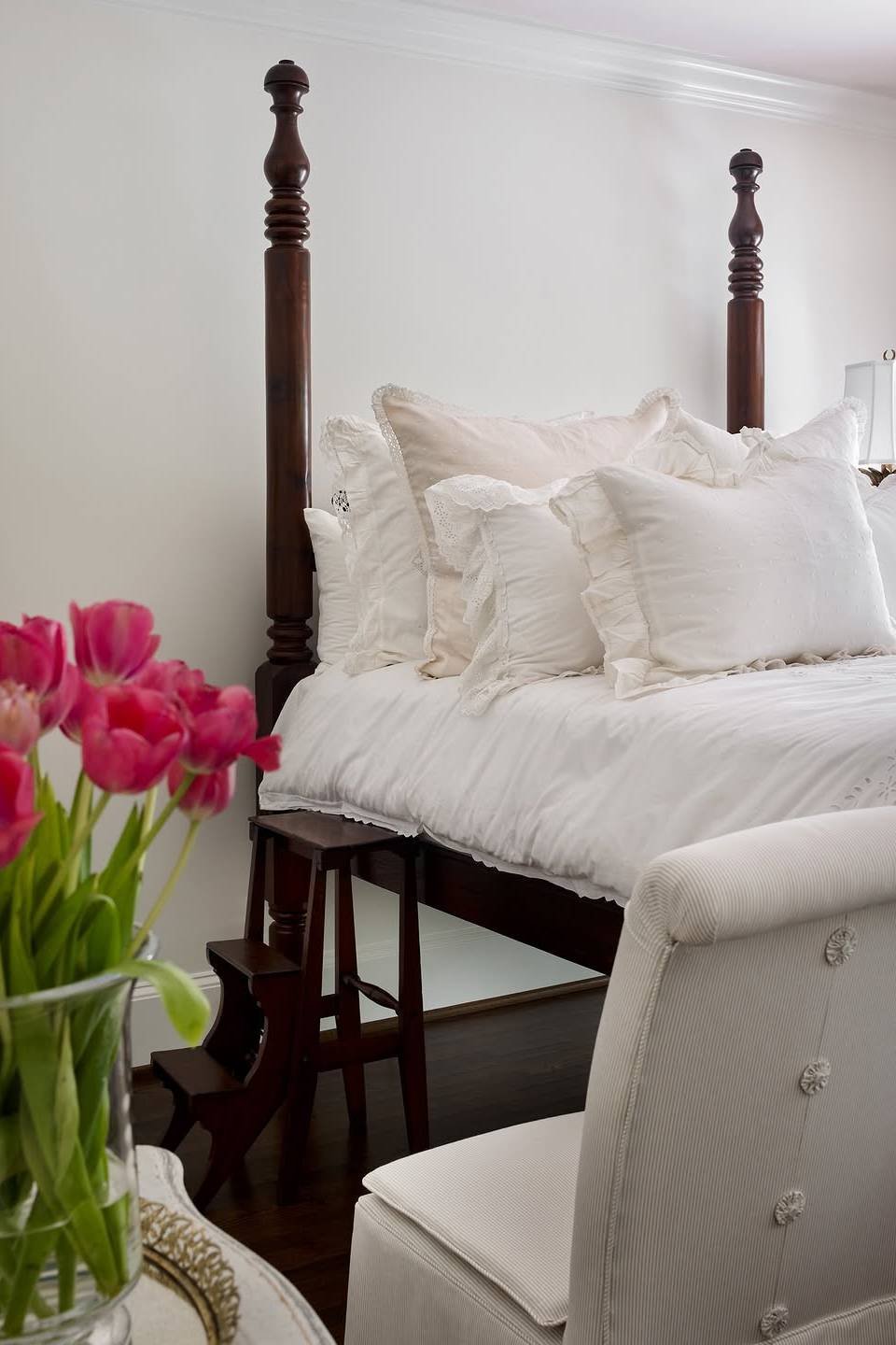
Photo: Julieanne Burch (@julieanneburch) on Instagram
16. Go Davenport Tan for a Richer Warm Neutral
Davenport Tan by Benjamin Moore is a mid-tone warm tan, and the richest beige in this guide. It has more presence than the pale greiges, so it suits a living room that needs grounding, and it pairs beautifully with cream sofas, woven textures and dark wood. This living room shows the closest match: a curved beige sectional under exposed wooden beams, with the warm tones doing all the work. Davenport Tan is the color to pick when pale neutrals feel too shy for your room.

Photo: Queen 53079 (@queen53079) on Instagram
17. Use Universal Khaki for Earthy, Grounded Rooms
Universal Khaki by Sherwin-Williams is a warm khaki with an earthy undertone, and the most grounded beige in this guide. It reads as a soft brown-gray on the wall, which makes it perfect for rooms with lots of wood, stone or woven texture, because it ties the natural materials together. This living room shows the closest version: a white sectional against warm wood wall panels, with the wood and the neutral sharing the room evenly. These cozy earthy living room ideas use the same balance of warm neutrals and natural texture.

Photo: MGBW Home (@mgbwhome) on Instagram
How Do You Build a Whole-Home Palette From the Best Neutral Paint Colors?
A whole-home palette is not one color repeated everywhere without thinking. It is one main neutral for the walls that flow together, one white for the trim and ceilings, and one deeper neutral for the accents. These minimalist living room ideas show how little a calm palette needs to feel finished.

Photo: Buttermilk Chic by Wendy (@buttermilkchic_bywendy) on Instagram
18. Run One Neutral Through the Open Spaces
The calmest homes use one wall color through every space you can see at once. In an open-plan home, that means the living room, dining area and hallway all share the same neutral, so your eye never stops at a color change. This living room shows why it works: vaulted wooden beams, a leather armchair and a stone fireplace, with the pale walls letting the architecture and the wood do the talking. Agreeable Gray and Revere Pewter are the two best choices for this job, because they hold up in both bright and dim corners of an open plan.

Photo: Lauren Ashley Elder (@laurenashleyelder) on Instagram
19. Pair Your Neutral With Revere Pewter
Pairing paint colors with Revere Pewter is the easiest way to build a palette, because Revere Pewter gets along with almost every white and beige in this guide. Use it on the walls and pair it with White Dove or Simply White on the trim, then add Pale Oak or Balboa Mist in the bedrooms for a softer version of the same warmth. This dining area shows the pairing in action: an oval wooden table with gray chairs and glass pendant lights, calm and connected to the rooms around it. The rule is simple: keep the undertone family the same, warm with warm, and the rooms will flow. Write the three colors on one card and carry it to the store.
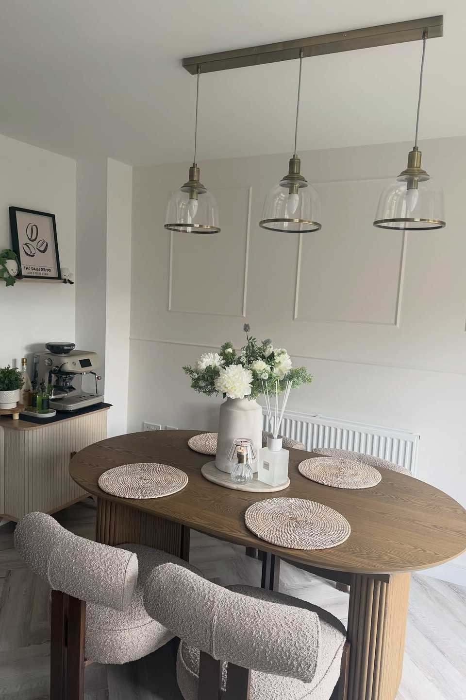
Photo: Laura (@home_at_thirtyfour_) on Instagram
20. Anchor the Palette With One Dark Neutral
Every calm palette needs one dark note, or the whole house can feel washed out. Iron Ore by Sherwin-Williams and Kendall Charcoal by Benjamin Moore are the two dark neutrals to use: a soft charcoal that reads as almost black in dim light and as a deep warm gray in daylight. Use the dark neutral in one place only, kitchen cabinets, a fireplace wall or a front door, and keep everything else pale. This kitchen shows the closest version: dark gray cabinets with a white marble island, where the dark color grounds the room and the white keeps it bright.
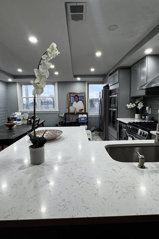
Photo: Fahda Barber (@fahdabarber1) on Instagram
21. Test the Palette Before You Commit
Choosing a paint color is the cheapest decision in decorating and the most expensive to undo, so test before you commit. Buy sample pots of your top two neutrals, paint a large swatch on the biggest wall in each room, and live with them for three days. Look at them in the morning, at noon and in the evening, with the lamps on and off, and hold your sofa fabric and your rug against them. This dining room shows the reward: a white marble table with beige chairs and a crystal chandelier, calm because every color in it was chosen to agree.
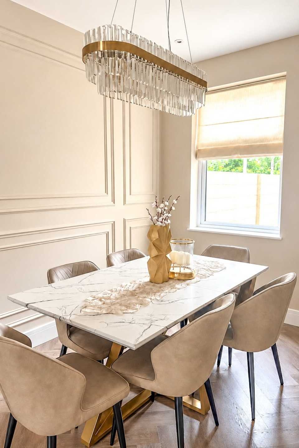
Photo: My Neutral Nest (@my_neutral_nest) on Instagram

The best neutral paint colors are not the trendiest ones. They are the ones you stop noticing, because the room feels right and the furniture, the light and the life in the house take over. If you want to see where color is heading before you settle, these 2026 paint color trends show the shades worth watching.

Photo: Industrial Farm Co (@industrialfarmco) on Instagram
💬 Join Our Decor Community
Decor Fern | Home Decor Ideas & Inspiration — share your rooms, get ideas, and chat with fellow decor lovers.
Join the Facebook GroupFollow on Facebook