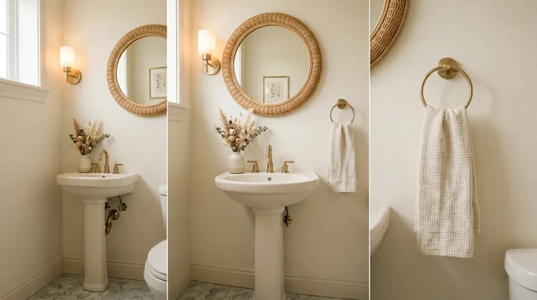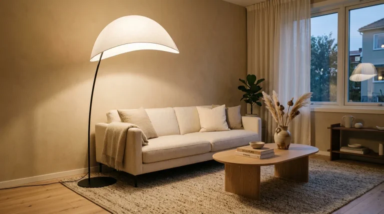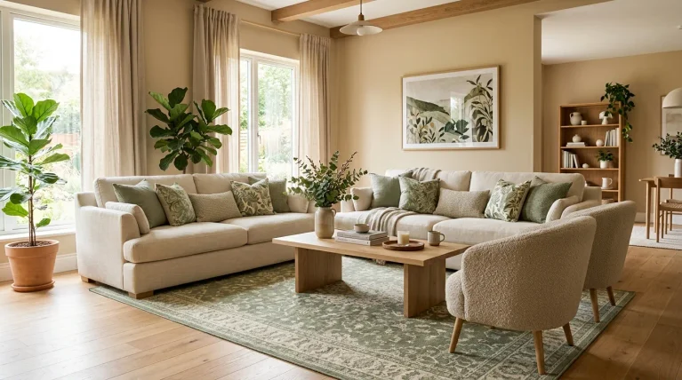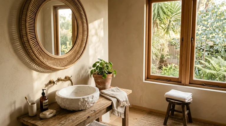
Tired of kitchens that all look the same? White walls, gray cabinets, matching everything — it gets boring fast. If you’re craving a space that actually feels like you, these maximalist kitchen ideas are exactly what you need. This style is all about layering color, pattern, and texture until a room feels rich, personal, and full of life. In my experience, most homeowners don’t need a full renovation to get there — sometimes it’s a painted pantry door or a bold backsplash that changes everything. Whether you’re planning a complete redesign or just looking for small updates, these 25 ideas offer inspiration for every budget, every kitchen size, and every level of boldness you’re ready to try.
1. Jewel-Tone Cabinets
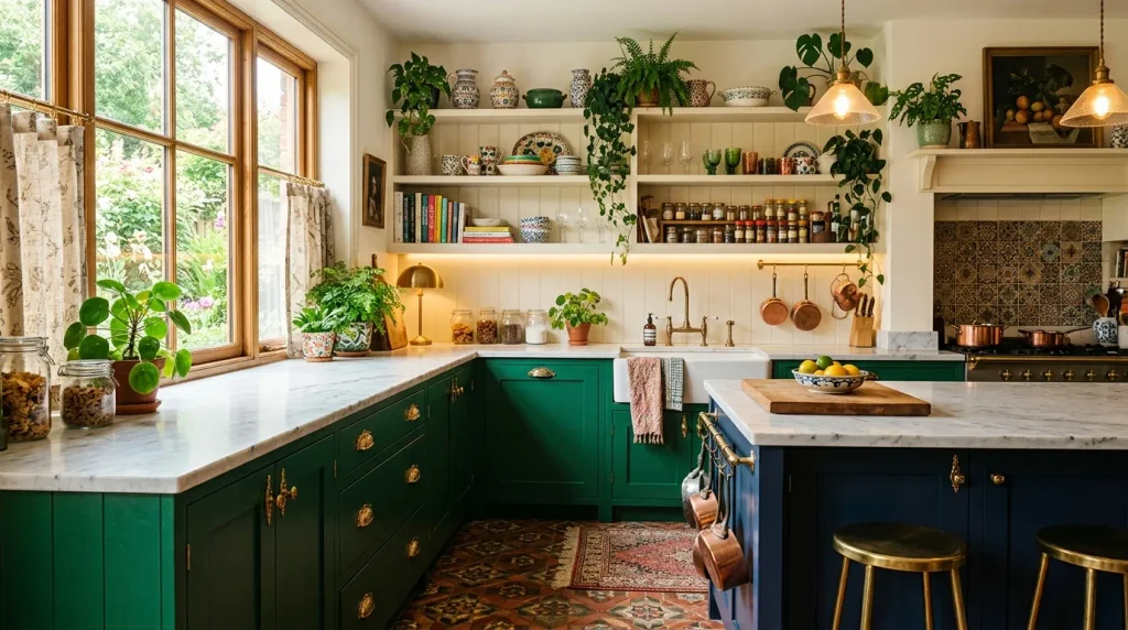
- Deep colors like emerald and sapphire add instant richness to plain cabinetry
- Works beautifully with brass or gold hardware for a luxe contrast
- Small kitchens can use one jewel-tone wall or island instead of full cabinetry
- Pairs well with warm wood accents and natural stone counters
Jewel-tone cabinets turn an ordinary kitchen into a statement space instantly. Instead of playing it safe with white or gray, deep shades like emerald, sapphire, and plum bring depth and personality to everyday cooking areas. In my experience, even one accent wall of cabinets in a bold color can shift the entire mood of a kitchen without overwhelming the space. These rich tones pair beautifully with warm lighting, creating a cozy yet sophisticated atmosphere. Homeowners drawn to maximalist kitchen ideas often start here, since color is one of the fastest ways to transform a plain layout into something memorable.
A maximalist kitchen thrives on color confidence, and jewel tones deliver that instantly. I’ve noticed that homeowners who hesitate at first often fall in love with the results once cabinets are installed, since the color reads more elegant than expected. Pairing dark cabinetry with lighter countertops or open shelving keeps the space balanced rather than heavy. Natural light plays beautifully off these saturated hues, shifting subtly throughout the day. Whether used across an entire kitchen or just a single island, jewel-tone cabinetry proves that bold color choices can feel timeless rather than trendy when balanced with the right materials.
Also Read : 23 Tropical Jungle Living Room Ideas for a Lush Retreat
2. Patterned Tile Backsplash
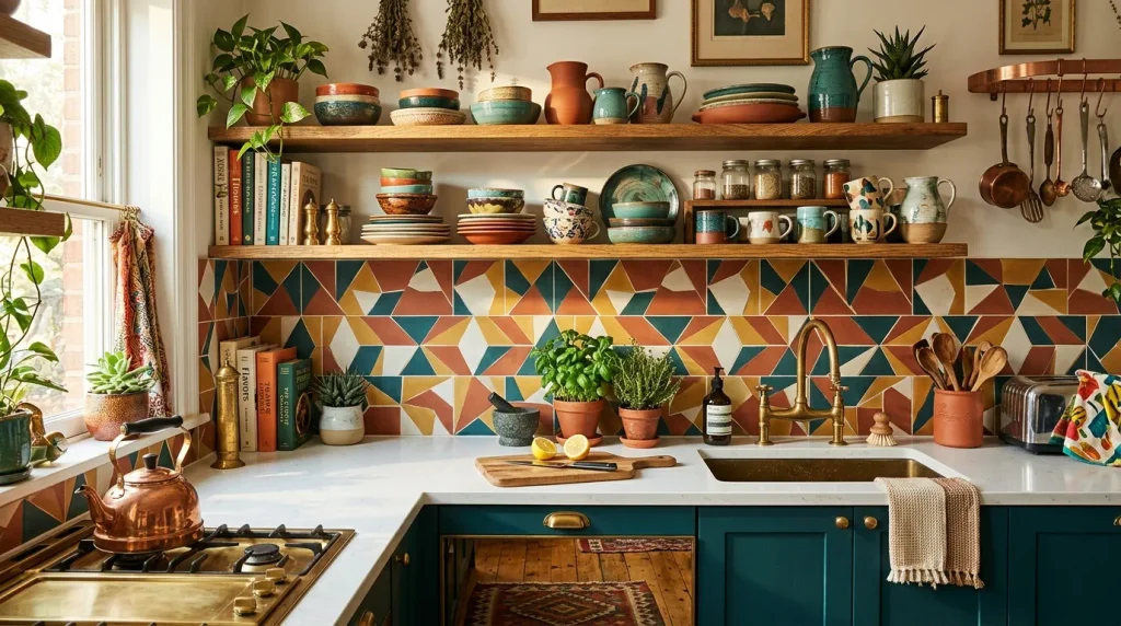
- Patterned tiles instantly become the visual centerpiece of the kitchen
- Mixing warm and cool tones keeps the palette playful without feeling chaotic
- Works well behind stoves or sinks where the eye naturally lands first
- Easy to balance with plain cabinetry so the pattern doesn’t overwhelm
A patterned backsplash is one of the easiest ways to add personality without touching cabinetry or layout. Bold tiles in geometric or floral prints instantly draw the eye and give a kitchen a handmade, curated feel. I’ve seen this work well in smaller kitchens especially, where one striking wall becomes the focal point instead of relying on furniture or accessories. Pairing patterned tile with simple countertops and neutral cabinets keeps the overall look balanced. It’s a favorite design move because it adds so much visual interest while remaining a relatively simple renovation compared to full cabinetry changes.
Beyond looks, a patterned backsplash also protects walls in high-splash zones like behind the stove or sink, making it as practical as it is beautiful. That’s why many designers recommend investing in a statement tile there first, since it delivers the biggest visual impact for a relatively small surface area. Grout lines and tile texture add subtle depth that plain paint simply cannot achieve. Over time, patterned tile tends to hide small marks or splatters better than flat surfaces, keeping the kitchen looking fresh. It’s a detail guests always notice and remember long after leaving the room.
Also Read : 23 Dark Blue Bedrooms Ideas for a Moody Stylish Retreat
3. Mixed Metal Fixtures
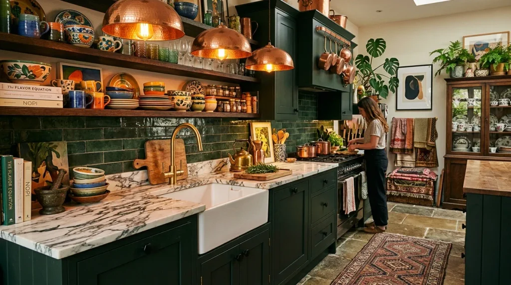
- Combining gold, black, and copper hardware adds subtle contrast without clashing
- Pendant lights in a different metal than faucets create intentional layering
- Small hardware swaps are budget-friendly ways to refresh an outdated kitchen
- Works especially well in kitchens with dark or jewel-toned cabinetry
Mixing metal finishes might sound risky, but it’s one of the simplest upgrades that instantly elevates a kitchen. Brushed gold faucets, matte black handles, and copper light fixtures can coexist beautifully when there’s a shared undertone connecting them. I’ve tried this combination in smaller kitchen renovations and noticed it adds a collected-over-time feel rather than looking like everything was bought from the same store. The key is choosing one dominant metal and letting the others act as accents. This layered approach brings warmth, texture, and visual movement to a space without requiring major structural changes.
Choosing mixed metals also gives a kitchen more flexibility over time, since future updates don’t need to match perfectly. A copper pendant light can stay even if cabinet hardware changes later, keeping renovation costs lower down the road. This approach photographs especially well too, which matters for anyone sharing kitchen inspiration online. Soft, warm lighting bounces differently off gold, black, and copper surfaces, creating subtle highlights throughout the day. For anyone exploring maximalist kitchen ideas on a budget, hardware is often the most affordable place to start before committing to bigger changes like cabinetry or flooring.
Also Read : 22 Maximalist Decor Bedroom Ideas for a Colorful Retreat
4. Layered Rugs
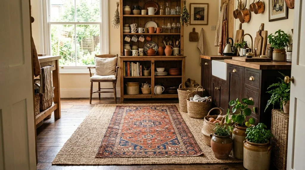
- Layering a patterned rug over a plain jute base adds texture underfoot
- Runners near sinks or stoves protect flooring while adding color
- Vintage or Persian-style patterns bring instant warmth to tile or wood floors
- Easy to swap seasonally without committing to permanent flooring changes
Layered rugs bring softness and personality to a room that’s often dominated by hard surfaces like tile, stone, or wood. A jute or woven base rug grounds the space, while a smaller patterned runner adds color and visual interest on top. I’ve noticed this combination works particularly well in galley-style kitchens, where a single long runner can transform the whole walkway. Beyond aesthetics, rugs also make standing at the counter more comfortable during long cooking sessions. This layering technique is affordable, low-commitment, and easy to change whenever the space needs a refresh.
Rugs also help define zones within an open kitchen, especially where cooking and dining areas blend together without walls. A rug placed under a kitchen island or breakfast nook subtly signals a separate function within the same room. That’s why many designers recommend layering textures here rather than relying on furniture alone to create boundaries. Patterned runners hide daily wear better than solid colors, which matters in a space that sees constant foot traffic. Choosing washable or low-pile options keeps maintenance simple while still delivering the rich, collected look maximalist spaces are known for.
ALso Read : 23 Masculine Home Office Ideas for a Stylish Workspace
5. Bold Ceiling Color
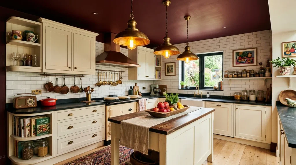
- Painting the ceiling adds a fifth wall of color and drama
- Deep tones like burgundy or navy make low ceilings feel intentional, not cramped
- Balances well against lighter cabinetry and flooring below
- A high-impact change that avoids the cost of full room renovation
Painting the ceiling is often called the fifth wall, and in a maximalist kitchen it becomes one of the boldest design moves available. A deep burgundy, navy, or forest green overhead instantly adds drama and draws the eye upward. In my experience, this works especially well in kitchens with lower ceilings, since a dark hue paired with warm lighting makes the space feel cozy rather than closed in. It’s a relatively low-cost change compared to renovating cabinetry or flooring, yet the visual payoff is significant. This single decision can redefine the entire personality of the room.
The contrast between a bold ceiling and lighter walls or cabinetry keeps the look balanced rather than heavy. Brass or warm-toned lighting fixtures enhance the richness of a painted ceiling, especially during evening hours when the glow reflects off the color above. I’ve seen this work well in older homes with character details like crown molding, where the paint highlights architectural features that often get overlooked. For anyone hesitant about full-room color commitment, starting with the ceiling offers drama without permanence, since it can always be repainted later if preferences change over time.
Also Read : 24 Cherry Red Room Ideas for a Bold Stylish Home
6. Statement Kitchen Island
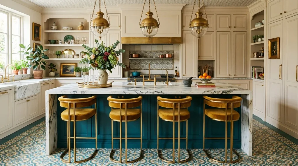
- Painting the island a contrasting color instantly makes it the room’s centerpiece
- Waterfall countertops add a sculptural, high-end visual effect
- Barstools in brass or patterned fabric tie the color story together
- Works as a focal point even in otherwise neutral kitchens
A statement island anchors the entire kitchen and gives homeowners permission to experiment with color in one contained area. Painting it teal, navy, or even a rich plum against neutral surrounding cabinetry creates instant contrast and visual weight. I’ve tried this approach in kitchens that felt flat and found it completely changes how the room reads, even without touching walls or flooring. Adding a waterfall countertop edge enhances the sculptural feel, making the island look custom-built. This is one of the most popular maximalist kitchen ideas because it delivers maximum impact while keeping the rest of the space easy to manage.
Beyond visual drama, a statement island also naturally becomes the gathering point for guests during cooking or entertaining. Barstools upholstered in bold fabric or finished in warm metal tones tie the color scheme together without requiring matching everything else in the room. That’s why many designers recommend starting design decisions at the island before finalizing wall colors or backsplash choices. It’s the piece most people interact with daily, so the investment tends to feel worthwhile long-term. A well-designed island balances beauty with function, offering storage, seating, and personality in a single furniture piece.
Also Read : 23 Moody Farmhouse Kitchen Ideas for a Cozy Rustic Space
7. Open Shelving Display
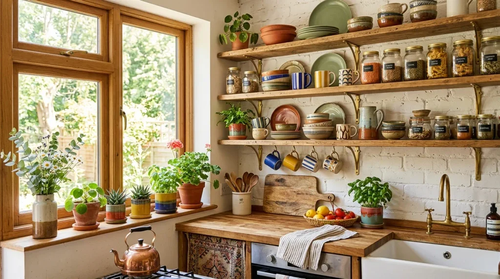
- Open shelves turn everyday dishware into part of the room’s decor
- Mixing colors, shapes, and textures creates a curated, collected-over-time look
- Great for displaying vintage or thrifted pieces that add character
- Keeps frequently used items accessible while adding visual warmth
Open shelving invites homeowners to treat their dishware as decoration rather than something hidden behind closed doors. Colorful plates, patterned bowls, and glass jars become part of the room’s visual story when arranged thoughtfully on wood or metal brackets. I’ve noticed that mixing heights and textures, like stacking plates next to a trailing plant, gives shelves a natural, unforced look. This approach also encourages more intentional buying, since new dishware becomes a design choice as much as a practical one. It’s a simple shift that adds warmth and personality without any structural renovation involved.
Beyond aesthetics, open shelving keeps everyday items within easy reach, which makes cooking and cleanup noticeably more convenient. Grouping items by color or category, rather than by size alone, creates a more visually pleasing arrangement that still functions well. I’ve seen this work particularly well in kitchens with limited cabinet space, since it turns a practical necessity into an intentional design feature. Natural light enhances the display further, casting soft shadows across ceramics throughout the day. For anyone drawn to maximalist kitchen ideas but hesitant about bold paint, open shelving offers a lower-commitment way to introduce color and texture.
8. Vintage Light Fixtures

- Vintage fixtures add instant character that new lighting often lacks
- Mixing chandelier and pendant styles creates layered, ambient lighting
- Thrifted or antique pieces add history and uniqueness to modern kitchens
- Warm bulb tones enhance the cozy, collected feel of the room
Vintage light fixtures bring a sense of history into a kitchen that new, mass-produced lighting simply can’t replicate. An ornate brass chandelier or an antique glass pendant introduces texture and story, especially when paired with warm amber bulbs. I’ve tried sourcing these pieces from flea markets and estate sales, and the character they bring is always worth the extra search time. Unlike matching lighting sets sold in stores, vintage pieces feel personal and specific to the home they’re placed in. This small detail often becomes a conversation starter for anyone visiting the space.
Layering different vintage fixtures throughout a kitchen, such as a chandelier over the table and pendants above the counter, creates depth that a single overhead light never achieves. That’s why many designers recommend mixing lighting types rather than relying on one uniform style throughout the room. Warm-toned bulbs enhance brass, copper, and gold finishes especially well, casting a soft glow that flatters both the fixtures and the surrounding decor. For anyone building out maximalist kitchen ideas gradually, lighting is an easy category to collect piece by piece without needing to finish the whole room at once.
9. Wallpapered Accent Wall
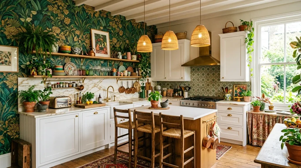
- A wallpapered accent wall adds pattern without overwhelming the whole room
- Botanical or floral prints bring life and color into cooking spaces
- Pairs well with neutral cabinetry to keep the space balanced
- Removable wallpaper makes this an easy, renter-friendly design choice
A wallpapered accent wall is one of the most transformative additions a kitchen can receive without any major construction work. Bold botanical prints or rich geometric patterns instantly give a plain wall personality and depth. In my experience, choosing just one wall rather than the entire room keeps the space feeling intentional instead of overwhelming. This works especially well behind open shelving or a dining nook, where the pattern has room to breathe. Removable wallpaper options also make this an accessible upgrade for renters who still want the maximalist look without permanent changes.
Pairing a patterned wall with simpler cabinetry and countertops keeps the overall design balanced and visually digestible. I’ve seen this work well in kitchens that felt sterile or unfinished, since the wallpaper immediately adds warmth and character to an otherwise plain space. Natural light interacts beautifully with metallic or botanical prints, shifting the mood throughout the day. For homeowners exploring maximalist kitchen ideas without committing to full renovations, wallpaper offers one of the highest visual returns for a relatively small and reversible investment.
10. Colorful Range Hood
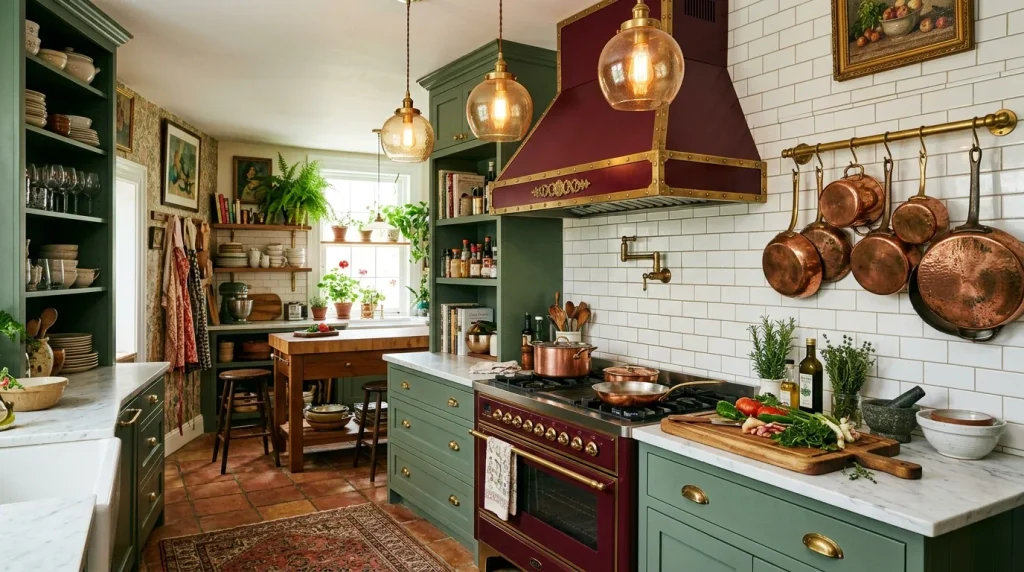
- A painted range hood becomes a natural focal point above the stove
- Brass or gold trim adds a finished, custom-built appearance
- Works well as a color anchor even when surrounding cabinets stay neutral
- A smaller surface area makes bold color choices feel less risky
The range hood is often overlooked, yet it sits at eye level and naturally draws attention above the stove. Painting it a rich color like burgundy, forest green, or navy instantly turns a functional appliance cover into a design feature. I’ve tried this in kitchens where the surrounding cabinetry stayed neutral, and the hood alone was enough to give the whole room personality. Adding trim or molding details around the edges makes it look custom-built rather than store-bought. It’s a smaller commitment than painting full cabinetry, which makes it approachable for first-time colorful kitchen ideas.
Because the range hood covers a relatively small surface, it’s an ideal place to experiment with bold colors without overwhelming the whole kitchen. Pairing it with warm metal trim, like brass or copper, enhances the custom, high-end feel even on a modest budget. I’ve seen this work well in kitchens undergoing partial updates, since the hood can be repainted long before cabinetry needs replacing. This detail also photographs beautifully, which matters for anyone documenting their renovation journey online. It’s a small design move with a surprisingly large visual return.
11. Terracotta Accents
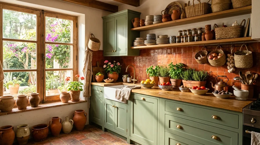
- Terracotta tones bring warmth without feeling as bold as jewel colors
- Clay pots and pottery add texture alongside color
- Pairs beautifully with sage green, cream, and warm wood finishes
- Creates a Mediterranean-inspired mood that feels timeless rather than trendy
Terracotta accents bring an earthy, sun-warmed quality into a kitchen that softer colors often can’t achieve. Clay pots, rust-toned tiles, and warm ceramic dishware introduce color in a way that feels grounded rather than overwhelming. I’ve noticed this palette works particularly well for homeowners who love bold design but want something that still feels calm and livable day to day. Terracotta pairs naturally with sage green, cream, and warm wood tones, creating a Mediterranean-inspired warmth throughout the room. It’s a versatile starting point for anyone easing into more colorful kitchen ideas gradually.
This earthy palette also tends to age well, avoiding the trend-driven feel that some bolder color choices can carry over time. Layering terracotta pottery on open shelves alongside woven baskets and wooden utensils adds texture that complements the warm tones beautifully. That’s why many designers recommend terracotta as an entry point into maximalism, since it bridges neutral and bold aesthetics comfortably. Natural light enhances these warm hues throughout the day, casting a soft golden glow across the kitchen. It’s a grounded, textural approach to color that feels both fresh and enduring.
12. Curtain Under Sink
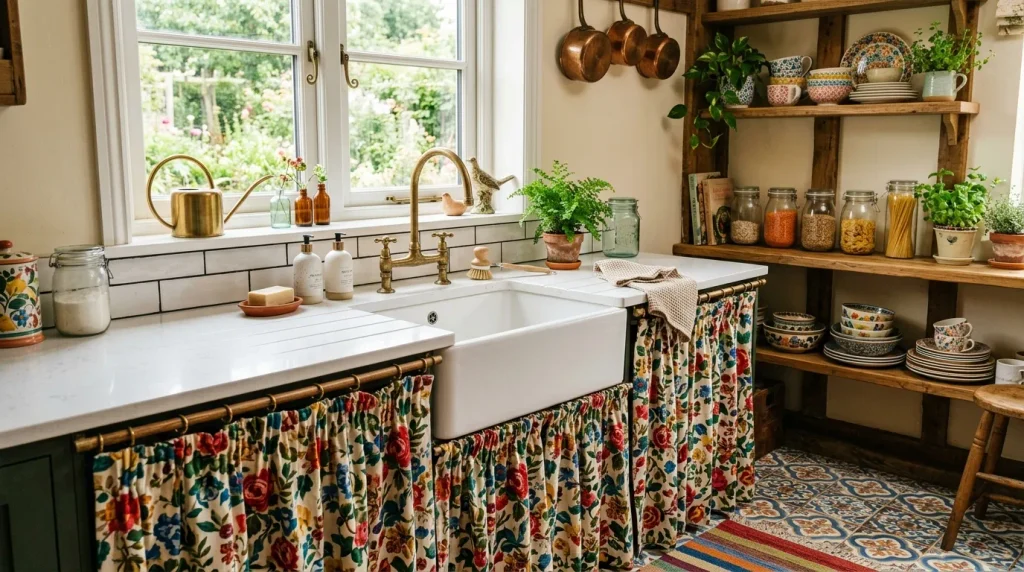
- A fabric curtain under the sink softens hard cabinetry lines
- Floral or patterned fabric adds texture in an unexpected spot
- Easy, affordable swap that doesn’t require removing cabinet doors
- Brings a cottagecore or vintage touch to modern kitchen layouts
Swapping cabinet doors under the sink for a gathered fabric curtain is a small but distinctly charming design choice. Bold floral or patterned fabric softens what’s usually the hardest, most utilitarian corner of the kitchen. I’ve tried this in older homes with mismatched cabinetry, and the curtain instantly became a cohesive design element rather than drawing attention to outdated doors. It’s also one of the most affordable updates on this list, since it requires only fabric, a tension rod, and basic sewing or no-sew methods. This detail brings a nostalgic, cottage-style charm into otherwise modern layouts.
Beyond looks, a curtain is easier to open and close than heavy cabinet doors, making it a practical choice for frequently accessed cleaning supplies. I’ve seen this work well in rental kitchens especially, since it requires no permanent alterations and can be removed entirely when moving out. Choosing a fabric that echoes other patterns in the room, like a backsplash or rug, ties the whole space together visually. For anyone building out maximalist kitchen ideas piece by piece, this is one of the simplest and most budget-friendly places to start experimenting with pattern.
13. Gallery Wall Kitchen
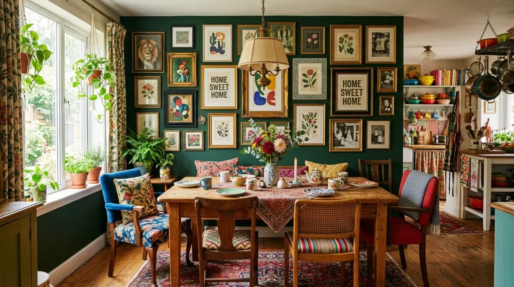
- A gallery wall brings color and personality into an often-overlooked dining nook
- Mixing frame styles and sizes creates a collected, personal feel
- Works well above a banquette or breakfast table for a cozy focal point
- Easy to rearrange or expand over time as new pieces are found
A gallery wall turns a blank dining nook into one of the most personal corners of the entire kitchen. Mixing framed prints, family photos, and small art pieces in varied frame styles creates a layered look that feels collected rather than staged. I’ve noticed that homeowners often start with just three or four pieces and slowly build the wall over months or years, which adds to its authentic charm. Placing it above a breakfast table or window seat gives the eye somewhere warm to land during meals. This detail turns an ordinary eating space into a genuinely memorable part of the home.
Choosing frames in varying but complementary metals, like gold and black together, keeps the wall feeling intentional even with mismatched art styles. That’s why many designers recommend starting with a loose layout on the floor before committing to nail placement on the wall. Deep wall colors behind the gallery, such as forest green or navy, help the frames stand out with more contrast and depth. I’ve seen this work beautifully in smaller kitchens, where the dining nook becomes the most expressive part of an otherwise compact layout. It’s a flexible, ever-evolving design feature.
14. Checkerboard Flooring
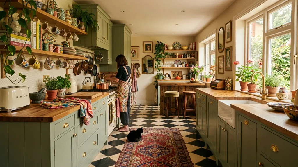
- Checkerboard flooring adds graphic pattern that anchors the entire room
- Classic black and cream feels timeless, while colorful versions feel playful
- Pairs well with both vintage and modern cabinetry styles
- A bold flooring choice that reduces the need for extra pattern elsewhere
Checkerboard flooring instantly gives a kitchen a strong graphic foundation that ties the entire room together. Whether done in classic black and cream or a more playful color combination, this pattern adds movement and structure underfoot. In my experience, homeowners who choose checkerboard flooring often simplify other elements in the room, since the floor alone provides enough visual interest. It works beautifully with both vintage-style cabinetry and cleaner, more modern finishes, making it a surprisingly versatile choice. This flooring pattern has remained popular for decades because it never quite goes out of style.
Because checkerboard flooring carries so much visual weight, it pairs best with simpler wall colors and cabinetry to avoid competing patterns. I’ve seen this work particularly well in kitchens that wanted a bold statement without introducing multiple colors throughout the space. Adding a runner rug in a muted, textured fabric softens the graphic pattern underfoot while still letting the tile shine. This flooring choice also tends to hide daily scuffs and marks better than solid-colored tile, which matters in a high-traffic cooking space. It’s a design decision that balances drama with everyday practicality.
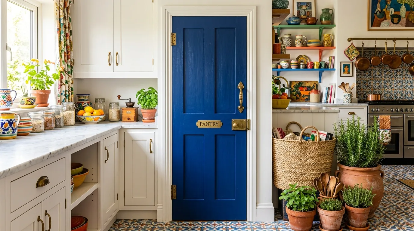
15. Colorful Pantry Door
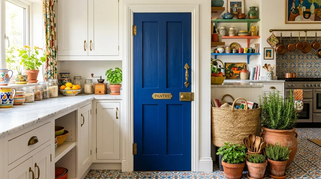
- A painted pantry door adds color in a contained, low-risk way
- Brass or gold hardware enhances the finished, custom look
- Works as a surprising pop of color in otherwise neutral kitchens
- Small surface area makes bold shades feel approachable, not overwhelming
A painted pantry door is one of the easiest ways to introduce bold color into a kitchen without committing to a full renovation. Cobalt blue, deep red, or bright yellow against otherwise neutral cabinetry creates a cheerful surprise every time the door catches the eye. I’ve tried this approach in kitchens where homeowners wanted color but felt nervous about painting entire cabinet runs. Because the door is a single, contained surface, it delivers impact without financial or design risk. Updating the hardware to brass or gold afterward completes the look with a polished, intentional finish.
This small-scale color experiment often gives homeowners the confidence to introduce more color elsewhere in the home over time. I’ve seen this work well as a starting point for maximalist kitchen ideas, since it proves how much personality a single door can add to a room. Pairing the painted door with woven textures, like baskets or a jute mat nearby, softens the boldness and keeps the area feeling warm rather than stark. It’s a low-cost, high-impact project that can typically be completed in a single weekend with minimal tools.
16. Botanical Kitchen Corner
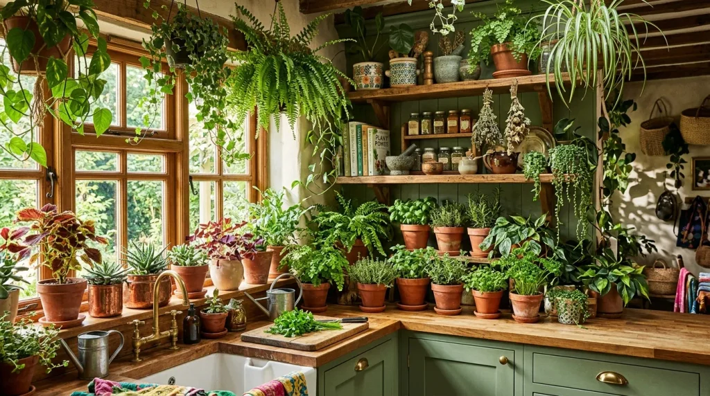
- A dedicated plant corner brings life and movement into the kitchen
- Trailing vines and herbs soften hard lines from cabinetry and counters
- Terracotta planters tie naturally into warm, earthy color palettes
- Fresh herbs double as functional decor for everyday cooking
A botanical corner turns unused kitchen space into one of the most alive, welcoming parts of the room. Trailing pothos, potted herbs, and hanging greenery add movement and softness that hard surfaces like tile and countertop simply can’t provide. I’ve noticed that even a small cluster of three or four plants near a sunny window can completely change how a kitchen feels day to day. Beyond looks, fresh herbs like basil or rosemary add function, letting the greenery double as an ingredient source. This corner becomes a small daily ritual for anyone who enjoys tending to plants while cooking.
Grouping plants at varying heights, using stands, hanging planters, and shelf placement, creates a fuller, more layered look than a single potted plant alone. That’s why many designers recommend building a plant corner gradually, adding new pots as the collection grows rather than buying everything at once. Terracotta and ceramic planters in warm tones tie beautifully into earthy kitchen palettes already featuring wood or clay accents. I’ve seen this work especially well near windows with strong natural light, where plants thrive and the greenery catches soft daytime glow throughout the room.
17. Scalloped Shelf Edges
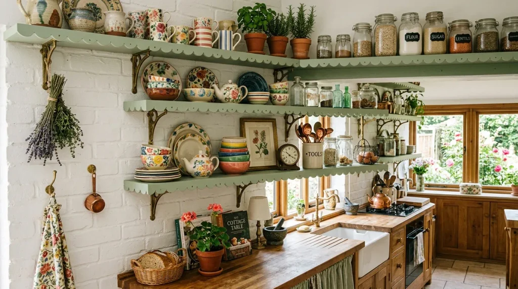
- Scalloped edges add a soft, decorative detail to plain open shelving
- Painting the trim a contrasting color highlights the shape further
- A small architectural detail that feels custom and intentional
- Pairs beautifully with vintage dishware and cottage-style kitchens
Scalloped shelf edges take an ordinary open shelf and turn it into a genuinely decorative feature. This simple trim detail, often added with basic scalloped molding, brings a soft, whimsical touch that straight-edged shelves lack entirely. I’ve tried adding this to plain builder-grade shelving, and the transformation felt disproportionately large compared to the small effort involved. Painting the scalloped trim in a contrasting color, like sage against white walls, makes the detail pop even further. It’s a favorite among cottage-style and vintage-inspired kitchens looking for charm in small architectural touches.
This detail works especially well because it draws attention to whatever is displayed on the shelf below it, whether that’s colorful ceramics or glass jars. I’ve seen this work beautifully in kitchens that wanted character without a full renovation, since scalloped trim can be added to existing shelving with basic tools. Pairing it with brass brackets enhances the vintage, custom-built feel even further. For anyone exploring maximalist kitchen ideas through small, achievable projects, this detail offers a big personality boost for a relatively modest amount of time and materials.
18. Two-Tone Cabinetry
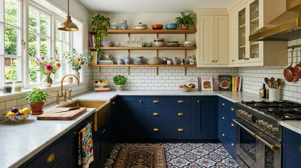
- Two-tone cabinetry adds contrast without overwhelming the entire kitchen
- Dark lower cabinets ground the room while lighter uppers keep it airy
- Brass or gold hardware ties both tones together seamlessly
- A flexible approach that works in both large and small kitchens
Two-tone cabinetry offers a middle ground between an all-neutral kitchen and a fully bold, colorful one. Pairing deep navy or forest green lower cabinets with lighter cream or white uppers creates contrast while still keeping the space feeling open and airy. In my experience, this approach works particularly well in smaller kitchens, since the lighter upper cabinets prevent the room from feeling visually heavy or closed in. The color division also draws the eye naturally through the room, adding structure without needing extra decor elements. It’s one of the most versatile maximalist kitchen ideas available today.
Choosing one consistent hardware finish, like brushed brass, across both cabinet tones helps unify the look rather than making it feel like two separate design choices. I’ve seen this work particularly well in kitchens undergoing partial renovations, since only the lower cabinets typically need replacing or repainting. Marble or quartz countertops in soft, neutral tones bridge the two colors beautifully, adding a polished finish. This layered cabinetry approach proves that bold design doesn’t require covering every surface in color, just enough contrast to create visual interest and depth.
19. Bold Window Trim
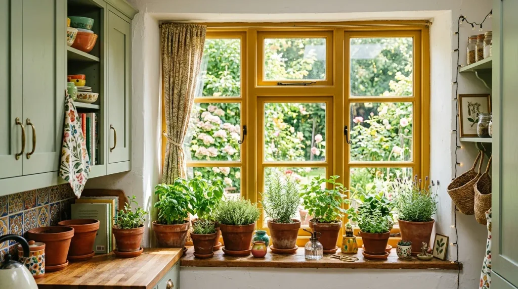
- Painted window trim adds a pop of color without repainting entire walls
- Mustard, terracotta, or deep red trim frames natural light beautifully
- A small, affordable detail that photographs especially well
- Works in both large and small kitchens without overwhelming the space
Painting window trim in a bold color is one of the smallest changes that delivers a surprisingly large visual reward. A mustard yellow or terracotta frame around a kitchen window instantly draws the eye and highlights natural light in a way plain white trim never could. I’ve tried this in kitchens where full wall color felt like too big a commitment, and the trim alone added enough personality to satisfy that craving for color. It also frames whatever sits on the windowsill, whether that’s herbs, ceramics, or small plants, giving that little vignette extra visual weight throughout the day.
Because window trim covers such a small surface area, it’s one of the lowest-risk ways to experiment with color before committing to anything larger. That’s why many designers recommend starting here for anyone nervous about painting full cabinetry or walls. I’ve seen this work particularly well in rental kitchens too, since trim paint is relatively easy to reverse if needed later. Pairing bold trim with a simple herb garden on the sill ties the color choice back to function, not just decoration, making the whole corner feel purposeful and alive.
20. Mismatched Dining Chairs
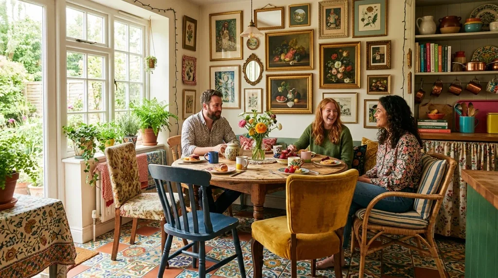
- Mismatched chairs create a collected-over-time look instead of a matching set
- Mixing materials like rattan, velvet, and wood adds textural variety
- An affordable way to furnish a dining nook using thrifted pieces
- Ties together beautifully when chairs share a common color thread
Mismatched dining chairs bring an effortless, collected charm that a matching furniture set simply can’t replicate. Combining a rattan chair, a velvet-upholstered seat, and a simple wooden one around the same table creates textural variety that feels curated rather than accidental. I’ve noticed that the easiest way to unify mismatched pieces is choosing a shared color thread, even if the materials themselves differ completely. This approach also makes furnishing a dining nook far more affordable, since chairs can be sourced individually from thrift stores or secondhand sales rather than purchased as an expensive matching set all at once.
Beyond budget benefits, mismatched chairs allow a dining space to evolve naturally over months or years as new pieces are found. That’s why many designers recommend starting with just one statement chair and building the collection slowly rather than furnishing everything at once. I’ve seen this work particularly well in eclectic, maximalist kitchens where the dining nook already features bold wallpaper or a gallery wall, since the chairs add one more layer of personality. The result feels lived-in, personal, and far more interesting than a uniform dining set ever could.
21. Colorful Ceiling Beams
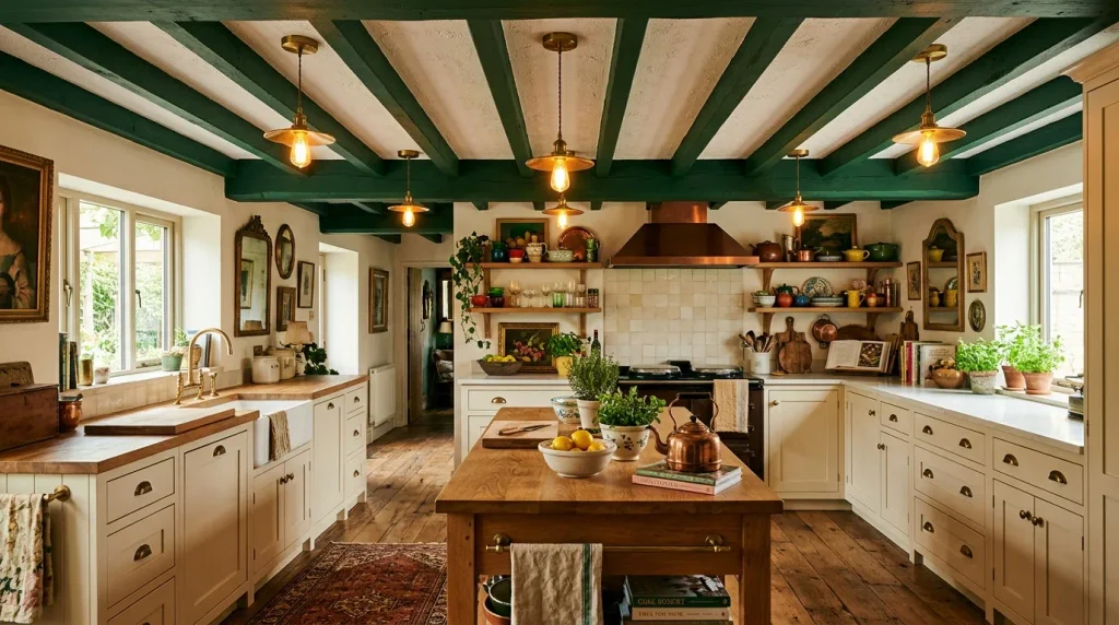
- Painted ceiling beams add architectural drama without full ceiling color
- Deep tones like forest green or navy make beams the room’s focal point
- Works especially well in kitchens with exposed or faux wood beams
- Balances beautifully against lighter walls and cabinetry below
Painted ceiling beams give a kitchen architectural drama that a flat, single-color ceiling can’t achieve on its own. Coloring exposed beams in forest green or navy against a white ceiling creates striking contrast and draws the eye upward in a way that feels intentional and custom-designed. I’ve tried this in kitchens with existing wood beams that had gone unnoticed for years, and painting them completely changed how the whole room read. This technique also works with faux beams added specifically for this purpose, making it accessible even in newer homes without original architectural detail.
The contrast between bold beams and a lighter ceiling background keeps the look dramatic without feeling overwhelming or too dark overall. Brass or warm-toned pendant lighting hung between the beams enhances the richness of the color, especially as the light catches the paint from different angles throughout the day. I’ve seen this work particularly well in kitchens with vaulted or slightly higher ceilings, where the beams add structure that a plain ceiling would otherwise lack. It’s a striking detail that consistently draws attention in maximalist kitchen ideas.
22. Striped Accent Wall
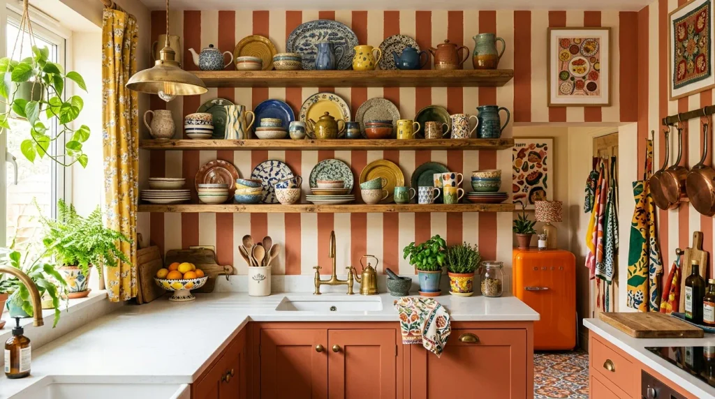
- Striped walls add graphic movement without needing wallpaper installation
- Wide, hand-painted stripes feel more custom than thin, uniform lines
- Works well behind open shelving or a breakfast nook
- Pairs beautifully with warm, earthy color combinations
A striped accent wall brings graphic energy into a kitchen using nothing more than paint, tape, and a little patience. Wide stripes in terracotta and cream feel warm and hand-crafted, especially when the lines aren’t perfectly uniform. I’ve tried this technique in kitchens without the budget for wallpaper, and the result looked surprisingly custom once finished. Choosing one wall, rather than the whole room, keeps the pattern feeling intentional instead of busy. This detail works especially well behind open shelving, where the stripes peek through gaps between displayed dishware and add extra depth.
Stripes also make a small kitchen feel more dynamic, since the repeating pattern draws the eye across the room rather than letting it settle on one flat surface. That’s why many designers recommend horizontal stripes for visually widening a narrow galley kitchen. I’ve seen this work particularly well paired with warm, earthy tones like terracotta and cream, which feel playful without veering into overly bold territory. It’s an affordable weekend project that delivers a genuinely custom, boutique-style finish for a fraction of the cost of wallpaper or tile.
23. Colorful Bar Stools

- Colorful bar stools add personality without repainting the whole island
- Mixing shades like mustard, teal, and terracotta creates playful contrast
- Easy to update or replace as trends and preferences change
- Works well even in otherwise neutral kitchen color schemes
Colorful bar stools are one of the simplest furniture updates that instantly energizes a kitchen island or counter seating area. Choosing stools in mustard, teal, or terracotta upholstery adds a playful pop of color, even when the surrounding cabinetry stays completely neutral. I’ve noticed that mixing two or three complementary colors across stools, rather than choosing one uniform shade, creates a more collected and lived-in feel. Because stools are freestanding furniture rather than a fixed renovation, they’re also one of the easiest elements to update whenever a homeowner wants to refresh the space.
This flexibility makes colorful stools a low-risk entry point into bolder maximalist kitchen ideas for anyone hesitant about permanent color choices. I’ve seen this work particularly well in rental kitchens, since stools can move with a tenant from one home to the next. Pairing upholstered stools with warm pendant lighting above enhances their color even further, especially during evening hours. For a relatively small investment, this update brings noticeable warmth and personality to what’s often the most-used seating area in the entire kitchen.
24. Framed Kitchen Mirror
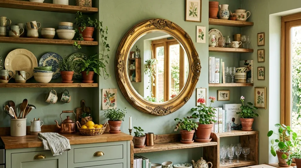
- A framed mirror bounces natural light deeper into the kitchen
- Ornate or vintage frames add unexpected elegance to a cooking space
- Works well on an otherwise blank wall near a window or shelf
- Creates the illusion of a larger, brighter room
A framed mirror might not be the first thing people think of for kitchen decor, but it’s a detail that adds both light and elegance. Placing a round mirror in an ornate gold frame near a window bounces natural light deeper into the room, brightening corners that might otherwise feel dim. I’ve tried this in smaller kitchens specifically, and the mirror genuinely made the space feel larger and more open. Beyond function, an unexpected mirror also adds a layer of unexpected sophistication that most people don’t associate with kitchen design at all.
Choosing a frame that echoes other metal finishes in the room, like brass hardware or pendant lighting, ties the mirror into the existing color story rather than making it feel out of place. I’ve seen this work particularly well on blank walls near open shelving, where the reflection adds visual depth to displayed dishware and ceramics. This detail is especially useful in kitchens without much natural light to begin with, since the mirror maximizes whatever brightness is already available. It’s a small addition with a genuinely noticeable impact.
25. Layered Textiles
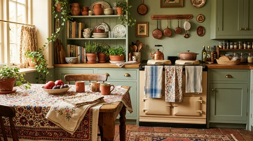
- Layered textiles like tablecloths and towels add color without permanent changes
- Mixing prints on napkins and towels creates a curated, collected feel
- Easy to rotate seasonally for a quick, low-cost refresh
- Adds softness that balances hard surfaces like tile and countertop
Layered textiles are often the final, finishing touch that pulls an entire maximalist kitchen together. A patterned tablecloth, mismatched napkins, and a draped tea towel introduce color and softness in a way that hard surfaces like countertops and tile simply cannot provide. I’ve noticed that even a single bold tablecloth can visually unify a room that otherwise features several different colors across cabinetry, walls, and flooring. Because textiles are inexpensive and easy to swap, this is one of the lowest-risk ways to experiment with new patterns before committing to anything permanent elsewhere in the kitchen.
Rotating textiles seasonally, like switching to warmer tones in autumn or brighter prints in summer, keeps a kitchen feeling fresh without any real renovation involved. That’s why many designers recommend textiles as the last layer added to a space, since they’re easiest to adjust once everything else is finished. I’ve seen this work particularly well in kitchens that already have strong color foundations, since the textiles simply reinforce and soften what’s already there. It’s a small, affordable detail that consistently makes a maximalist kitchen feel finished, warm, and genuinely lived-in.
Conclusion
A kitchen doesn’t have to stay plain to feel functional. These maximalist kitchen ideas prove that color, pattern, and personality can turn an everyday cooking space into a room you genuinely love spending time in. I’ve seen how small changes like these can completely transform a space, often faster and cheaper than people expect. You don’t need to try all 25 at once — start with one idea that excites you, whether it’s a bold ceiling color or a curtain under the sink, and build from there. Save this post to Pinterest for later, and share it with anyone ready to bring more color into their kitchen.