Ever stare at a blank chalkboard and freeze up, unsure what to draw? That’s more common than you’d think. Summer chalkboard ideas are the perfect fix, giving you simple, ready-to-copy designs that instantly make any space feel warmer and more inviting. This list was built for real homes, cafés, and porches, not professional art studios, so every idea here is genuinely doable. I’ve noticed the boards people love most are rarely the fanciest ones, they’re the ones that feel personal and inviting. Whether you want something bold and colorful or soft and minimal, you’ll walk away from this list with practical, easy-to-recreate ideas you can start using today.
1: Beach Sunset Palette
- Warm oranges and soft pinks instantly bring a beachy summer mood to any chalkboard
- Works great for cafés, porches, or kitchen menus wanting a relaxed coastal feel
- Simple palm tree silhouette adds visual interest without complicated drawing skills
- Gradient shading between colors gives the board a professional, polished look
- I’ve noticed this palette photographs beautifully for social media and Pinterest saves
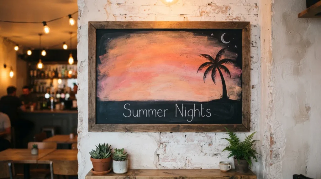
Nothing captures summer quite like a chalkboard blended with sunset colors. Warm orange, soft pink, and a touch of coral chalk create a gradient that instantly feels relaxed and inviting. This look works beautifully for cafés, porches, or kitchen walls where you want a cozy coastal mood without much effort. In my experience, blending colors with a slightly damp cloth or your fingertip gives the smoothest transition and avoids harsh lines. A simple palm tree silhouette or a few birds in the distance finishes the scene without requiring advanced drawing skills, making this one of the easiest summer chalkboard ideas to recreate at home.
This sunset-inspired look does more than decorate — it sets a mood the moment someone walks in. Warm color palettes feel welcoming and calm, which is exactly why so many coffee shops and porches lean into this style during warmer months. I’ve seen this work well even on small chalkboards, where just a strip of gradient color along the bottom edge is enough to transform the whole board. Pair it with simple lettering like “Summer Nights” or “Golden Hour” and you get a display that feels seasonal, personal, and genuinely photo-worthy for anyone scrolling past it.
Also Read : 22 Black Fireplace Ideas for a Bold Modern Living Room
2: Tropical Fruit Doodles
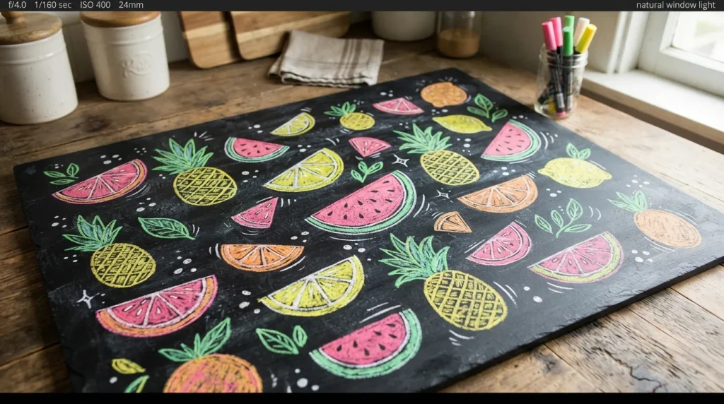
- Cute fruit icons like watermelon, pineapple, and citrus slices add instant charm
- Great for kitchen boards, party décor, or drink menus during summer months
- Doodle-style drawing keeps this idea beginner-friendly and quick to complete
- Bright colored chalk pens make the fruits pop against the dark background
- Easy to mix and match fruits depending on the season or occasion
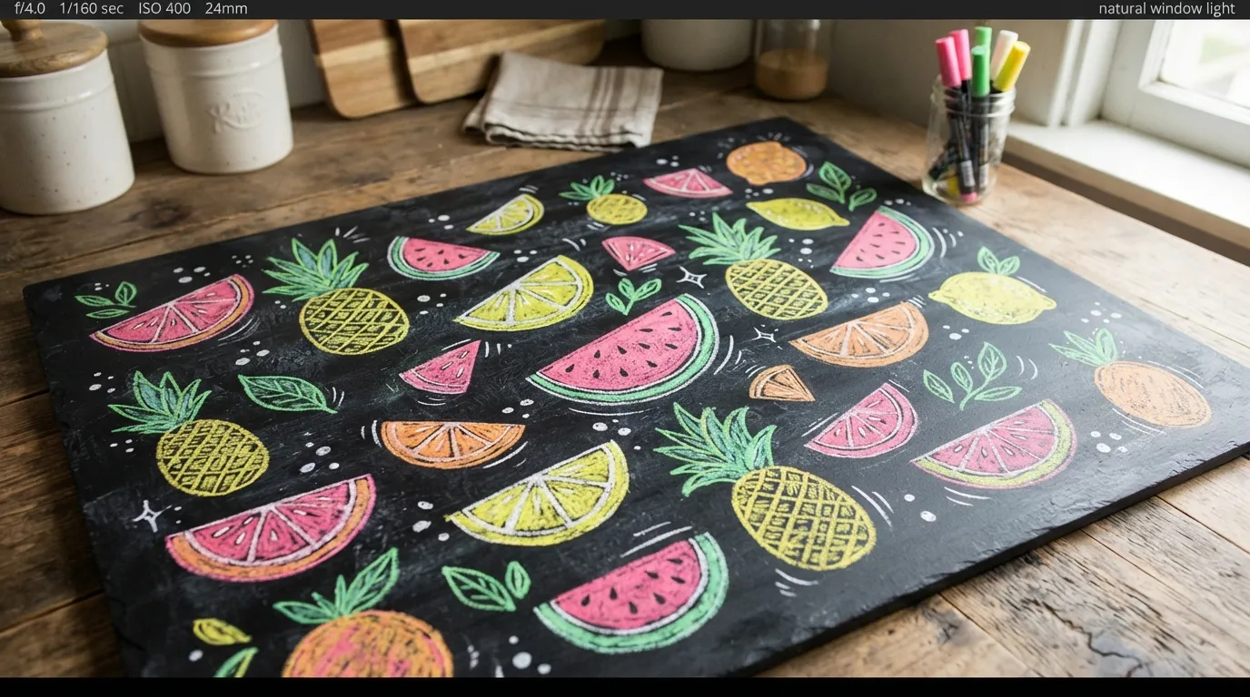
Few things capture playful seasonal charm better than a handful of fruit doodles scattered across a chalkboard. Watermelon slices, pineapples, and citrus wedges are simple shapes that even beginners can sketch confidently. Their bright colors stand out beautifully against a black background, giving the whole design instant energy and charm. This idea works especially well for kitchens, patios, or drink stations where a cheerful, laid-back vibe fits the space. Adding a few small dots or highlights with white chalk gives each fruit a bit of shine, making the drawings feel fresh, fun, and a little more polished than a flat sketch.
What makes fruit doodles so popular is how flexible they are for different summer occasions. You can group them around a menu for a backyard party, or scatter a few near a welcome message for a relaxed everyday look. I’ve noticed that mixing two or three fruit types, rather than overcrowding the board, keeps the design clean and easy to read from a distance. This approach also photographs well, since the bold colors and simple shapes translate nicely into bright, scroll-stopping images that people enjoy saving for their own decorating inspiration.
Also Read : 23 Dark Blue Bedrooms Ideas for a Moody Stylish Retreat
3: Pastel Ice Cream Scene
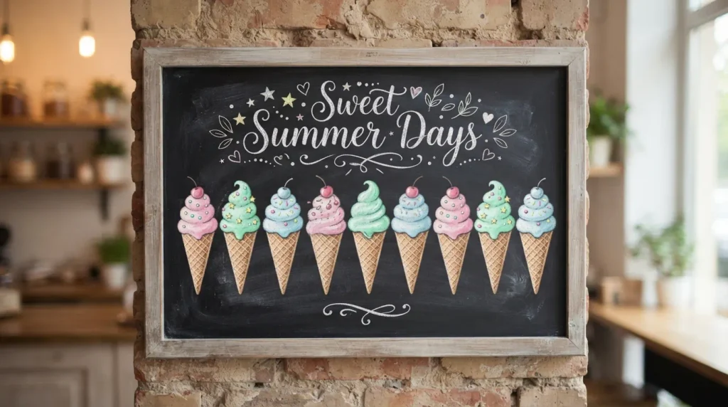
- Soft pastel colors give a gentle, dreamy summer feel instead of bold brights
- Ice cream cones and scoops are simple shapes that read clearly even from far away
- Works well for dessert shops, kids’ rooms, or casual home kitchens
- Pairs nicely with cursive or bubble lettering for a playful finishing touch
- A small drip detail adds realism without much extra effort
A pastel ice cream scene brings a soft, nostalgic charm that feels distinctly summery without leaning on bold, saturated colors. Light pink, mint, and baby blue chalk work beautifully together to sketch a row of ice cream cones or a simple sundae illustration. This style feels approachable, which is why it works so well in kids’ spaces, dessert shops, and casual kitchens. In my experience, using lighter pressure with the chalk keeps pastel tones soft and dreamy rather than chalky or flat. A short phrase like “Sweet Summer Days” underneath ties the whole scene together into a cohesive, inviting display.
The appeal of this idea lies in its simplicity and warmth. Unlike bold tropical designs, pastel scenes feel calm and familiar, almost like a memory of childhood summers. I’ve seen this style work particularly well on smaller chalkboards, where one or two ice cream illustrations are enough to fill the space without feeling cluttered. Adding a tiny drip line beneath a scoop gives just enough realism to make the drawing feel intentional and charming. It’s an easy, low-pressure way to bring a sweet seasonal touch to any room.
Also Read : 24 White Brick Fireplace Ideas for a Bright Cozy Home
4: Beach Umbrella Rows
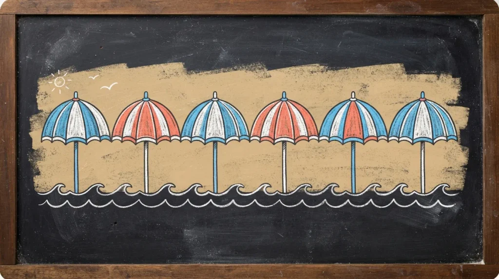
- Striped umbrellas instantly signal beach vibes and warm-weather relaxation
- Simple wave lines underneath add context without overcomplicating the drawing
- Works well for patios, pool areas, or any space needing a vacation mood
- Repeating a single shape in a row is an easy way to fill wide boards
- Alternating stripe colors keeps the design lively without extra decoration
A row of striped beach umbrellas is one of those summer chalkboard ideas that looks impressive but is genuinely simple to draw. Because the umbrella shape repeats, you only need to master it once before filling the rest of the board with confidence. Alternating chalk colors like blue, coral, and soft yellow between each umbrella keeps the design lively and prevents it from feeling repetitive. A few simple wave lines drawn beneath the umbrellas ground the scene and instantly suggest a beach setting. This idea works particularly well on wider boards, where the repeated pattern naturally fills space without leaving awkward gaps.
This design earns its popularity because it feels like a mini vacation every time someone glances at it. Pool areas, patios, and outdoor cafés benefit most from this look, since the umbrella motif reinforces the relaxed, sunny atmosphere already present in the space. I’ve noticed that keeping the umbrellas evenly spaced, rather than clustering them tightly, gives the board a more polished, intentional feel. Adding a short caption like “Sun’s Out” above or below the row rounds out the design without competing for attention against the illustration itself.
Also Read : 23 Masculine Home Office Ideas for a Stylish Workspace
5: Sunflower Field Border
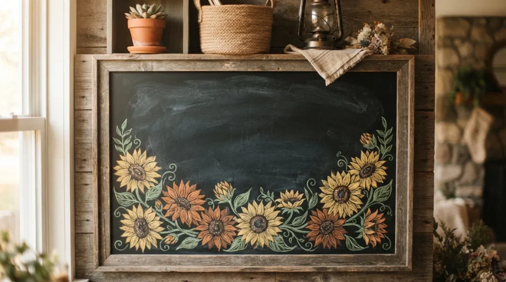
- Sunflower borders frame the board nicely while leaving space for text in the middle
- Golden yellow tones bring warmth and a cheerful, sunny energy to any room
- Works beautifully for farmhouse-style kitchens, porches, or rustic-themed spaces
- Repeating flower shapes along one edge is easier than filling the whole board
- Leaves plenty of open space for a welcome message, quote, or menu
A sunflower border is a lovely way to frame a chalkboard without overwhelming the entire surface with detail. Drawing a simple row of sunflowers along the bottom edge, connected with thin green stems, creates a natural frame that leaves the center open for lettering. Golden yellow petals paired with warm brown centers bring an immediate sense of sunshine and cheer, which fits perfectly with a farmhouse or rustic-themed space. That’s why many designers recommend borders over full-board illustrations when the goal is a functional display, like a welcome sign or seasonal quote board, that still needs to remain easy to read.
What makes this idea stand out is its balance between decoration and practicality. The sunflowers do the visual work along the edges while the open center stays clear for whatever message matters most, whether that’s a quote, a menu, or a simple seasonal greeting. In my experience, shading the petals with short diagonal strokes rather than solid fill gives the flowers a softer, more textured look that feels hand-drawn and warm. This approach suits porches and kitchens especially well, where the board needs to feel both decorative and genuinely useful.
Also Read : 21 Moody Dining Room Ideas for a Dramatic Cozy Space
6: Citrus Slice Pattern
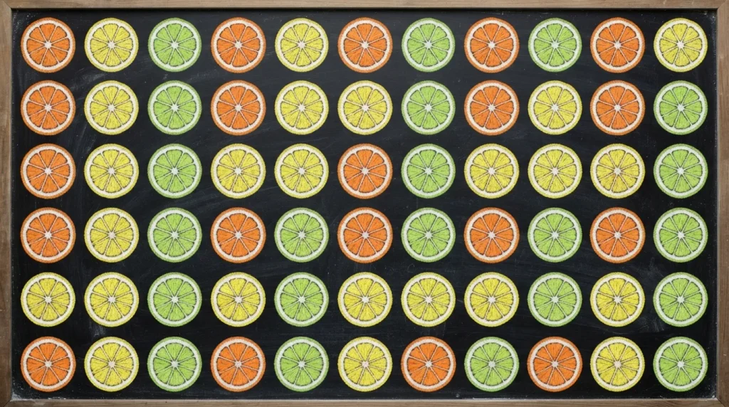
- Repeating citrus slices create a bold, eye-catching all-over pattern
- Bright orange, yellow, and green tones feel fresh, zesty, and energetic
- Great for drink stations, kitchens, or summer party backdrops
- Simple circular shapes make this one of the easier patterns to replicate
- Loose, even spacing keeps the pattern feeling fresh rather than busy
A citrus slice pattern turns a plain chalkboard into a bold, energetic centerpiece using nothing more than simple circles and a few well-placed lines. Orange, lemon, and lime slices each start as a circle, with thin lines drawn from center to edge to mimic natural citrus segments. Because the shapes are so simple, this is one of the more approachable summer chalkboard ideas for anyone who feels unsure about freehand drawing. Spacing the slices loosely across the board, rather than packing them tightly, keeps the pattern feeling fresh and breathable instead of overwhelming or cluttered to the eye.
This pattern works especially well in spaces centered around food or drinks, like kitchen walls, juice bars, or summer party setups. I’ve seen this work well as a backdrop behind a drink menu, where the citrus imagery reinforces the fresh, seasonal feel of whatever is being served. Using slightly different shades of yellow and green for each slice, rather than identical coloring, adds subtle variation that makes the whole board feel more handmade and less mechanical. It’s a simple pattern with a surprisingly big visual payoff.
Also Read : 25 Jewel Tone Bedroom Ideas for a Rich Luxurious Look
7: Palm Leaf Silhouettes
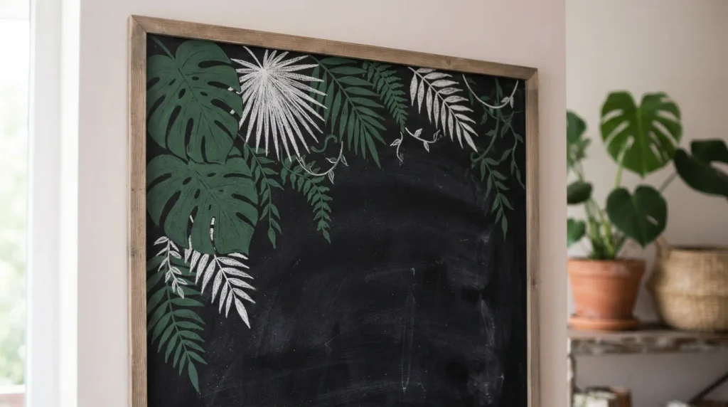
- Bold leaf silhouettes create a modern, jungle-inspired summer look
- Works well in corners, framing text or a central message nicely
- Solid shapes are easier to draw than detailed line-by-line leaves
- Feels fresh and current, fitting well with modern tropical décor trends
- Pairs nicely with gold or white lettering for extra contrast
Palm leaf silhouettes bring a bold, modern take on tropical style that feels a little more current than classic beach imagery. Rather than drawing detailed veins and edges, filling in solid leaf shapes with green chalk creates a clean, graphic look that reads clearly even from a distance. Positioning a cluster of leaves in one corner, with a few smaller trailing leaves nearby, gives the design movement without needing to cover the entire board. This approach is especially useful for anyone newer to chalk art, since solid silhouettes are far more forgiving than intricate line work or fine detail.
This idea works particularly well when paired with modern tropical décor, think rattan furniture, greenery, and neutral tones. In my experience, using white or gold chalk for lettering against the dark green leaves creates strong contrast that keeps text easy to read without competing with the illustration. Keeping the leaves confined to one section, rather than scattering them across the whole board, also makes the design feel intentional and current rather than busy. It’s a simple way to bring a fresh, modern edge to a summer chalkboard.
8: Lemonade Stand Vibes
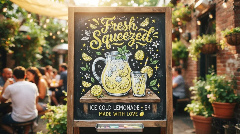
- A pitcher and glass illustration instantly signals a refreshing summer treat
- Nostalgic lemonade-stand style feels warm, familiar, and inviting
- Great for drink menus, patios, or casual outdoor party setups
- Small lemon slice accents add detail without much extra drawing effort
- Pairs naturally with playful script lettering for a complete look
There’s something instantly nostalgic about a lemonade stand illustration, and that familiar warmth is exactly why it works so well as one of the more charming summer chalkboard ideas. A simple pitcher with a few lemon slices and ice cube details, paired with a glass beside it, creates a scene that feels both refreshing and comforting. Bright yellow chalk against the dark board makes the lemons pop, while white chalk highlights on the glass add a sense of coolness and condensation. This design works especially well near drink stations, where the illustration doubles as a natural menu backdrop.
What makes this idea so effective is how directly it connects to a feeling most people already associate with summer. I’ve noticed that adding a playful script phrase like “Fresh Squeezed” above the illustration gives the board a finished, intentional look without requiring extra imagery. This style suits patios, backyard parties, and casual kitchens especially well, since it feels approachable rather than overly polished. It’s a simple, nostalgic design that consistently draws attention and feels genuinely inviting to anyone passing by.
9: Ocean Wave Lines
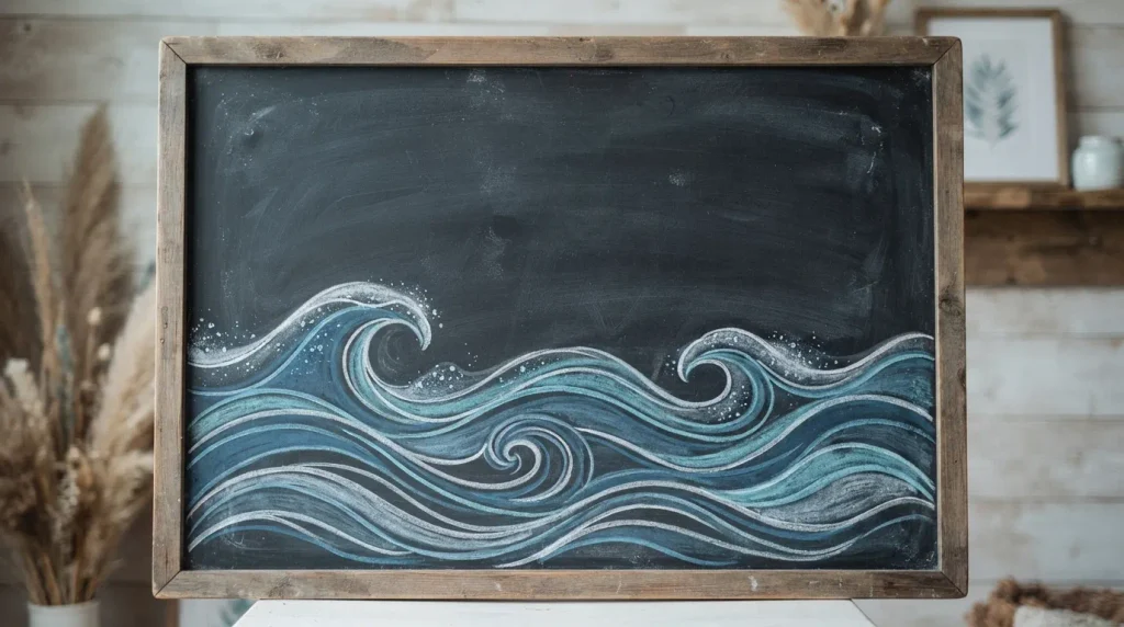
- Flowing wave lines create a calming, coastal feel without much complexity
- Layered blues add depth while staying simple enough for beginners
- Leaves open space above for lettering, quotes, or a seasonal message
- Works well in bathrooms, coastal-themed rooms, or relaxed living spaces
- Minimal design keeps the board feeling calm rather than busy
Minimalist wave lines offer a calming alternative to busier tropical designs, relying on simple curved strokes rather than detailed illustrations. Layering two or three shades of blue chalk, from deep navy to soft sky blue, creates a sense of depth and movement across the lower portion of the board. Adding small white dashes along the top of each wave suggests gentle foam without requiring precise detail work. This design is one of the easier summer chalkboard ideas to execute quickly, making it a great choice for anyone short on time but still wanting a polished, seasonal look.
That’s why many designers recommend this style for spaces meant to feel calm and restorative, like bathrooms, reading nooks, or coastal-themed bedrooms. The open space left above the waves works perfectly for a short quote, a welcome message, or even just the season’s name in simple lettering. I’ve seen this work well as a backdrop that never competes with other décor, since the muted blue tones and clean lines blend easily into most color schemes. It’s understated, but it consistently reads as intentional and well-designed.
10: Pineapple Focal Point
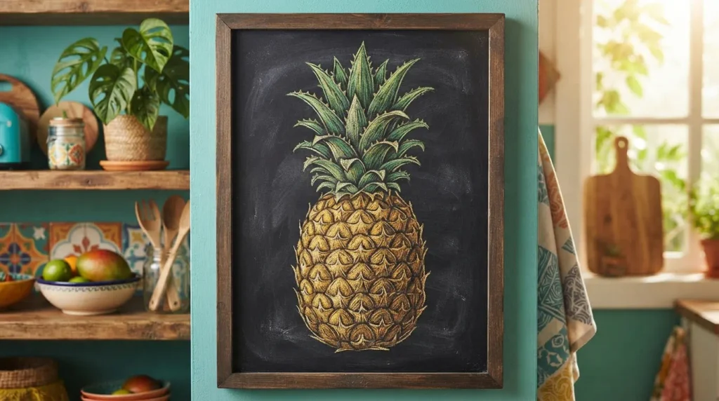
- A single bold pineapple makes a strong, eye-catching centerpiece
- Crosshatch texture on the body adds realism without needing fine detail skills
- Works well as a standalone design or paired with a short caption
- Golden yellow tones bring warmth and instantly read as summery
- Great option when you want one strong focal image rather than a full scene
A well-drawn pineapple makes for one of the boldest, most recognizable summer chalkboard ideas because it works as a strong focal point all on its own. Centering the illustration and filling most of the board gives it confidence and presence, rather than competing with smaller surrounding details. The crosshatch pattern across the pineapple’s body, drawn in slightly darker gold, creates convincing texture without requiring advanced shading skills. Spiky green leaves fanning out from the top add movement and complete the shape. This design suits kitchens and dining spaces particularly well, where a single striking image often works better than a busy scene.
In my experience, this idea works best when the pineapple is given room to breathe, meaning it shouldn’t be crowded by extra doodles or heavy lettering. A short word or two beneath the illustration, like “Stay Sweet,” is usually enough to complete the look. Because the shape is so recognizable, even a slightly imperfect drawing still reads clearly as a pineapple, which makes this a forgiving choice for beginners. It’s a confident, low-fuss design that consistently earns attention for its simplicity and warmth.
11: Popsicle Row Design
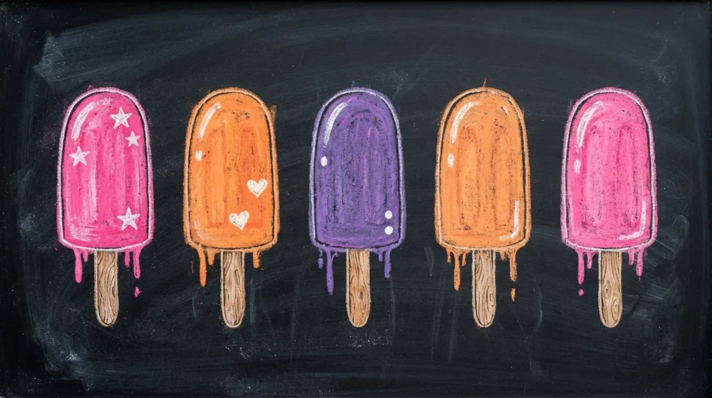
- A row of popsicles brings instant nostalgia and playful summer energy
- Bright contrasting colors make each popsicle stand out clearly
- Simple stick and drip details add realism without much extra effort
- Works well for kids’ spaces, party décor, or casual kitchen boards
- Easy to adjust the number of popsicles based on board size
A row of popsicles is a playful, nostalgic choice among summer chalkboard ideas, and it’s easier to draw than most people expect. Each popsicle starts as a simple rectangle or rounded shape, with a thin wooden stick beneath and a short drip line for realism. Using bright, contrasting colors like pink, orange, and purple for each one keeps the row visually lively without needing complicated shading. This design works especially well in kids’ rooms, playrooms, or casual party settings, where a cheerful, low-key illustration fits the mood far better than something overly detailed or formal.
I’ve noticed that spacing the popsicles evenly, with a small gap between each one, keeps the design feeling clean rather than cluttered. Adjusting the number of popsicles to match the board size is simple, since the shape repeats easily without losing visual appeal. This idea also works nicely as a backdrop for a dessert table or summer party sign, where the playful imagery reinforces the festive mood. It’s a quick, cheerful design that feels approachable for artists of any skill level.
12: Cactus and Succulent Cluster
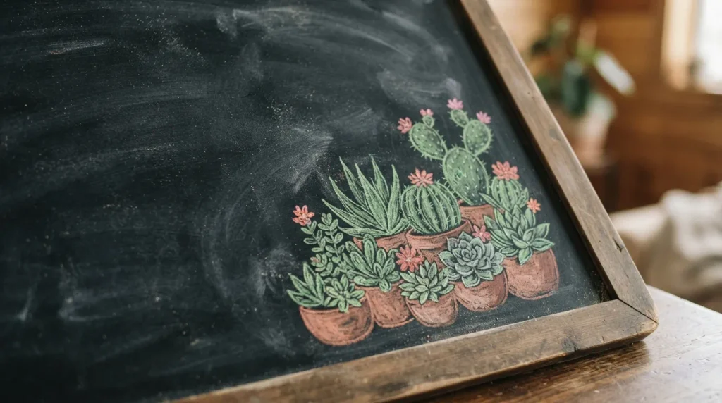
- A cluster of cacti brings a trendy desert-summer feel to the board
- Small pink flower accents add a soft, unexpected pop of color
- Terracotta pot outlines ground the illustration and add visual structure
- Works well in corners, leaving open space for text elsewhere
- Fits nicely with boho or desert-inspired seasonal themes
A small cluster of cacti and succulents offers a trendy twist on typical summer chalkboard ideas, especially for anyone drawn to boho or desert-inspired style. Grouping two or three simple cactus shapes together, each outlined in green chalk with basic terracotta pot details beneath, creates a charming corner illustration without demanding much space. Adding a few tiny pink flower accents on top of one or two cacti introduces a soft contrast against the mostly green palette. This design feels a little different from typical beach and tropical themes, giving it a fresh, distinctive edge for anyone wanting something less expected.
That’s why many designers recommend this style for modern or minimalist spaces where a subtler seasonal touch feels more appropriate than bold tropical imagery. Keeping the cluster confined to one corner leaves plenty of open space for lettering, quotes, or a simple welcome message elsewhere on the board. I’ve seen this work particularly well in home offices or reading nooks, where the earthy tones feel calming rather than overly playful. It’s a versatile design that fits comfortably into more understated seasonal décor.
13: Watermelon Wedge Focal
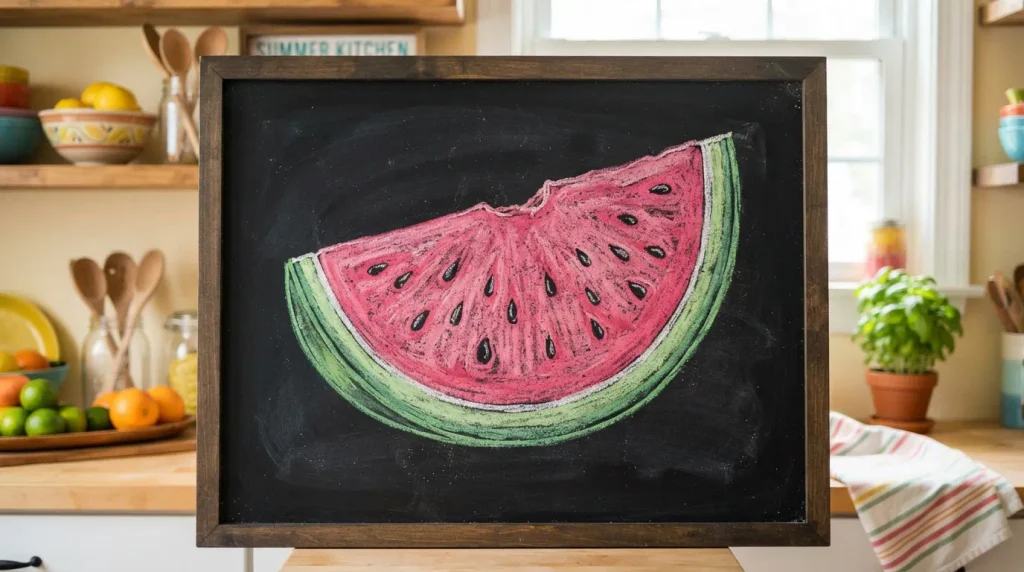
- A single watermelon wedge makes a bold, unmistakable summer statement
- Simple seed dots add charm and realism with very little effort
- Works beautifully as a standalone image or centerpiece for a party sign
- Bright pink and green tones create strong, eye-catching contrast
- Easy shape to scale up or down depending on board size
A watermelon wedge is one of the most instantly recognizable summer chalkboard ideas, and its simple triangular shape makes it surprisingly beginner-friendly. Starting with a basic wedge outline, then filling the top rind in green and the flesh in bright pink, creates a bold image that reads clearly even from across a room. Scattering a handful of small black seed dots across the pink area adds realism without requiring any advanced technique. This design works particularly well as a centerpiece for summer parties, dessert tables, or kitchen walls, where its bold color contrast naturally draws the eye toward it first.
In my experience, this idea works best when kept large and centered, rather than shrunk down and surrounded by other elements. The bold shape and bright colors already carry plenty of visual weight, so adding too many extra doodles nearby tends to compete rather than complement. A short caption like “One in a Melon” beneath the illustration adds a playful touch that pairs naturally with the imagery. It’s a cheerful, high-impact design that consistently performs well for both in-person décor and photos shared online.
14: Striped Beach Towel Pattern
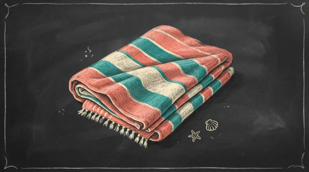
- Stripe patterns are simple to draw yet visually striking on a chalkboard
- Alternating colors create rhythm and movement across the design
- Fabric fold lines add subtle texture and realism to the towel shape
- Works well for beach-themed rooms, patios, or vacation-style décor
- Easy to adjust stripe width and color combination to match any space
A folded beach towel pattern brings a relaxed, vacation-ready feel to a chalkboard using nothing more than straight and slightly curved lines. Drawing a simple rectangular towel shape, then filling it with alternating stripes in coral, teal, and cream chalk, creates a rhythmic pattern that feels both structured and playful. A few soft fold lines across the towel add subtle texture, giving the illustration a sense of depth without much extra effort. This design fits naturally into beach house décor, patios, or any space aiming for that easygoing, sun-soaked summer atmosphere that towel patterns tend to evoke so well.
I’ve noticed that varying the stripe widths slightly, rather than making them perfectly uniform, gives the towel a more hand-drawn, authentic feel. This idea also works well paired with other beach-themed elements, like a small pair of sunglasses or a sunhat sketched nearby, though it holds up nicely as a standalone pattern too. The color combination can be easily swapped to match existing décor, making this one of the more adaptable summer chalkboard ideas for matching a specific room’s palette.
15: Tropical Bird Accent
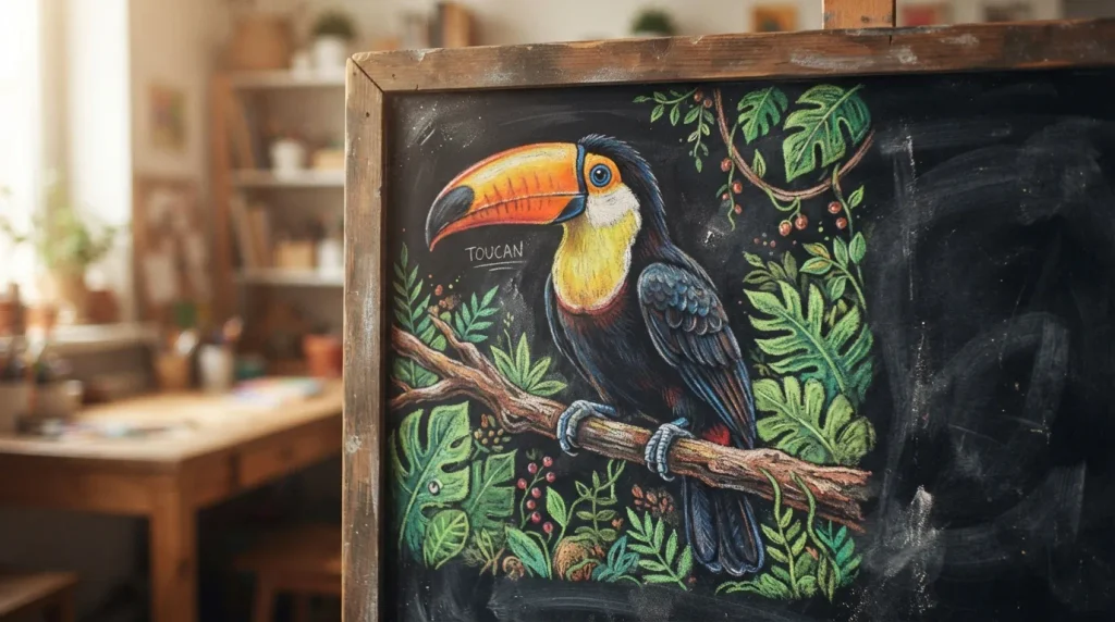
- A tropical bird adds a playful, eye-catching focal detail
- Vivid colors like orange and blue create strong visual contrast
- Feather texture details add realism without needing advanced drawing skills
- Works well in a corner, pairing nicely with palm leaves or greenery
- Brings a fun, exotic touch to jungle or tropical-themed boards
A tropical bird, like a toucan or parrot, brings a playful and slightly unexpected focal point to a summer chalkboard. Its bold coloring, typically bright orange, blue, and black, naturally draws the eye and adds energy to the overall design. Sketching the bird perched on a simple branch, with a few short leaf accents nearby, grounds the illustration and gives it context within a jungle or tropical theme. Feather texture can be suggested with short curved strokes rather than fine individual lines, keeping the technique approachable even for those newer to detailed chalk art.
That’s why many designers recommend pairing a tropical bird with palm leaves or greenery elsewhere on the board, since the combination reinforces a cohesive jungle theme rather than feeling like an isolated image. I’ve seen this work particularly well in sunrooms, tropical-themed kitchens, or spaces already featuring bold botanical prints. Keeping the bird confined to one corner, rather than centering it, allows the rest of the board to remain open for lettering or additional smaller design elements without feeling overcrowded.
16: Sun and Cloud Motif
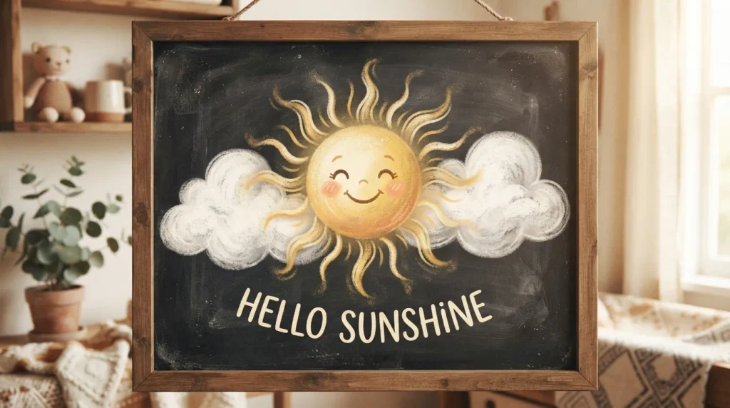
- A simple sun and cloud pairing feels cheerful and universally friendly
- Rounded, soft shapes make this one of the easiest designs to sketch
- Works especially well in kids’ rooms, nurseries, or casual family spaces
- Bright yellow against soft white creates a warm, gentle contrast
- Leaves plenty of open space nearby for a short seasonal greeting
A smiling sun paired with a couple of soft clouds is about as simple and cheerful as summer chalkboard ideas get, making it a great starting point for beginners or anyone drawing with kids. The sun’s rounded shape and short ray lines require no advanced technique, while the clouds can be sketched with a few overlapping bumpy curves. Golden yellow chalk against a black board creates immediate warmth, while soft white clouds nearby balance the brightness without overwhelming the design. This motif works particularly well in nurseries, playrooms, or kitchens where a friendly, approachable look matters more than intricate detail.
In my experience, this design earns its popularity because it feels instantly recognizable and universally cheerful, appealing to both kids and adults alike. Leaving generous open space around the sun and clouds allows room for a short greeting like “Hello Sunshine” without the board feeling crowded. This idea also works well as a starting point for someone new to chalk art, since the shapes are simple enough to build confidence before attempting more detailed illustrations elsewhere on future boards.
17: Flip Flop Doodles
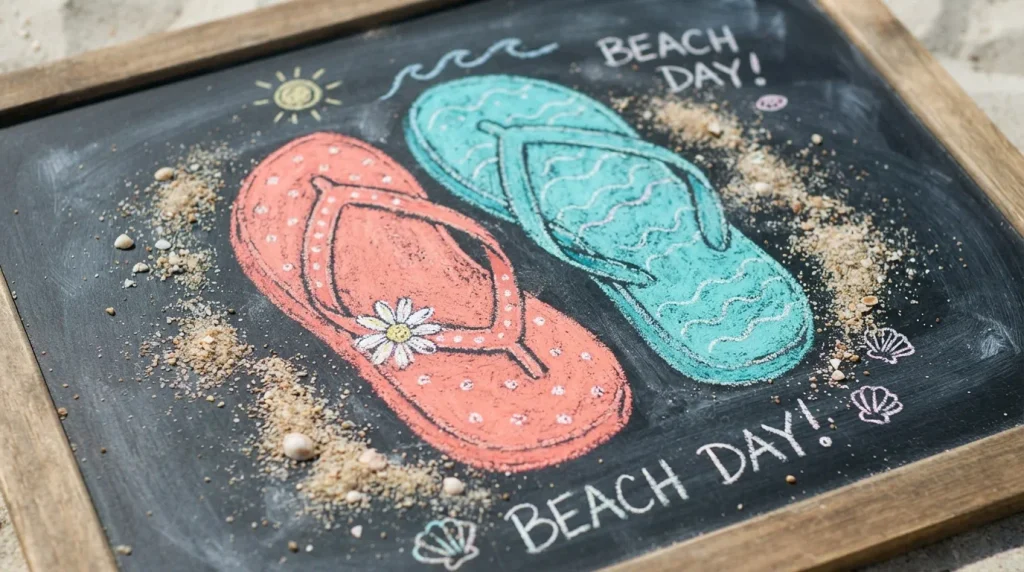
- Flip flop illustrations bring a casual, playful beach vibe to any board
- Small flower or strap details add charm without much extra work
- Works well as a small accent rather than a full-board design
- Bright colors like coral and turquoise keep the mood light and fun
- Great addition alongside other beach-themed elements like umbrellas or waves
A simple pair of flip flops adds a casual, playful touch to a summer chalkboard without requiring much space or effort. Drawing two flip flop outlines positioned diagonally, then adding a strap detail and a tiny daisy accent on one, creates a charming small-scale illustration that works well as a corner accent rather than a full centerpiece. Bright coral and turquoise chalk keep the design light and fun, echoing the relaxed energy associated with beach days and warm weather. This idea pairs especially well alongside other beach motifs, like waves or umbrellas, filling out a themed board nicely.
I’ve noticed that flip flop doodles work best as a supporting detail rather than the main focus, since their small size makes them easy to overlook if they’re the only element on the board. Adding a light sandy texture beneath them, using short dotted chalk marks, helps ground the illustration and adds a bit of visual interest. This design suits entryways, pool areas, or casual beach house décor especially well, offering a lighthearted touch that feels effortless rather than overly planned.
18: Coconut Drink Illustration
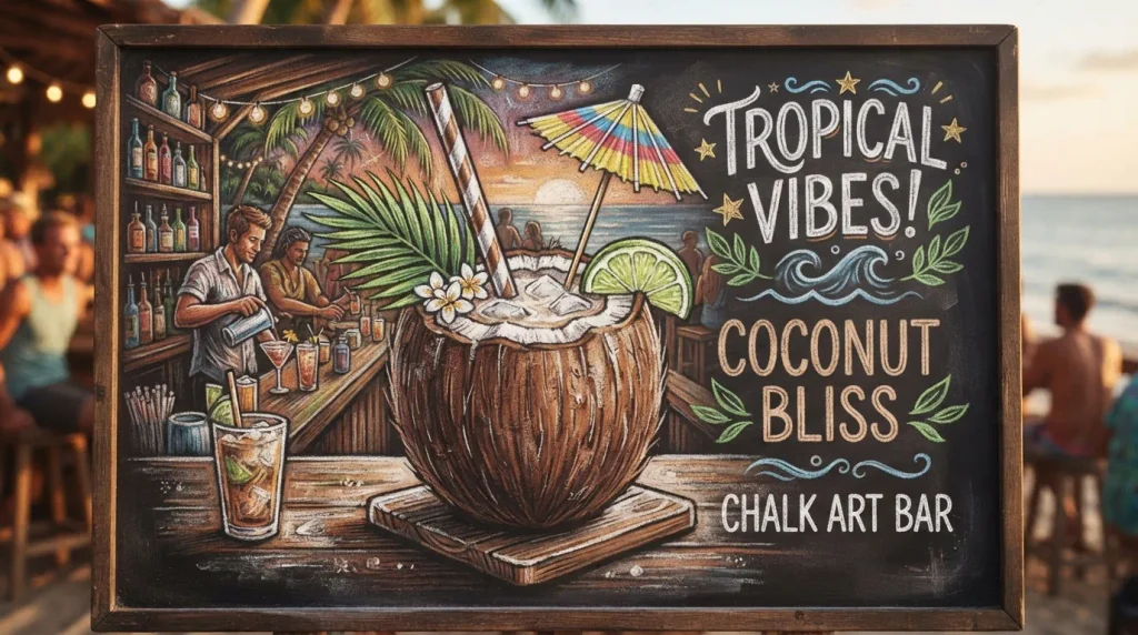
- A coconut drink illustration instantly signals vacation and relaxation
- Small details like a straw and umbrella add charm and personality
- Works well for patios, tiki-themed spaces, or summer drink menus
- Brown and white tones create simple, effective contrast on dark boards
- Pairs naturally with playful lettering like “Vacation Mode”
A coconut drink illustration, complete with a striped straw and tiny paper umbrella, brings an instant sense of vacation and relaxation to a summer chalkboard. The coconut shape itself is simple, essentially an oval with a few short texture lines, while the straw and umbrella add just enough personality to make the drawing feel complete. Brown chalk for the coconut shell paired with white highlights creates clean, effective contrast without needing many colors. This idea works especially well for patios, tiki bars, or any drink station wanting to reinforce a laid-back, tropical getaway feeling.
That’s why many designers recommend pairing this illustration with a short playful phrase like “Vacation Mode” or “Sip, Sip, Hooray,” since the wording naturally complements the relaxed imagery. I’ve seen this work particularly well as a menu backdrop for summer parties or backyard gatherings, where the drink illustration doubles as an invitation to unwind. Adding a small green leaf garnish on top rounds out the design with a touch of realism, making the coconut feel freshly served rather than flat or generic.
19: Shell and Starfish Scatter
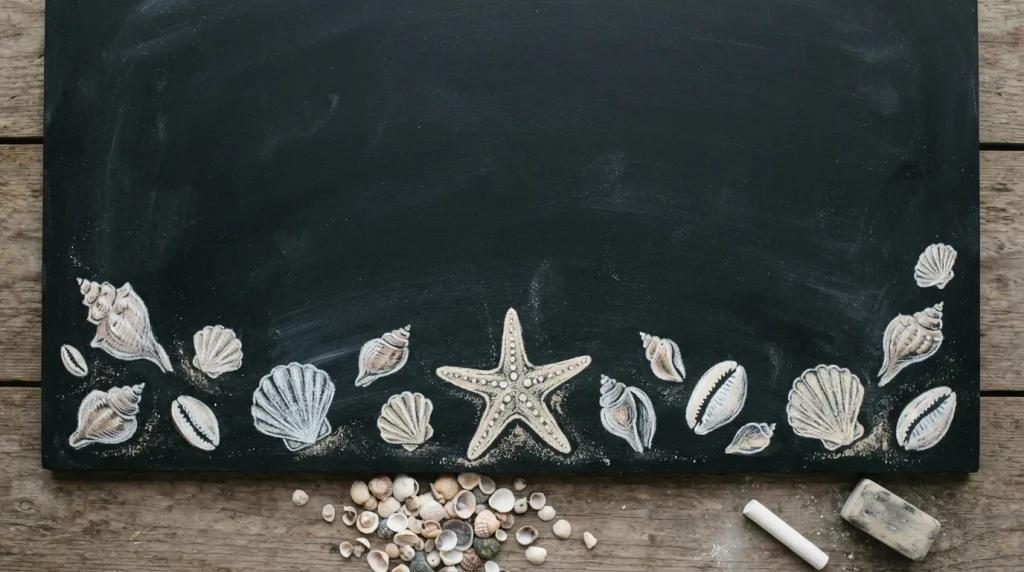
- Scattered shells and a starfish bring a delicate, beachy accent to any board
- Soft white and cream tones feel gentle and elegant rather than bold
- Works well along the bottom edge, leaving space above for text
- Simple shapes make this an easy addition for beginners
- Fits naturally with coastal, minimalist, or neutral-toned décor
A light scattering of shells and a single starfish along the bottom of the board offers a softer, more understated take on summer chalkboard ideas. Each shell starts as a simple curved shape, with a few short ridge lines added for texture, while the starfish is little more than a rounded five-point outline. Using soft white and cream chalk instead of bold colors keeps the design feeling delicate and coastal rather than playful or bright. This approach suits neutral, minimalist spaces particularly well, where a subtle seasonal touch fits better than a bold, colorful illustration.
In my experience, this idea works best when the shells are spaced unevenly rather than lined up perfectly, since natural, scattered placement feels more organic and true to how shells actually appear on a beach. Leaving the upper portion of the board completely open allows plenty of room for a quote, welcome message, or menu without competing against the illustration below. This design suits bathrooms, entryways, or coastal-themed living spaces especially well, offering a quiet, elegant nod to summer without overwhelming the room.
20: Iced Coffee Cup Feature
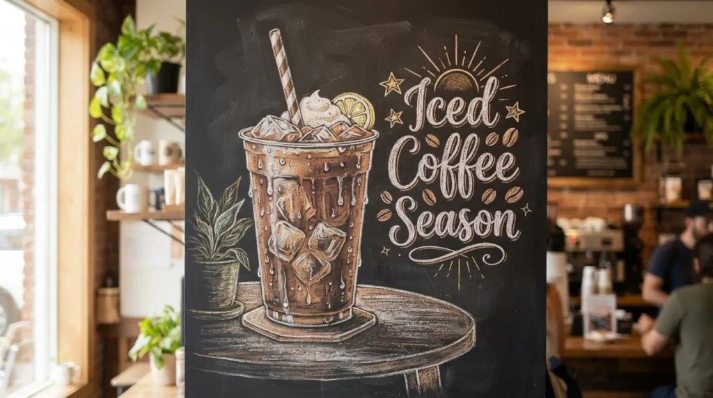
- An iced coffee illustration feels current and instantly relatable for summer
- Condensation droplet details add realism with very little extra effort
- Works especially well for cafés, kitchens, or drink menu boards
- Simple cup shape makes this approachable even for less experienced artists
- Pairs naturally with playful captions about coffee or summer mornings
An iced coffee cup illustration taps into one of the most relatable summer rituals, making it a natural fit among popular summer chalkboard ideas for cafés and kitchens alike. The cup itself is a simple tapered shape, filled with a few jagged ice cube outlines and a striped straw for detail. Adding small condensation droplets along the outside of the glass, using short white chalk dashes, gives the illustration a refreshing, realistic touch without much added effort. This design works particularly well as a centerpiece for drink menus or morning-themed displays.
I’ve noticed that pairing this illustration with a short caption like “Iced Coffee Season” or “Cold Brew Only” gives the board a clear, functional purpose while still feeling playful and current. This idea resonates especially well with younger audiences and café-style spaces, where iced coffee has become a genuine summer staple rather than a passing trend. Keeping the cup centered and fairly large ensures the design remains the clear focal point, even when additional lettering or small accents are added nearby.
21: Beach Ball Accent
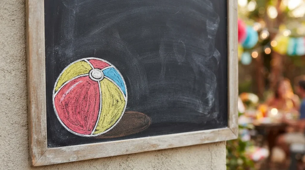
- A beach ball adds a bold pop of color and playful energy
- Simple curved panel lines make this shape easier to draw than expected
- Works well as a small corner accent rather than a full illustration
- Adding a shadow beneath gives the ball a sense of depth and realism
- Great addition to party décor or casual summer gathering boards
A colorful beach ball tucked into the corner of a chalkboard adds a playful pop of color without demanding much space or drawing skill. Starting with a simple circle, then adding a few curved lines to create panel sections, is enough to suggest the classic beach ball look. Filling alternating panels with red, yellow, and blue chalk keeps the design bold and cheerful, echoing the fun, carefree energy associated with summer gatherings. This accent works particularly well alongside other small illustrations, filling empty corners without competing against a larger central design elsewhere on the board.
That’s why many designers recommend using a beach ball as a finishing touch rather than a standalone feature, since its small size and bold color make it ideal for balancing out a composition. Adding a soft curved shadow beneath the ball, using a smudged gray or white chalk line, gives it a subtle sense of weight and realism. I’ve seen this work particularly well on party invitation boards or backyard gathering signs, where the playful shape reinforces a relaxed, celebratory summer mood instantly.
22: Hammock and Palm Scene
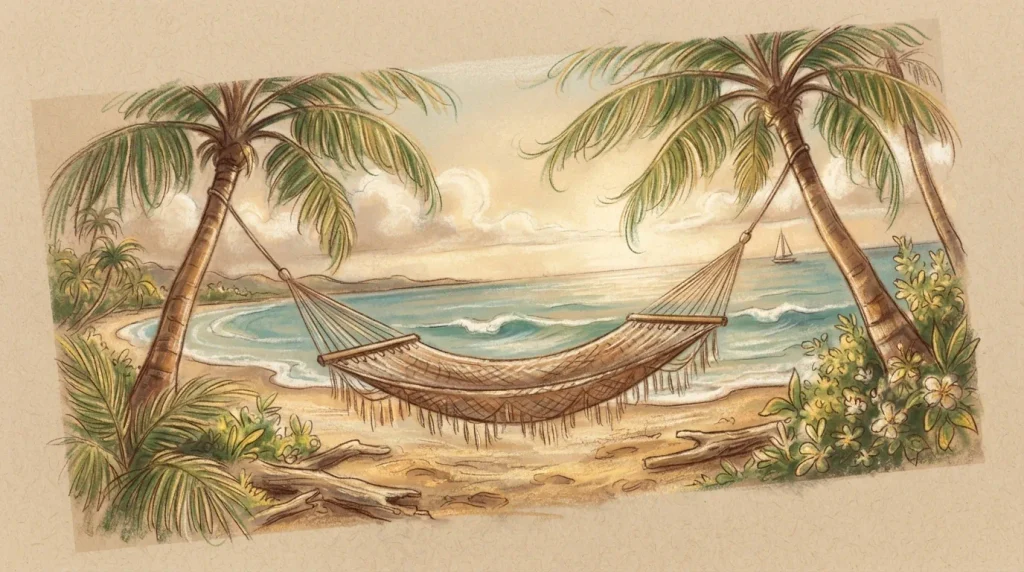
- A hammock scene captures a relaxed, slow-down feeling unique to summer
- Curved lines throughout give the illustration a sense of gentle movement
- Works beautifully as a wide feature across longer, horizontal chalkboards
- Palm trees on either side naturally frame the hammock in the middle
- Evokes a strong emotional response tied to rest and vacation
A hammock strung between two palm trees captures a feeling that few other summer chalkboard ideas manage quite as well, that unmistakable sense of slowing down and doing absolutely nothing. The hammock itself can be sketched with a few gentle curved lines forming a sagging weave pattern, while two simple palm trees on either side frame the scene naturally. Warm brown chalk for the tree trunks and hammock ropes, paired with soft green for the swaying leaves, creates a cohesive, relaxed color palette. This design works especially well on wider chalkboards, where the horizontal composition has room to breathe.
In my experience, this scene resonates with people on an emotional level more than most other summer designs, since it visually represents rest rather than just decoration. Adding a few short curved lines near the leaves suggests a gentle breeze, giving the whole illustration a subtle sense of movement without overcomplicating the drawing. This idea suits porches, patios, or vacation-style spaces particularly well, where the imagery reinforces the exact mood the space is meant to create. It’s a design people tend to linger on and remember.
23: Ocean Sunset Horizon
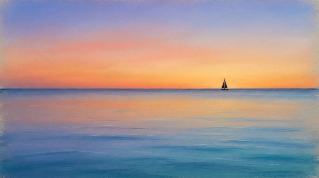
- A glowing horizon line creates a peaceful, wide-format focal point
- Blended sunset tones give the board a soft, professional gradient effect
- A small sailboat silhouette adds subtle detail without extra complexity
- Works beautifully as a closing or signature design for a themed board
- Evokes calm, reflection, and the quiet side of summer evenings
An ocean sunset horizon brings a quiet, reflective close to a lineup of summer chalkboard ideas, focusing on mood and color rather than detailed illustration. The design relies on a soft horizontal blend, warm orange and pink fading into deeper blue near the top, with a simple straight line marking where the ocean meets the sky. A tiny sailboat silhouette placed off-center in the water adds just enough detail to give the scene depth without disrupting its calm, minimal feel. This look works particularly well as a signature piece, since its soft gradient naturally draws the eye without needing bold shapes.
I’ve seen this work well as a closing image for larger themed displays, where its calm tone offers a nice contrast to busier, more colorful designs elsewhere. Blending the chalk with a soft cloth rather than leaving hard color lines makes the biggest difference in how professional the gradient looks. This design suits bedrooms, reading corners, or any space meant to feel peaceful rather than energetic. It’s a fitting final note for anyone building out a full seasonal chalkboard collection, closing things out on a calm, memorable image.
Conclusion
A great chalkboard doesn’t need to be perfect, it just needs a little personality. These summer chalkboard ideas are proof that simple shapes and a bit of color can completely change how a space feels. I’ve tried several of these myself, and even the smallest sketches tend to make the biggest impression. Choose one that catches your eye and give it a try this week, your board doesn’t have to be complicated to look great. If you found this helpful, save it to Pinterest for later, and pass it along to a friend who could use a little seasonal inspiration too.
Let me know which version you’d like to keep, or if you’d like me to blend elements from both.