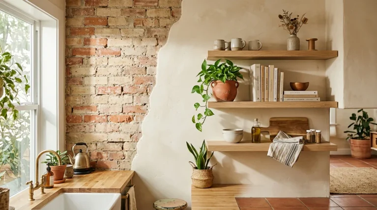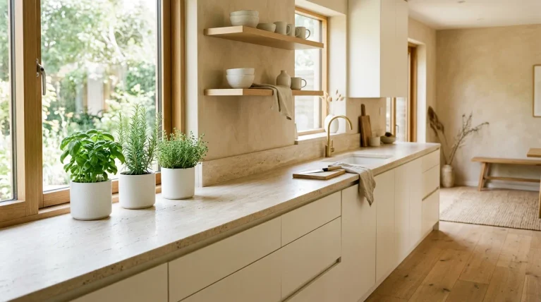
Ever walked into a room and felt instantly calmer, without knowing exactly why? That’s the quiet magic behind this year’s Pantone Color of the Year, a soft, billowy white called Cloud Dancer, and it’s about to change the way you think about home design. If you’ve been searching for a palette that feels fresh, timeless, and genuinely easy to live with, this is it. In my experience, the biggest design mistakes happen when people chase bold trends that feel dated within a year. This shade isn’t that. It’s calm, versatile, and works in almost every room you own. In this article, you’ll find 24 real, achievable ways to bring this soft white into your living room, kitchen, bedroom, and beyond, whether you’re planning a full refresh or a single weekend project. Each idea comes with practical styling details you can actually picture and recreate, so you’re not just scrolling for inspiration, you’re walking away with a plan. I’ve noticed that the best home updates start small, and this palette makes that easier than almost any other color choice I’ve seen in years.
1. Cloud Dancer Living Room
- Instantly opens up small or dim living rooms
- Creates a calm, uncluttered visual anchor for the whole space
- Pairs effortlessly with wood, stone, rattan, and other textures
- Makes bold accent pieces stand out without overwhelming the eye
- Feels timeless instead of trend-heavy, so it won’t date quickly
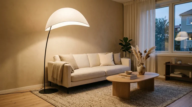
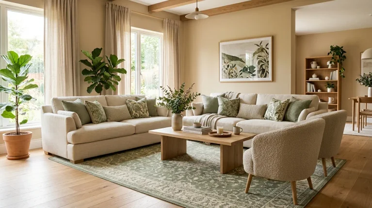
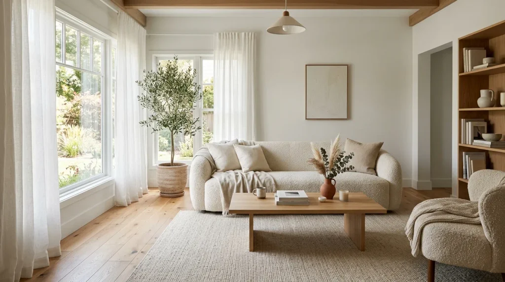
Walk into a room painted in Cloud Dancer and the first thing you notice is how much lighter the air feels. This isn’t just another white — it’s a structural, versatile shade that gives every other color in the room room to breathe. In my experience, homeowners who switch to a soft billowy white like this one often say their living room finally feels “finished” rather than empty. It works because it doesn’t compete with furniture, art, or natural light; it simply supports everything around it, which is exactly what makes the 2026 palette so livable.
A Cloud Dancer living room also solves a problem many people don’t expect: it makes small spaces feel noticeably larger. Because the tone reflects light so gently, corners that once looked dark and boxed-in suddenly open up. I’ve noticed this works especially well in apartments with limited windows, where every bit of natural light needs help traveling across the room. Add a few textured throws or a jute rug, and the space feels curated rather than stripped back. It’s a simple shift, but the visual payoff is one of the biggest you’ll get from a single paint choice this year.
Also Read : 21 Moody Dining Room Ideas for a Dramatic Cozy Space
2. Soft White Kitchen Cabinets
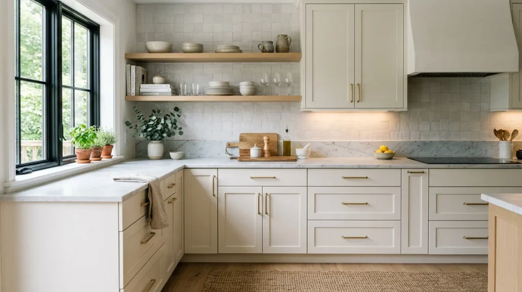
- Softens the sterile look of an all-white kitchen
- Hides everyday smudges better than stark white
- Pairs beautifully with warm metal hardware and wood accents
- Gives an expensive, custom-built feel without a full renovation
- Works with both modern and farmhouse-style kitchens
Cabinets are one of the fastest ways to update a kitchen without touching a single wall, and this year’s pantone color of the year makes that update feel effortless. Cloud Dancer reads warmer and softer than a typical bright white, which is why it photographs so well in Pinterest kitchen inspiration boards. That’s why many designers recommend it for kitchens that get heavy daily use — the slightly muted tone forgives fingerprints, water spots, and everyday wear far more gracefully than a stark white ever could. It’s practical as much as it is beautiful.
Pair these cabinets with brass or matte black hardware and the kitchen instantly feels intentional rather than default. I’ve seen this work well in both tiny apartment kitchens and larger family kitchens, because the softness of the tone never feels cold or clinical. Open shelving in light wood breaks up the white nicely, adding warmth and texture without introducing another color. If you’re planning a kitchen refresh this year, cabinetry is the highest-impact, lowest-effort place to bring this trending shade into your home.
Also Read : 23 Spring Front Porch Decor Ideas for a Fresh Welcome
3. Layered White Bedroom
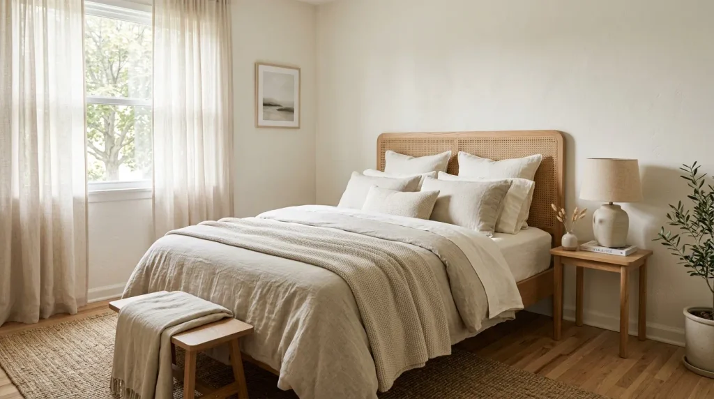
- Creates an instantly calming, sleep-friendly atmosphere
- Layering different white tones prevents the room from feeling flat
- Texture becomes the main design feature instead of color contrast
- Easy to refresh seasonally with small accent swaps
- Works in bedrooms of any size, including small guest rooms
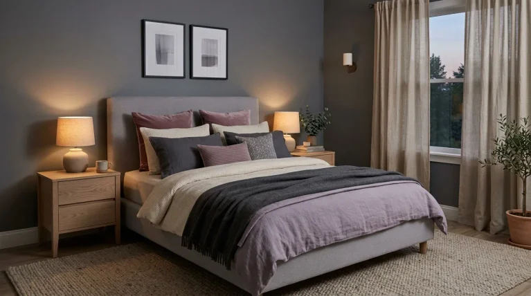
A bedroom is where this soft, billowy white truly earns its reputation as a calming color. Layering two or three shades of white — bedding, walls, and curtains — keeps the room from feeling flat or clinical, and instead gives it depth you can actually feel when you walk in. In my experience, the trick isn’t picking one white and repeating it everywhere; it’s mixing textures like linen, bouclé, and woven wood so the eye has something to rest on. The result is a bedroom that feels like a quiet retreat rather than a blank canvas.
This approach also makes seasonal updates incredibly easy. Swap a wool throw for a lighter linen one, add a dried floral arrangement, or bring in a woven basket, and the whole room shifts mood without any repainting. I’ve noticed guest rooms styled this way tend to photograph beautifully for Pinterest because the softness reads as both aspirational and achievable. It’s a bedroom style that feels expensive and restful at the same time, which is exactly the balance most people are searching for this year.
Also Read : 25 Jewel Tone Bedroom Ideas for a Rich Luxurious Look
4. Cloud Dancer Accent Wall

- Adds dimension without introducing a bold color
- Plaster or lime-wash texture gives the wall quiet visual interest
- Works well behind a bed, sofa, or reading nook
- A low-commitment way to try a designer finish
- Easy to update later since it’s still a neutral base
An accent wall doesn’t have to mean bright color or heavy pattern. Using Cloud Dancer with a textured plaster or lime-wash finish gives a wall real depth while staying completely neutral, which is exactly why this idea keeps showing up on Pinterest boards this year. The texture catches natural light differently throughout the day, so the wall almost feels alive rather than static. In my experience, this is one of the easiest upgrades for renters too, since textured paint finishes can often be achieved with peel-and-stick wallpaper instead of a full renovation, keeping the look temporary and damage-free.
Placing this accent wall behind a bed or sofa gives the eye a natural focal point without competing with furniture or artwork. Because the tone is so close to a true neutral, it never risks clashing with existing decor, which makes it a safer choice than a saturated accent color. I’ve noticed that homeowners who try this finish once tend to expand it to hallways or entryways shortly after, simply because the subtle texture photographs so well. It’s proof that a quiet color choice can still make a bold design statement.
Also Read : 25 Japandi Bathroom Design Ideas for a Calm Modern Space
5. Neutral White Home Office
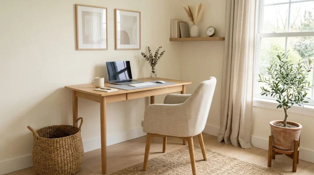
- Reduces visual clutter that can distract during work hours
- Creates a calm backdrop for video calls and virtual meetings
- Pairs well with warm wood tones to avoid feeling sterile
- Makes small storage and shelving details easier to keep tidy
- Suits both dedicated offices and small work corners
A home office painted in this soft, structural white does more than look good on camera — it genuinely helps with focus. Cluttered, high-contrast rooms can quietly add mental noise throughout the workday, and a calm neutral backdrop removes that friction. That’s why many designers recommend soft whites for home offices specifically, since the tone keeps the eye from being pulled toward the walls and instead lets task lighting and desk styling do the visual work. It’s a small design choice with a surprisingly real impact on daily productivity.
This palette also solves a common problem: home offices that feel cold or corporate. Because Cloud Dancer leans warm rather than stark, it avoids that sterile feeling even in a small, windowless corner. I’ve seen this work well in shared spaces too, where one corner needs to double as a workspace without dominating the room’s overall look. Add a wood desk, a woven basket for cables, and a single plant, and the space feels both productive and genuinely pleasant to sit in for hours at a time.
Also Read : 22 Year Round Mantle Decor Ideas for Every Season
6. Soft White Bathroom Refresh
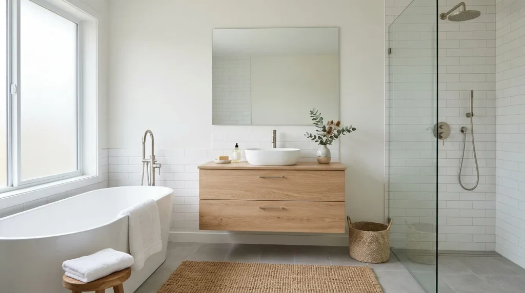
- Turns an ordinary bathroom into a spa-like retreat
- Reflects light well in small or windowless bathrooms
- Pairs naturally with brushed metal and warm wood accents
- Makes tile grout lines and fixtures easier to keep looking fresh
- A budget-friendly refresh compared to a full remodel
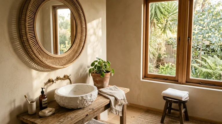
Bathrooms are often the smallest room in the house, which makes them the perfect place to experiment with this year’s most talked-about neutral. A soft white like Cloud Dancer bounces natural or artificial light around tight spaces far more effectively than darker tones, instantly making the room feel bigger and brighter. I’ve noticed this works especially well in bathrooms without windows, where every bit of reflected light matters. Pairing the walls with warm wood vanities or brushed metal fixtures keeps the space from feeling clinical, striking that spa-like balance so many people are trying to recreate at home.
Because bathrooms see daily wear from steam, water, and cleaning products, choosing a slightly muted white also has a practical upside: it hides minor scuffs and water spots better than a stark, bright white. This is a refresh that doesn’t require a full remodel to feel impactful. A few coats of paint, updated hardware, and a woven bath mat can transform the space in a weekend. It’s an easy win for anyone chasing a calming, hotel-style bathroom without the hotel-sized budget.
Also Read : 24 Modern Fireplace Ideas for a Stylish Cozy Home
7. Airy White Entryway
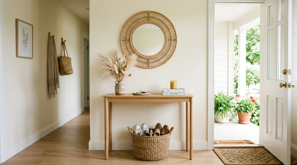
- Sets a calm, welcoming tone the moment guests walk in
- Makes narrow or dark entryways feel wider and brighter
- Keeps the eye focused on texture instead of clutter
- Pairs beautifully with woven baskets for practical shoe storage
- A small space that delivers a big first impression
The entryway is the first thing anyone sees when they step into your home, which makes it one of the most underrated places to use this soft, structural white. Narrow hallways and small foyers often feel cramped, but a lighter wall tone opens the space up almost instantly. In my experience, this is one of the fastest transformations homeowners notice, because entryways are usually small enough to repaint in an afternoon. Adding a console table and a round mirror doubles the effect, bouncing even more light back into the room.
What makes this idea especially practical is how well it hides everyday wear. Entryways take a beating from shoes, bags, and foot traffic, and a slightly muted white forgives scuffs far better than a stark bright one. I’ve seen this work well even in rental apartments, where a temporary wallpaper version of the finish delivers the same calming effect without a long-term commitment. Pair it with a woven basket for shoes and a small plant, and the space feels curated rather than chaotic, setting the tone for the rest of the home.
8. Cloud Dancer Nursery
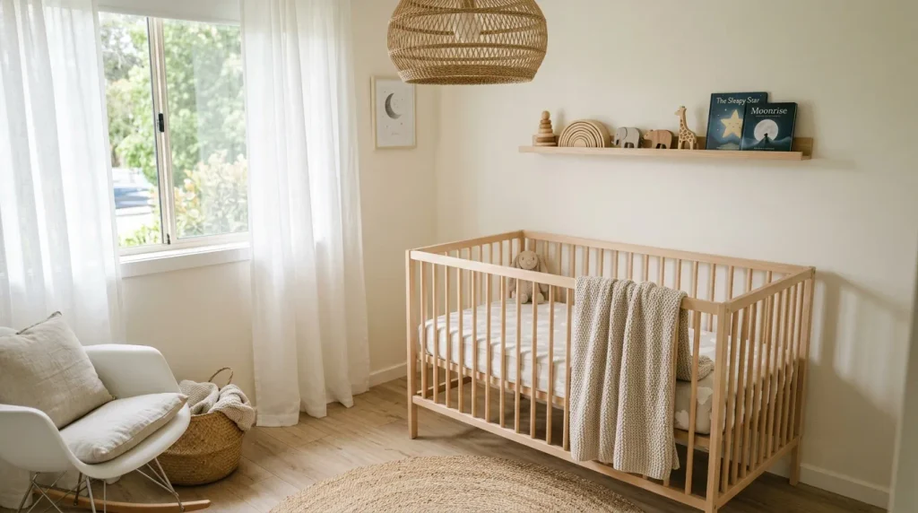
- Creates a gender-neutral palette that grows with the child
- Soft tones support a calmer, more restful sleep environment
- Easy to layer in pastel accents without repainting later
- Feels warm rather than sterile, unlike stark white nurseries
- A timeless choice that won’t need updating in a year or two
Nurseries are one of the most emotional rooms to design, and this soft, billowy white takes a lot of the pressure off. Because it’s gender-neutral and easy to layer with any accent color, parents don’t need to commit to a theme before the baby even arrives. That’s why many designers recommend a calm neutral base for nurseries specifically — it gives the room room to evolve as the child grows, from soft pastels in infancy to bolder colors later on, without ever needing to repaint the walls themselves.
This palette also supports the practical side of nursery design. Soft, muted whites tend to feel warmer under both natural and lamp light, which matters during long nighttime feedings and diaper changes. I’ve noticed parents often add texture through knit blankets, woven baskets, and wooden toys rather than color, keeping the room visually calm while still feeling personal. It’s a nursery style that photographs beautifully for baby announcements and stays functional and soothing for the child long after the newborn stage has passed.
9. Minimalist White Dining Room
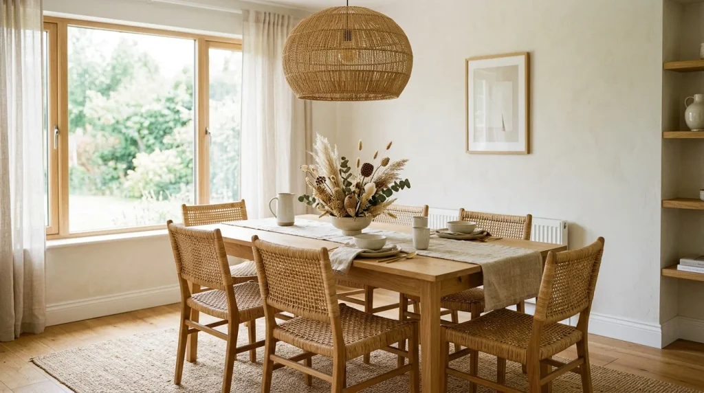
- Creates a flexible backdrop for everyday meals and hosting
- Makes table settings and centerpieces the visual focal point
- Pairs naturally with wood, rattan, and linen textures
- Reflects candlelight and pendant lighting beautifully at dinner
- Works for both casual family dinners and formal gatherings
A dining room painted in this soft neutral white becomes a stage rather than a statement, letting the table setting take center attention instead of the walls competing for it. This matters more than people expect, because dining rooms are used for everything from quick weekday breakfasts to holiday dinners, and a neutral backdrop adapts to both without feeling mismatched. In my experience, this flexibility is exactly why the space keeps showing up in home tours and Pinterest dining room boards, since it photographs well in any season or styling theme.
The tone also does something practical with lighting. Soft whites like this one reflect warm pendant light and candlelight beautifully in the evening, giving dinner parties a gentle glow instead of harsh shadows. I’ve seen this work particularly well in open-concept homes, where the dining area needs to visually connect to an adjoining kitchen or living room without clashing. Add a linen runner, dried florals, and woven chairs, and the room feels effortlessly put together for guests, whether it’s a Tuesday dinner or a holiday gathering.
10. Textured White Reading Nook
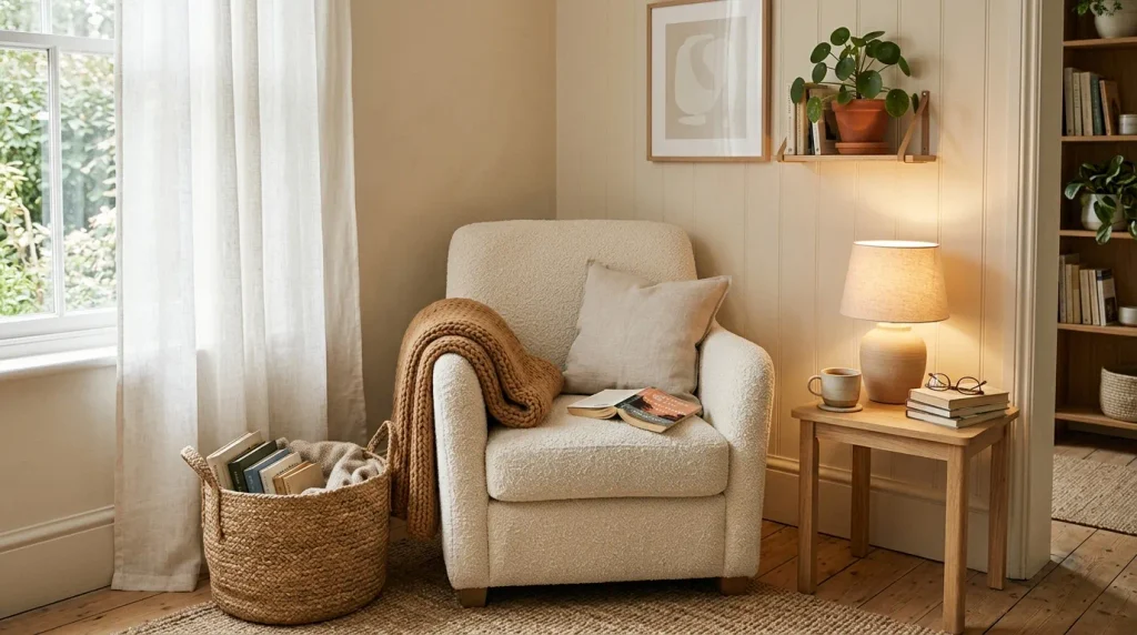
- Turns an unused corner into a genuinely relaxing spot
- Soft tones make small nooks feel cozy instead of cramped
- Layered textures add warmth without adding more color
- Easy to recreate with just a chair, throw, and lamp
- Encourages slower, screen-free moments at home
Every home has a forgotten corner, and this soft, structural white is one of the easiest ways to turn it into somewhere you actually want to sit. Because the tone is so calm and unobtrusive, it lets texture do all the visual work — a bouclé chair, a knit throw, a woven basket of books. In my experience, this is one of the lowest-cost transformations on this entire list, since it rarely requires more than a single accent wall, a chair, and good lighting to feel complete and genuinely inviting.
What makes a reading nook like this so effective is the mood it sets. Warm lamp light against a soft white wall creates a gentle glow in the evening, which naturally encourages slower, more restful moments away from screens. I’ve noticed that even a small unused corner near a window can become the most-used spot in the house once it’s styled this way. It’s proof that comfort doesn’t require a big room or a big budget, just the right combination of color, texture, and light.
11. Cloud Dancer Staircase Wall
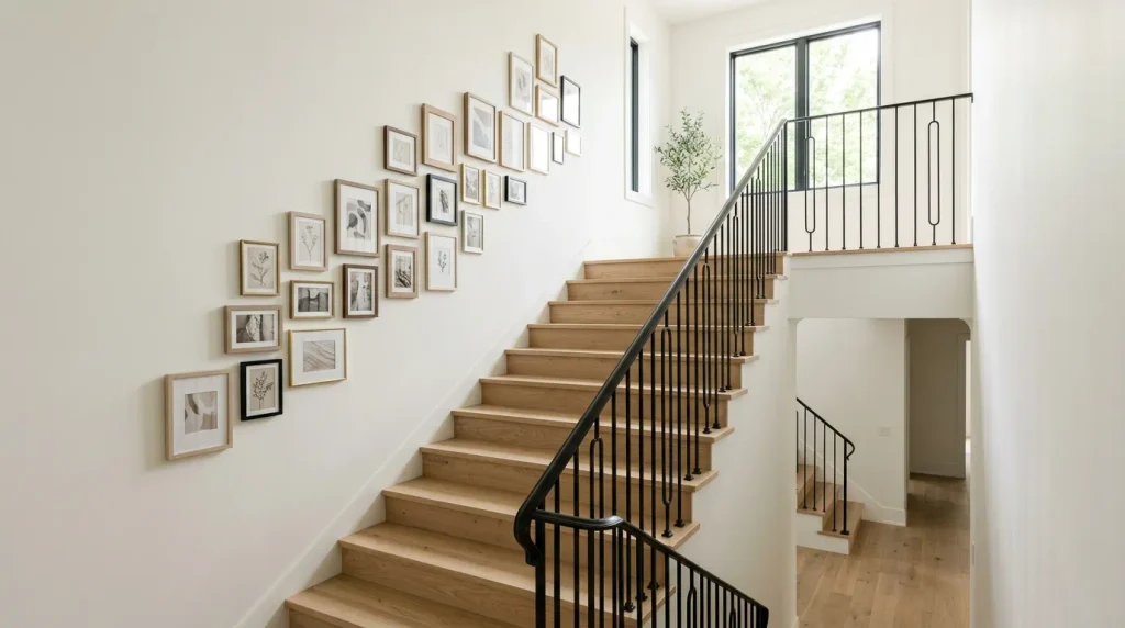
- Brightens a space that’s often overlooked in home design
- Creates a natural backdrop for a gallery wall or artwork
- Makes narrow staircases feel less closed-in and heavy
- Pairs well with black or brass railing details
- A high-traffic area that benefits most from a fresh, light tone
Staircases rarely get the design attention they deserve, yet they’re one of the most visible parts of a home. Painting the surrounding walls in this soft, versatile white immediately lightens a space that’s often dim due to limited windows and tall, narrow proportions. That’s why many designers recommend starting here when a home feels heavier than it should — brightening the staircase has a ripple effect on how open the adjoining hallways and rooms feel, without needing to touch a single other wall in the house.
This tone also creates the perfect blank canvas for a gallery wall, since neutral art frames and black-and-white photography stand out beautifully against it. I’ve seen this work well in both narrow city homes and open farmhouse-style staircases, proving the idea isn’t limited to one architectural style. Add a black iron railing for contrast, and the staircase becomes a quiet design feature instead of just a functional pathway between floors, which is exactly the kind of detail that makes a home feel considered.
12. Soft White Closet Makeover
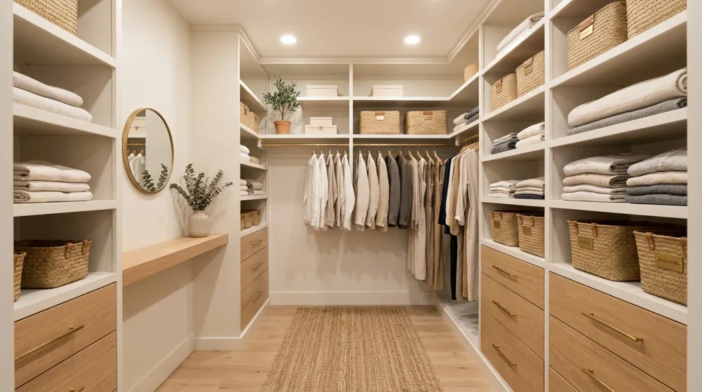
- Makes a small closet feel more like a boutique space
- Reflects light well in windowless storage areas
- Creates a calm backdrop that makes organizing easier to maintain
- Pairs beautifully with brass hardware and woven baskets
- A weekend project with a genuinely high visual payoff
Closets are easy to overlook, but they’re also one of the most satisfying spaces to refresh using this soft, calming white. Because most closets lack natural light, a lighter wall and shelving tone makes a real difference, turning a dark storage space into something that feels closer to a boutique dressing room. In my experience, this is a project people finish in a weekend, yet the payoff lasts for years, since a neutral backdrop never clashes with clothing colors or storage bin choices down the line.
There’s also a practical side to this makeover that goes beyond looks. A soft, light-reflecting tone genuinely makes it easier to see what you own, which in turn makes staying organized less of a chore. I’ve noticed that closets styled this way tend to stay tidier longer, simply because everything feels more visible and intentional. Add woven baskets and brass hardware for warmth, and the closet becomes a small daily moment of calm rather than a cluttered afterthought tucked behind a door.
13. Cloud Dancer Kids’ Playroom
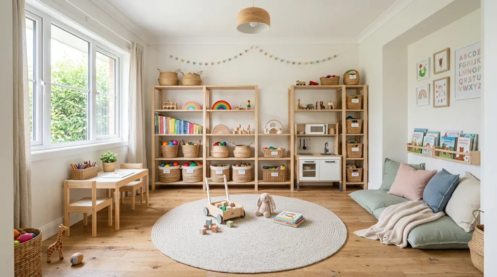
- Creates a calm base that colorful toys won’t visually clash with
- Makes bright accent colors pop instead of competing for attention
- Reflects natural light well, keeping the room from feeling gloomy
- Easy to update as a child’s interests and colors change
- Helps keep a busy, toy-filled room from feeling overwhelming
Playrooms are naturally chaotic, full of color, texture, and constantly changing toys, which is exactly why a soft neutral base matters more here than almost anywhere else in the home. Painting the walls in this year’s pantone color of the year gives bright toys, books, and artwork a calm backdrop to stand out against, instead of adding to the visual noise. In my experience, parents who repaint a playroom this way often say the space feels more manageable day to day, simply because the color chaos has somewhere neutral to land.
This approach also makes the room far easier to update over time. As a child’s favorite colors shift from soft pastels to bold primaries, the walls never need to change, only the accents do. I’ve seen this work well in shared playroom-bedroom combinations too, where a calm base keeps the space feeling restful even when toy storage is at its busiest. Add a soft rug and a few floor pillows, and the playroom becomes a space that feels both playful and genuinely calming at the same time.
14. Warm White Fireplace Wall
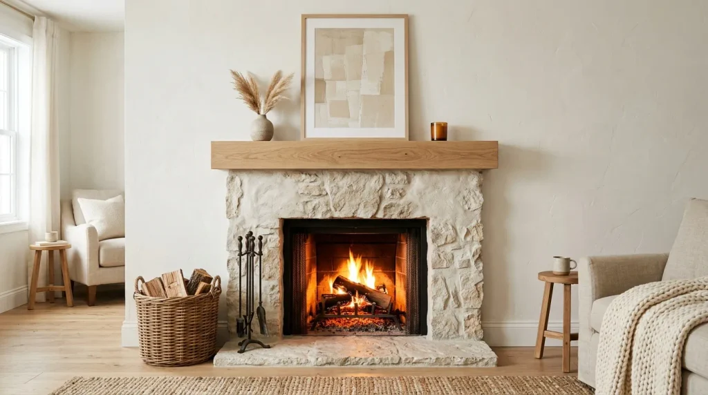
- Makes the fireplace the natural focal point of the room
- Softens the look of stone or brick surrounds beautifully
- Creates a warm glow effect when paired with firelight
- Works well with both modern and traditional mantel styles
- A simple update that instantly elevates the whole living space
A fireplace is already the heart of a living room, and painting the surrounding wall in this soft, billowy white only strengthens that focal point. Instead of competing with the brick or stone texture underneath, the tone gently highlights it, giving the fireplace a cleaner, more intentional presence in the room. That’s why many designers recommend a soft neutral for fireplace walls specifically, since it works with nearly any mantel style, from modern floating shelves to more traditional wood surrounds, without ever looking dated.
The real magic happens in the evening, when warm firelight reflects off the wall and fills the room with a soft glow. I’ve noticed this effect is far more noticeable with a muted white than with a stark, cool-toned one, which can make the light feel harsh by comparison. Add a woven basket for firewood and a piece of neutral artwork above the mantel, and the fireplace wall becomes the kind of cozy, photograph-ready focal point that anchors the entire living room’s design.
15. Cloud Dancer Laundry Room
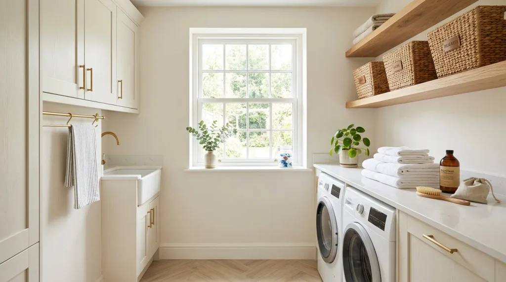
- Turns a purely functional room into a pleasant space to work in
- Reflects light well in small, often windowless laundry areas
- Hides detergent splashes and everyday mess better than stark white
- Pairs naturally with open shelving and woven storage baskets
- A budget-friendly refresh that makes chores feel less like chores
Laundry rooms are among the most functional spaces in a home, but that doesn’t mean they can’t also feel good to spend time in. A soft, structural white instantly brightens these often small, windowless rooms, making the space feel less like a hidden utility closet and more like an intentional part of the home. I’ve noticed that even a small laundry nook feels less like a chore zone once it’s painted this way, especially when paired with open wood shelving that keeps supplies visible and within easy reach.
This tone also holds up well against the realities of daily laundry life. It’s forgiving of small splashes, dust, and lint in a way that a stark bright white simply isn’t, which matters in a room that sees constant use. Add a few woven baskets for sorting and a small plant on the counter, and the laundry room starts to feel considered rather than purely practical. It’s proof that even the most utilitarian spaces in a home deserve a thoughtful design touch.
16. Soft White Home Library
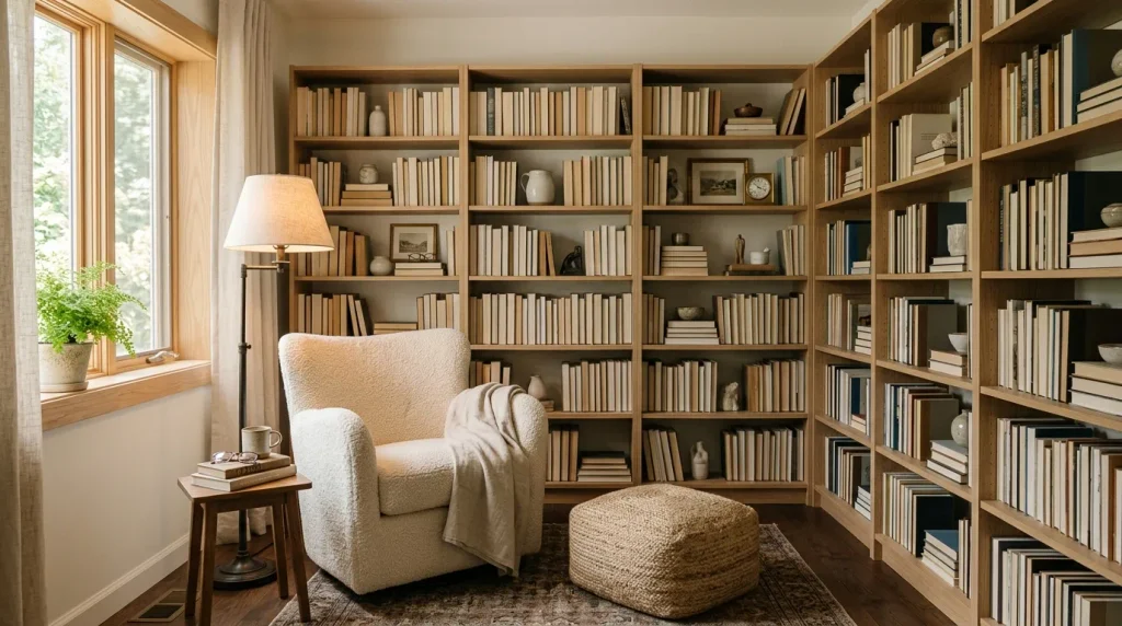
- Creates a calm, distraction-free backdrop for reading and focus
- Makes colorful book spines and artwork stand out naturally
- Reflects warm lamp light beautifully for evening reading sessions
- Pairs well with wood shelving for a timeless, collected look
- Works in both a full room and a small dedicated corner
A home library benefits from calm more than almost any other room, and this soft, billowy white delivers exactly that. Because the tone is quiet and unobtrusive, it lets the real color and personality of the space come from the books themselves, their spines creating natural, ever-changing visual interest against the neutral walls. In my experience, this is one of the reasons soft white libraries photograph so well for Pinterest — the shelves do the storytelling, while the walls simply provide a calm, considered stage for everything displayed on them.
This palette also makes the room feel genuinely restful to spend time in, which matters for a space meant for slow reading and focus. Warm lamp light against a soft white wall creates a gentle, book-shop-like glow in the evening, encouraging longer, more relaxed reading sessions. I’ve seen this work well even in small library corners tucked into a hallway or landing, proving that a full room isn’t required to capture the feeling. Add a bouclé chair and a floor pouf, and the space becomes a quiet retreat within the home.
17. Cloud Dancer Powder Room
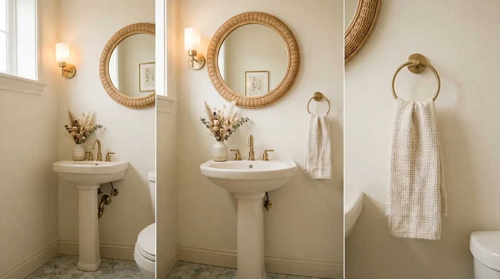
- Makes a tiny powder room feel unexpectedly luxurious
- Reflects light beautifully in windowless guest bathrooms
- Creates a polished first impression for visiting guests
- Pairs naturally with brass fixtures and round mirror shapes
- A small space that’s inexpensive to fully transform
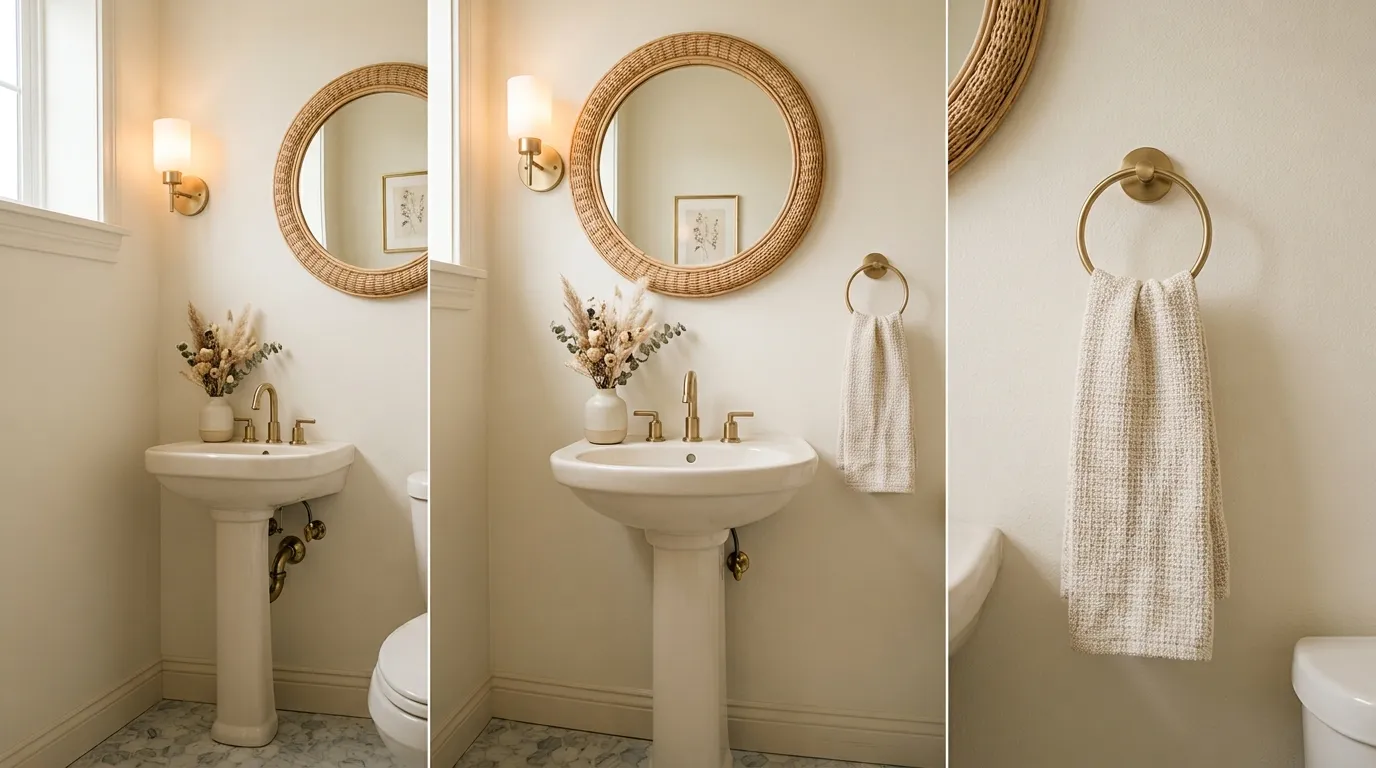
Powder rooms are small enough that even a modest budget can completely transform them, and this soft, structural white is one of the most reliable ways to do it. Because these rooms are often windowless and cramped, a lighter wall tone makes an outsized difference, reflecting whatever light is available and keeping the space from feeling closed-in. That’s why many designers recommend starting here when testing a new palette at home — the low square footage means less paint, less risk, and a much faster path to seeing the finished result.
A powder room is also one of the few spaces guests actually spend time alone in, which makes the details matter more than people expect. Brushed brass fixtures, a round mirror, and soft ambient lighting all read as intentional against this warm white base, creating a polished first impression without a full renovation budget. I’ve noticed that small elegant touches like a woven hand towel or a single dried floral arrangement go further in this space than almost anywhere else in the home, simply because there’s less visual competition for attention.
18. Layered White Balcony Nook
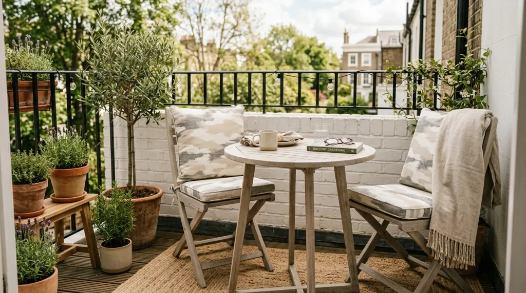
- Extends the soft, calming palette into outdoor living spaces
- Creates a cohesive look between indoor and outdoor areas
- Makes a small balcony feel like a genuine extra room
- Pairs beautifully with greenery and natural wood textures
- Easy to style seasonally with cushions and potted plants
Balconies and small outdoor nooks often get decorated as an afterthought, but bringing this year’s soft, neutral palette outside creates a genuine sense of flow between indoor and outdoor spaces. A light wood bistro set and soft white cushions read as calm and intentional rather than mismatched patio furniture, which is exactly the look that keeps showing up in small-space outdoor inspiration this year. In my experience, this cohesion is what makes a tiny balcony feel like a real extension of the home instead of a leftover corner squeezed in beside the railing.
Greenery does most of the heavy lifting in a space styled this way, since potted plants provide natural color and texture against the soft neutral backdrop. I’ve seen this work particularly well on small apartment balconies, where every design choice needs to earn its place in a limited footprint. A woven outdoor rug and a linen throw add just enough warmth to make the space feel cozy rather than sparse, proving that even a few square feet can become a genuinely relaxing outdoor retreat.
19. Cloud Dancer Wardrobe Doors
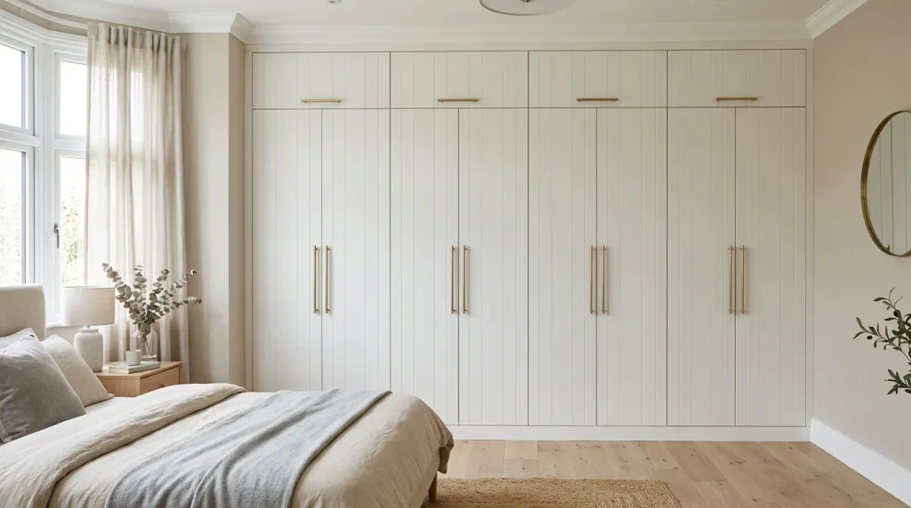
- Gives built-in or freestanding wardrobes a custom, high-end look
- Reflects light well, brightening bedrooms with limited windows
- Pairs beautifully with brass or matte black hardware
- Hides scuffs and daily wear better than a stark white finish
- A furniture-level update that doesn’t require a full room repaint
Wardrobe doors are one of the largest visual surfaces in a bedroom, yet they’re often the last thing anyone thinks to update. Repainting or resurfacing them in this soft, structural white instantly gives even basic flat-panel doors a custom, built-in look, without the cost of a full wardrobe replacement. In my experience, this is one of the most underrated upgrades on this entire list, since most people focus on walls and bedding first, completely overlooking how much visual space a large wardrobe front actually takes up in the room.
Adding brushed brass or matte black handles finishes the look and makes the wardrobe feel like an intentional design choice rather than a purely functional piece. I’ve noticed this update works especially well in bedrooms with limited natural light, since the softer white reflects what light there is far better than a dark or heavily grained wood finish. It’s a project that can often be completed in a weekend with paint made for laminate or wood surfaces, yet the visual payoff rivals a much larger renovation.
20. Soft White Ceiling Trend
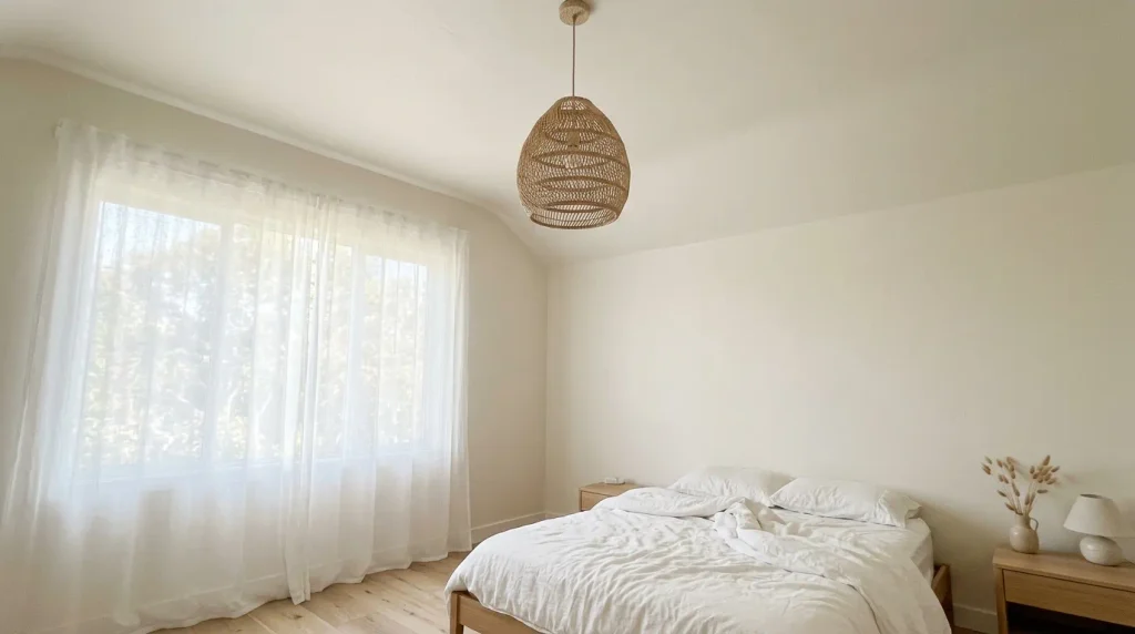
- Removes the visual break between walls and ceiling
- Makes low ceilings feel taller and rooms feel more spacious
- Creates a soft, cocooning, monochromatic atmosphere
- Works especially well in bedrooms and reading nooks
- A subtle trend that photographs beautifully in natural light
Painting the ceiling the same soft white as the walls is a small technical choice with a surprisingly large visual effect. Without a stark white ceiling breaking up the room, the eye reads the space as one continuous, flowing volume rather than a box with defined edges. That’s why many designers recommend this approach for rooms with lower ceilings specifically, since removing that visual line genuinely makes the space feel taller and more open, even though nothing about the actual room dimensions has changed.
This monochromatic approach also creates a soft, cocooning atmosphere that’s especially effective in bedrooms. I’ve seen this work well in older homes with slightly uneven or textured ceilings, since a matching soft white tends to disguise minor imperfections better than a bright, glossy white would. Paired with a woven pendant light and sheer curtains, the whole room feels like it’s wrapped in a single, gentle tone, which is exactly the calm, dreamy look so many people are chasing with this year’s palette.
21. Cloud Dancer Built-In Shelving
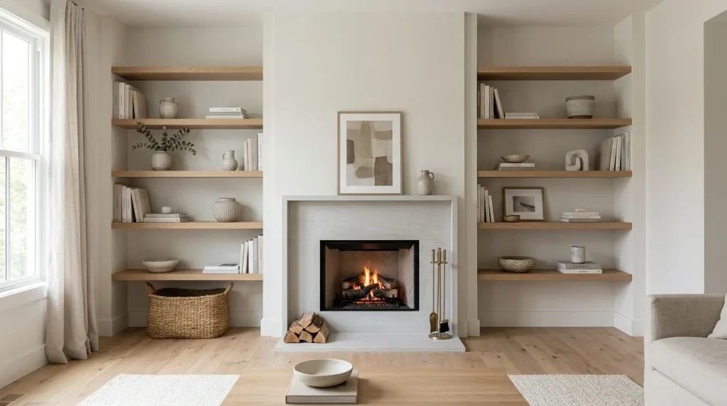
- Gives built-ins a custom, architectural look without new construction
- Makes displayed books, art, and ceramics the visual focus
- Reflects light well, brightening shelving nooks near windows
- Pairs naturally with wood shelves and neutral decor pieces
- A high-impact update for existing shelving that feels dated
Built-in shelving is often one of the most expensive features to add to a home, which is exactly why repainting existing built-ins in this soft, structural white feels like such a smart, high-impact update. Dated or heavily stained built-ins can look instantly refreshed and architectural with a coat of the right neutral, especially when paired with light wood floating shelves for contrast and warmth. In my experience, this is a project many homeowners put off simply because they assume shelving updates require full replacement, when in most cases paint alone makes a dramatic difference.
The real benefit shows up once the shelves are styled. A calm, neutral background lets displayed books, ceramics, and art pieces genuinely stand out, rather than competing with a busy or dark shelf color behind them. I’ve noticed that built-ins painted this way photograph especially well flanking a fireplace, since the symmetry and soft tone create a naturally balanced, gallery-like focal point in the living room without requiring any new construction at all.
22. Warm White Front Porch
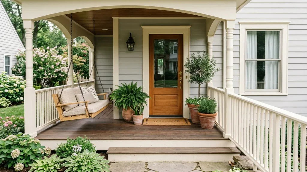
- Creates a warm, inviting first impression from the street
- Makes trim and railings look crisp without feeling stark
- Pairs beautifully with greenery and natural wood porch furniture
- Hides weather wear better than a bright, high-gloss white
- A curb-appeal update that photographs beautifully for listings
A front porch sets the tone for a home before anyone even steps through the door, and this soft, structural white brings a warmth to trim and railings that a typical bright white can’t match. Because the tone leans gentle rather than stark, it holds up visually against weather, dust, and everyday wear far better over time. That’s why many designers recommend it for exterior trim specifically, since it keeps that crisp, clean porch look without needing constant repainting to stay looking fresh season after season.
Styled with a wood porch swing, woven cushions, and potted greenery, the space becomes genuinely inviting rather than just decorative. I’ve seen this work particularly well for homes preparing to sell, since a soft white porch consistently photographs better in listing photos than either a dark or overly bright exterior. It’s a relatively small, affordable update, yet it does more for a home’s curb appeal and first impression than almost any other single change on this list.
23. Cloud Dancer Kitchen Backsplash
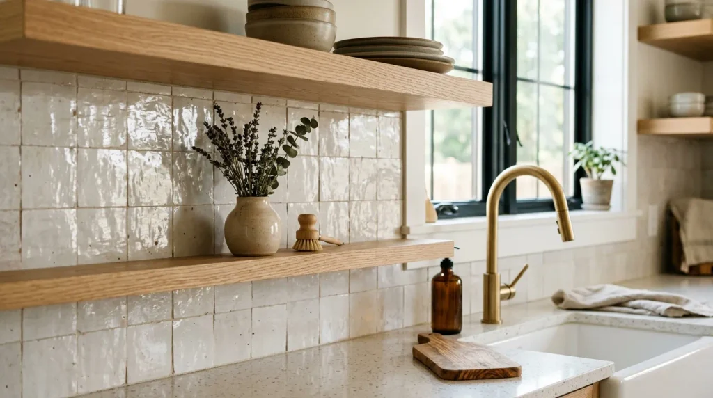
- Adds subtle texture and dimension without a bold pattern
- Handmade or zellige-style tile catches light beautifully
- Pairs naturally with wood shelving and brass fixtures
- Keeps the kitchen feeling cohesive with a soft, neutral palette
- A manageable weekend project compared to a full kitchen remodel
A backsplash is one of the few places in a kitchen where texture can shine without needing a bold color to make an impact. Using this soft white in a handmade or zellige-style tile brings subtle variation and light-catching texture to the wall, giving the kitchen visual interest even while staying within a calm, neutral palette. In my experience, this kind of textured tile is what elevates a kitchen from simply clean to genuinely designed, since the slight imperfections in handmade tile catch natural light differently throughout the day.
This idea also pairs beautifully with the earlier cabinet and shelving ideas on this list, creating a cohesive look throughout the whole kitchen rather than a single standout feature. I’ve noticed that kitchens using this layered, monochromatic approach tend to feel larger and more put-together than ones relying on contrasting colors for interest. It’s a project that’s manageable in a weekend for most DIY-comfortable homeowners, yet the tactile, handcrafted look it delivers rivals far more expensive full kitchen renovations.
24. Soft White Gallery Wall
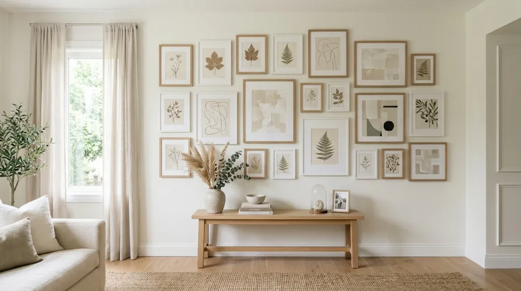
- Creates a cohesive backdrop for mismatched frames and art styles
- Lets artwork stand out instead of competing with a busy wall
- Reflects light well, keeping a gallery wall from feeling heavy
- Pairs beautifully with wood and matte white frame combinations
- A flexible display that’s easy to rearrange or expand over time
A gallery wall can quickly feel chaotic when the art and frames don’t match, but painting the wall itself in this soft, versatile white solves that problem before it starts. The neutral backdrop gives even a mismatched mix of frame styles and art subjects a sense of cohesion, letting the collection read as curated rather than cluttered. I’ve noticed this is especially helpful for people building a gallery wall slowly over time, since new pieces in different styles or colors never clash with a soft white base the way they might against a bolder wall color.
Lighting also plays a bigger role here than most people expect. A soft white wall reflects natural light evenly across the whole display, avoiding the glare or heavy shadows that can happen against a stark white or dark wall. I’ve seen this work particularly well above a console table or sofa, where the gallery wall becomes the room’s main focal point. It’s a flexible, evolving display, and this soft neutral base is what keeps it looking intentional no matter how many pieces get added.
Conclusion
Small changes really can transform how a home feels, and that’s exactly what these 24 ideas prove. Whether you start with a single accent wall or work your way through a full kitchen refresh, the Pantone Color of the Year offers a calm, flexible foundation that grows with your style instead of fighting against it. I’ve seen how small changes like these can completely transform a space, often faster and more affordably than people expect. Pick one idea from this list and try it this week. Save this article to your Pinterest board so you can come back to it, and share it with a friend who’s planning their own home refresh. Your calmer, more beautiful home is closer than you think.