Ready to make your bedroom feel richer, warmer, and instantly more luxurious? ✨
A few deep, saturated colors can completely change the mood of your space.
If you love a jewel tone bedroom, these ideas will give you plenty of inspiration to try.
This collection features 25 stylish ways to bring emerald, sapphire, ruby, amethyst, teal, and other jewel-inspired shades into your bedroom. You’ll discover practical ideas for walls, bedding, curtains, upholstered furniture, accent pieces, and layered color palettes. Whether you want one dramatic statement or several smaller touches, there’s an approach that can fit your existing space. In my experience, the easiest way to work with rich colors is to start with one dominant shade and balance it with softer neutrals, natural wood, and warm lighting. Keep reading for ideas that can help your bedroom feel more polished, cozy, and beautifully personal.
1. Emerald Green Walls
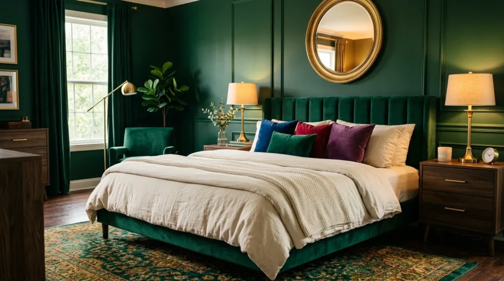
- Deep green creates an instantly rich and enveloping backdrop.
- Pair it with cream bedding to keep the room balanced.
- Brass accents add warmth against the cooler green.
- Velvet and wood textures make the space feel layered and sophisticated.
A deep green wall can instantly turn an ordinary bedroom into a dramatic retreat. Emerald creates a saturated backdrop that makes cream bedding, brass lighting, and warm wood furniture stand out beautifully. This approach works especially well in bedrooms with good natural light because daylight keeps the darker color from feeling too heavy. For smaller rooms, painting only the main wall behind the bed can create the same focal effect without overwhelming the space. In my experience, adding lighter bedding and curtains helps rich wall colors feel luxurious rather than closed-in or overly dark.
The easiest way to make emerald walls feel polished is to repeat small touches of the color throughout the room. Try emerald cushions, a patterned throw, or a small decorative vase rather than matching every accessory. Cream, beige, and warm brown can soften the intensity, while brass or antique gold introduces a refined glow. Choose matte or eggshell wall finishes when possible because excessive shine can make saturated colors look harsh. With the right balance, this color creates a cozy backdrop that feels dramatic at night and surprisingly fresh when natural daylight fills the room.
2. Sapphire Blue Bedding
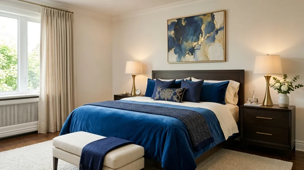
- Sapphire bedding creates a bold focal point without repainting the room.
- Layer different blue shades for depth instead of matching everything exactly.
- Ivory sheets help brighten the darker bedding.
- Add brass or warm wood accents to balance cool blue tones.
Sapphire blue bedding can bring jewel-toned richness into a bedroom without committing to a permanent wall color. A deep blue duvet or velvet quilt immediately becomes the visual centerpiece, especially when paired with simple ivory sheets and neutral walls. This makes the idea practical for renters or anyone who enjoys changing their bedroom style regularly. Layering navy, sapphire, and slightly lighter blue pillows creates depth while keeping the palette cohesive. The finished bed feels plush and inviting, but the surrounding neutral surfaces prevent the strong color from making the entire room feel too intense.
Texture makes rich blue bedding even more effective. Velvet catches light differently from linen or cotton, creating subtle shifts in color as you move around the room. If velvet feels too formal, use a cotton or quilted coverlet in sapphire and add one velvet accent pillow instead. Warm wood nightstands, brass lamps, and cream rugs help balance the coolness of the blue. I’ve noticed that keeping the walls relatively quiet allows saturated bedding to feel intentional rather than competitive. This is an easy update when you want a noticeable transformation without replacing your entire bedroom furniture set.
3. Ruby Red Accents
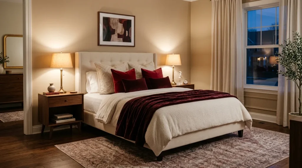
- Ruby and burgundy accents add warmth without covering the entire room.
- Use red through pillows, throws, artwork, or a single upholstered piece.
- Pair deep red with cream and walnut for a sophisticated contrast.
- Keep the strongest red accents close to the bed for visual focus.
A few ruby red accents can completely change the energy of a bedroom while keeping the overall design comfortable and livable. Instead of covering the walls, introduce this intense color through velvet pillows, a burgundy throw, artwork, or a small upholstered bench. Deep red works beautifully against cream, beige, walnut, and warm gray because those softer tones give the eye somewhere to rest. This approach is ideal when you want the richness of jewel colors without committing to a highly saturated room. The result feels warm, confident, and visually layered without becoming overwhelming.
The secret to using ruby tones successfully is repetition without excess. Choose one main red accent, then echo the shade in two smaller details across the room. For example, a burgundy throw can connect with a small artwork detail and a decorative pillow. Avoid introducing several unrelated shades of red because they can compete with each other. In my experience, deeper ruby and wine tones are easier to live with than bright scarlet when creating a sophisticated bedroom. Combined with warm lighting and tactile fabrics, they create a cozy atmosphere that feels especially inviting after sunset.
4. Amethyst Purple Accents
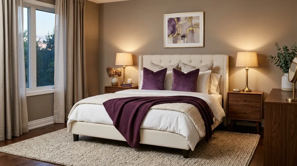
- Amethyst adds depth while keeping the room visually soft.
- Use plum, violet, and muted purple in small layered accents.
- Cream bedding prevents the darker tones from feeling too heavy.
- Brass lighting creates a warm contrast against cool purple shades.
Amethyst accents can give a bedroom an elegant sense of depth without making the entire space feel dark. A velvet pillow, plum throw, patterned artwork, or upholstered bench can introduce the color beautifully against cream or taupe surroundings. Purple works especially well when several related shades are layered rather than using one exact tone everywhere. A darker plum cushion beside a softer violet throw creates subtle variation and makes the bed look more inviting. This approach brings the richness associated with jewel colors while keeping the room comfortable enough for everyday living.
Lighting plays an important role when decorating with purple because cool bulbs can make the color appear flat or overly blue. Warm bedside lamps help bring out the red undertones in plum and amethyst shades, creating a softer evening atmosphere. Keep the surrounding materials natural, such as walnut wood, linen, or woven textures, to prevent the room from feeling overly glamorous. I’ve noticed that purple looks particularly sophisticated when used sparingly against warm neutrals. A few intentional accents can make the bedroom feel layered and luxurious without turning the design into a themed space.
5. Teal Velvet Headboard
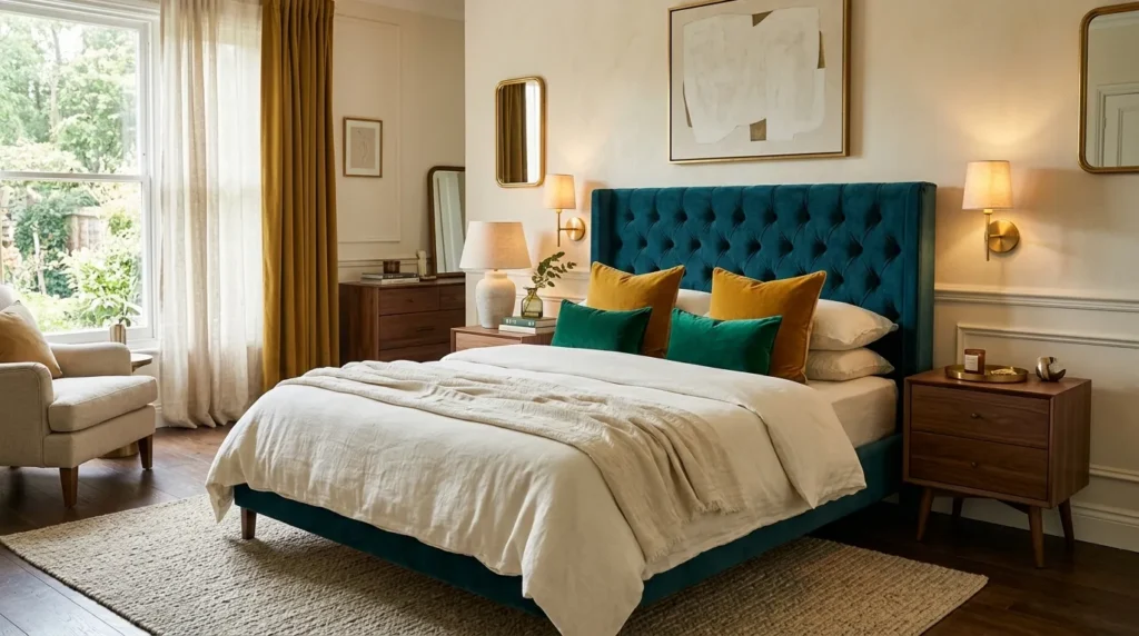
- A teal headboard creates an instant focal point behind the bed.
- Velvet adds depth because its surface changes with the light.
- Keep surrounding bedding neutral to highlight the saturated color.
- Introduce small complementary jewel tones through pillows or artwork.
A deep teal velvet headboard can transform the bed into a dramatic centerpiece without requiring bold color on every wall. Teal combines the richness of blue with the natural depth of green, making it easier to pair with other saturated shades. Against ivory bedding and warm neutral walls, the headboard becomes the first thing the eye notices. Velvet adds another layer because its texture catches daylight and evening light differently. This makes the color appear subtly varied throughout the day, creating the polished, dimensional feeling often associated with high-end bedroom interiors.
To keep the look balanced, let the headboard remain the strongest color in the room and introduce supporting shades in smaller amounts. Emerald pillows, mustard accents, or muted purple artwork can complement teal beautifully without competing for attention. Warm brass sconces and walnut furniture add earthy contrast and keep the palette grounded. If your room is small, choose a streamlined headboard rather than an oversized design so the color remains striking without visually shrinking the space. In my experience, this single investment piece can make simple bedding and basic furniture look considerably more intentional.
Also Read: 21 Moody Dining Room Ideas for a Dramatic Cozy Space
6. Jewel Tone Gallery Wall
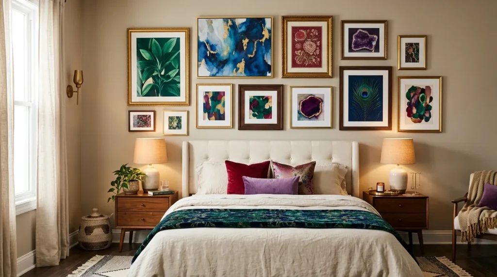
- A gallery wall lets you combine several rich colors without overwhelming the room.
- Repeat two or three colors across the artwork for cohesion.
- Mix frame finishes to create a collected, sophisticated appearance.
- Keep bedding simple so the artwork remains the main visual feature.
A jewel-toned gallery wall can introduce multiple rich colors while keeping the bedroom visually organized. Choose artwork featuring emerald, sapphire, ruby, amethyst, or teal, then arrange the pieces above the bed or on a nearby accent wall. The trick is repeating a few colors throughout the collection so the artwork feels connected rather than random. Neutral bedding provides a calm foundation, allowing the saturated prints to become the main focal point. This approach works especially well when you love colorful interiors but want to avoid committing to one dominant shade across the entire room.
Frame selection can make the gallery feel either casual or luxurious. Dark wood frames create warmth and depth, while antique brass frames add a more polished appearance. You can mix both if the artwork shares a consistent color story. Before hanging everything, arrange the frames on the floor to test spacing and balance. I’ve noticed this simple step prevents many common gallery-wall mistakes, especially when mixing different sizes. Keep enough breathing room between pieces so each artwork remains visible. The finished arrangement adds personality, color, and visual interest while still feeling thoughtfully coordinated.
7. Emerald and Gold
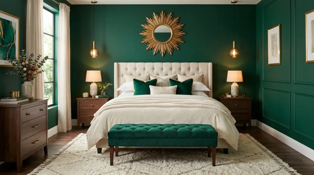
- Emerald and gold create a classic high-impact combination.
- Use gold through lighting, mirrors, hardware, or small accessories.
- Keep bedding neutral to prevent the color palette from becoming heavy.
- Walnut and cream materials soften the overall contrast.
Emerald and gold create an instantly luxurious bedroom combination, especially when the green is deep and saturated. You can introduce emerald through an accent wall, velvet bench, curtains, or decorative pillows, then use warm gold in smaller details such as lamps, mirrors, and hardware. The metallic finish catches light and prevents the darker green from feeling flat. Cream bedding and natural wood provide visual breathing room between the two rich tones. This balance creates a sophisticated room that feels dramatic but still comfortable enough for everyday relaxation.
The amount of gold matters more than the number of pieces you use. A brass pendant, mirror frame, and two small decorative accents are often enough to establish the connection. Avoid covering every surface with metallic finishes because the room can quickly feel overly formal. Instead, let emerald remain the dominant color and use gold as an understated highlight. In my experience, aged brass works particularly well because its softer finish feels warmer and more collected than highly polished gold. Add textured fabrics such as linen or velvet to make the overall design feel inviting rather than overly decorative.
8. Sapphire and Silver
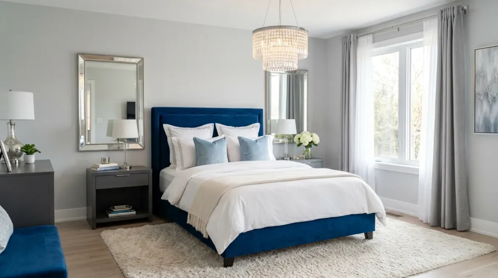
- Sapphire creates depth while silver keeps the palette crisp.
- Use silver through mirrors, lamps, hardware, or decorative frames.
- White and pale gray prevent the darker blue from overpowering the room.
- Add soft textiles to balance the cooler color combination.
Sapphire blue and silver create a refined bedroom palette with a crisp, sophisticated appearance. A deep blue upholstered bed or accent wall provides richness, while silver details add brightness and a subtle reflective quality. Pair the stronger shades with white bedding, pale gray walls, or soft cream flooring so the room maintains visual balance. This combination works particularly well in contemporary bedrooms where clean lines and controlled color are important. Instead of using many decorations, let the saturated blue and metallic accents provide most of the visual impact.
Because both sapphire and silver can feel cool, introduce warmth through lighting and tactile fabrics. A plush rug, velvet cushions, or knitted throw can make the space feel more comfortable. Choose warm-white bulbs for bedside lamps so the room does not appear overly blue at night. A silver-framed mirror can also reflect natural daylight and make the bedroom feel more spacious. I’ve noticed that limiting the silver to a few carefully selected pieces gives the room a more sophisticated appearance. The result feels polished and luxurious while remaining calm enough for restful evenings.
9. Burgundy Feature Wall
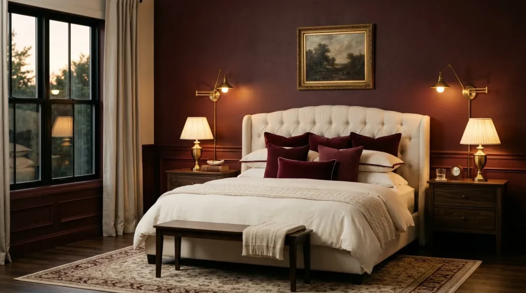
- Burgundy creates a warm and intimate backdrop behind the bed.
- Use a feature wall when painting the entire room feels too intense.
- Cream bedding creates strong but comfortable contrast.
- Walnut and brass accents reinforce the warmth of the palette.
A burgundy feature wall can make a bedroom feel intimate, warm, and dramatically sophisticated. Rather than covering every wall, use this deep red shade behind the bed to create a focused backdrop. The color naturally draws attention toward the sleeping area, making the bed feel more substantial and intentional. Cream bedding, walnut furniture, and warm brass lighting balance the intensity beautifully. This setup works especially well in bedrooms with moderate natural light, where the rich wall color can create a cozy atmosphere without appearing excessively bright or harsh.
Before painting, test the burgundy shade at different times of day because deep reds can change significantly under different lighting conditions. A color that looks balanced in daylight may appear much darker under warm lamps. Choose bedding in ivory, oatmeal, or soft beige rather than bright white if you want a softer transition. I’ve seen many bedrooms benefit from this approach because the feature wall adds personality without requiring an expensive furniture change. Finish the look with one or two burgundy accessories elsewhere in the room to create a subtle connection without repeating the color excessively.
10. Plum and Blush
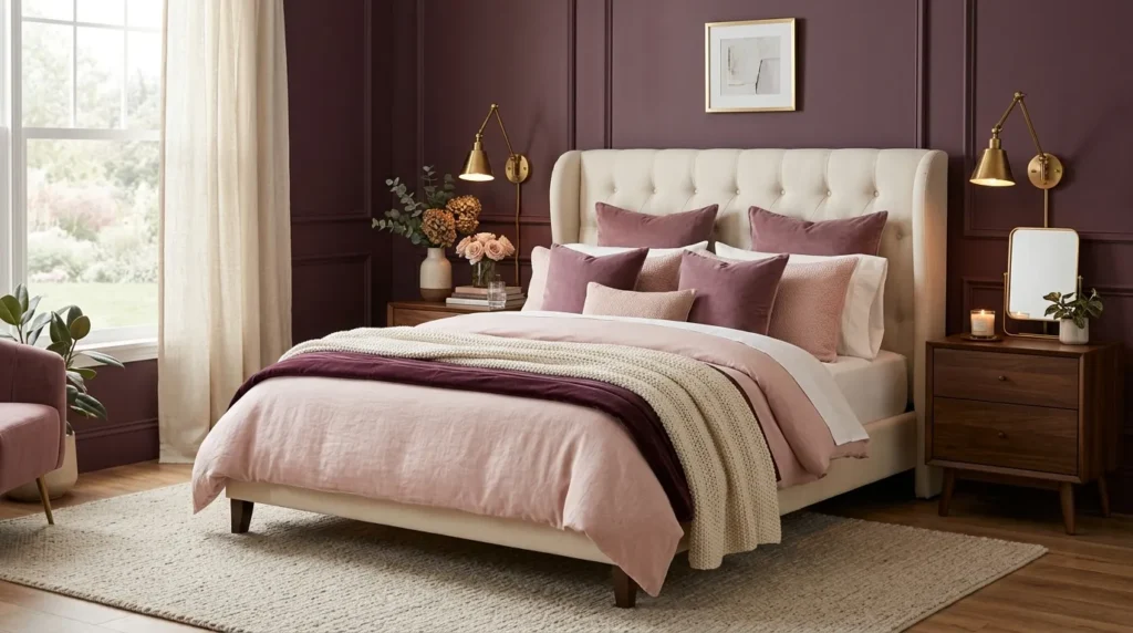
- Plum creates depth while blush adds softness and lightness.
- Use blush through bedding, pillows, curtains, or a small bench.
- Warm brass details connect the two contrasting shades.
- Keep larger furniture pieces neutral for a balanced finish.
Plum and blush create a beautiful contrast between deep richness and soft warmth. A plum accent wall or upholstered bed can provide the dramatic foundation, while blush bedding and cushions prevent the room from feeling too dark. The combination works particularly well with cream, beige, and warm wood because these neutral materials soften the transition between the two colors. Instead of using equal amounts of plum and blush, let one shade dominate and use the other as an accent. This creates a more sophisticated composition while keeping the bedroom comfortable and visually balanced.
Texture is what makes this color pairing feel especially luxurious. Try velvet plum pillows with a linen blush duvet, or combine a plush throw with smooth ceramic accessories. Brass lighting adds another warm element that helps connect the two shades. If the bedroom receives limited daylight, choose a slightly muted plum rather than an extremely dark version. In my experience, softer versions of saturated colors are easier to live with because they still feel rich without making the room visually heavy. Add warm lighting in the evening to bring out the cozy undertones.
11. Peacock Teal Bedding
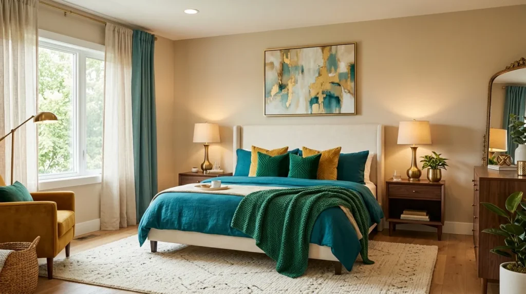
- Peacock teal gives the bed a bold and sophisticated focal point.
- Mix teal with mustard or emerald for layered jewel color.
- Keep walls neutral to let the bedding command attention.
- Combine velvet with linen or cotton for contrasting textures.
Peacock teal bedding can make the bed feel like a luxurious centerpiece without changing the room’s permanent finishes. This blue-green shade has enough depth to look dramatic while remaining versatile with warm neutrals. Pair it with an ivory headboard, cream sheets, and natural wood furniture for contrast. Small touches of mustard, emerald, or gold can build a richer palette without creating visual competition. The strongest color should remain concentrated around the bed, where it naturally draws attention and gives the room a clear focal point.
Different fabrics can make teal appear more dimensional. Velvet creates a deep, reflective surface, while linen or cotton introduces a softer matte finish. Try using teal on the duvet and adding lighter blue-green pillows in different textures. Warm brass lamps or wood nightstands help balance the cooler undertones. I’ve noticed that peacock shades look particularly beautiful near natural greenery because the colors feel connected without matching exactly. If you want a bold bedroom update without repainting, changing the bedding is one of the easiest ways to create a dramatic transformation with relatively little commitment.
12. Ruby Velvet Chair
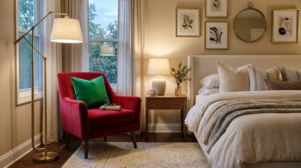
- A single velvet chair can introduce rich color without overwhelming the room.
- Position it near a window or reading corner for practical use.
- Choose a deep ruby or wine tone for a sophisticated effect.
- Add one complementary jewel-toned cushion for visual connection.
A ruby velvet chair can introduce a strong jewel tone while giving the bedroom a practical seating area. Place it beside a window, near a dresser, or in an unused corner where you can actually use it for reading or getting ready. The saturated upholstery becomes an attractive focal point without requiring an entire accent wall. Pair the chair with a small walnut table and warm brass lamp to create a functional little corner. Cream walls and bedding keep the bold red from dominating the rest of the room.
The chair can also become the starting point for the room’s color palette. Pull a small amount of the ruby shade into a cushion, artwork detail, or throw, then introduce one complementary color such as emerald or deep teal. Avoid matching every accessory exactly because the room can quickly feel staged. Choose durable upholstery if the chair will receive regular use, especially in a busy bedroom. I’ve seen this approach work well when homeowners want more color but do not want to repaint or replace large furniture pieces. One thoughtfully chosen chair can provide both personality and purpose.
13. Emerald Canopy Bed
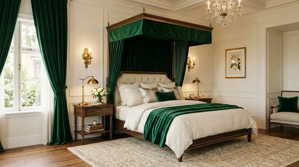
- An emerald canopy creates a dramatic focal point around the bed.
- Use ivory bedding to keep the strong green feeling balanced.
- Brass lighting adds warmth and elegant contrast.
- Choose lightweight curtains for a softer, more breathable appearance.
An emerald canopy bed can instantly give a bedroom a rich, boutique-hotel feeling while creating a clear focal point. The canopy structure naturally frames the sleeping area, and deep green fabric makes that architectural feature even more noticeable. Pair it with ivory linen bedding, warm wood nightstands, and brass lighting to keep the room balanced. This idea works especially well in bedrooms with higher ceilings because the vertical structure draws the eye upward. Even when the surrounding furniture is simple, the canopy gives the room a strong sense of character and intentional design.
The green does not have to appear on every part of the bed. If a fully upholstered canopy feels too dramatic, choose an emerald fabric headboard with lighter curtains or a simple metal frame. This keeps the color focused while allowing the room to breathe. Add natural textures such as linen, woven baskets, or a wool rug to soften the richness. In my experience, strong colors feel much easier to live with when they are surrounded by quieter materials. The result is luxurious without becoming overly formal, creating a bedroom that feels both impressive and genuinely comfortable.
14. Cobalt Accent Pillows
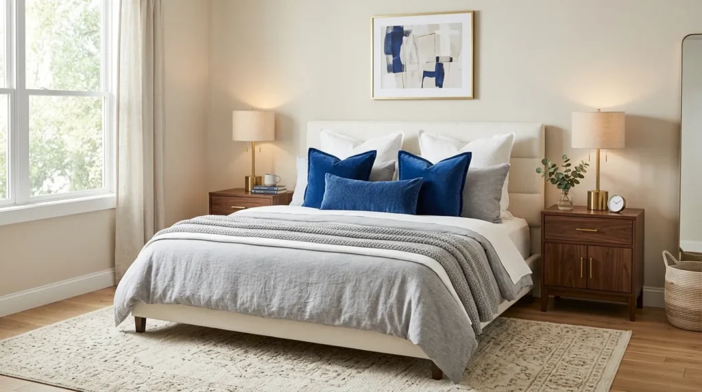
- Cobalt pillows add bold color without requiring permanent changes.
- Layer different blue patterns for a more collected appearance.
- Keep the duvet and walls neutral to highlight the accents.
- Repeat a small amount of blue in artwork or accessories.
Cobalt blue pillows are an easy way to introduce bold jewel color without making a permanent commitment. A few richly saturated cushions can transform a neutral bed, especially when layered against ivory, cream, or soft gray bedding. Mix velvet, linen, and patterned fabrics to create depth rather than choosing identical pillow covers. The intense blue naturally draws attention toward the bed, making it feel more styled and inviting. This option is especially practical when you enjoy refreshing your bedroom regularly because the accessories can be changed without replacing major furniture or repainting the walls.
For a balanced arrangement, use cobalt as the strongest accent and keep the surrounding colors relatively quiet. One patterned pillow can connect the blue with another shade, such as emerald or mustard, while solid cushions keep the composition controlled. Repeat a small amount of cobalt in artwork, a vase, or a throw so the color does not appear isolated. I’ve noticed that saturated pillows look particularly effective when the bed has several layers of texture. A quilted coverlet, linen sheets, and velvet cushions create a cozy, dimensional finish that feels polished without looking overly coordinated.
15. Sapphire Accent Wall
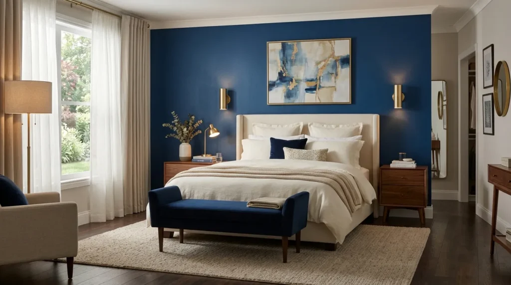
- A sapphire wall creates instant depth behind the bed.
- Use an accent wall when a full-room color feels too intense.
- Cream and beige pieces brighten the saturated blue.
- Warm wood and brass prevent the palette from feeling too cool.
A sapphire accent wall can turn the area behind the bed into a dramatic architectural feature. This deep blue shade works beautifully with cream upholstery, ivory bedding, warm wood, and brass because those materials soften its intensity. Painting only the wall behind the bed also gives you the richness of a saturated color without making the entire bedroom feel enclosed. The strong backdrop naturally frames the sleeping area, creating a polished focal point even when the rest of the furniture remains simple. This is a practical way to create a luxurious transformation with one major change.
Test your chosen blue on the wall before committing because sapphire can look dramatically different under daylight and artificial lighting. If the room receives little natural light, choose a slightly lighter or warmer blue to avoid a flat appearance. Keep large surrounding surfaces neutral, then introduce smaller blue accessories to reinforce the connection. In my experience, a single saturated wall often looks more sophisticated when the room has plenty of texture rather than lots of additional color. Linen curtains, a woven rug, and natural wood can make the entire space feel warmer and more inviting.
16. Amethyst Upholstered Bed
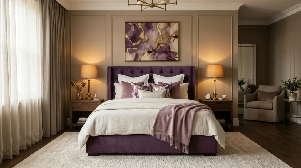
- An amethyst bed creates a dramatic focal point without colorful walls.
- Keep bedding light to balance the saturated upholstery.
- Use mauve and plum accents for subtle color layering.
- Warm wood and brass help ground the purple tones.
An amethyst upholstered bed can become the defining feature of a bedroom without requiring a dramatic wall treatment. Deep purple upholstery gives the bed visual weight and creates a luxurious focal point, especially when paired with ivory bedding and warm neutral walls. Layer mauve, plum, or softer violet pillows to create tonal depth without introducing too many competing colors. Walnut furniture and antique brass lighting provide warmth against the cooler purple. This approach works beautifully when you want a rich bedroom palette but prefer keeping the permanent walls and flooring relatively neutral.
The texture of the upholstery makes a major difference in how the color feels. Velvet creates a more glamorous appearance, while linen or textured fabric gives the same saturated shade a relaxed quality. Choose the finish based on the atmosphere you want to create. Keep the surrounding accessories restrained so the bed remains the visual anchor. I’ve noticed that deep purple looks particularly elegant when paired with warm cream rather than stark white because the softer contrast feels more cohesive. Add a textured rug under the bed to connect the furniture visually with the rest of the room.
17. Teal and Brass
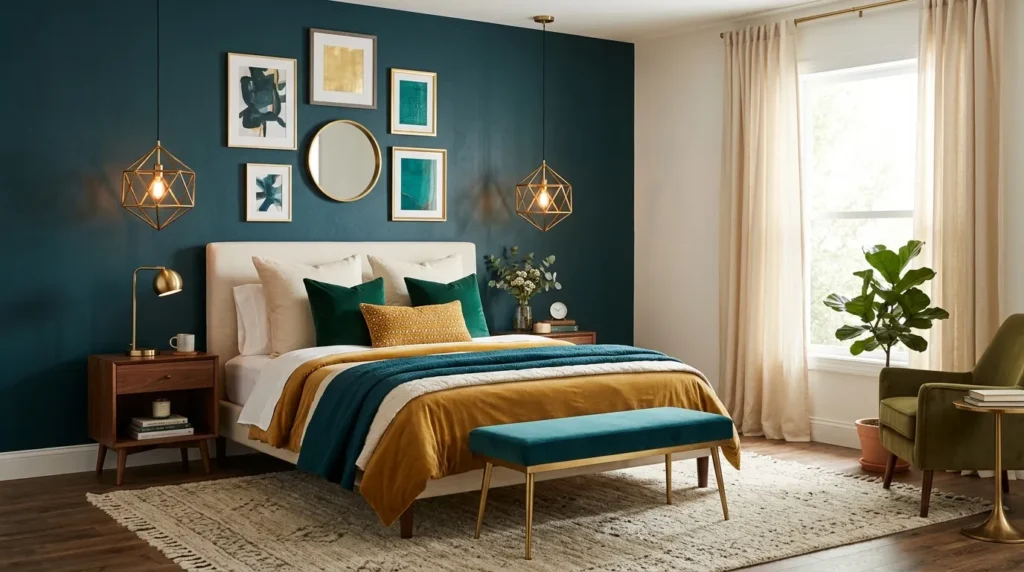
- Teal and brass create warmth while maintaining rich visual depth.
- Use brass in lighting, mirrors, or small decorative details.
- Keep larger surfaces neutral to prevent the palette from becoming heavy.
- Add mustard or emerald accents in small amounts for extra dimension.
Teal and brass create a rich combination that feels colorful without becoming overly bright. A deep teal wall or upholstered headboard can provide the saturated foundation, while brass lighting and hardware add warmth and reflective detail. Cream bedding and warm beige textiles help soften the contrast, making the bedroom feel comfortable rather than overly dramatic. This palette works particularly well in rooms with natural wood because the earthy undertones connect beautifully with both the green and blue elements within teal.
Keep the brass controlled so it enhances rather than dominates the color scheme. A pair of brass sconces, a mirror frame, or a few small accessories can be enough to establish the connection. If you want more color, introduce mustard, emerald, or muted burgundy through pillows and artwork. Avoid adding all three in equal amounts because the room can quickly become visually busy. In my experience, teal looks most sophisticated when its surrounding colors are warm and slightly muted. Soft lighting in the evening also brings out the depth of the shade beautifully.
18. Ruby and Navy
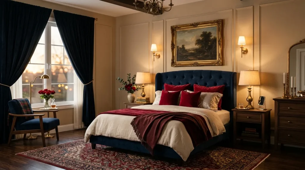
- Ruby and navy create strong contrast with a sophisticated feel.
- Use navy as the larger color and ruby as the accent.
- Cream bedding provides a visual break between saturated tones.
- Walnut and brass add warmth to the darker palette.
Ruby and navy create a dramatic bedroom palette that feels sophisticated without relying on excessive decoration. Use navy for the larger element, such as an upholstered headboard, curtains, or accent wall, then introduce ruby through velvet pillows, a throw, or artwork. Cream bedding provides an important visual break between the two saturated shades. Walnut furniture and warm brass lighting help keep the palette grounded. This combination is especially effective in bedrooms where you want a cozy, slightly moody atmosphere that still feels polished and intentional rather than overly dark.
The ratio between the colors is important. Let navy occupy more visual space and allow ruby to act as the concentrated accent. This prevents the two strong colors from competing for attention. You can soften the overall look with oatmeal curtains, a beige rug, or light wood accessories. I’ve noticed that velvet works particularly well for ruby because its texture gives the red a deeper, more sophisticated appearance. If the room receives limited daylight, add layered lighting around the bed and dresser. Good lighting keeps the darker palette inviting and makes the rich colors feel dimensional.
19. Emerald Bedding Layers
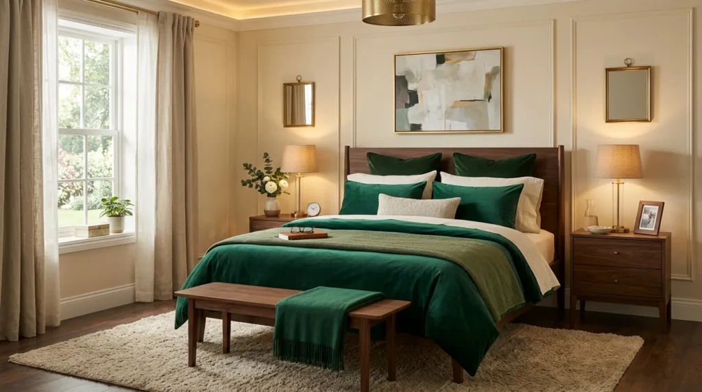
- Layer several green shades instead of matching every piece exactly.
- Use ivory sheets to create contrast against darker bedding.
- Velvet pillows add depth and a luxurious tactile finish.
- Warm wood and brass accessories keep the palette balanced.
Emerald bedding layers can make a bedroom feel instantly richer while keeping the walls light and versatile. Start with ivory sheets, add an emerald duvet or quilt, then layer darker green velvet pillows and a softer throw. Using several related shades gives the bed dimension instead of making it look like one solid block of color. This approach works particularly well when you want a jewel tone bedroom that feels dramatic but still restful. Keep the surrounding walls and larger furniture neutral so the layered bedding remains the main visual focus without overwhelming the room.
Texture makes this arrangement feel even more luxurious. Pair crisp cotton sheets with linen, velvet, or a quilted coverlet so each layer has a slightly different surface. Brass lamps and walnut nightstands add warmth while cream walls keep the darker green from making the room feel enclosed. I’ve noticed that emerald bedding looks especially inviting when the bed has enough layers to appear plush rather than perfectly flat. If you want seasonal flexibility, keep the ivory foundation year-round and simply switch the green throw or accent pillows. The result feels polished, cozy, and easy to refresh.
20. Peacock Blue Walls
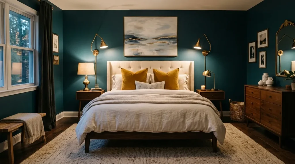
- Peacock blue creates a dramatic backdrop with green and blue undertones.
- Cream bedding helps brighten the saturated wall color.
- Mustard and brass add warmth against the cooler blue.
- Keep flooring and larger furniture pieces in natural tones.
Peacock blue walls can give a bedroom remarkable depth while creating a sophisticated backdrop for lighter furniture and textiles. The blue-green undertones make this shade more complex than a standard navy, especially when natural light moves across the walls throughout the day. Pair it with an ivory upholstered bed, cream bedding, and warm wood furniture to create contrast. Small mustard or emerald accents can add another layer of richness without competing with the walls. This approach works particularly well when you want the room to feel dramatic, cozy, and visually memorable.
Because peacock blue is highly saturated, test several samples before choosing your final shade. Light exposure can make the color appear greener during the day and deeper blue in the evening. Warm brass sconces or lamps can help balance its cooler undertones, while a textured beige rug adds softness underfoot. In my experience, keeping window treatments relatively light prevents dark painted bedrooms from feeling closed in. Choose sheer or warm ivory curtains when privacy allows, and let the wall remain the main statement. The finished space feels luxurious while still maintaining a comfortable residential atmosphere.
21. Jewel Tone Curtains
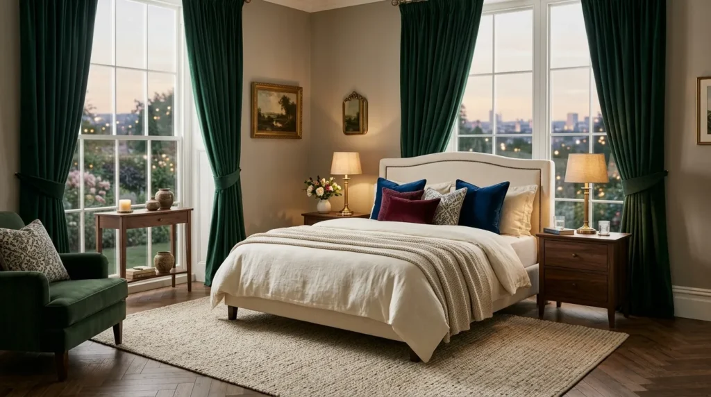
- Jewel-toned curtains create drama without changing the walls.
- Floor-to-ceiling panels can emphasize ceiling height.
- Velvet adds richness while heavier fabrics provide a cozy feel.
- Keep bedding relatively neutral when the curtains are highly saturated.
Jewel-toned curtains can introduce rich color in a surprisingly flexible way. Floor-to-ceiling emerald, sapphire, burgundy, or teal panels frame the windows while drawing attention upward and making the ceiling appear taller. Because curtains can be replaced more easily than painted walls or upholstered furniture, they are a practical choice when you want a noticeable bedroom transformation. Keep the bed and walls neutral if the curtains are deeply saturated. This creates a strong focal point without allowing the color to dominate every surface. The result feels dramatic, polished, and comfortable at the same time.
Fabric choice changes the overall mood significantly. Velvet creates a luxurious, light-catching effect, while linen or cotton gives saturated colors a softer and more relaxed appearance. Hang the curtain rod several inches above the window frame and extend it beyond the sides when possible to make the window feel larger. I’ve noticed that this small installation detail can make an average bedroom look considerably more finished. Choose a curtain color that appears somewhere else in the room through a pillow, artwork detail, or small accessory. That repetition helps the strong fabric feel naturally integrated rather than randomly added.
22. Garnet Accent Bench
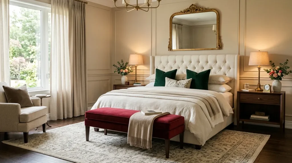
- A garnet bench adds rich color without dominating the entire room.
- Place it at the foot of the bed for both style and function.
- Velvet upholstery enhances the depth of the deep red shade.
- Repeat garnet in one or two smaller accessories for cohesion.
A garnet accent bench can add a luxurious burst of color while giving the bedroom a useful place to sit. Position it at the foot of an upholstered bed where it naturally becomes part of the room’s focal area. Deep red velvet works beautifully with ivory bedding, walnut furniture, and warm brass lighting because these materials soften the intensity of the color. The bench also creates a visual transition between the bed and flooring, making the entire arrangement feel more complete. This is an easy way to introduce rich color without committing to an entire feature wall.
Choose a bench with clean lines if the room already has several decorative details, or select a softly curved design for a more romantic appearance. Keep the upholstery as the strongest red element and repeat the shade subtly through artwork or a small cushion. If you use an emerald or sapphire accent elsewhere, keep it secondary so the colors do not compete. In my experience, a bench is one of the most practical statement pieces because it combines decoration with everyday function. It can hold folded blankets, provide seating, and make the bed area feel more intentionally designed.
23. Jewel Tone Ceiling
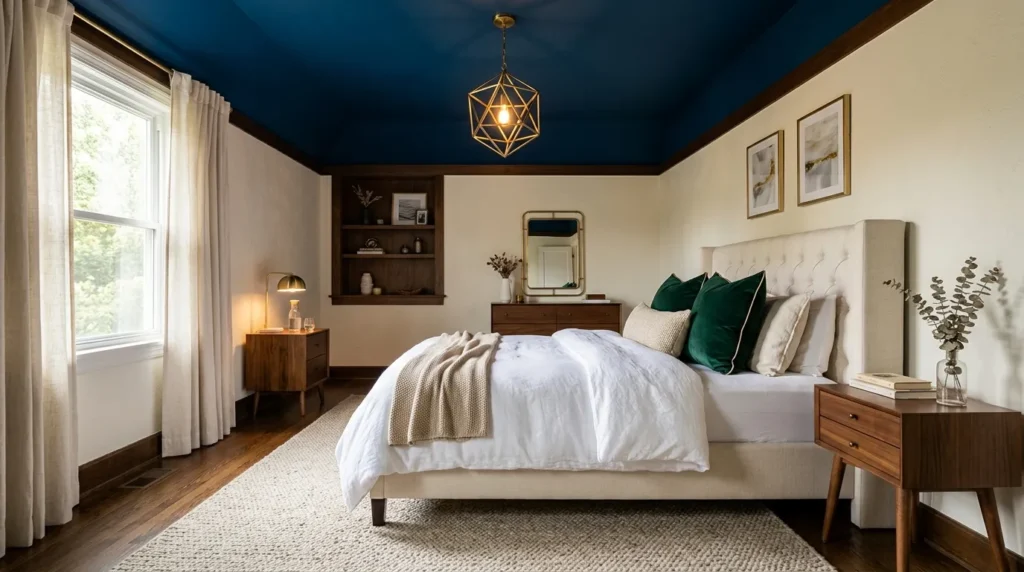
- A colored ceiling creates an unexpected luxury detail.
- Sapphire, emerald, or deep teal can work beautifully overhead.
- Keep walls lighter to maintain visual balance.
- Use warm lighting to bring out the richness of the ceiling.
A jewel-toned ceiling can create an unexpected sense of luxury while keeping the bedroom walls light and airy. Deep sapphire, emerald, or teal overhead adds color without competing directly with the bed or artwork. This technique works particularly well in rooms with sufficient ceiling height because the darker surface creates depth rather than making the room feel compressed. Pair the ceiling with warm ivory walls, cream bedding, and natural wood furniture to create a balanced transition. The result is subtle from some angles but becomes a memorable design feature when you look upward.
Lighting deserves extra attention when using a saturated ceiling color. A warm pendant or chandelier can create a soft glow across the surface, highlighting the depth of the paint after sunset. During the day, natural light will reveal different undertones and make the ceiling feel more dynamic. I’ve noticed that matte finishes are often easier to live with because they reduce distracting reflections. Keep the rest of the room relatively restrained so the ceiling remains the surprise element. This approach is especially useful when you want a rich bedroom look without filling every wall with color.
24. Multi-Tone Jewel Palette
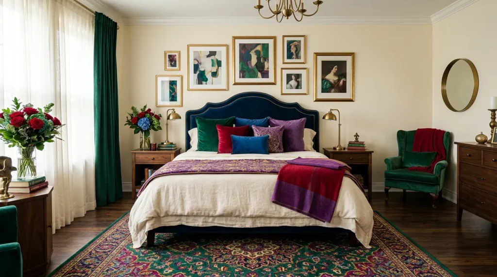
- Combine several jewel colors through small, controlled accents.
- Use cream or beige as the visual base.
- Repeat each strong color at least twice for better cohesion.
- Let one jewel shade dominate while the others support it.
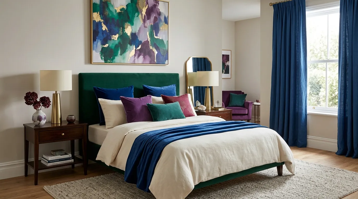
A multi-tone jewel palette can make a bedroom feel rich, expressive, and highly personalized when the colors are carefully balanced. Start with a neutral foundation such as cream walls, ivory bedding, and warm wood furniture. Then introduce emerald, sapphire, ruby, and amethyst through pillows, artwork, rugs, or small upholstered pieces. Instead of giving every color equal attention, choose one dominant shade and use the others as supporting accents. This creates the layered appearance of a collected interior rather than a room filled with competing saturated colors.
The easiest way to keep several bold colors harmonious is to repeat them in small details. For example, emerald can appear in the largest pillow, sapphire in artwork, ruby in a throw, and amethyst in a decorative vase. Keep the finishes and textures varied so the colors do not look like a matching set. In my experience, neutral materials are what make a colorful bedroom feel sophisticated. Linen, natural wood, aged brass, and cream upholstery give the eye quiet areas between saturated shades. The result is dramatic and inviting while still feeling intentional enough for everyday living.
25. Jewel Tone Layered Bedding
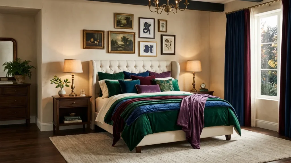
- Layer rich colors through pillows, throws, and blankets rather than matching everything.
- Keep sheets and larger bedding pieces neutral for balance.
- Mix velvet, linen, cotton, and quilted textures.
- Use one dominant jewel color and smaller complementary accents.
Layered jewel-tone bedding can bring the entire bedroom together by combining color, texture, and comfort in one focal point. Start with neutral sheets and a cream or beige base layer, then introduce one dominant shade such as emerald, sapphire, or burgundy. Add smaller accents in complementary jewel colors through velvet pillows, patterned cushions, or a folded throw. This creates depth without making the bed look chaotic. The layered approach also makes it easier to change the room’s mood because individual pieces can be removed or replaced without rebuilding the entire bedding arrangement.
Texture is just as important as color when creating a luxurious bed. Combine crisp cotton sheets with a quilted coverlet, linen blanket, and velvet cushions to create noticeable variation. Avoid making every layer equally bold because the eye needs a quieter foundation. Keep the strongest jewel shade closest to the center of the composition, then use lighter or darker versions around it. I’ve seen this work particularly well in bedrooms where the furniture is simple because the bedding provides enough personality to transform the entire space. Finish with warm lighting and a soft rug for a cozy, polished result.
Conclusion
A luxurious bedroom does not require every surface to be bold. The right jewel colors, layered textures, warm lighting, and thoughtful neutral accents can create a space that feels rich without becoming overwhelming. These jewel tone bedroom ideas give you plenty of ways to experiment, whether you prefer one statement wall or a colorful mix of emerald, sapphire, ruby, and amethyst. I’ve seen how even a few small changes can completely refresh a bedroom’s personality. Save this post on Pinterest for your next decorating project, try your favorite idea, and share it with someone who loves beautiful, colorful spaces. Your dream bedroom can start with one shade.