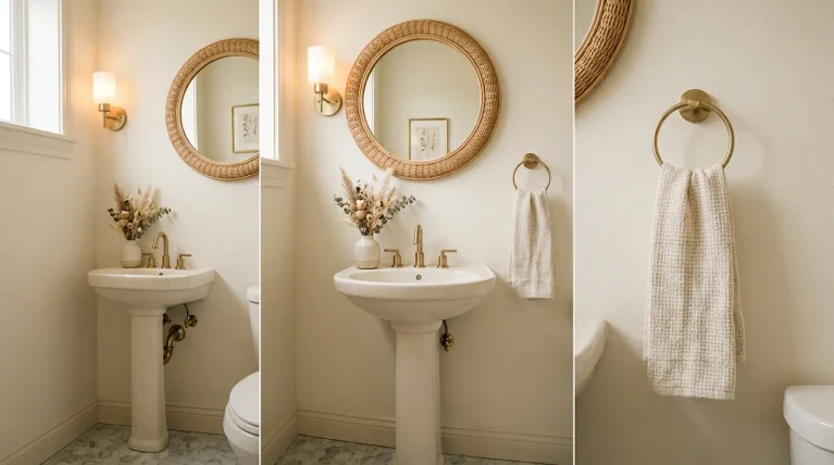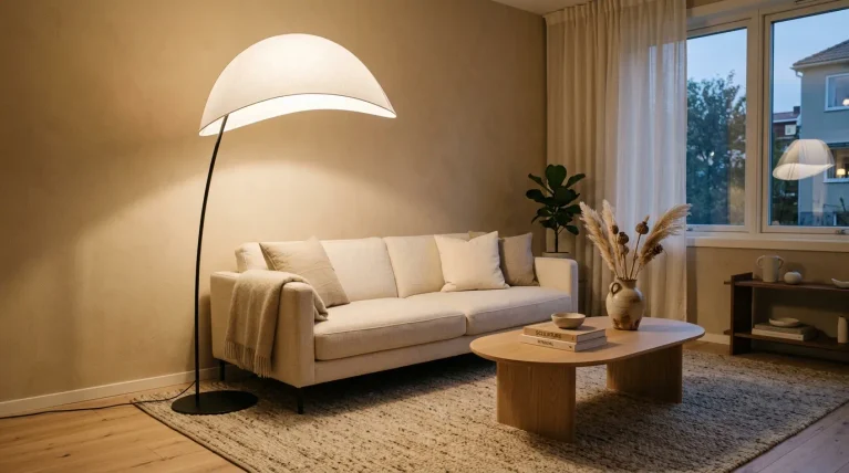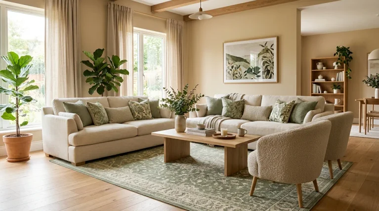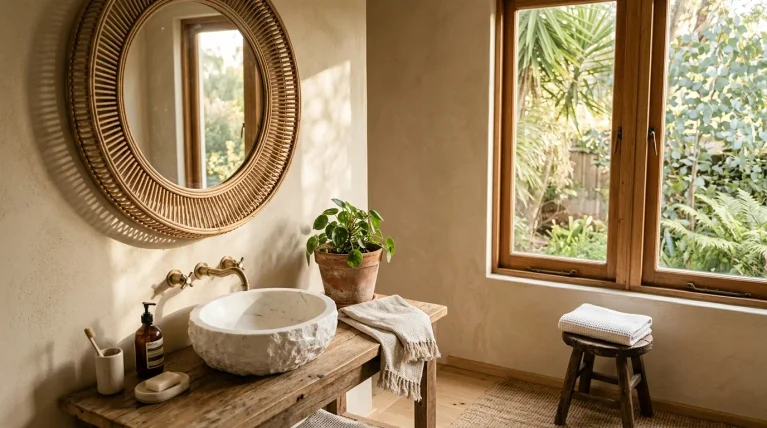
Imagine walking into a bedroom that feels instantly calmer, richer, and more inviting. Deep blue walls, soft bedding, warm wood, and glowing lamps can turn an ordinary room into a retreat you actually look forward to at the end of the day. Dark blue bedrooms are a beautiful choice when you want drama without sacrificing comfort. This collection brings together 23 practical ideas for creating that look, whether you are refreshing a rental, updating one wall, or planning a complete bedroom makeover. You’ll find easy ways to balance deeper colors with cream, wood, brass, texture, and thoughtful lighting. In my experience, even one small change—like navy bedding or a blue accent chair—can make a room feel completely different.
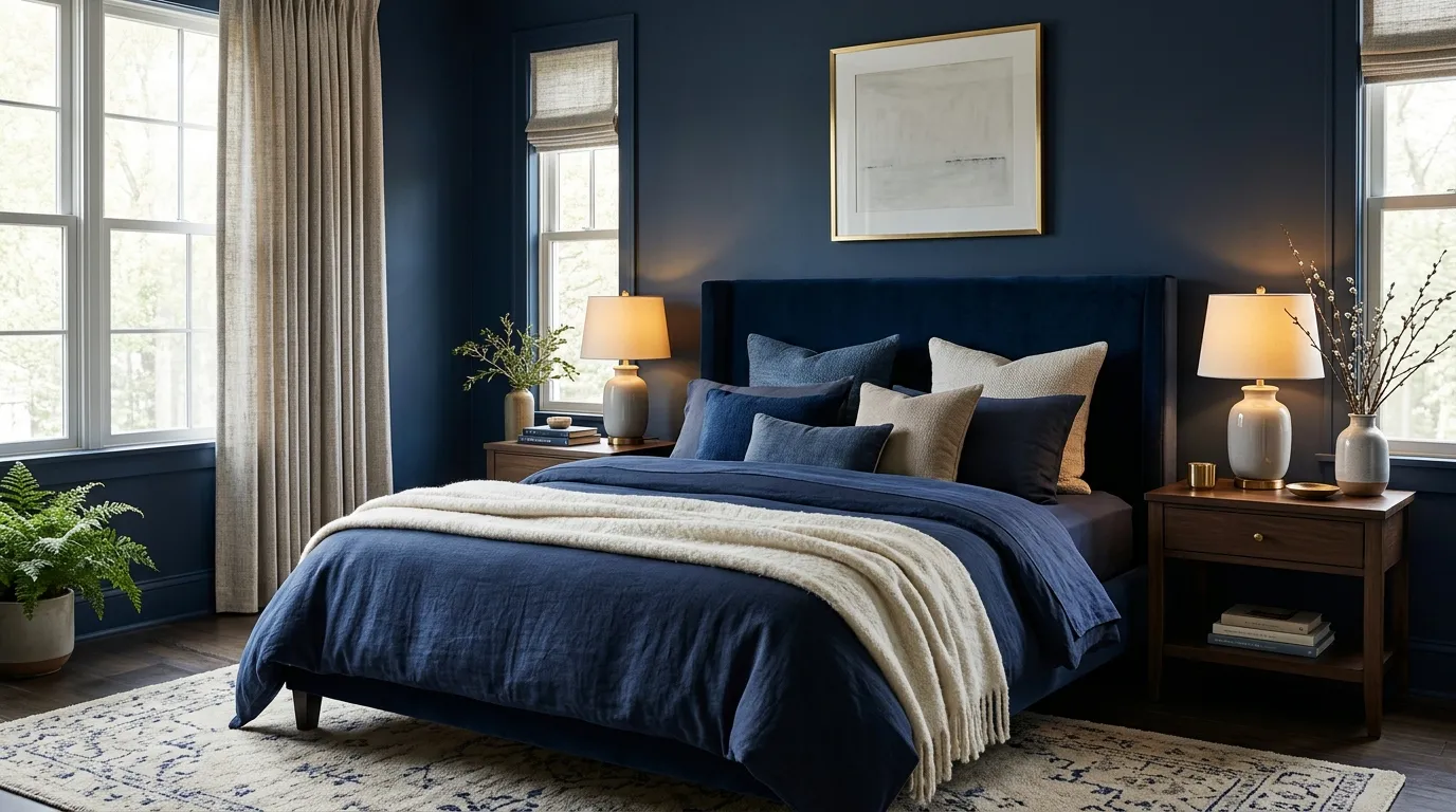
1. Navy Accent Walls

- Deep navy walls create an instantly polished focal point.
- Light trim helps balance the richness of the color.
- Natural wood adds warmth and prevents the room from feeling flat.
- Brass lighting or hardware brings a subtle decorative contrast.
- Layered fabrics make the darker palette feel softer and more inviting.
Navy walls instantly give a bedroom a richer, more grounded look, especially when paired with crisp bedding and warm wood accents. The deep color creates a cocooning backdrop without making the room feel overly dramatic. In smaller spaces, keeping the ceiling and trim light can balance the intensity and preserve brightness. Layering linen, cotton, or boucle textures also keeps the scheme from looking flat. This approach works particularly well when you want a sophisticated retreat that still feels comfortable and practical. A few brass details, such as lamps or drawer pulls, can add just enough contrast.
The easiest way to make this look feel intentional is to repeat the wall color in small details around the room. Try a navy throw, patterned cushion, artwork, or upholstered bench instead of matching every piece. This creates visual connection while allowing lighter elements to breathe. For flooring, pale oak, natural rugs, or warm beige carpeting can soften the deeper backdrop beautifully. In my experience, this balance is especially useful in bedrooms with limited daylight because the lighter accents keep the palette from becoming heavy. Finish with warm bulbs rather than cool white lighting for a relaxed evening glow.
2. Blue Upholstered Bed
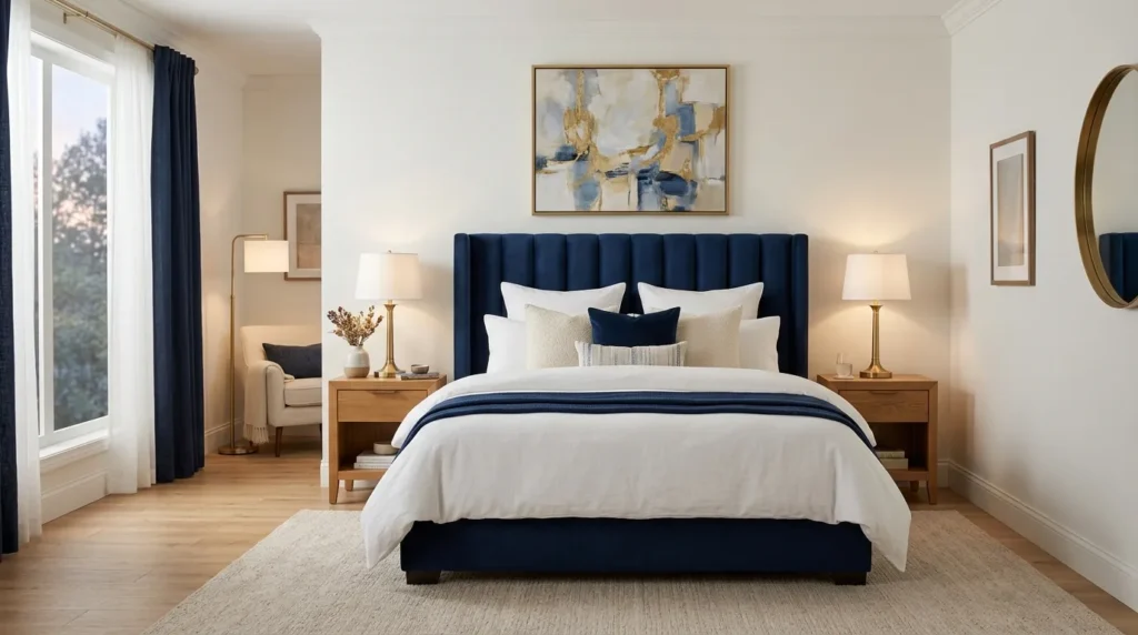
- A fabric headboard adds softness to a deeper color scheme.
- Curved or padded shapes make the furniture feel more inviting.
- Neutral bedding keeps the bed from visually dominating the room.
- Warm wood flooring balances the cool blue upholstery.
- Layered bedside lighting makes the setup feel finished and functional.
Want a moody bedroom without sacrificing comfort? A deep blue upholstered bed can become the focal point while softer surrounding finishes keep the room inviting. Choose a headboard with gentle curves or visible fabric texture to soften the strong color and introduce a layered, hotel-inspired feel. Pair it with neutral walls, pale bedding, and natural flooring so the bed anchors the room rather than overwhelms it. I’ve noticed this combination works especially well in bedrooms where the furniture needs to provide visual weight without making the whole space feel dark. Add adjustable bedside lighting for a polished finish.
To make the bed feel connected to the rest of the room, repeat its blue tone in just two or three smaller accents. A patterned lumbar pillow, small artwork, or folded throw can do the job without creating a matching set. Keep larger surrounding pieces lighter, such as cream nightstands or pale wood dressers, so the composition stays balanced. For an especially cozy finish, add a textured rug beneath the bed and use warm bedside bulbs. This arrangement is practical too, because the upholstered headboard provides a comfortable surface for reading while creating a strong visual centerpiece.
3. Midnight Blue Bedding
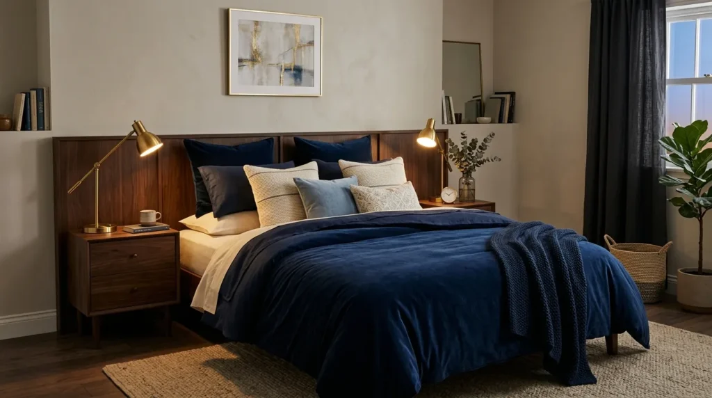
- Dark bedding instantly changes the mood without repainting the room.
- White or cream sheets create crisp contrast against the deeper layers.
- Velvet, linen, and quilted textures add dimension.
- Wooden furniture keeps the palette warm and grounded.
- A lighter rug can visually brighten the entire floor area.
The quickest way to create dark blue bedrooms is often much simpler than repainting every wall: start with the bed. Midnight blue duvet covers, quilts, or comforters create a dramatic foundation while leaving the surrounding architecture light. This makes the idea especially useful for renters or anyone who wants an easy seasonal update. Pair the darker bedding with cream sheets, soft beige pillows, and natural textures to keep the contrast relaxed. A layered arrangement also photographs beautifully, which makes this setup particularly appealing for Pinterest-inspired bedroom styling. The result feels sophisticated without requiring a complete room makeover.
Texture is what keeps a dark bedding scheme from looking visually heavy. Mix smooth cotton sheets with a linen duvet, knitted throw, or subtly quilted coverlet to create small shifts in light and shadow. I’ve seen this work especially well when the bedroom already has neutral walls, because the bedding becomes a flexible focal point rather than competing with the architecture. If the room feels too dark at night, add a bedside lamp with a warm bulb and place a lighter rug near the bed. These simple changes can make the space feel layered, comfortable, and intentionally styled.
4. Moody Blue Ceiling
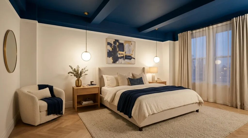
- Painting the ceiling blue creates a cocoon-like effect.
- Keeping the walls lighter prevents the room from feeling enclosed.
- Warm lighting softens the deeper overhead color at night.
- Light bedding creates a fresh visual break.
- Natural wood and woven textures add warmth and balance.
A blue ceiling can completely change the atmosphere of a bedroom without requiring every wall to become dark. The overhead color draws the eye upward and creates a cozy, wrapped-in feeling that works beautifully in rooms with high ceilings. Pairing it with pale walls, cream bedding, and warm wood keeps the overall space balanced. This is also a smart choice when you want a dramatic design feature without committing to a fully dark room. The ceiling becomes an unexpected focal point, while the lighter walls continue reflecting available daylight throughout the space.
The key is choosing the right shade and finish for your room. A muted navy or dusty blue usually feels more sophisticated than an extremely bright blue, especially when paired with warm white walls. Use matte or low-sheen paint to minimize glare and create a softer appearance. In my experience, layered lighting makes this idea especially successful because the ceiling color becomes more atmospheric after sunset. Add bedside lamps, a central pendant, and perhaps a small reading light so the room feels warmly illuminated from several levels rather than relying on one harsh overhead fixture.
5. Blue and Brass Accents
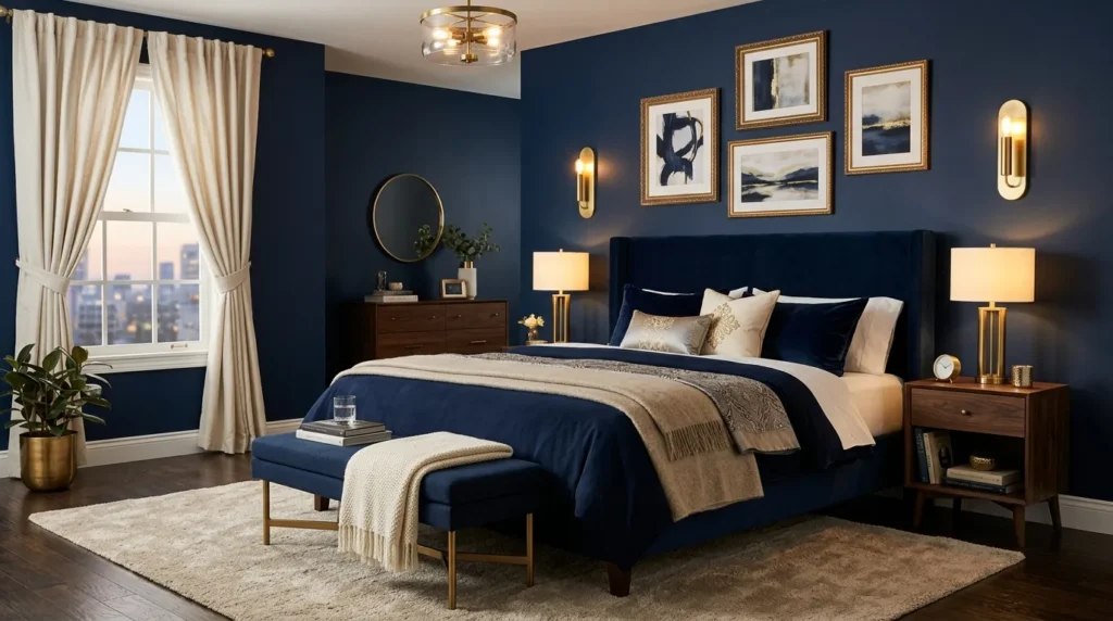
- Brass details add warmth against deep blue surfaces.
- Small metallic touches can create a high-end appearance.
- Matte finishes keep the combination from feeling overly flashy.
- Brass lamps and handles are easy updates for existing furniture.
- Cream textiles soften the contrast between cool and warm tones.
Deep blue and brass make a naturally striking combination, bringing together a cool, dramatic backdrop with warm metallic details. You do not need expensive furniture to create the effect. A brass bedside lamp, drawer pulls, picture frames, or curtain rod can introduce enough warmth to make the room feel thoughtfully designed. Keep the larger pieces simple and let the small metallic accents catch the light. This works particularly well with navy walls, upholstered furniture, or darker bedding because the brass creates tiny points of brightness that prevent the palette from looking too uniform.
For a balanced result, repeat brass in several small places instead of using one oversized metallic feature. A bedside lamp can coordinate with a mirror frame, while a few decorative objects echo the same finish across the room. I’ve noticed that brushed or aged brass often feels more relaxed than highly polished gold, especially in bedrooms where the goal is comfort rather than glamour. Combine these accents with cream bedding, warm wood, and textured fabrics. The result is a refined color scheme that feels sophisticated during the day and especially cozy under warm evening lighting.
Also Read: 25 2026 Paint Color Trends for a Stylish Home Update
6. Navy and Cream Layers
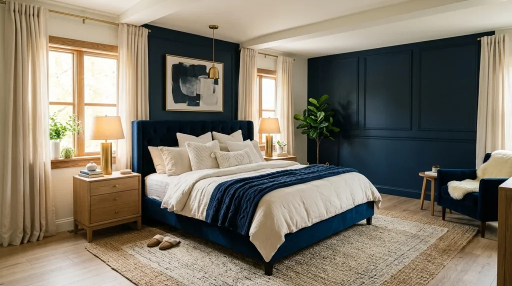
- Cream bedding brightens a deep blue palette immediately.
- Layered textiles create softness and visual depth.
- Light curtains can help preserve natural daylight.
- Beige rugs connect the cool and warm tones.
- Wooden accessories add an organic finishing touch.
Navy and cream create an easy bedroom combination because each color naturally balances the other. The deeper shade provides structure and contrast, while cream brings brightness and softness around the bed. Try cream sheets, a textured duvet, boucle pillows, or a light upholstered bench against a darker backdrop. The contrast makes both colors look richer without creating a busy appearance. This approach is especially useful when you want the room to feel moody at night but still fresh during the day. Natural daylight bouncing across cream surfaces can keep the overall space feeling open and comfortable.
The best results usually come from layering several slightly different neutral tones instead of choosing one exact shade of cream. Mix ivory, oatmeal, warm beige, and soft taupe through bedding, rugs, curtains, and accessories. This creates subtle variation while keeping the palette cohesive. A natural wood nightstand or woven basket can add another layer of warmth without distracting from the main color scheme. That’s why many designers recommend using texture as much as color when working with darker palettes. It gives the eye plenty to notice and makes a simple bedroom arrangement feel more complete.
7. Dark Blue Paneling
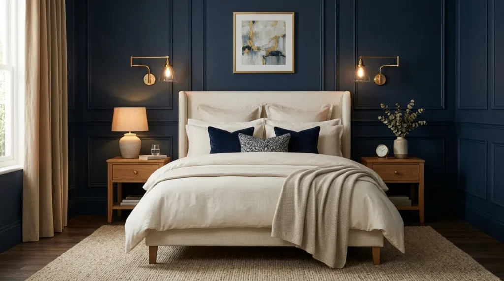
- Wall paneling adds architectural detail to a deep color.
- Vertical panels can make the ceiling appear taller.
- Simple bedding keeps the wall treatment as the focal point.
- Brass or black sconces add practical bedside lighting.
- Textured flooring softens the structured wall design.
Dark blue paneling gives a bedroom instant architectural character while creating a rich backdrop for the bed. Vertical grooves, traditional box molding, or slim shaker-style panels can all work, depending on the overall decorating style. The texture catches changing light throughout the day, making the wall more interesting than a completely flat painted surface. Keep the furniture relatively streamlined so the paneling remains the main feature. In a smaller bedroom, using the treatment only behind the bed can create definition without visually crowding the rest of the space.
The panel style should complement the proportions of the room rather than simply following a trend. Tall vertical panels can emphasize height, while wider rectangular molding can make a large wall feel more balanced. Choose a low-sheen finish so the deeper color remains sophisticated and the architectural details stay visible. I’ve noticed that warm bedside sconces work particularly well here because their glow highlights the raised surfaces after dark. Add cream bedding, natural wood, and a textured rug to soften the structured look and create a bedroom that feels polished but still comfortable.
8. Blue Floral Wallpaper
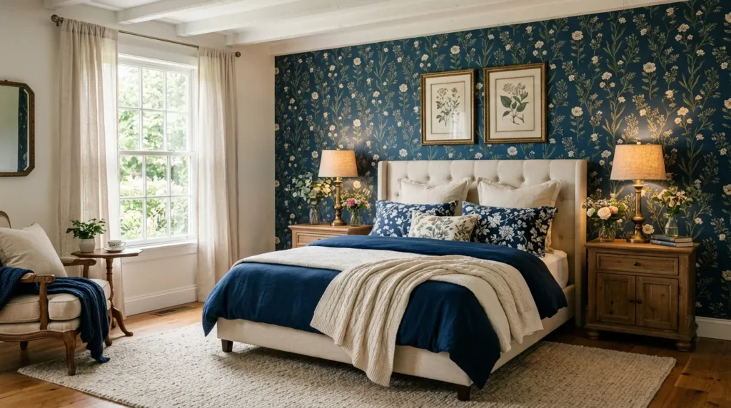
- Floral wallpaper brings pattern into a darker bedroom palette.
- Small-scale prints can work beautifully in compact spaces.
- Cream or muted backgrounds keep the pattern from feeling overwhelming.
- Simple furniture allows the wallpaper to remain the star.
- Repeating one floral color in bedding creates visual connection.
Blue floral wallpaper can bring softness and personality to a moody bedroom while adding far more visual detail than paint alone. Look for botanical prints featuring navy, dusty blue, cream, or muted green rather than extremely bright colors. A floral wall behind the bed creates an obvious focal point and gives the room a collected, decorative appearance. Keep surrounding furniture simple so the pattern has room to breathe. This approach works especially well for bedrooms that feel plain or unfinished because the wallpaper introduces color, texture, and movement in one design decision.
If you are nervous about using a bold print, start with one feature wall rather than covering the entire room. Choose bedding that picks up one or two quieter colors from the wallpaper without matching the pattern exactly. This creates cohesion while keeping the design relaxed. In my experience, natural wood furniture is particularly useful with floral prints because it adds warmth and prevents the room from looking overly coordinated. Finish with woven baskets, linen curtains, and warm bedside lighting for a comfortable balance between traditional charm and modern simplicity.
9. Coastal Navy Retreat
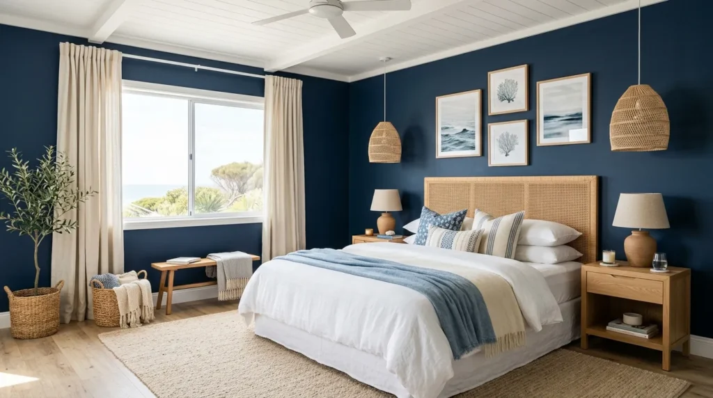
- Navy creates a deeper alternative to traditional coastal blue.
- White bedding keeps the room airy and fresh.
- Woven materials introduce relaxed natural texture.
- Pale wood furniture prevents the palette from becoming heavy.
- Striped accents add subtle coastal character without looking themed.
A coastal bedroom does not have to rely on pale blue and bright white to feel relaxed. Deep navy can create a more sophisticated interpretation while preserving the breezy qualities that make coastal interiors so appealing. Pair it with crisp white bedding, pale wood, woven baskets, and natural fiber rugs for contrast. Keep patterns understated, such as narrow stripes or simple geometric prints, rather than covering the room in obvious nautical motifs. The combination works because the dark blue provides depth while the natural materials maintain a light, casual feeling.
The most convincing coastal spaces usually feel collected rather than decorated around a single theme. Choose materials that naturally suggest the seaside, such as linen, rattan, jute, cotton, and unfinished wood, instead of relying heavily on shells or anchor motifs. I’ve seen this approach make darker bedrooms feel surprisingly fresh because the textures reflect light and add warmth. Add sheer curtains if privacy allows, and position the bed where it can benefit from natural daylight. A few carefully chosen accessories will give you the coastal atmosphere without making the bedroom feel like a themed vacation rental.
10. Blue Velvet Headboard
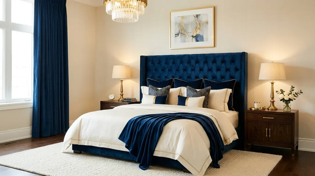
- Velvet adds rich texture and subtle light variation.
- A tall headboard creates a strong focal point behind the bed.
- Cream bedding keeps the arrangement balanced.
- Rounded edges can soften an otherwise dramatic palette.
- Brass or warm wood accents complement the fabric beautifully.
A blue velvet headboard can make an ordinary bedroom feel instantly more luxurious while keeping the overall design surprisingly simple. The fabric catches light differently across its surface, creating gentle shifts in tone that make the color look richer and more dimensional. Choose a tall or slightly curved silhouette if you want the bed to feel especially substantial. Keep the bedding lighter in shades such as ivory, oatmeal, or soft gray so the headboard remains the main feature. This idea works particularly well when you want a boutique-hotel feeling without replacing every piece of bedroom furniture.
Velvet already provides plenty of visual richness, so the surrounding finishes can stay understated. Pair the headboard with smooth cotton sheets, a textured throw, and simple nightstands to create contrast without visual clutter. Warm wood adds an organic element, while aged brass works beautifully for bedside lighting. In my experience, a velvet headboard is also practical because it gives you a comfortable surface for sitting up in bed. Choose durable upholstery if the bedroom receives frequent use, and vacuum gently with an appropriate attachment to keep the fabric looking fresh over time.
11. Blue and Wood Contrast
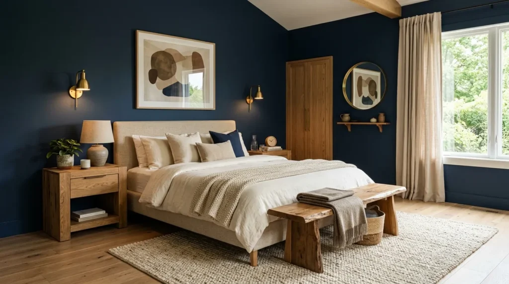
- Natural wood warms up a darker bedroom instantly.
- Oak and walnut both pair beautifully with deeper blue shades.
- Wood nightstands add organic texture without overwhelming the palette.
- Cream textiles create a softer transition between colors.
- Minimal accessories let the materials remain visually important.
Deep blue becomes much more inviting when paired with natural wood, making this combination ideal for bedrooms that need warmth as well as drama. Oak brings a lighter, casual feeling, while walnut creates a richer and more sophisticated appearance. Use wood through nightstands, a bed frame, dresser, bench, or even a simple floating shelf. The organic grain breaks up large areas of color and gives the room subtle texture. Instead of making the space feel cold or overly formal, the contrast creates a grounded atmosphere that feels comfortable enough for everyday living.
The amount of wood matters just as much as the type you choose. If the walls or bedding are already dark, lighter oak can help reflect warmth and keep the room visually open. With lighter walls, deeper walnut furniture can provide stronger contrast without needing additional dramatic colors. I’ve noticed that this pairing becomes especially effective when natural materials appear in several small ways, such as a woven basket or wood-framed artwork. Add cream linen, a textured rug, and warm lighting to connect the materials and create a balanced, restful bedroom arrangement.
12. Moody Gallery Wall
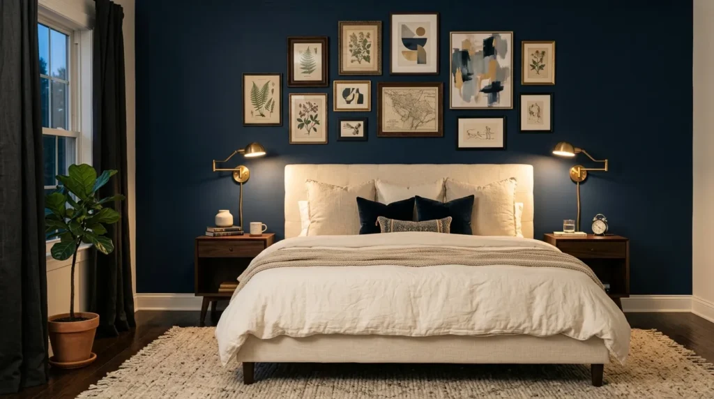
- Artwork breaks up large dark surfaces with personality.
- Light-colored frames can create contrast against deeper walls.
- A mix of sizes makes the arrangement feel collected.
- Personal photographs add warmth and individuality.
- Keeping a consistent color palette prevents visual clutter.
A gallery wall can turn a dark bedroom wall into a personalized focal point without relying on bold furniture or complicated decorating. Choose artwork with touches of cream, muted blue, charcoal, beige, or warm brown so the collection feels connected to the surrounding palette. Mix different frame sizes and orientations to create movement while keeping enough space between pieces for each image to remain visible. This approach works especially well above a bed, dresser, or reading corner because it gives an otherwise empty wall a clear visual purpose.
For a polished arrangement, lay the artwork on the floor first and experiment with spacing before putting anything on the wall. This makes it easier to create a balanced composition without unnecessary holes or adjustments. In my experience, mixing one or two personal pieces with prints or photography makes a gallery wall feel much more authentic than using only decorative art. Keep the lower edge of the arrangement comfortably above furniture, and repeat one accent color from the artwork in a pillow, throw, or small accessory to tie everything together.
13. Dark Blue Built-Ins
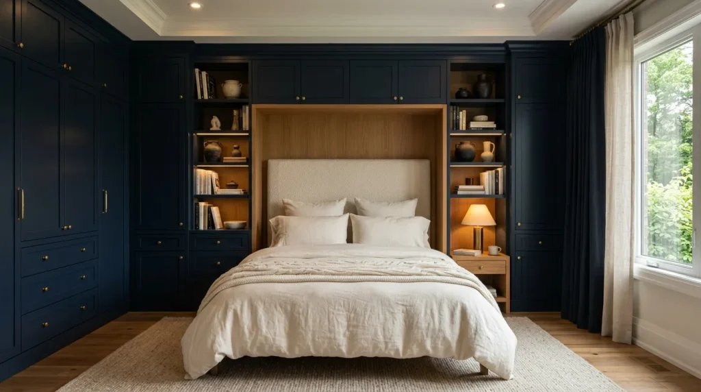
- Built-in storage makes use of otherwise overlooked wall space.
- Deep color helps cabinetry feel intentional and architectural.
- Open shelves provide room for books and decorative objects.
- Brass or black hardware adds a finished detail.
- Light bedding keeps the sleeping area visually balanced.
Dark blue built-ins can make a bedroom feel more organized while adding a strong architectural feature. Floor-to-ceiling cabinetry around a bed, window, or reading nook turns unused wall space into purposeful storage. Closed cupboards can hide clothing and everyday clutter, while a few open shelves provide space for books, framed artwork, baskets, or small plants. The deeper finish gives the cabinetry a furniture-like presence and helps the entire wall feel cohesive. This is especially useful in smaller bedrooms where every storage opportunity matters and freestanding furniture could make the floor feel crowded.
For a practical layout, think about what you need to store before deciding how many shelves or cabinets to include. Keep frequently used items within easy reach and reserve higher compartments for things you use less often. Warm wood shelves can soften the darker cabinetry, while simple hardware keeps the overall appearance clean. A lighter ceiling and pale bedding can prevent the built-ins from visually closing in the room. I’ve noticed that combining concealed storage with a few carefully styled open shelves creates the best balance between a beautiful bedroom and one that still functions easily every day.
14. Blue Bedroom Nook
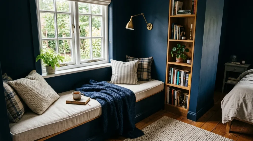
- A small nook can become a dedicated reading or relaxing area.
- Darker color helps visually define the separate zone.
- A compact chair saves valuable floor space.
- Layered cushions make the corner feel comfortable.
- A wall-mounted lamp provides useful focused lighting.
A small bedroom nook can become one of the most useful parts of the room when it has its own visual identity. Use a deeper blue shade on the nook wall, alcove, or surrounding paneling to distinguish it from the sleeping area. Add a compact upholstered chair, small stool, or built-in bench depending on the available space. A floor lamp or wall-mounted reading light makes the corner functional rather than purely decorative. Even a narrow unused section beside a wardrobe can become a comfortable place for reading, getting dressed, or enjoying a quiet morning.
The secret to making a nook feel intentional is keeping the furniture proportional to the available area. Choose one comfortable seat instead of trying to squeeze in several pieces, then add a small side table for a book, drink, or lamp. A textured cushion and soft throw can introduce warmth without taking up much space. If natural light reaches the nook, use it to your advantage by positioning the chair nearby. I’ve noticed that these small dedicated zones often make bedrooms feel larger because they give each part of the room a clear purpose.
15. Navy Canopy Bed
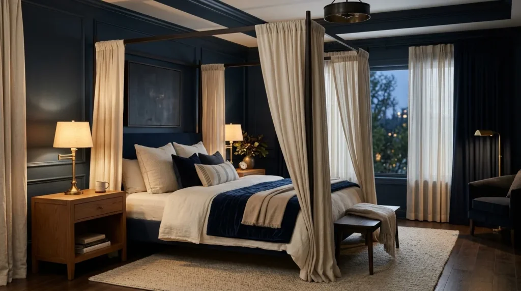
- A canopy creates height and drama around the sleeping area.
- Light fabric can soften the structure without hiding it.
- Simple bedding keeps the silhouette visually clean.
- Warm wood or black metal offers different style directions.
- Soft bedside lighting emphasizes the canopy after dark.
A navy canopy bed creates a dramatic centerpiece while giving the bedroom a sense of structure and height. The frame naturally draws attention upward, making it especially effective in rooms with generous ceiling height. Choose dark wood, painted timber, or slim black metal for the structure, then let the bedding and surrounding colors provide contrast. You can leave the canopy completely open for a modern look or add lightweight curtains for a softer appearance. This idea works beautifully when you want the bed to feel like a defined retreat within a larger bedroom.
The surrounding decor should support the canopy rather than compete with its strong silhouette. Keep the bedding relatively simple, using cream, white, or warm beige layers that create clear contrast against the deeper frame or fabric. If curtains are added, choose linen or another lightweight material so the structure remains visible and the room still receives plenty of daylight. Warm bedside lamps can create a beautiful glow through the fabric in the evening. For smaller rooms, a slim canopy frame can provide the same visual impact without consuming too much floor space.
16. Blue Accent Furniture
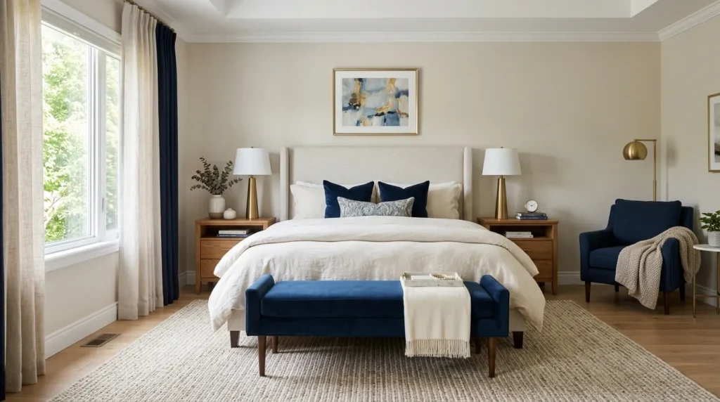
- A blue dresser can add color without changing the entire room.
- Painted nightstands create an easy weekend-friendly update.
- Light walls keep colorful furniture visually balanced.
- Brass or wood hardware can change the furniture’s character.
- One strong piece often works better than several matching pieces.
Blue accent furniture is an easy way to introduce a deeper color without committing to painted walls or a complete bedroom redesign. A dresser, nightstand, bench, or storage cabinet can become the room’s visual anchor while the rest of the furniture remains neutral. This approach is especially helpful for renters or anyone who enjoys changing their decor regularly. Pair one substantial blue piece with cream bedding, pale walls, and natural flooring for contrast. The result feels intentional without requiring every element in the room to follow the same color scheme.
If you already own a wooden dresser or nightstand, painting it can create a similar effect at a much lower cost than buying new furniture. Test the color under both daylight and artificial lighting before committing, because deeper shades can appear dramatically different throughout the day. I’ve noticed that replacing standard hardware with aged brass, matte black, or simple wood pulls can also change the overall character of painted furniture. Keep the rest of the accessories restrained so the accent piece has room to stand out and the bedroom remains visually calm.
17. Dark Blue Window Treatments
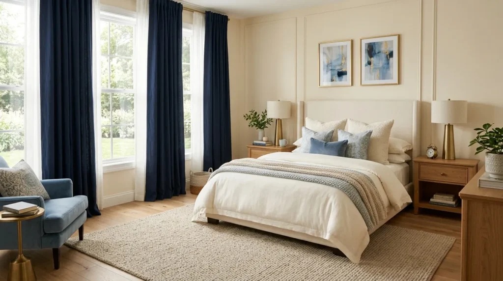
- Full-length curtains make windows appear taller.
- Heavy fabric adds warmth and softness.
- Lined curtains can improve privacy and light control.
- Pale walls create useful contrast around darker panels.
- Repeating the curtain shade in small accents creates cohesion.
Dark blue curtains can dramatically frame a bedroom without changing the walls, making them an easy option for creating a richer atmosphere. Floor-length panels add softness and can make the ceiling appear higher when mounted close to the ceiling. Choose linen for a relaxed look, velvet for a more luxurious effect, or a lined cotton blend when privacy and light control are priorities. The deeper fabric also provides a strong contrast against pale walls and bedding, giving the windows a more intentional presence instead of allowing them to disappear into the background.
The width and placement of curtains can make a surprisingly large difference. Extend the rod beyond the window frame so the panels can sit beside the glass when open, allowing more daylight into the room. When closed, the full fabric width creates a generous backdrop. I’ve noticed that warm neutrals such as ivory, oatmeal, and natural wood pair especially well with dark window treatments because they soften the contrast. Add one or two small accents in a related blue tone, such as a cushion or throw, to connect the curtains with the rest of the room.
18. Blue Bedroom Lighting
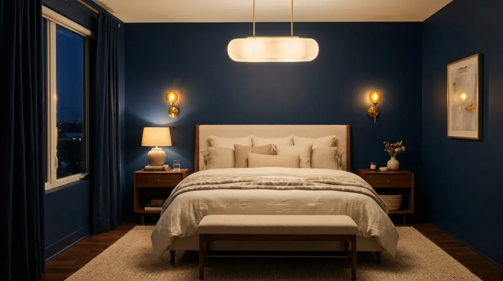
- Warm lighting prevents deeper colors from feeling harsh at night.
- Layered fixtures create more control over the room’s atmosphere.
- Bedside sconces free space on small nightstands.
- A pendant can become a decorative focal point.
- Soft lampshades diffuse light for a calmer evening setting.
Lighting can completely change how a dark bedroom looks after sunset, so it deserves as much attention as the color palette itself. Warm bulbs reveal richer blue tones while creating a softer, more relaxing atmosphere than cool white lighting. Instead of depending on one ceiling fixture, combine bedside lamps, wall sconces, pendants, or a floor lamp at different heights. This creates layers of illumination and gives you control over how bright the room feels. The deeper the surrounding colors, the more useful these separate light sources become for maintaining comfort and visibility.
Consider the function of each light before choosing the fixture. A bedside sconce is useful for reading, while a shaded lamp provides gentle ambient illumination and a ceiling fixture handles general lighting. Dimmers are particularly helpful because they allow the same room to transition from bright morning routines to a quiet evening setting. In my experience, warm lighting around 2700K usually complements deeper bedroom palettes beautifully. Use metallic, ceramic, woven, or glass fixtures to add another decorative layer without introducing unnecessary colors that could compete with the main scheme.
19. Blue and Gray Layers
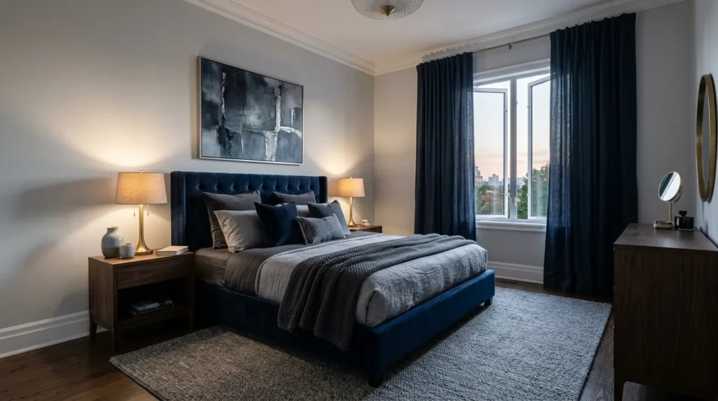
- Gray creates a softer transition around deeper blue tones.
- Mixing warm and cool grays adds subtle dimension.
- Pale gray bedding keeps the bed feeling fresh.
- Charcoal accents can strengthen the room’s contrast.
- Wood accessories prevent the palette from becoming too cool.
Blue and gray create a sophisticated bedroom palette when the shades are carefully balanced rather than treated as identical neutrals. A deep blue wall or upholstered bed can provide the strongest visual anchor, while pale gray bedding, curtains, or rugs soften the surrounding areas. Charcoal accents can add depth, but using too much gray may make the room feel cold. Introduce warm materials such as oak, woven baskets, or beige textiles to keep the composition comfortable. This layered approach works particularly well in modern bedrooms where you want depth without relying on numerous decorative colors.
Pay attention to the undertones before combining several gray pieces. Blue-gray shades can create a cool, contemporary appearance, while warm gray with beige undertones gives the bedroom a softer and more relaxed feeling. Start with one dominant blue element, then add gray through larger textiles rather than small scattered accessories. I’ve noticed that this makes the room feel more intentional because the colors have clear roles. Finish with warm white lighting and natural textures to bring out the subtle differences between the shades, especially during the evening when artificial light changes their appearance.
20. Blue Cottage Style
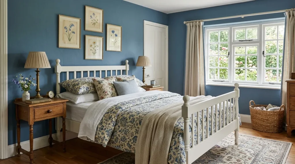
- Deeper blue adds character to traditional cottage details.
- White trim creates a crisp architectural contrast.
- Floral or checked textiles introduce gentle pattern.
- Painted wood furniture reinforces the relaxed aesthetic.
- Woven accessories add natural texture and warmth.
Blue cottage style combines the charm of traditional bedroom details with a richer, more sophisticated color palette. Think painted wood furniture, simple paneling, floral bedding, checked cushions, woven baskets, and classic white trim. A deeper blue can appear especially beautiful against older architectural features because it emphasizes molding, doors, beams, or original woodwork. Keep the patterns relaxed rather than overly coordinated, choosing one floral or checked print and supporting it with quieter fabrics. The result feels collected and comfortable instead of looking like every piece came from the same matching collection.
The cottage look becomes more convincing when imperfections and natural materials are allowed to remain visible. Choose furniture with simple shapes, slightly aged finishes, or visible wood grain instead of overly sleek pieces. Soft linen curtains and layered quilts can add practical comfort while reinforcing the relaxed character. If the room receives plenty of daylight, use lighter bedding and trim to maintain freshness around the deeper walls or furniture. I’ve seen this approach work especially well in older homes because the richer color highlights architectural details without requiring expensive renovations.
21. Blue Boho Textures
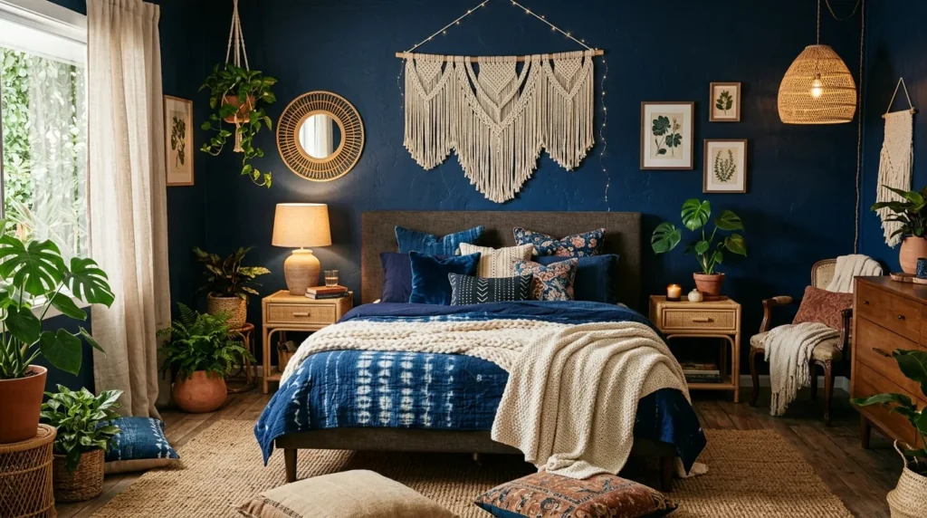
- Layered textiles keep a dark palette feeling relaxed.
- Woven materials introduce warmth and natural variation.
- Patterned cushions add personality without overwhelming the room.
- Rattan furniture softens stronger blue elements.
- Plants bring a fresh organic contrast to deeper colors.
A boho-inspired bedroom can handle deeper blue beautifully when texture takes center stage. Instead of relying on many bright colors, build the room with woven baskets, cotton throws, tasseled cushions, rattan furniture, natural rugs, and relaxed linen bedding. These materials create small variations in texture that keep a darker palette from feeling flat. Add a few muted earthy tones, such as terracotta, sand, or olive, to introduce warmth without competing with the main blue elements. The finished room feels layered, casual, and personal rather than overly styled.
The easiest way to achieve this look is to layer gradually rather than buying an entire matching collection. Start with the bed, add one textured rug, then introduce baskets, cushions, and natural accessories where they are genuinely useful. Keep some open space so the room does not become visually crowded. I’ve noticed that greenery can be especially effective against deeper colors because leaves create a fresh organic contrast. Choose plants suited to the room’s actual light conditions, and use simple ceramic or woven planters to connect them with the rest of the natural materials.
22. Blue Minimalist Bedroom
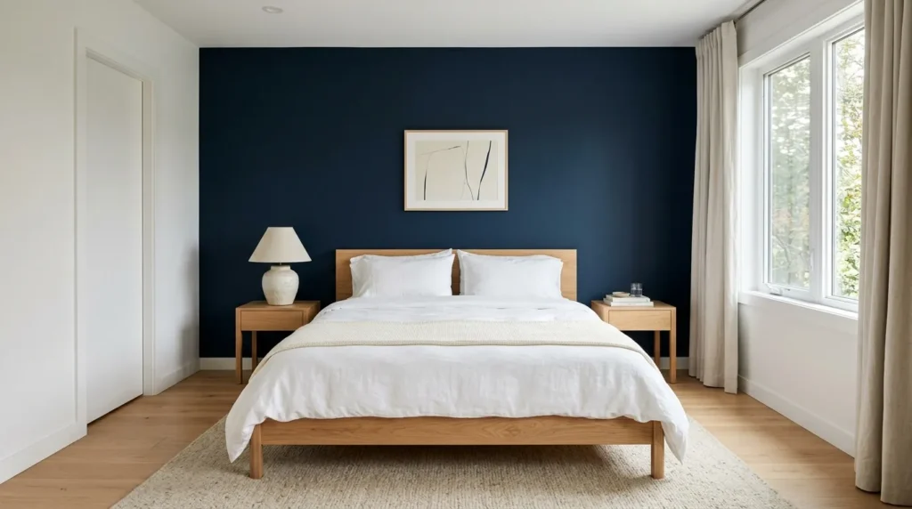
- Minimal furniture lets the deeper color become the main feature.
- Clean lines create a calm, uncluttered appearance.
- Cream bedding softens the stronger wall or furniture color.
- Natural wood adds warmth without visual noise.
- Hidden storage helps maintain the streamlined look.
Minimalism can make a dark bedroom feel surprisingly calm because there are fewer competing elements for the eye to process. Choose one strong blue feature, such as a wall, upholstered bed, or large rug, then keep the remaining furniture simple and functional. Crisp bedding, clean-lined nightstands, and uncluttered surfaces allow the deeper color to provide visual interest on its own. This approach is especially useful in smaller rooms where too many accessories can quickly make the space feel crowded. The finished look feels intentional, spacious, and restful rather than empty or unfinished.
A minimalist room still needs texture to avoid feeling sterile. Add linen bedding, a softly woven rug, natural wood, or a single ceramic accessory to create subtle variation without sacrificing simplicity. Keep decorative pieces purposeful and give frequently used items a designated storage place. In my experience, reducing visible clutter often makes richer colors feel more sophisticated because the eye has one clear focal point instead of many competing details. Use warm lighting in the evening and leave some negative space around furniture so the deeper palette feels like a deliberate design choice rather than something the room is struggling to contain.
23. Layered Blue Sanctuary
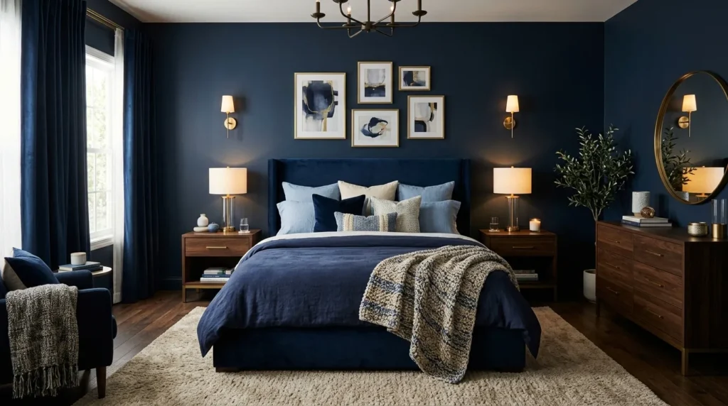
- Combining several blue tones creates depth without relying on patterns.
- Different fabrics make the color palette feel dimensional.
- Cream and beige accents prevent the room from becoming too dark.
- Warm wood adds an organic finishing layer.
- Soft lighting brings out subtle differences between each shade.
Layering several shades of blue can create the most immersive look of all, especially when each tone has a slightly different role. Use a deeper shade on the main focal point, then introduce softer navy, dusty blue, slate, or muted denim through bedding, curtains, cushions, and artwork. The variations prevent the room from looking flat while maintaining a cohesive color story. Add cream, beige, or warm white in smaller areas to create breathing space. This approach works beautifully when you want dark blue bedrooms to feel sophisticated, comfortable, and richly layered rather than simply dark.
The secret is variation in texture as well as color. Combine smooth cotton sheets with linen, velvet, woven fabric, or a lightly quilted blanket so light moves differently across every layer. Keep the largest furniture pieces simple, then build interest through textiles and a few meaningful accessories. Warm oak, rattan, or walnut can introduce another natural dimension without disrupting the palette. I’ve noticed that layered rooms often feel more finished when they include something personal, such as favorite artwork or a well-used reading chair. That final touch keeps the space from feeling staged and makes the retreat genuinely yours.
Conclusion
Your bedroom can feel dramatically different with a few thoughtful changes. Dark blue bedrooms bring depth, warmth, and personality while leaving room for comfort and light. Whether you choose a navy accent wall, velvet headboard, layered bedding, blue furniture, or simple lighting updates, the goal is to create a space that feels intentional and inviting. Start with the idea that fits your room and style best. You do not need to redesign everything at once. I’ve seen how small changes can transform a space when colors, textures, and lighting work together. Save these ideas on Pinterest, try your favorite one, and share this guide with someone planning a bedroom refresh.